Testing the use of the monitor profile in the application program
When I came across this article “Anwendung des Monitorprofils im Anwendungsprogramm testen”
by Andreas Beitinger

I thought, that’s a given … until I read on and tried myself …
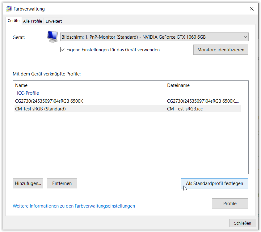
Extra-false profile → CM-Test_sRGB.icc
This profile is a modification of the sRGB profile with twisted color channels. If it is used as a monitor profile, images will be displayed in completely wrong colors. Install it and set it as default for the specific monitor - exactly as described in the previous section “Test loading the calibration data”.
By the way, the profile “CM-Test_sRGB.icc” does not contain any calibration data, but only pure profile data. Now it’s no longer about the calibration, but about the actual profile.( translated by DeepL )
So, what does it do?
Installing & setting up this test profile as Standard monitor profile
then shows in the application, if color management is working → colors looking strange
and where there is NO color management → colors untouched.
.
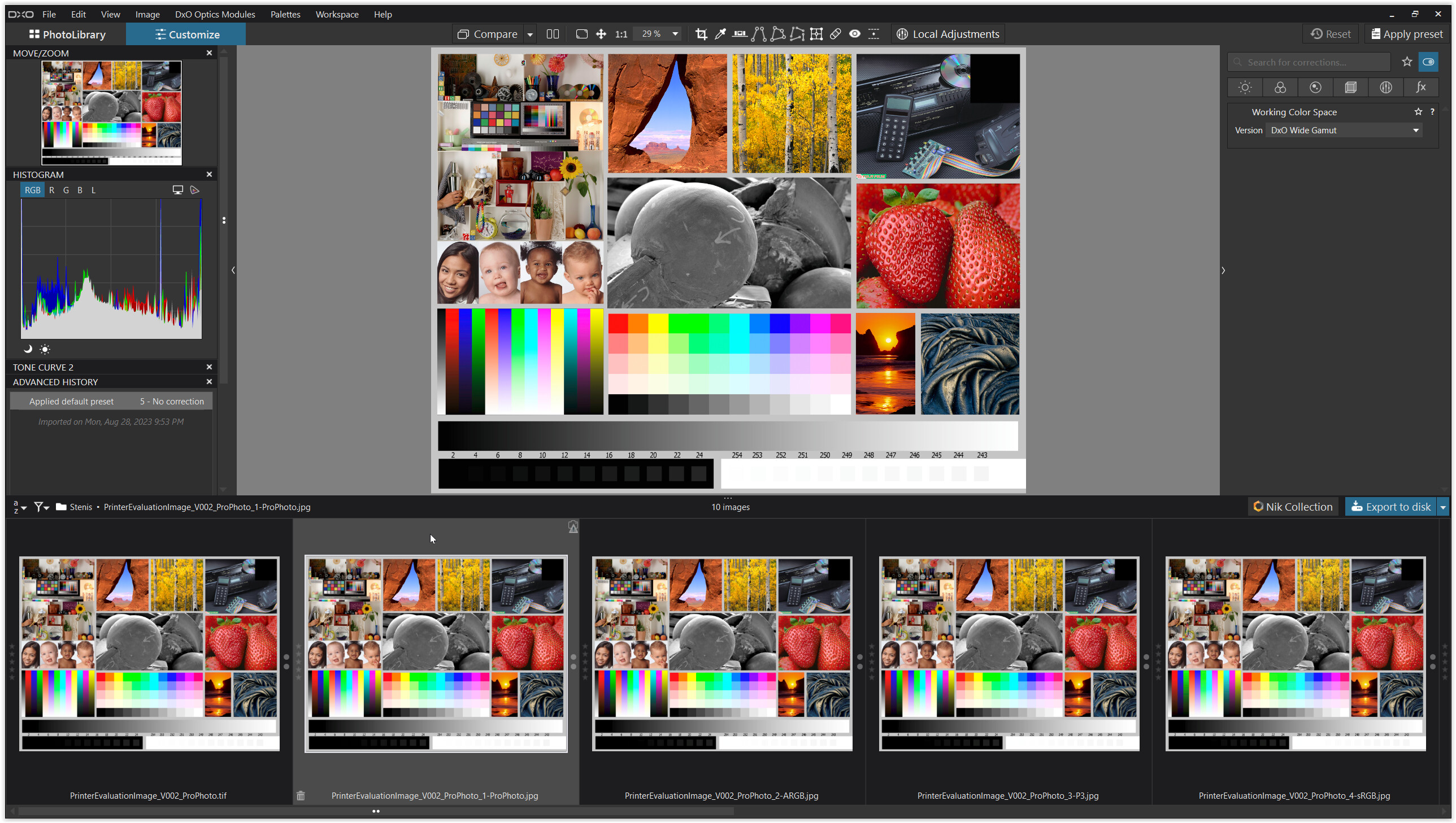
PL6
.
is fully color managed

(needs refresh / restart)
.
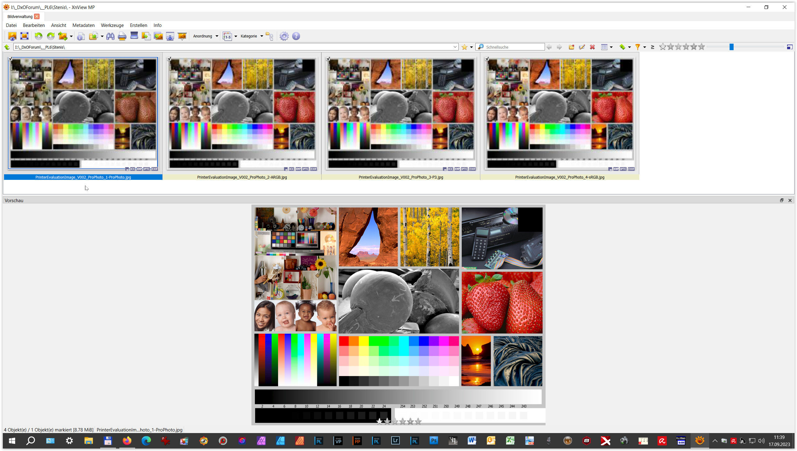
XnViewXP
.
the preview is color managed – but not the ‘thumbnails’
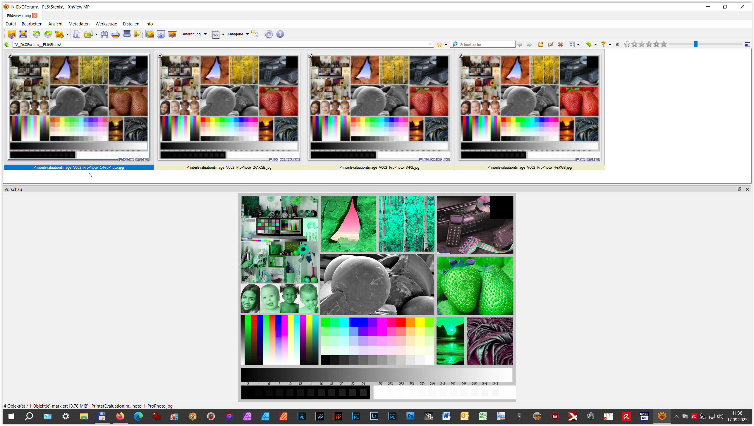
(needs restart)
.
Epson Print Layout
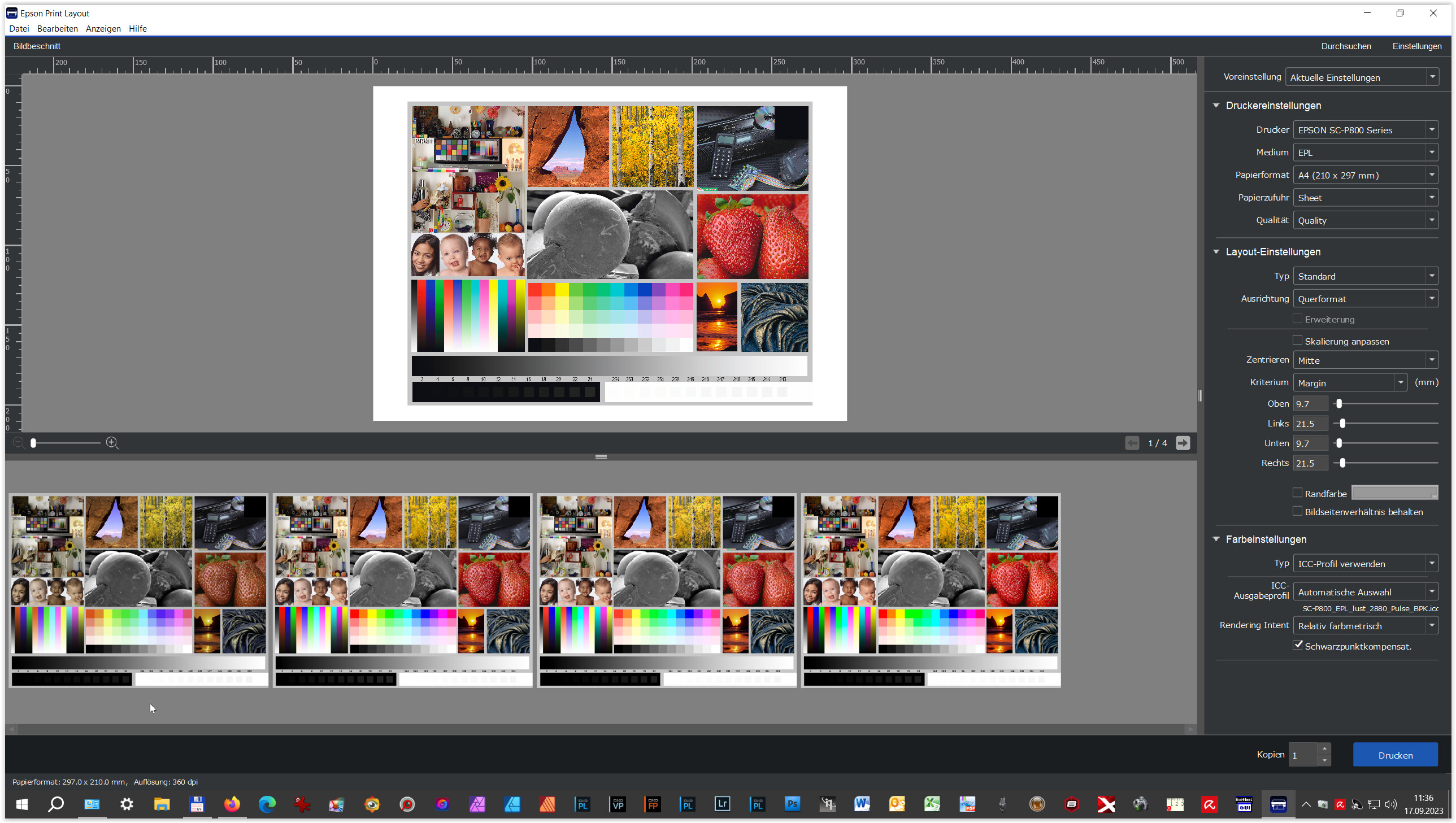
.
the preview is color managed – but not the ‘thumbnails’

(needs restart)
.
checked a few more
-
Fast Stone Image Viewer
preview color managed / can follow the current monitor profile
thumbnails not color managed -
Fast Raw Viewer
preview color managed / can follow the current monitor profile
thumbnails not color managed / set up manually -
IrfanView
preview color managed / can follow the current monitor profile -
Fast Picture Viewer
preview color managed / set up manually
.
above, I used this test picture (allow download or see → here … )
(ed)