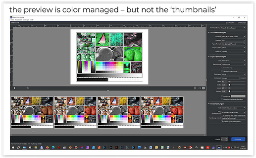
As shown in Sept. 2023 → Workflow Soft proofing / exporting / QimageOne printing and Profiles (?) - #54 by Wolfgang Epson Print Layout is only partially color managed.
(thumbnails from left to right in the ProPhoto, Adobe RGB, P3 and sRGB color spaces)
The “ProPhoto” image on the far left should appear as the most vibrant, but it isn’t because this area isn’t color-managed.
.
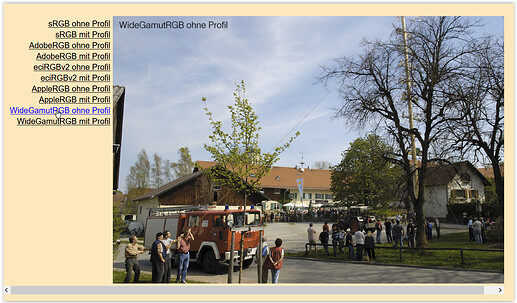
To see a similar “effect”, check out this demonstration
→ Mögliche Probleme im Umgang mit Websites
(scroll all the way down for the examples)
where wide-gamut images without a profile appear dull, quite different from the profiled versions.
.
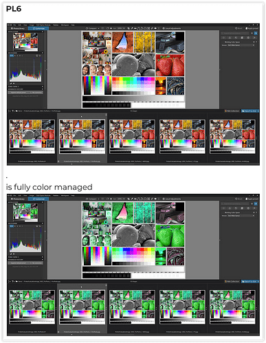
Just use the (fully color-managed) PhotoLab to compare color gamut and vibrancy,
and don’t be fooled.
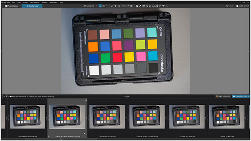
or a more recent example
(the highlighted version has an embedded ProPhoto profile)


