They probably ask so for their output devices, screen or print, are sRGB based. By using another color space you might get other, out of gamut, colors. So why should you use something as sRGB-elle?
George
They probably ask so for their output devices, screen or print, are sRGB based. By using another color space you might get other, out of gamut, colors. So why should you use something as sRGB-elle?
George
The Elle Stone V2 sRGB profile should be just fine there. This is often the default and/or recommended web output profile in open source applications. Yes, @George, this is sRGB color space.
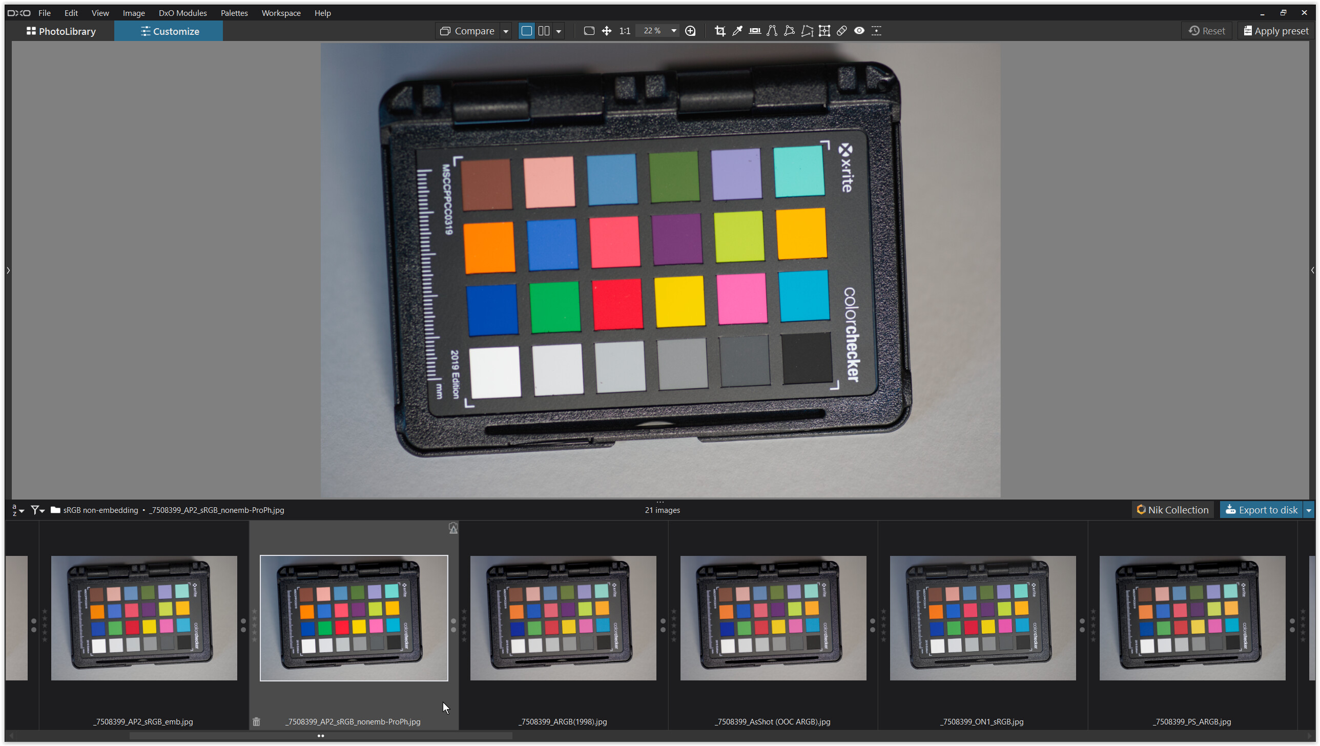
To complete, I’ve set the camera to sRGB → see post #42 .
As you mentioned, PS recognizes this sRGB color tag and actually displays it as “embedded”… which I then took for granted. ![]()
.
AffinityPhoto can optionally convert incoming files to its working color space.
Like @eriepa said, a JPEG with this sRGB color tag doesn’t display a warning that no profile is embedded, but the corresponding TIFF does.
I prefer PS’s approach, but I suggest setting AP to disable automatic conversion. This should solve these (quite rare) problems. Then the wrong profile won’t be used.
.
What I’ve tried …
After developing a raw file in AP you save it in the proprietary afphoto file format. To create an output file (e.g. JPEG or TIFF), you export it and can (should) embed the desired ICC profile.
So far from my side.
I would be more careful with that. You never know what they use, which may deal with embedded ICC in an unexpected way. Just use standard jpeg way, assuming standard sRGB, whatever that means.
I think you are suggesting an alternative which is great - that’s what a forum is good for, seeing what others do and recommend. Maybe you will come back with a level of useful detail?
Another anecdote from outside the DxO PL bubble. Lightroom Classic, v.6.14, will export a JPEG with four options for color space: sRGB, Display P3, Adobe RGB (1998), and ProPhoto RGB. Each option will embed an actual (real) ICC color profile. The sRGB option embeds the sRGB IEC61966-2.1 profile. This is the old 1998 Hewlett-Packard copyrighted profile developed for CRT displays. I don’t know what profile LrC is using currently, maybe they have updated.
Of special note, unlike DxO PL, there is no LrC, v6.14, export option for a simple color tag in ANY color space. If photo contest competitors are using LrC, they will be submitting JPEGs with an embedded actual (real) ICC color profile.
RIP sRGB - there is better things to use today.
Which?
Interoperability?
What we can expect is standarizing color spaces for very specific purposes (e.g. medical), but sRGB would stay lowest common denominator of all of them, “safest” for general purpose. Pragmatics will prevail, imho. So many things were declared dead prematurely, like photography a century ago, when motion pictures were introduced.
Which interoperability?? - and in this case, there is no binary relationship like in for example communication protocols interoperability to consider.
How many times haven’t I reacted over some of our Swedish newspapers when they publish pictures with too heavy red and yellow casts. Pretty sure they have lost control of color spaces or just doesn’t care anymore whether these pictures are processed with sRGB or Adobe RGB.
In many years even newspapers have used automated DAM- workflows to handle these pictures despite they are fully aware of the quality issues it has but economy has always had a stronger impact than image quality. The Fotoware DAM I worked with and took in production already 2013 had a module called “Smart Color” that automatically balanced color and exposures - long before AI even. Fotoware was from the beginning developed by people from Hasselblad in Gothenburg but is now a Norwegian owned company. From the beginning it was a software exclusively used newspaper all over the world.
I also look at that in a pragmatic way. I use Display P3 since a few years back both for display and print despite that I never have owned any hardware at all from Apple. I have published about 40 picture stories mostly in Display P3 read of maybe 150 000 + and not one single comment on color spaces from my readers. That is maybe because there is no interoperability problems at all after all in practise. In fact, people seem to be OK with pictures processed with Display P3 - even on sRGB displays - in practise - maybe because the newspapers often look far worse. I think we just have to live with a mix of Display P3 and sRGB and for that matter Adobe RGB even on displays because it is impossible to do something about it - it is as it is and that is the in fact the present de facto standard. It was years since sRGB was.
You and @Wlodek speak of color spaces in such a general way that the casual reader may miss the most important point. You receive few complaints using P3 because at export you are embedding the actual (real) Display P3 ICC color profile. Color managed displays, browsers, and applications will honor this embedded profile and display the image correctly. That is a cornerstone of color management. Color accuracy per se will also depend on whether a calibrated display is being used, yours and theirs.
I think most people miss one important thing here. My P3 files are not P3 files just because I happen to export them with a P3 profile. They are P3 files because I have developed them using a Display P3 profile on my hardware calibrated monitor together with Photolab or any other software of my choice - sometimes I use C1 too. That fact will produce a JPEG slightly different from both an sRGB-profiled file or for that matter one produced with an active Adobe RGB-profile in my monitor. It is very easy to verify toggling between sRGB-, Dispaly P3 and Addobe RGB on my monitor. If I should look at a picture processed as a Display P3 and one using sRGB profile on my monitor and an Adobe RGB-processed file, they would look about the same looking at them with the corresponding monitor profile because I would have adjusted them to give about the same impression.
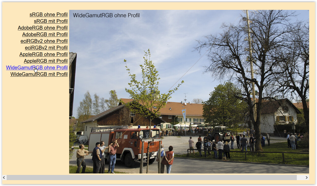
It is a difference compared to just export the same JPEG from Photolab just with different ICC-profiles. Below you can see a picture prepared with sRGB but exported with different ICC-profiles.
From left: Adobe RGB, Display P3, Prophoto and sRGB. At least for my eyes Display P3 and sRGB seem to have more in common than with Adobe RGB and Prophoto. As I told you I don´t really like Adobe RGB because of its heavier blue bias and Prophoto just looks awful. I also appreciate to use Display P3 in my whole workflow since that looks more natural for me than Adobe RGB and I couldn´t care less about ARGB as the industry printing color space standard since I print all my stuff myself since 2005. I know what I´m doing and I´m very pleased with my results since a long time. Practically color space is not an issues at all anymore for me. Displsy P3 works fine for me on my Samsung TV too, so its not even just about computers, computer monitors, telephones and pads anymore. It is also about TV-sets that often have an even wider color space that Display P3 or Adobe RGB.
That’s intriguing … Are you not using Soft Proofing (with its ICC Profile = sRGB) when you are reviewing your image from within PL ?
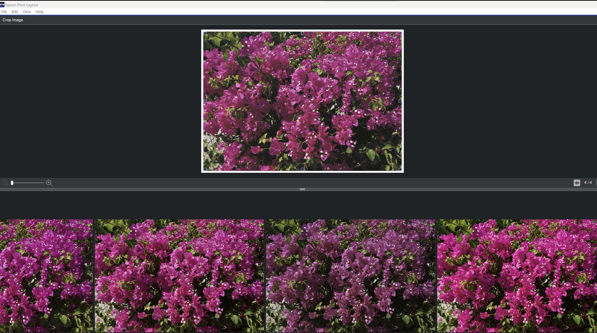
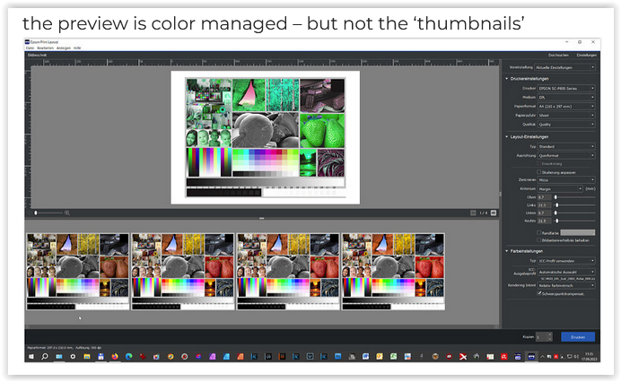
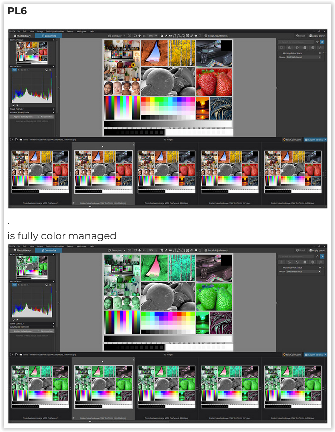
You may have trotted out these images before (see link below)? Where there are differences, are these not viewer thumbnails rather than images from the viewer main window? In that same thread @Wolfgang nicely demonstrated how the main window in viewers is usually color managed (if so set) and that the thumbnails are typically not color managed. Is that what you are demonstrating here?
As shown in Sept. 2023 → Workflow Soft proofing / exporting / QimageOne printing and Profiles (?) - #54 by Wolfgang Epson Print Layout is only partially color managed.
The “ProPhoto” image on the far left should appear as the most vibrant, but it isn’t because this area isn’t color-managed.
.
To see a similar “effect”, check out this demonstration
→ Mögliche Probleme im Umgang mit Websites
(scroll all the way down for the examples)
Just use the (fully color-managed) PhotoLab to compare color gamut and vibrancy,
and don’t be fooled.
or a more recent example
I also can add some other data from Sweden. I saw some info lately that stated that in Sweden Apples I-phones had 57% market share of the phone market which if that would be the case should mean that Display P3 is the dominating color space in phones.
I think that is rediculous figures and has to stand out internationally. Even many young children have Iphones today. People seem to have too much money.
Pesonally I have always used semi cheap Samsung phones for max 3-400 U$. Spending like 2000 on a phone that you might forget somewhere not to be found just doesn´t seem to be an all that smart use of that kind of money. I would not lke myself if that happened.
Well, my point is after all that sRGB might not be the most common color space in use these days in my country. It is more likely Display P3. I guess most people reading my illustrated blog-stories are doing it using an iPhone or an iPad. Why publish them in a an inferior quality of some historical reasons?
I’m happy that I came across this topic, because it lets me fix my exported JPEGs looking different from what I see in PL8.
Some programs I’ve been using: XnView and Firefox - by default seem to not apply the display(?) color profile when they open an image they consider “untagged” (which maybe isn’t the right thing, but that’s their defaults). PL8 consistently produces these supposedly “untagged” images, unless I select the “sRGB-elle-V2-srgbtrc.icc” suggested here. Exporting a TIFF and converting to JPEG in GIMP adds GIMP’s own profile and also works.
Now, my Oly camera’s SOOCs are also “untagged”, so there’s that.
https://www.w3.org/Graphics/Color/sRGB.html
To reference part of the document (Colour Management - found towards the end of the document):
‘HP and Microsoft propose an additional means of managing color that is optimized to meet the needs of most users without the overhead of carrying an ICC profile with the image: the addition to the OS and the Internet of support for a Standard Color Space. Since the image is in a known color space and the profile for that color space would ship with the OS and browser, this enables the end users to enjoy the benefits of color management without the overhead of larger files. While it may be argued that profiles could buy slightly higher color accuracy, we believe that the benefits of using a standard color space far out-weigh the drawbacks for a wide range of users. The migration of devices to natively support the standard color space will further enhance the speed and quality of the user experience.’
‘In April of 1990 this space obtained unanimous worldwide agreement as the calibrated nonlinear RGB space for HDTV production and program exchange.’
An Adobe RGE image needs a profile to be attached, a sRGB image doesn’t.
If you open a sRGB in the Adobe RGB working space then the host application will say a profile isn’t attached and check if would you like to convert the image to Adobe RGB and attach a profile.