Hi @Stenis
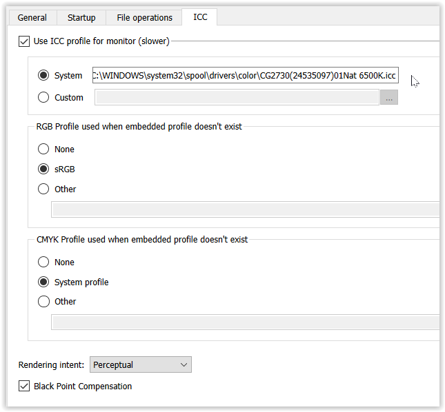
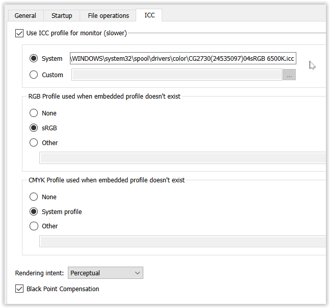
simply make sure your monitor color space is in sync with Windows Color System,
as every color management capable application relies on it.
About color management capabilities …
( A ) Monitor set to calibrated Native / 6500K
with → corresponding profile in WCS
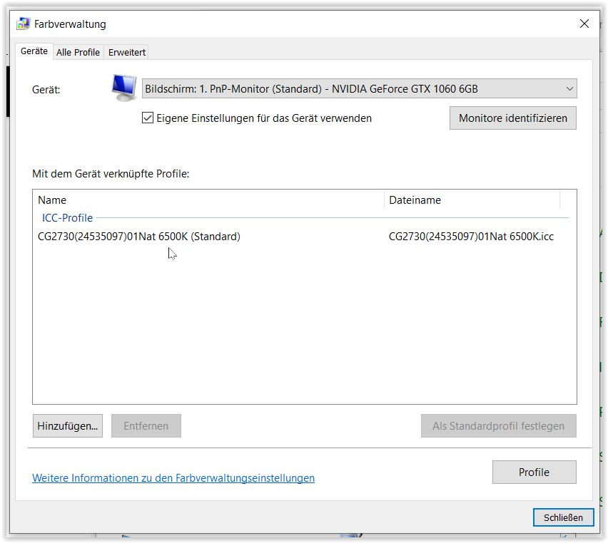
.
Thumbnails in PL6 PhotoLibrary
.
each exported & converted from original ProPhoto.tif
to 1-ProPhoto, 2-AdobeRGB, 3-P3, 4-sRGB.jpg
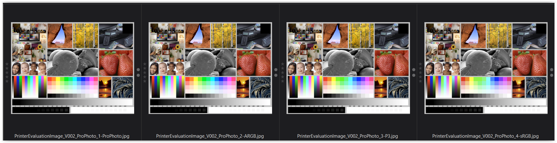
( color management does its job = the pics appear similar )
.
XnViewXP
( mirroring → WCS )
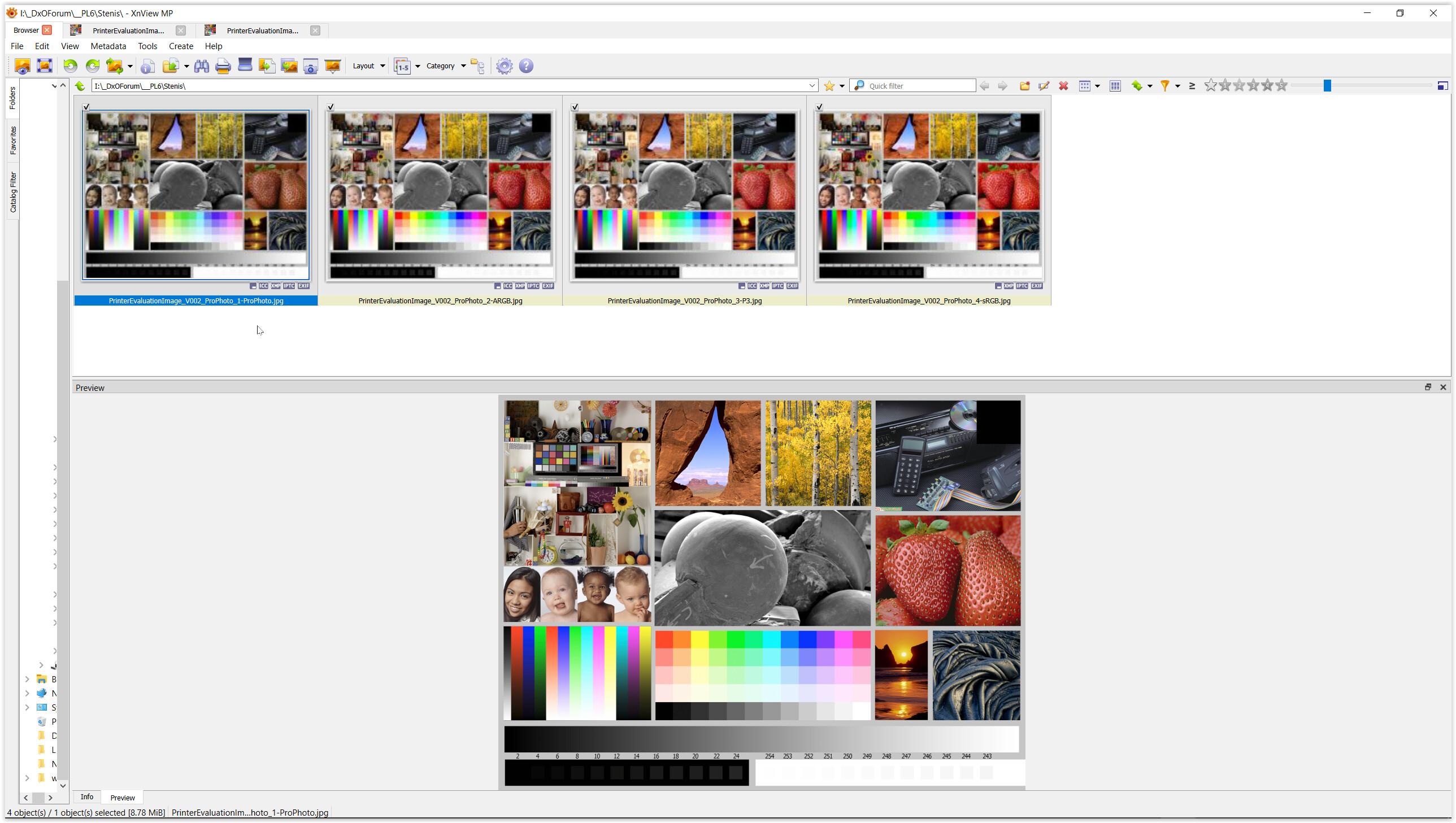
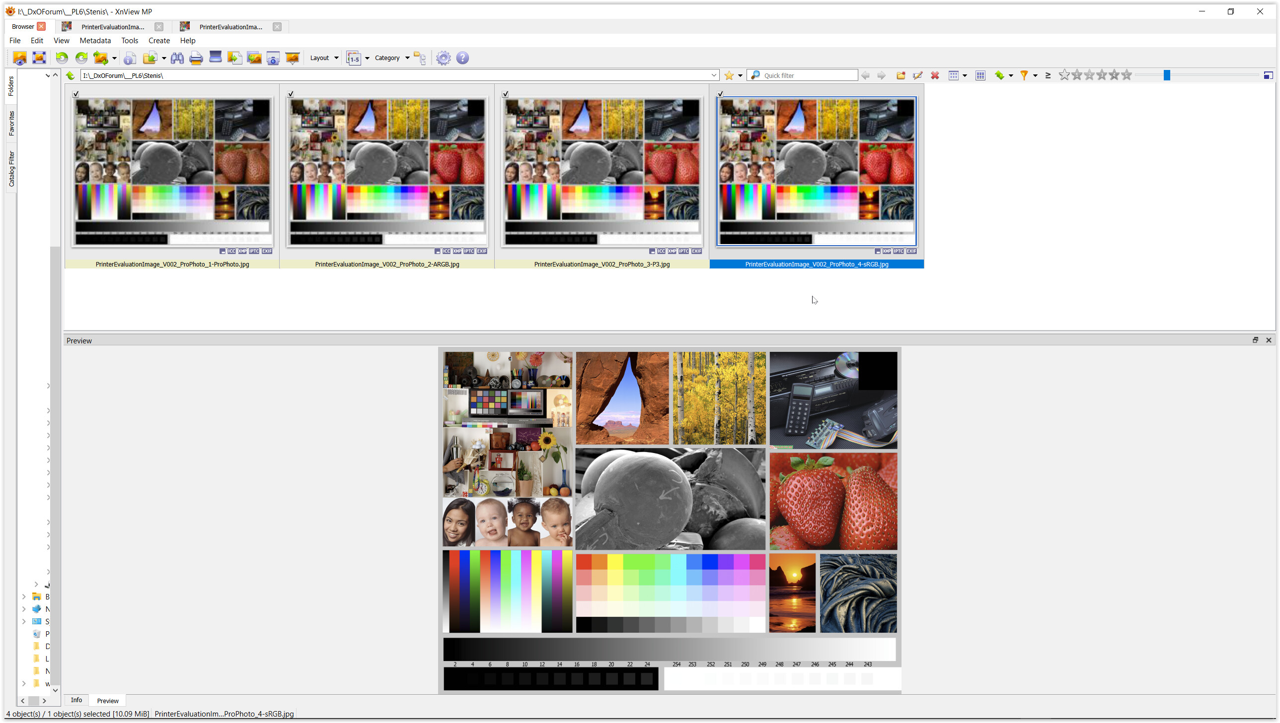
( the row of thumbnails shows up very different,
but both previews appear similar, while the preview from the sRGB pic clearly shows less saturation )
.
( B ) Monitor set to calibrated sRGB / 6500K
( the corresponding profile in WCS changes to sRGB )
.
Thumbnails in PL6 PhotoLibrary
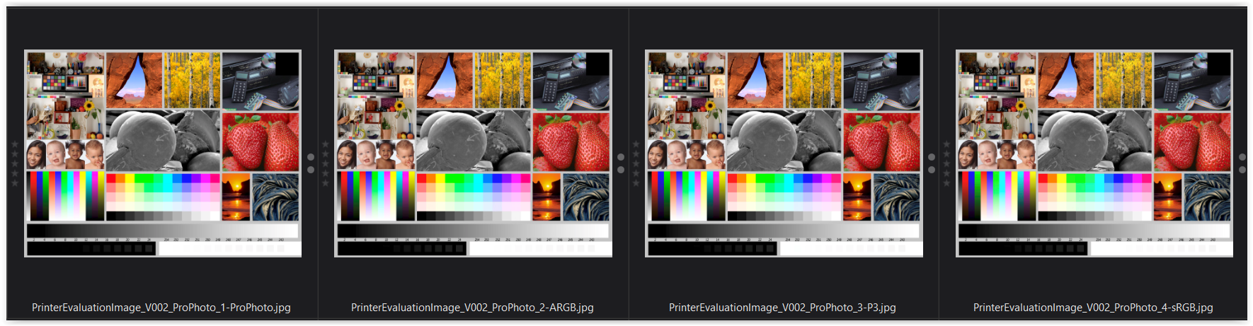
( color management does its job = the pics appear similar )
.
XnViewXP
( mirroring → WCS )
( again – the row of thumbnails shows up very different,
but both previews appear similar, while due to the monitor setting now with lesser differencies )
for more … and I used this test picture (allow download or see → here … )