Simulate iPhone 14/15 screen when editing

Lately I found that the color looks very different from my Dell monitor (not color tuned), when viewing on my iPhone 14 Plus.

As I think I am anyway circulating my photos among my friends and family more often on the phone, it would be nice to “preview” what it looks like, at least in brightness and contrast, on an iPhone as I am editing my photo.

Is there any way to do this with DxO Photolab (7)?

If your monitor is not calibrated, then nothing on any other screen, computer or phone, will be guaranteed to look the same.

This has nothing to do with PhotoLab.

5 Likes

Maybe it’s time to think about (software) calibration → check for Calibrite, DataColor and the like.
That has nothing to do with PL.

3 Likes

I think so, later I tried to calibrate the monitor manually to make it look similar to my iPhone and it works to certain extent, guess I am happy for now.

I wondered if this can be done for Photolab only as doing this also affects other applications like movie playback.

In a word, no. Calibration is for the physical screen and all apps use the same screen.

Computer monitors are usually set to have a neutral, realistic color image. Certain deviations can be corrected through calibration.
Smartphones, on the other hand, are usually configured in such a way that they show an exaggeratedly bright, “vivid” image that usually has nothing to do with reality and color fidelity.
This is part of the advertising concept of the manufacturers who want to outdo each other and make their device appear better than the competition. TV advertising has also been switched off accordingly. Everything there is hip, colorful, loud, fast and young. You will rarely find a smartphone advertising clip that focuses on classical, calm music, for example in the Semperoper.

3 Likes

You decide what’s your reference – and when you “adjust” your monitor to one device with more ‘screaming’ colors then everything else will be off / out of control.

It’s unfortunate and yeah I do find iPhone being quite biased in color, but I don’t adjust for them my photos will look overly dark as a result.

Guess I have to find a way to conveniently switch between color profile.

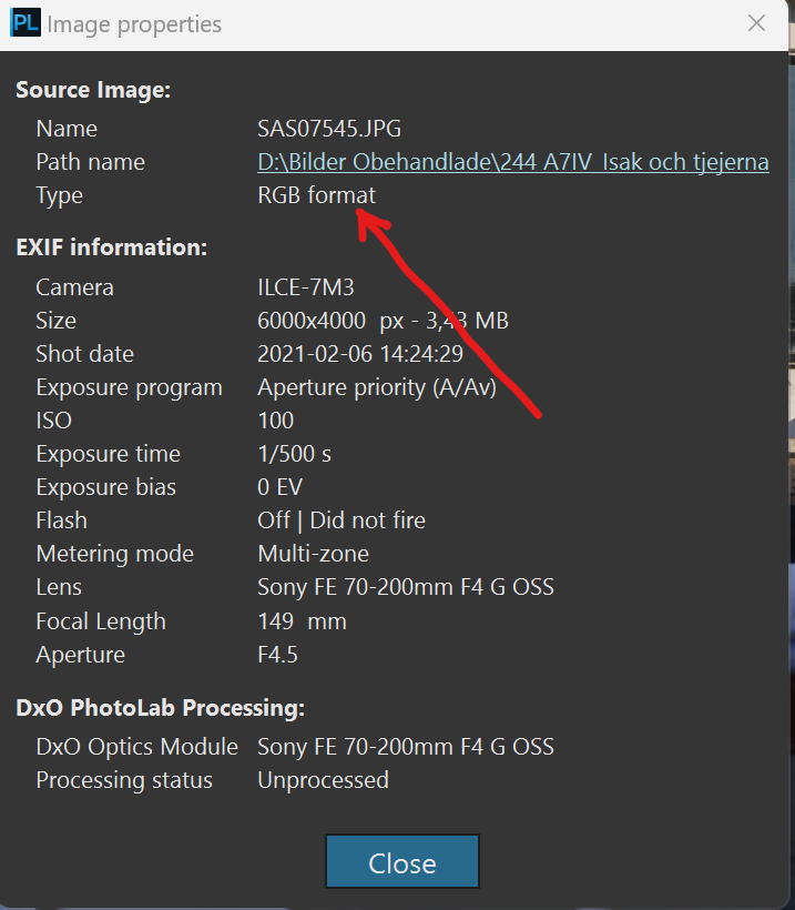
Is it really that easy that this has nothing to do with Photolab at all??

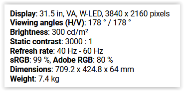
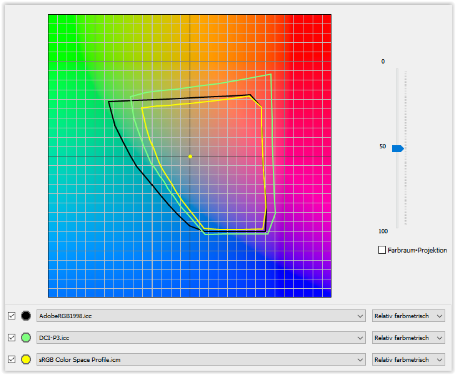
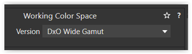
We are now living in a period where the sRGB-standard for displays is challenged by wider gamuts for displays. Apples flavour of DCI-P3 Display P3 is one of the most important alternative. Another even wider is REC. 2020 used for modern high res TV-displays.

Even this is important to relate to when TV-sets are so common these days when people get together to watch digital images. Modern Samsung TV monitors can easily be calibrated these days by using a phone app.

Photolab might not have anything to do with this despite offering the means export the JPEG-files with an ICC that matches the device that these images are going to be watched on. Sorry to say but it is common people are using the wrong ICC-profiles to their devices and one reason is that it sometimes is hard to find out which one that actually is embedded in a file. Here even Photolab is a really bad example.

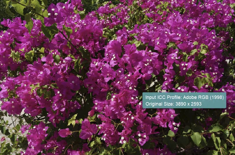
One problem here is that these images might get exported with an ICC for say Adobe RGB that rarely is suitable for either computer monitors when watching them or on TV. It is just a week or two since I read a recommendation by one of the “experts” at Fotosidan - Swedens biggest photo site, that recommended people to set Adobe RGB as a default in their cameras, despite that color space was created exclusively to match the color spaces used in printers.

There is even other factors that might affect how an image looks when consumed on another device and that is the “rendering settings” in Photolab. Even standard presets affects how a RAW might turn out on the computer screen during development of the images. As most of us know there is nothing that prevent us from using other camera-profiles than the “Generic” and they do differ and will for sure affect the total outcome.

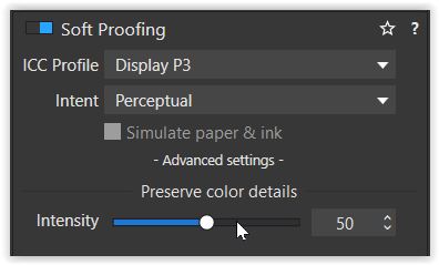
Still I guess it might not be so common that people prepare prints with Display P3 but I am one of them. I do it because I prefer one single workflow for both display and print and to get less yellow, blue and green that Adobe emphasizes. Blue Adobe-skies often tends to be to much for me.

I don’t think Display P3 is the problem in the mobiles. The problem with over-satured faces with a too reddish cast is when Adobe RGB or Display P3 ICC is used with sRGB-screens. P3 on sRGB don’t bother me really with one exception and that is skintones. Adobe RGB disturbs often even in other motifs. Only when I know my images containing faces are going to be consumed on sRGB I export with sRGB because I don’t want to maintain multipel sets of JPEG-files.

… and Joanna from my experience and recent tests: it is not at all the case anymore that all applications necessarily uses the system ICC of the operating systems in this new beauitiful worlds of hardware calibrated monitors, because as I have experienced with my Benq-moniitor it can happen that the OS and the monitor is out of sync despite it is calibrated.

Some appplications does not even read the system ICM, others are defaulting to sRGB without syncing with the system ICM and others like Epsons printing application can be configured in a lot of different ways. XnView as I have described are reading the ICC of the images by default but can also be configured to lean on the system ICM-profile of the OS. So this is really a mess we are living in and have done so for decades.

Excause me for the initial text that had a lot of spelling mistakes. It is a bit better now.

Yes. I just bought a new 27" Apple Studio Display with nano-texture glass and had to do some weird stuff with the monitor settings and then use my Calibrite system as well.

Mind you, it does look beautiful and work wonderfully.

Now that we have Soft Proofing in PL, it’s become even easier to get the best results out of my Canon PRO-1000 A2 printer.

2 Likes

@Joanna
I’m a geeat fan of Display P3 even if I never have owned any Apple-device since got an IPod as a bribe when I bought XML Spy software 15 years ago or so.

Finally I feel “at home” now with my entire P3-based work flow after changing my monitor.

Happy to hear that you are too :slight_smile:

1 Like

As others have already said, that is to be expected.

You say you have a Dell monitor, in which case investigate Dell Display Manger:
https://www.dell.com/en-uk/lp/dell-display-manager
It allows you to specify which of your monitor’s native display modes is used for different applications via the ‘color’ settings:
https://www.dell.com/en-uk/lp/dell-display-manager#Easy-Management

Thanks for the reminder about Dell Display Manager, I used it long time ago but forgot to install it back after upgrading to Windows 11, seems quite convenient in some cases.

Though, a problem with my monitor (Dell S3221QS) is that it doesn’t have gamma control, and that’s what makes the biggest difference between my phone and the monitor. (It was being asked for by someone on Dell’s forum but was officially declined its implementation via any future firmware updates).

I am guessing it is possible, maybe the software that comes with Calibrite/X-Rite alike will offer similar feature? I am considering getting one of those calibrator, while I kind of believe it is a bit unnecessary in my case. Though I often print my photos online, not sure if it will be helpful for that.

I have Calibrite and it doesn’t. You also need to consider, for paper printing, that the screen luminance needs to be kept low (around 80cd/m²).

I print for other photographers and camera club members and the biggest problem I encounter is that their screens are ridiculously bright, for reasons previously discussed. This means that they will print very dark unless they are completely re-worked on a calibrated screen.

Do yourself a favour, get a good calibrator for your screen and get used to how different it might look for other apps. It won’t take too long until you get accustomed to it and you will find you have to do less work to get everything right, especially for printing.

2 Likes

Thanks for the advice, given all that I have invested and how I find myself committed to post-processing all photos I took, a calibrator seems a purchase I won’t regret.

It´s not a problem today to have several calibrations for one monitor and switch between them. I have three but uses normally just Display P3. The others I have mostly as references. The real problem I think is that many users over time lose control over what ICC is embedded in the files, since there often isn´t a very easy way to figure it out - and that is the case in Photolab too. Image Properties info in Photolab isn´t good enough really:

The info “RGB Format” is nothing that makes me happy because it just have too low “resolution” to be useful in this case.

I have said it before. I think it ought to be a good feature to get a function like Epson has given us in Epson Print Layout, their printing application. Here we just need a “mouse over”, to find out what is embedded in the files.

I am pretty sure the reason why I see far too many far too reddish portraits of people in the evening papers I read, is that the photographers have had Adobe RGB as a default color space in their cameras instead of sRGB.

Absent a new monitor, I would suggest a workaround as follows. Make global edits on your iPhone or iPad using something like RAW Power. Export a full-sized TIFF with an embedded Display-P3 profile for some local editing in PL if needed (nothing heavy handed). Export from PL with the embedded Display-P3 profile. Not perfect but should work for many images.

Yes, that might be your way to go …


You indicated your monitor model (Dell S3221QS) and I checked for the specs
grafik

For an overview have a look at this graph, which shows 3 color spaces at mid luminance level.

Now, the mentioned mobile device might come with a colorspace closer to P3 than sRGB.
While the mobile … most properly is not calibrated, you can try to set PL6 to
Screen Shot 10-22-23 at 03.28 PM

and softproof to Display P3
grafik

before you export to P3
grafik

While your monitor might not be able to show the complete P3 color space / range,
it might suit the presentation on the mobile device (better). – Simply try it out!

For printing via a printing provider you might need to control / export in sRGB color space,
as often that’s what they use. Just check their informations.


Apart from all that, for consistent color experience there is no other way than to calibrate your monitor.
The resulting monitor profile is then registered as your system profile and read by all color management capable applications.

Don’t hesitate to ask further … :slight_smile:

1 Like

Thanks a lot for the detailed explanations and suggestions, guess it will take some time for me to digest. As also suggested by others, now I am more convinced getting a calibrator would be a good starting point.

1 Like

I did a double take reading this. :joy: