Hi @Stenis … and all interested,
It’s not easy, but not too complicated either. 
Use DxO WGCS as internal/working color space (remember: in LR we have “Melissa” as internal WGCS) to start with maximum quality (color, saturation…), or in other words, don’t ‘degrade’ your image too early.
Now for evaluation purposes, skip your own images for a moment so you are not influenced by the subject, your camera/lens, DxO’s color engine/interpretation (aka profiles … ) and use an image created for testing.
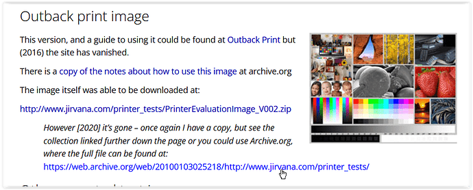
Checking e.g. this site https://www.northlight-images.co.uk/printer-test-images/ you can get a variety of test images. Scrolling about halfway down you see the “Outback print image”
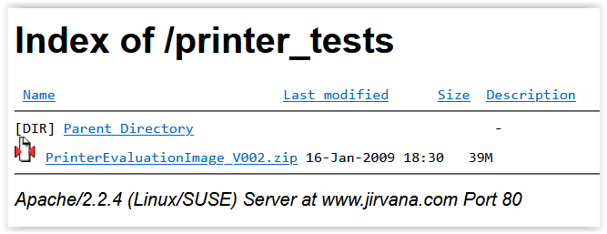
and the link to download from → https://web.archive.org/web/20100103025218/http://www.jirvana.com/printer_tests/

When extracted, you will receive a TIFF file in the ProPhoto color space that shows a variety of subjects as well as color swatches with highly saturated colors, which simplifies the assessment here.
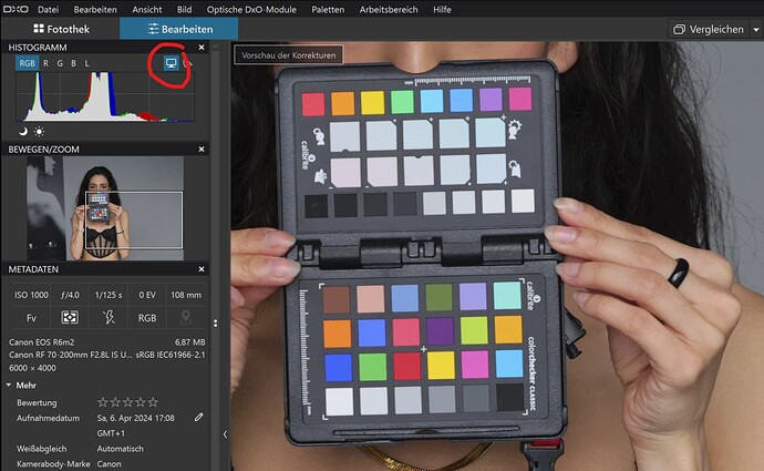
Your monitor shows you what fits into its color space. To see if there is anything beyond that, in PL 6/7 enable Monitor Gamut Warning (blue overlay). This means you will see the corresponding display on your P3 monitor the way others see it on their AdobeRGB or sRGB screen.
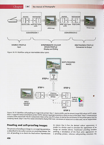
So why a Soft Proof?
Activate Soft Proofing and select the ICC profile corresponding to your monitor’s color space and enable Destination Gamut Warning (red overlay) … and the same area as before will be shown as being out of color space.
Disable this warning and toggle Soft Proof (SP) ON/OFF. If you look at the different motifs you may or may not notice any change, just the color swatches. Why this?
What you see now is the result of the Preserve Color Details function.
To check this, move the slider all the way to the left “0” and turn SP ON/OFF. Everything looks exactly the same. – Move the slider to the right “100” and the subtle change becomes more noticeable.
That said … if you are exporting to your monitor’s color space, you may or may not want to use SP (and the same for others on a AdobeRGB or sRGB screen).
If you care about “your customers” (the people you want to show your images to) and you don’t know what monitors they have and whether they use (or know how to use) a color managed app, this is better/ safer to export (convert) the images to the usual sRGB color space.
Before exporting to sRGB from your P3 capable monitor (and the same goes for others on an AdobeRGB screen), you can use Soft Proof (SP, then set to sRGB) to simulate the result and also use the Preserve Color Details (PCD) feature.
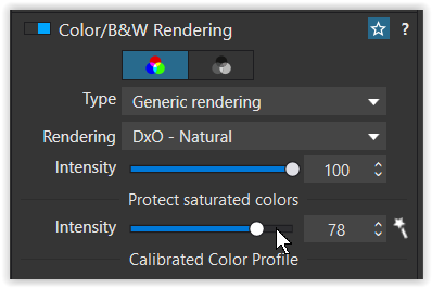
Now, for real images you will use PL’s color engine, develop your (raw) file to your liking and possibly invoke the Protect Saturated Colors (PSC) function (e.g. instead of the HSL tool).

All of this affects what colors are in your target color space, which could be P3 for example.
You may also want to export (convert) the result to sRGB… and possibly use soft proof. – You decide how you work.
Wolfgang
