PLv7: Wide Gamut Color Space - Soft Proofing, Export to Disk, NikCollection

Hello all,

I’ve read many threads on this topic over the last few days, but haven’t really found an answer. I appreciate any advice and tips!

A few comments first:
I am aware of what the Wide Gamut Color Space is and what it can do:

I have knowledge of color management. My MacBook Pro M1 display is calibrated.
I don’t print myself, but occasionally have my pictures printed by a print lab - 95% of my photos are intended for the internet.

I worked with PLv5 until recently and now use PLv7, but not yet in WGCS. Why? Because I read this and don’t know how PLv7 behaves in this respect:

→ How does the situation with PLv6 compare to PLv7 now?
→ Assuming I’m an “average-Joe”, as @John-m puts it in the thread who expects PLv6 (or now PLv7) to exhibit “WYSIWYG” behavior in all cases - has this now been enabled - what is the situation with PLv7? I have not found any reference.
→ As a work around, it was recommended in the thread to always leave soft proofing enabled. Does this still apply to PLv7?

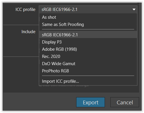
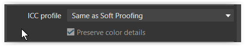
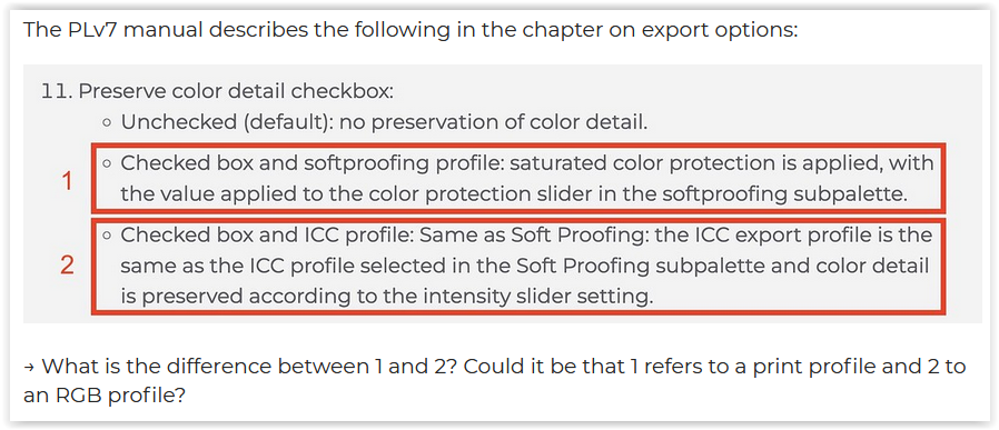
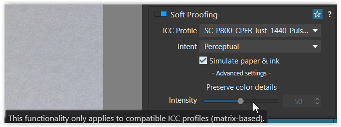
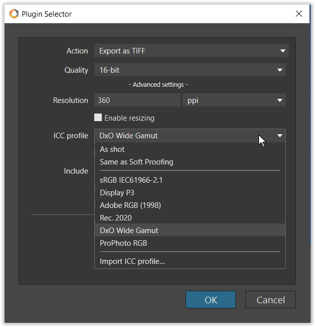
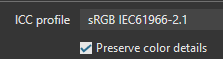
The PLv7 manual describes the following in the chapter on export options:

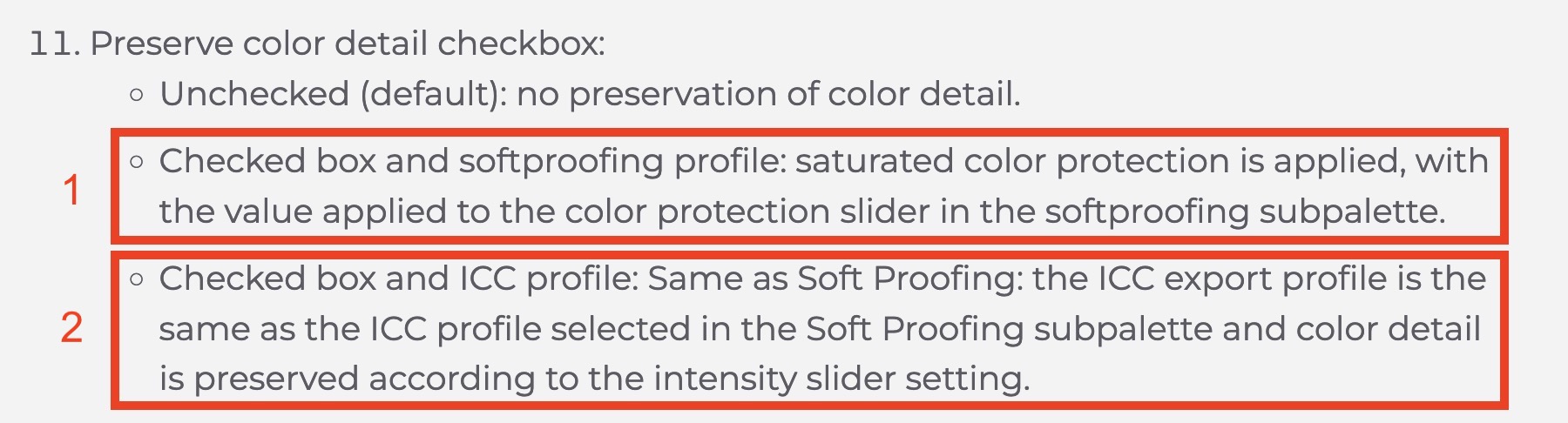
→ What is the difference between 1 and 2? Could it be that 1 refers to a print profile and 2 to an RGB profile?

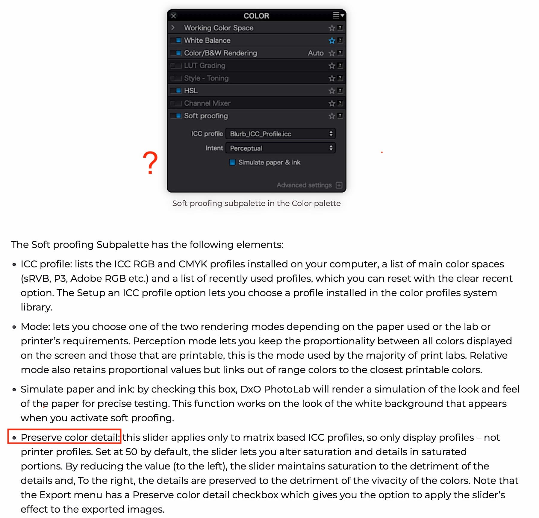
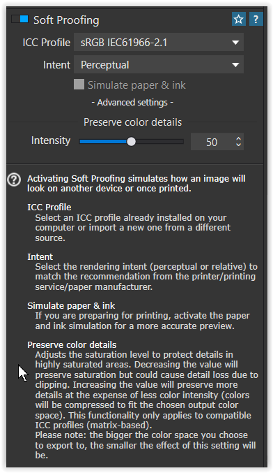
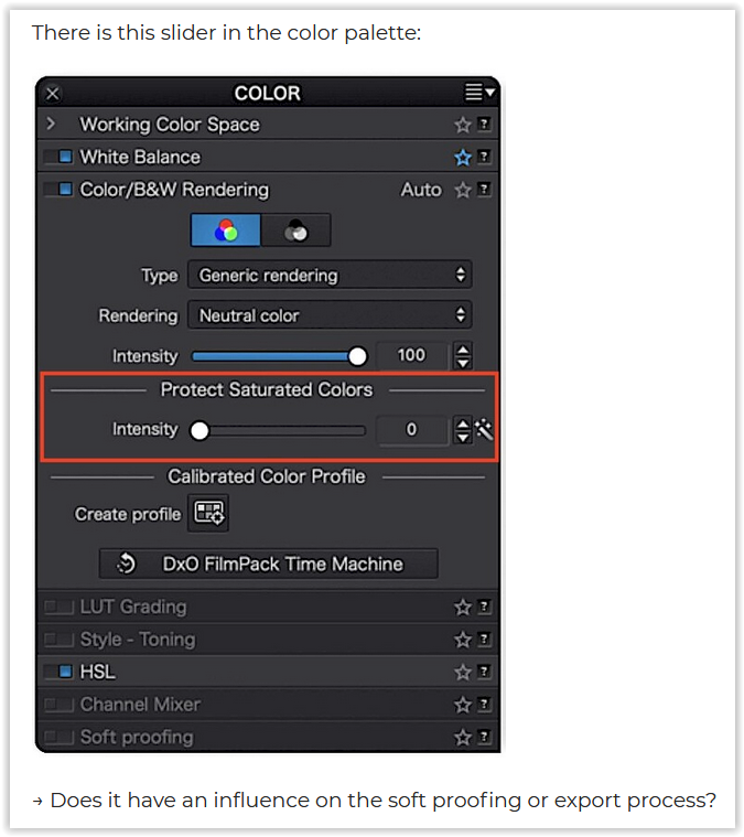
There is this slider in the color palette:

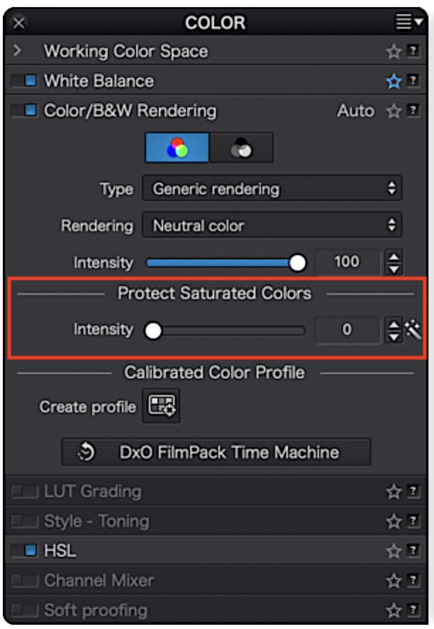
→ Does it have an influence on the soft proofing or export process?

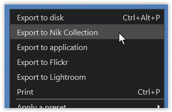
→ What is the recommended workflow with images that are to be processed in the NikCollection?

Many thanks in advance for any tips and advice!

Hi Manfred - - The following comments and explanations may help …

  1. DxO’s Wide Gamut Color Space contains a “wider color range” than any display device is capable of rendering and any printer is capable of printing.
  • Even so, it’s well worthwhile using the WGCS as DP’s working-color-space as it allows for more accuracy/nuance when applying the image corrections that you apply … just as it’s more accurate to work with a calculator that’s capable of more precision than, say, 2-decimal places versus one limited to only that.
  1. You note that most of your output from PL is destined for the interwebs … which works on the assumption that images are rendered to sRGB

  2. If you don’t have Soft Proofing (SP) enabled in PhotoLab then it will render the working image as best as it can for the screen that you’re using … which, I believe, for your MacBook is probably better than sRGB, but not as wide/complete as AdobeRGB.

  • So, in your case; if you don’t have SP enabled then potentially you’ll be seeing (on your monitor) colors and details that are not reproduced when the exported image is displayed from a web-site.
    – I say “potentially” because it depends whether the image contains colors outside sRGB
    – I say “colors and details” because details that you see on your better-than-sRGB monitor may be obscured when colors are constrained to fit into sRGB - as displayed on a website.
  1. Therefore, for simplicity, I suggest you enable SP permanently (I have it enabled in my default Preset - as applied to all newly encountered images) … That way, you will always be seeing on your monitor the same result that you’ll see when the exported (to sRGB) image is displayed from a web-site = WYSIWYG !
    image
    image
  • To be very sure of this approach, you should also have your Export-to-disk options set as follows; image … for consistency, to ensure WYSIWYG.

Continued below

John M

1 Like

@John-M and @Klick /Manfred

If Manfred has a Mac it will be suboptimal for both himself and all out there using Apple devices. Wouldn´t it be more natural for Manfred to calibrate his system for Display P3??

@Klick reading across your post. I take along a few “key” items and/or (my thoughts/guesses)

  • You have (and are using) PhotoLab versions 5 and 7 on macOS
  • You know colour management and use a calibrated screen
  • Most of your images are for display on screens (and sRGB would be best for exports)
  • (You feel that you should use the new WCS, but don’t really know why)
  • (You seek advice on how to use the WCS and new profile features in editing and export)

Did I miss anything?

I have wondered whether or not “Protect Saturated Colors” in the Colour palette is redundant if “Preserve Colour Detail” is enabled.

Also, I find that using the associated slider in Soft Proofing - Advanced has no impact on out of gamut warnings, which is very unhelpful. The “Protect Saturated Colors” slider does have an impact.

An insight into how to use the “Preserve Color Detail” slider would be welcome.

Hello John,

Thank you very much for your reply and comments.
Yes, I am aware of the advantages of the WGCS. My MacBook display can display P3.

Obviously the “Fix to avoid being caught-out if NOT using Soft Proofing (with new Working Color Space)” you requested was not implemented in PLv7. I will therefore follow your advice and leave SP permanently switched on - and also create a corresponding preset.

Further tips are highly appreciated.

Greetings from Austria to Australia :wink:

Manfred

1 Like

Hello Stenis,

why suboptional? Can you please explain in more detail?

My MacBook Pro M1 Max can (approximately) reproduce the P3 color space.

What I have often heard is to calibrate the display “for” a certain color space. I wouldn’t know how to do that. When calibrating, I enter the desired value of the white point, the tone value curve and the luminance and the software creates the profile for my display with the i1Display Pro. That’s it. I don’t have any more options.

Best regards
Manfred

Hello @platypus,

thanks for your reply.

  1. Version 5 no longer exists, I have since uninstalled it.

  2. Yes

  3. Most images, about 95%, are intended for the internet. Therefore they must/should be exported with sRGB.

  4. I know what the Wide Gamut CS is and what it can do. Among other things, I have read this:
    DxO Wide Gamut : une révolution haute en couleurs - DxO
    And there are good videos on YouTube on this topic, such as this one:
    https://www.youtube.com/watch?v=iZ_G-H0lyVs&list=PLyBjgg0NvOrPObBf4ku-bfilBoFKYjeuL&index=4
    So I think (and hope) I have understood the WGCS.

My main and core question is whether or not “Fix to avoid being caught-out if NOT using Soft Proofing (with new Working Color Space)” was somehow implemented in PLv7.
Apparently not, because John-M recommends to leave SP permanently enabled.

Furthermore: I don’t know how working in WGCS in PLv7 behaves in connection with the Nik Collection and would like some tips here. For example, as far as I know, the Nik Collection has no options for performing SP.

Thanks!
Manfred

Hello David,

interesting question, which I agree with.

I can only guess:
“Protect Saturated Colors” is just about saturation, “Reserve Colour Detail” is about ‘details’ in the colors.

Thanks!
Manfred

Have you checked what the user manual has to say about these things?

You’re right, it’s in the manual.
Interesting that the ‘Preserve color detail’ slider is not shown anywhere.

Hi Manfred,

while I’m on Windows it should be the same for you.

.
As you know for web use (and often for printing services) it is recommended to export as sRGB – if you care about others.

When exporting, DO NOT select “As shot” but explicitly select “sRGB IEC61966-2.1” to avoid a profile mismatch (you may have your camera set up other than sRGB or want to keep your work in a wider color space).
Screen Shot 04-24-24 at 07.42 PM
Your calibrated P3 display will show the exported file correctly.

.
Now, exporting with a ICC profile → … you get the option “Preserve color details”,
Screen Shot 04-24-24 at 07.44 PM
which when checked applies the default setting [ 50 ] from Softproof.

.
While when exporting with “ICC profile → Same as Soft Proofing”,
Screen Shot 04-24-24 at 07.44 PM 001
the option is checked / grayed out → to then apply the “Preserve color details”
.
from the Soft Proofing → “Advanced settings”,


where the “Intensity” is set to [ 50 ] by default, but here can be adjusted.

.
The above should clear up your first question …


.
while it has ‘nothing’ to do with printing & paper profiles. *)
grafik
*) paper profiles are NOT matrix-based ( → the Intensity slider / value is grayed out )

.
That is, this option
Screen Shot 04-24-24 at 07.44 PM
is there for convenience (e.g. straight export w/o Soft Proofing),
.
but use Soft Proofing when*) to have a correct Preview

  • with Color Space deviations / changes
  • to check Color Saturation vs Color Details/Texture **)

*) depends on several factors (pic, color space, monitor, settings, eye sight … )
**) talking about colored textures, not ‘textures’ from local contrast / sharpening

( and please see explanation / statements by @John-M )

.

To your 2nd question …


.
The “Protect Saturated Colors” slider ( as part of the “Color Rendering” ) → controls & affects the Color Saturation / Texture balance … and then also the subsequent export (be it with or without soft proof).

It may be helpful to consider the Export → Preserve Color Details setting as an additional correction when exporting to a smaller color space or to account for limited color and contrast reproduction when printing.

.

Lastly …


.
In the Nik Collection, there is no Softproof and Color changes can affect Color Space and Color Saturation / Texture balance. … Why not to check the processed pics in PL to then finally export (or print).

have fun, Wolfgang

(and sorry for this longish answer)


addendum
for more details about Nik please see → here …

1 Like

Hi Wolfgang,

Thank you very much for your detailed answer! No need to apologize, I really appreciate your illustrations and explanations. I’ll have to read through them carefully tomorrow, my head is already full today.

Thank you and best regards

Manfred

Continued, from above

Addressing more of your points, Manfred;

In this case, you’re exporting for Paper-&-Ink (not to a display device).

So, the best approach would be to ask your print lab for an ICC-Profile that best describes the printer+paper that they’ll be using … and set-up Soft Proofing for that profile … so that, once again, it will be a case of WYSIWYG.

No change with PLv7 … DxO chose not to contrive to provide a WYSIWYG experience by default … One needs to have SP activated to achieve that.

  • I’m fine with this - It just means (for simplicity) that SP should be activated for one’s intended output target (which, typically, is sRGB).

Regarding your question about the “Preserve Color Detail” check-box in Export to Disk;
@wolfgang addresses this question in his response

I’ll elaborate for some emphasis …

Preserve Color Detail refers to a DxO-specific algorithm (PCD) that determines how colors and details are “squished” to fit into a smaller color space (such as sRGB) … In the SP interface, the slider associated with this setting determines the strength or degree by which this algorithm is applied.

  • I recommend using the default=50 in SP settings - because;
    i) my experience is that this setting works well (I’ve never found a reason to change it)
    ii) using this default avoids potential clashes with related settings for Export to Disk
  • In the case of 1) - the PCD algorithm is applied at its default strength (=50)

  • The the case of 2) - the PCD algorithm is applied at the same degree/strength as is defined in Soft Proofing … which may be other than the default.

  • If the “Preserve Color Detail” check-box is left unchecked then the PCD algorithm is not applied at all … but I cannot imagine why one would want that (?!)

See this thread, posted by @KeithRJ, for a process-flow explanation of how, and when, the PCD algorithm is applied.


Note: There’s a glitch/fault in the Soft Proofing UI that probably causes confusion for some users (esp. those coming to PL from “other” software);

  • When an ICC Profile is selected that targets a display device (such as sRGB) then, wrongly/redundantly, the drop-down control for Intent is left activated on the UI.

  • “Intent” is a legacy setting that predates the introduction of the PCD-algorithm - which was described to beta-testers, during development of PLv6, as being a proprietary algorith that’s a combination of Perceptual & Relative (the Intent options), providing a “smart” implementation that does not require the user to make a choice between one OR the other.

  • (The Intent dropdown IS relative ONLY when the selected ICC Profile is for a non-display/printer target … in which case, the PCD slider IS correctly de-activated).

  • DxO is aware of this issue - and, hopefully, we’ll see this fixed in an upcoming release.


NOTE:

The “Preserve Color Details” setting for Soft Proofing (which relates to the PCD algorithm described above) is NOT the same as the similarly named “Protect Saturated Colors” setting in the Color/B&W Rendering tool - - they’re each doing “different things”.

Addressing some specific points;

Yes - that’s probably what I would do in his case - - thereby enjoying the benefit of his P3 screen in “general” circumstances (say, in games or movies).

However, when using PL, he would therefore need to have SP activated (with sRGB target - - as per his export intention for consumption via a website) … so that what he will see within PL will then match with what he expects to see reflected from a website.

  • Otherwise, he may be surprised and disappointed when a 5-star image (as it appeared on his P3 screen) looks “flat” when displayed from a website.

No - they’re (albeit, subtlety) different concepts … See above.
Manfred puts it well like this;

A good related point by Wolfgang too;

Nice !


Application of this slider (which determines the strength/degree by which the PCD-algorithm is applied) is subtle - it’s a “smart” algorithm, that’s applied according to the needs of each specific image … it’s not a linear result (unlike, say, exposure comp).

For simplicity, the PCD slider (in the SP UI) can be (reliably) left at its default setting = 50


Yep … Exactly !

I don’t know which working color space is used by the Nik tools - but I’m confident that, at very least, it would be AdobeRGB (the same as PL’s legacy WCS) … So,

  • When exporting an image to any of the Nik tools, I specify ICC Profile = AdobeRGB (with Preserve Color Details checked/ticked)

  • I re-absorb the result from Nik back into PL (with the AdobeRGB color space retained, as I understand it) - and then I Export to Disk via an appropriate ICC Profile (typically, sRGB).


Yes, I definitely agree.
Having the Export to Disk option for ICC Profile = As Shot will be fine, provided your camera’s Color-Space setting is exactly the same as your intended target’s color-gamut … but having it set that way has potential to bring you undone - with, most probably, mystifying results !


On the point of having Soft Proofing permanently activated (as I do, for sRGB output) … If it irks you that PL then puts a bright-white border around PL’s working display, note that you can change this via Preferences;

image

@Klick, @John-M and all

Yes, forgot to point out … when exporting from PL to Nik
grafik
.
in the PlugIn Selector → Export Settings


.
you get the same export options to choose from

.
including the (Export) PCD option
grafik
( = no effect when exporting with the same or wider gamut than the source )

.
It depends very much on what you are doing, e.g. …

  • when you invoke Nik to modify something
    you may not want to restrict to a smaller color space that early in your workflow.

  • when you export to Nik and choose a smaller color space than the source,
    the smaller one is kept … with the PCD option to do ‘its magic’. :slight_smile:

1 Like

First of all, I would like to thank everyone for the detailed and great answers! I now understand some things, or rather some things better.

This tells me that as long as I don’t adjust the intensity slider in soft proofing, it doesn’t matter whether I set ‘sRGB IEC61966-2.1’ or ‘Same as Soft Proofing’ in the ‘ICC profile’ export option. Of course, assuming ‘Preserve color details’ is checked.
Got it. :slightly_smiling_face:

This is great information! Let me think:

I edit an image in PLv7 in WGCS. When I export it to NikCollection, it stays in WGCS (as long as I set this up in the plugin selector - and the ‘PCD option’ has no effect in this case).

When the processing in NikCollection is finished and the image comes back to PLv7, the TIFF (which I use as the format for processing in NikC) is still in WGCS and I still have the advantage of not being “surprised”, as soft proofing is still set in PLv7. :+1:
Correct?

Yes John, thank you for pointing that out. It’s important not to forget about that.

But this can only be a workaround. What does a user who is not aware of the situation actually do? Rhetorical question…

Thanks for your more detailed explanation and experience on this point - and on this topic:

I now have a better understanding of the diagram.

I think you referred to this circumstance in an earlier thread.

That was exactly my thought. Fortunately, I found this setting.


Wow, what a lot of information! I really appreciate the help and discussion, thank you all so much!

(And please, keep the ideas coming. :slightly_smiling_face:)

:white_check_mark:

Yes - true that PCD will have no impact … because, you’re not changing the color gamut (so, there’s no need to “squish” colors into a smaller working color space (WCS)

BUT, I’m not sure that the Nik tools can handle the WGCS (which is unique to pure-DxO tools - such as PhotoLab). I am confident, tho, that Nik tools can handle AdobeRGB - which is why I exchange files with Nik tools via that ICC Profile.


A rhetorical question that I’ll respond to any way !

Yes, that’s the point I was attempting to make in my suggestion that PL default to a SP setting that matches the user’s monitor’s capabilities (which, typically, would be sRGB) … but, that proposal was not taken up.

I guess the answer is that “Average Joe” who is not aware of Soft Proofing requirements also probably doesn’t notice differences between what is seen within PL and what he gets in his exported image (!)


Great questions, Manfred … Hopefully, this thread will be useful to others too.

John

That is a justified thought. Transferring an image to the NikCollection in AdobeRGB should not cause any “damage”, as we only had a maximum of AdobeRGB available up to PLv5.

Yes, indeed, you addressed this weakness of PLv6 (and still in PLv7) very clearly in your thread I referred to and vehemently demanded an improvement. So far, unfortunately, without success.

One thing, however, that I only became aware of through the discussion here:
Suppose I work with the WGCS and have soft proofing permanently activated.
I set sRGB IEC61966-2.1 as the profile for soft proofing.
This allows me to see on the screen what should also be visible on the Internet, as in my case.
Under these circumstances, what is the advantage of working in WGCS?
I mean, even if the WGCS can display so many and very saturated colors, I can’t see them due to the permanently switched on soft proofing (with sRGB IEC61966-2.1, for example), because this limits the colors. So I could set the legacy color space right away.
Where is my fallacy?

That would be fine.

something to consider …

DxO’s WGCS is their own ‘spawn’ (for additional input …), but not a widely used color space. Returning to PL with such an intermediate Tiff file doesn’t (shouldn’t) cause any problem as long you don’t use it “outside” PL ( → add a descriptive suffix as a reminder).

Otherwise you might want to use Rec. 2020 or ProPhoto instead, while AdobeRGB does not fully cover P3, but is suitable for printing.
[ note – those paper profiles (2nd graph) reflect the color range of my paper & printer ]

Having Soft Proofing with sRGB IEC61966-2.1 permanently enabled can be a “solution” for sRGB users (screen, output…) and make their lives “easier”. Also, they could use the legacy color space, as long DxO will support it, and don’t mind a couple of disadvantages (has been discussed somewhere – just don’t remember in detail).

But the sRGB/Legacy color space isn’t for everyone. You may want to take advantage of the larger color space (like your P3 capable screen) or print (which is what I do) and see in advance …
The real problem for sRGB users is that they can’t “see better” and therefore have difficulty following what’s happening when using DxO WGCS as their internal color space.
Monitor & destination gamut warnings are helpful tools, but they cannot replace the impression you get when you are on a wider gamut screen and switching between the (VC) versions.