Stenis
(Sten-Åke Sändh (Sony, Win 11, PL 6, CO 16, PM Plus 6, XnView))
21
The problem these days is that it will be impossible to please everybody, when it comes to the colorspace they are using when watching images on the webb. All people using Apple devices (and there is a lot out there) whether they are using stationary computers/workstations, laptops, I-pads och i-phone phones will be using Display P3 and even Samsung is using a wider color space than sRGB both in their phones or their TV-monitors today.
So sRGB is not at all as totally dominant as it was 10 years ago. The world is moving on a broad front to wider color spaces than sRGB. I even use my standard JPEG-form made for 4K with Display P3 ICC when watching them om my Samsung TV and it works very well I think even if the TV-colorspace might be even wider than Display P3. That compromise is nothing that disturbs me at all.
Infact many Mac-users and even others that do not use any Apple products might prefer P3-workflows of other reasons as well. In my case I have seen the benefits sticking to P3 all through my workflows regardless if my pictures are going to be displayed on screen or be printed. It is a big advantage not needing to prepare and export several different files with different ICC:s. It is much more efficient and easier to handle and also eliminates the risk of by mistake (like many do) get problems when these files get mixed up by poor order in peoples picture silos.
I also happen to prefer prints from pictures prepared with Display P3 than Adobe RGB. Display P3 is about as wide as Adobe RGB but is leaning more towards yellow and red instead of the heavy green and blue bias often in Adobe RGB, which I often too much to that end for my taste.
The design goal with Display P3 is said to have been to get a color space closer to what the human eye really sees generally and maybe that is why I prefer it too but I can understand that nature photographers prefer Adobe RGB.
The main reason is as I pointed out in an earlier response;
That is, before the process of “conversion down” to a smaller color space, internal (working color-space) details are maintained at a higher level of mathematical accuracy … which gives this process, and the PCD-algorithm, etc, much more detail to work with.
For a simple example; 8-bit JPG files are very susceptible to color-banding (when manipulated by an image editor) simply because they have limited detail to start with.
Regarding using WGCS for interchanges with Nik tools;
My concern here is that I don’t know whether or not the Nik tools can “fully consume” a file (say a TIF) generated via ICC Profile = DxO Wide Gamut color space.
If Nik is not WGCS-aware (which it’s probably not) - then how does it handle this file ? … At worst, it may assume it’s an sRGB file, and “trim” details accordingly !! !!
I’ve tried to check this, the only way that I can (visually !!) - but I’ve not been able to come to any confident conclusion.
So, I reckon the safest way to interchange images between PL & Nik tools is via AdobeRGB - which I’m completely confident Nik tools are able to properly consume.
Wolfgang: Do you know whether Nik tools can handle these wider color gamuts ??
(That would be really useful to understand … … Perhaps a question for DxO Support).
Some interesting points here - which I’ll respond to from my own perspective:
I haven’t yet progressed to printing my own images - I have used a photo lab a few times (with varying degrees of satisfaction !) … Mainly, I consume images on my own monitor, or share them with others (such as via my wife’s Android tablet) - - and I submit photos into my camera club’s monthly competitions (with some occasional success).
I have a very good quality BenQ monitor … it can reproduce 99% of the AdobeRGB color space (and, therefore, 100% sRGB).
So, in theory, I could use PL without soft-proofing (knowing I’m seeing the AdobeRGB color gamut within PL) … then I could export to disk with ICC Profile = AdobeRGB … and happily consume the result correctly rendered on my AdobeRGB-capable monitor.
BUT …
i) If I were to share those images with others then they’d be unlikely to see my images as I see them on my BenQ monitor … more likely, they’d be seeing a squished-to-fit-sRGB version created by a process that I had no control over
ii) My camera club requires that images be submitted in the sRGB color space … So, I would need to separately soft proof any such images (with ICC Profile = sRGB) and export accordingly.
I reckon it’s just much easier and simpler, with a lot less hassle, to have PL set (via SP = sRGB) to the color space via which most of my images will be consumed (and judged) … and I suspect this is true for most others too.
For preparation for printing, would one not be soft proofing with an ICC Profile that described the ink & paper … rather than with any of the matrix-based profiles ?
(Or perhaps that’s exactly what you’re saying - but I’m misunderstanding ?)
I don’t follow your logic on this point, Wolfgang … I certainly DO advocate use of DxO WGCS as our working color space (even tho I’m rendering and exporting to sRGB) - specifically because of the much higher degree of internal accuracy that this enables (see above).
Here’s another analogy (supporting the argument for using the DxO WGCS);
If we were to carry out a large number of separate calculations while maintaining, say, 5 decimal-places for each step - before rounding down to 2 decimal-places as the fine step … the result will be much more accurate (and almost certainly different) than if we used only 2 decimal-places for each separate calculation.
My simplistic analogies may not stand up to technical scrutiny - but, my basic assertion (working in the widest gamut possible is always better, even when we intend to export to a smaller color space) is undisputable.
John
PS. Let’s not have this thread drift off into tangents.
Hi Wolfgang, for my part I do everything with DxO products. So I don’t leave the “ecosystem” and the “language” in it is (I hope) consistent.
Printing myself is not my issue. I only have an office laser printer here.
I completely understand, Wolfgang. The thing is, if I work with soft proofing enabled to always get WYSWYG while editing in PL(v6 and v7) (as John does and recommends), I’m forcing myself to limit the capacity of my display. That’s the point.
Of course I would like to use the WGCS in PL, but what good is it if I realize at the end of editing (because only then do I switch on softproofing) that the image does not fit my output profile (sRGB for Internet) and I have to make changes.
If I am editing images for printing, that is of course a different matter.
What John says in my next quote, however, makes sense to me.
Thanks for reminding me, John, you’re right.
There are a lot of things going on in my mind right now.
That seems to be the best option.
Very interesting views and opinions, I can only say thank you for dealing with my topic so intensively.
@John-m:
If you work with soft proofing enabled for output in sRGB (internet), do you create a Virtual Copy of each image as recommended by PL?
No, I don’t - - I don’t see any need or point of doing so.
(As you know) I have SP activated for all images (via my default Presets), and I have the background for Soft Proofing set to be the same as for “normal” images (via Preferences) … So, all my images have the same look; no differentiation.
I use VCs for their natural/original purpose; to create different instances of the same image - for comparison purposes, or whatever.
Possibly anticipating the need to create multiple soft proofs, one for an in office printer and another for sending the file to a printer in a lab ???
I must admit that I never use soft proofing except for printing. I have a Canon Pro 1000 printer for printing, not just my own images but, also, those of other photographers, who sometimes require a particular paper that I don’t usually use. Then I can rename the VC
In that case, my personal feeling would be to only create soft proof VCs as and when necessary for images you are going to print and, once again, my opinion, I would change the thumbnail background to make them easier to find.
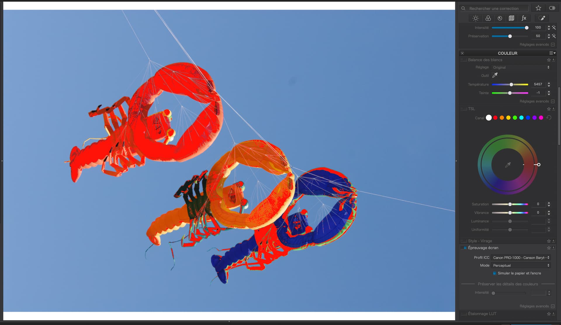
Sorry for coming in. But even when SP is on you’ll see the image in the monitors color space. So it is no WYSIWYG. Softproof in combination with the out of gamut warnings gives you an idea where these warnings are in the destination and/or monitor profile but not how they look like.
In the diagram of @KeithRJ that conversion is ommited.
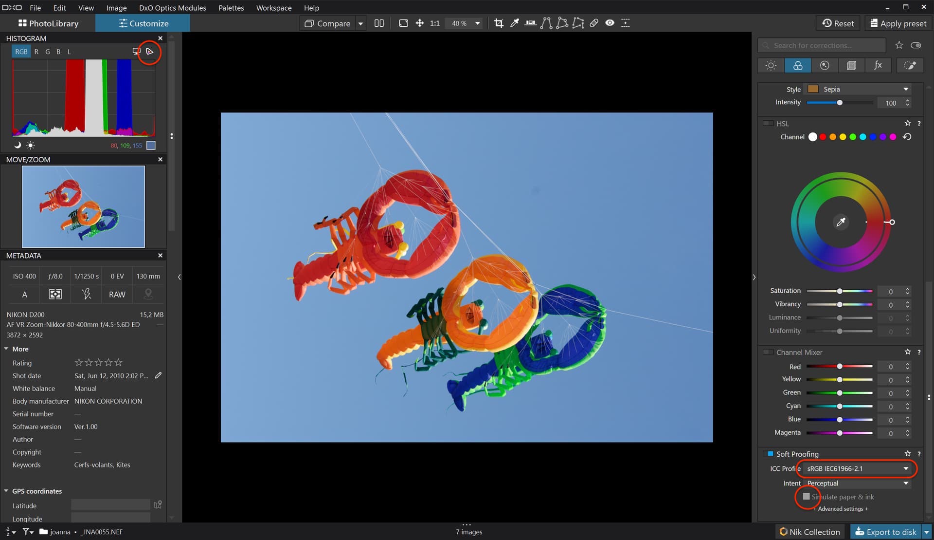
You need to activate OOG warning above the histogram
You need to select an ICC profile for your paper and ink combination
You need to activate simulation of paper and ink.
If you are only bothered about sRGB, for screens, you can either not bother, because, if it looks good on your screen, it should look good on anyone else’s.
Or, if you want to be really fussy, just activate the OOG warning.
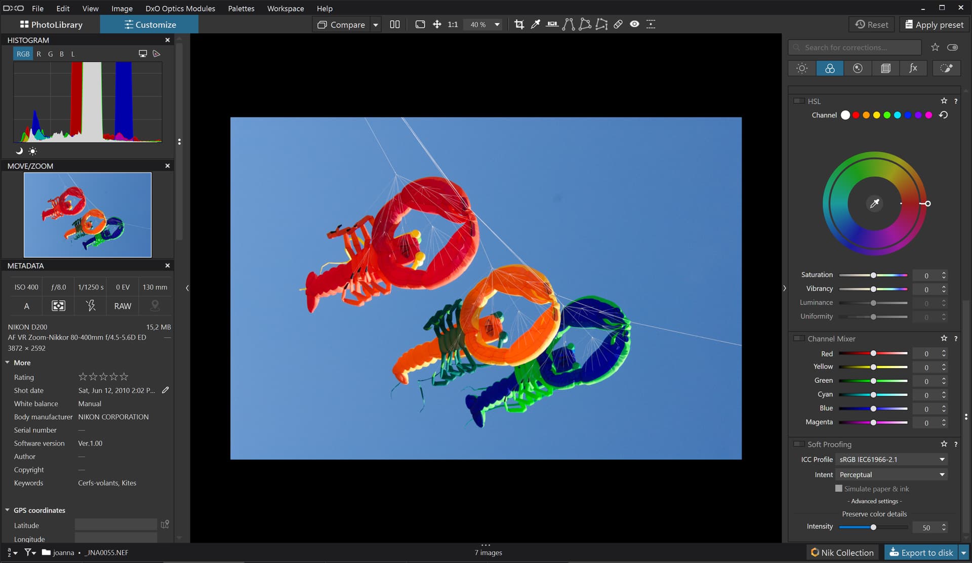
Here is the DOP file, with the VC containing a series of adjustments on the colour wheel, using the pipette to select the OOG colours.
SP is a SIMULATION shown in the monitor CS which is normally a larger CS than the target CS. The OOG warnings show you what colours are affected when converting to the target CS allowing you to make edits to improve the image when you finally output the image to the target device. There is no conversation at the SP step, just a simulation.