PLv7: Wide Gamut Color Space - Soft Proofing, Export to Disk, NikCollection

What I see is in the monitors color space. And when I want to use SP correct then the monitor and gamut warnings are important. They tell me what I see is what I don’t get.
I just want to show that SP is not a WYSIWYG tool.

@Joanna
I didn’t activate the warnings for that will change the colors of the image.

George

Indeed, that is what soft proofing is all about. then the idea is to use the colour wheel tool to adjust the OOG areas, whilst attempting to maintain the same overall appearance. This is not always possible so, this is one reason why, if the original doesn’t look too bad on your monitor, you might as well not bother.

1 Like

Is that not a bit of an exaggeration? PL is the only application that uses this colour space.

If we assume that a modern sensor can deliver RGB triplets within DxO’s wide gamut (wich contains Pointer’s gamut) and considering current screen technology, most monitors out there are unable to reproduce these colours faithfully. All we see is some kind of interpretation, look-alike or whatever we might call it.

Trying to squeeze out-of-gamut colours into a smaller space will inevitably introduce errors and/or unwanted shifts or will simply cut off anything that is oog…no matter if we let the app do it or try it in soft proofing. This all leads me to conclude that I can choose whatever I want and use what I see for export to file or for printing.

As a general rule, it is best to use the widest working colour space throughout and only change it in the very last step - if necessary - unless the system used is fully colour managed, in which case we can stop to wonder and go by what we see…ant the ultimate copy (exported file or print) should be the baseline on which to build.

Relating to the OP and thread title; I’d propose to do all colour/tonality work in one application near the beginning of the workflow and do the rest in whatever suits best, or, do everything in DPL and finish the image in Nik, exporting from there in sRGB for screen display or Adobe RGB for printing. Wait, that’s the opposite…yes, everything goes!

1 Like

Yes, I just packaged it nicely – more on that later. :slight_smile:

@Klick, @John-M … and all

As John had explained in detail, it is always better to edit an image in a wide color space, in the case of PL 6 + 7 the internal/working DxO Wide Gamut color space - and when to export as (intermediate) TIFF always in 16bit.

I had no doubt that PL could handle a TIFF file with DxO WGCS. Before PL6 (and long before I even decided to use PL), I always exported and printed in AdobeRGB. Since I started using DxO’s WGCS, I also export and print in ProPhoto CS.

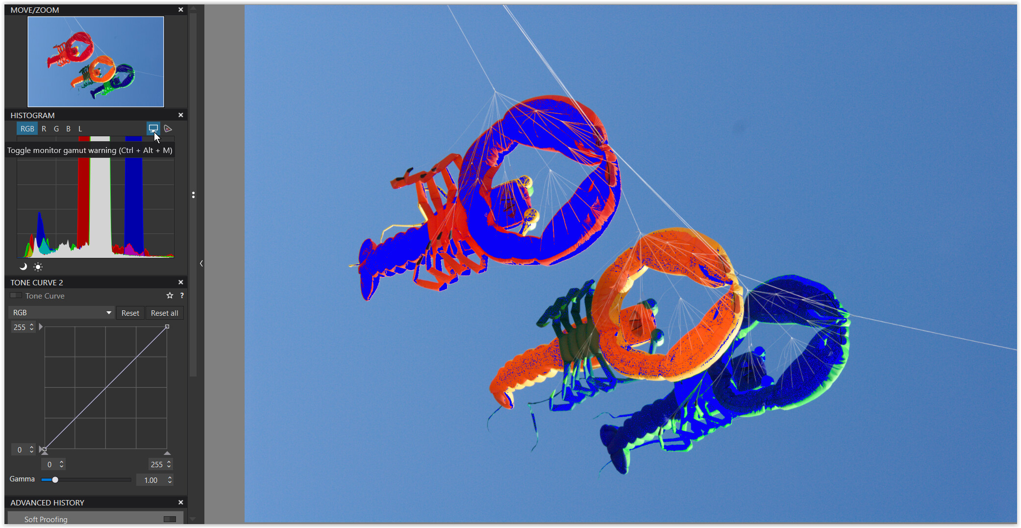
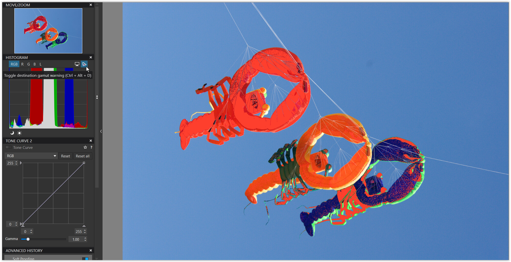
Based on the question here, I also had used @Joanna’s lobsters to find out… and yes, a TIFF with DxO WGCS is not only recognized by PL but also by PS !
I only made optical corrections to maintain the intense saturation in the reds, greens and blues, exported as a TIFF in the sRGB, P3, ARGB, Rec.2020, DxO WG, ProPhoto color spaces and renamed the output accordingly.

This was no scientific test, but since my monitor is calibrated to Native (= Adobe RGB + P3 combined), Adobe RGB as well as sRGB, all at 6500K [the 5900K is for my printing], I chose a color space to then restart PL and compare the NEF file with each of the exported TIFFs… and yes, I can attest to how difficult it is for someone on a sRGB screen.

  • With the monitor set to Native, I couldn’t see any differences between the NEF file and the exports in the DxO WGCS, ProPhoto and Rec.2020 color space, but with those in P3, ARGB + sRGB.

  • In the AdobeRGB setting there was no difference with DxO WG, ProPhoto, Rec.2020 + ARGB, but some with P3 (in green + blue) and a larger difference with sRGB (in red, green + blue).

  • In sRGB mode, I could no longer see these differences. The sRGB monitor color swallows everything.

I repeated the test only in Native mode, but now compared the DxO WGCS TIFF with the other exports. In ProPhoto and Rec.2020 I saw no difference, in P3 some in green + blue, in ARGB clearly in red and in sRGB big differences in red, green + blue.

And the same thing was also seen in PS, which incidentally recognized all profiles.


The difference/level of coverage can be seen when comparing the profile diagrams.


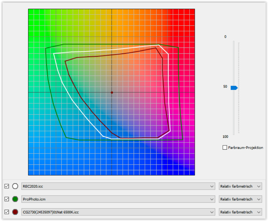
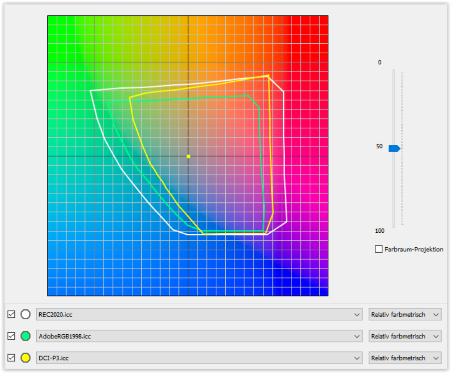
ProPhoto > Rec.2020 > monitor in Native mode (ARGB + P3)


my monitor in Native mode covers roughly ARGB + P3
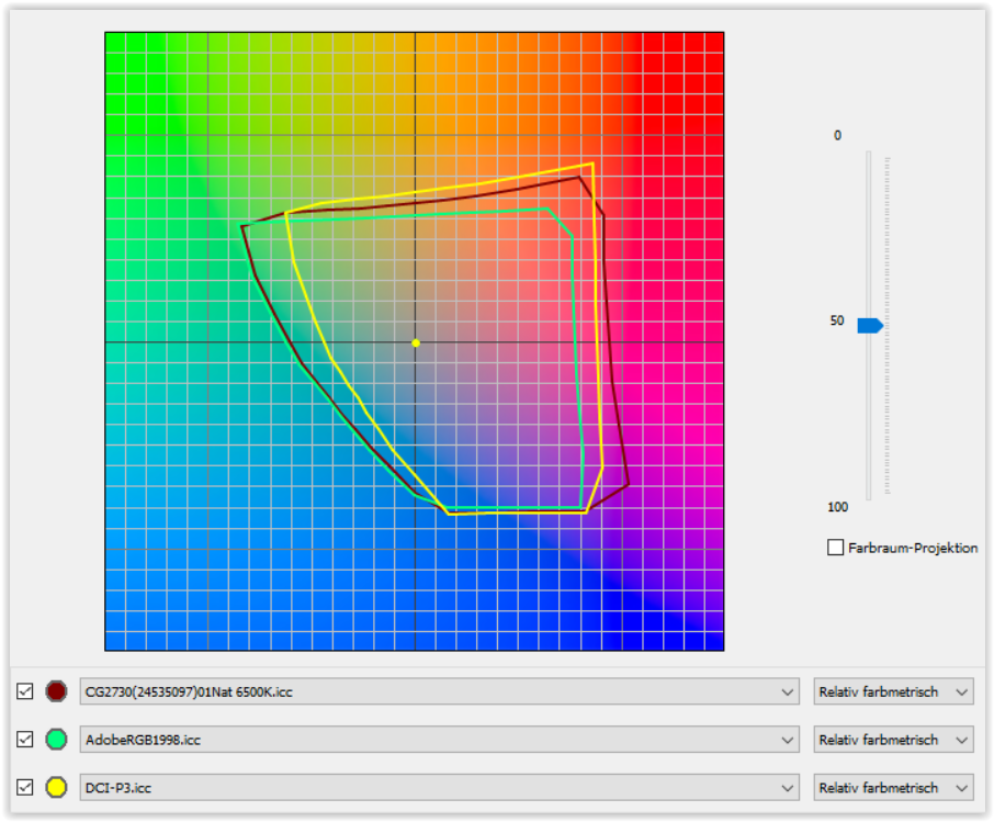
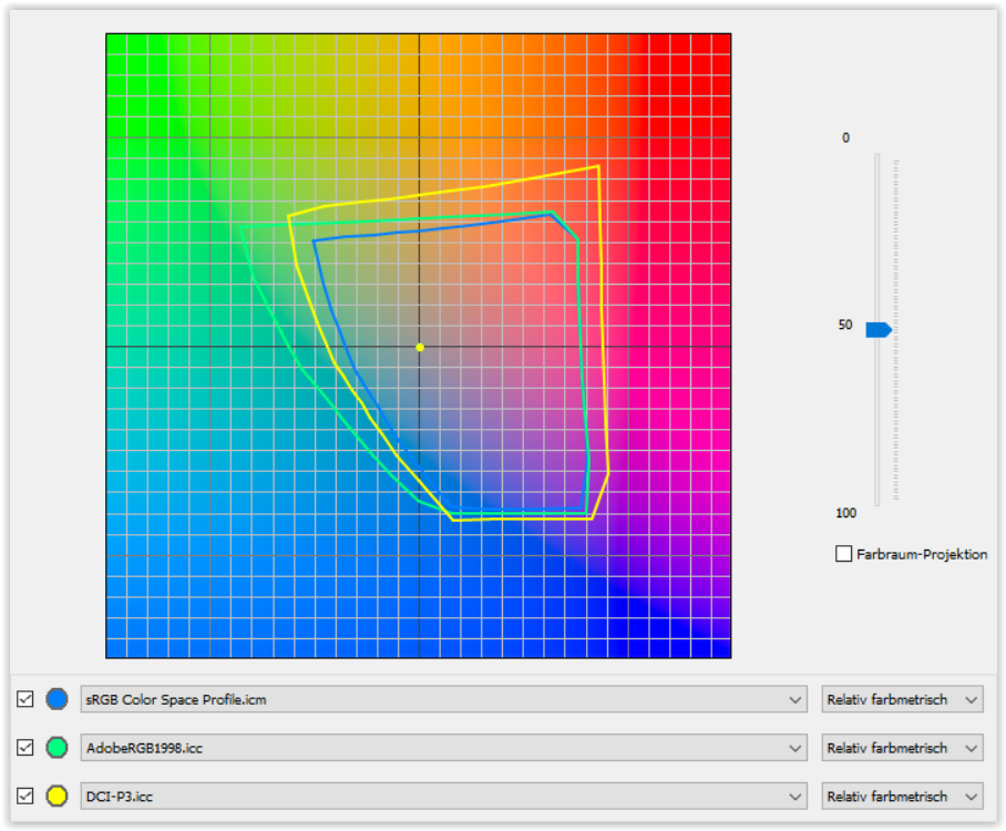

ARGB / P3 > sRGB


Canson Platine Fibre Rag (on my printer)
renders green + blue > ARGB / P3, but is fully covered by Rec.2020


Rec.2020 > ARGB / P3


note
ProPhoto being the largest color space, Rec.2020 is said to be quite similar to DxO’s WG.

1 Like

I don’t get it. What exactly is ‘DxO Wide Gamut’ colorspace?
You can export a file to TIFF, setting the ICC profile to ‘DxO Wide Gamut’, and then read the gamut triangle vertices coordinates (primaries) in the ICC profile of the exported TIFF using exiftool and compare it to other gamuts. I have the results somewhere on my disk, too lazy to find them now. But if the colors suit you, why bother? And if the colors are wrong, then which ones?

It seems that someone in DxO marketing tried to make out of WGCS a ‘story’, like Adobe made long ago when switching to ProPhoto for internal calculations. We should look at the end results (some ‘poppy reds’, fresh leaves greens, some violets), rather than try to reinvent the correction engine. Maybe I’m missing something basic.

That’s the key point, aproximate only as the last step. The devil is in the details though, so the mapping to the target colorspace is tricky and may depend on ‘taste’. Not sure, if this got standarized, seems not. You may get harsh color transitions, if mapping is done naively (see MacAdam ellipses, etc). But hese are just basics I think for DxO, Adobe, etc.

I may be misunderstanding, Joanna, but … this implies that you don’t have SP activated when your target is a digital file (not for printing) … If that’s the case then you risk producing an exported file that does not match with what you were seeing within PL - and/or does not match with how it looks to someone you have shared it with … Esp. given the high quality of your Mac monitor !

Cos why ? … See above.


Edit/Clarification:

My caution applies on my assumption that you’re exporting to disk for ICC Profile = Less-capable-than-your-monitor (such as sRGB.).

Otherwise, if you’re exporting to disk for ICC Profile = Same-as-your-monitor (P3 ?) then you’ll be safe with SP not activated … because WYSIWYG is already the case, even w/o SP.

You can find a good explanation here: DxO's new ultra-wide color space is unique - DxO

(It is a DxO document - but it’s not just marketing fluff)

1 Like

That is so ONLY if you were soft proofing to a wider color gamut than your monitor is capable of rendering … say, to take an extreme example, with SP ICC Profile = ProPhoto-RGB when you have only an sRGB-capable monitor.

Otherwise, WYSIWYG is definitely what you get … that’s exactly the point of soft-proofing.

Well, this is my approach. I do all the steps in PL, sometimes additionally using the Nik Collection, sometimes without. At the end of my workflow, I export to sRGB for the web, or for the print lab, with the profile that the lab requires.

Now my original question comes into play:

After the discussion so far, the answer for me is that it is still necessary to leave SP enabled during editing in PL so that I don’t get surprised like the “Average Joe”.

@Wolfgang
You’ve done a lot of work! If I understand you correctly, your attempt shows that

@John-M

John, another question for you:
If you are working with SP=on, how did you set these two options?
PL7_CUST_00001_de

That’s quite a limitation. My monitor is a sRGB monitor, 100%sRGB and 80% AdobeRGB. I just found out :grinning: But I think most monitors in use are still sRGB monitors.

Just a thought.
Normal flow,SP off: working color space->monitors color space.
SP on: working color space->target color space->monitors color space

When soft proofing to a profile smaller then my monitors profile, then SP for itself wouldn’t add anything: in both cases it just would show the image being part of the monitors profile. There might be a difference with SP on or off due to the extra conversion.

Even so, it’s well worthwhile using the WGCS as DP’s working-color-space as it allows for more accuracy/nuance when applying the image corrections that you apply … just as it’s more accurate to work with a calculator that’s capable of more precision than, say, 2-decimal places versus one limited to only that.

I still want to say what I said before. The bigger the color space, the bigger the steps in correction and the bigger the correction when converting to a smaller color space.
And the more out of gamut colors to deal with.
I don’t think a bigger color space is giving better editing. It’s just prepared for a bigger output color space.
And your mathematical example is dealing with the bit depth.

George

Yes, that’s what PS indicated when opening that said file – still, don’t “rely” on it outside of PL. DxO WGCS is their internal/working color space.
In LR we have the so-called “Melissa RGB”, which also works ‘behind the scenes’ to not restrict the user, but is not available ‘in public’.

And I was glad to see, that export with sRGB IEC61966-2.1 was also indicated.

PL6 and PL7 both have the DxO Wide gamut working colour space and soft proofing.

Mostly not, there are simply too many variables at play here. With a Mac, we get more comprehensive colour management infrastructure and default settings, but I still find proof in an actual hard print rather than in anything else. Not being after “Miami CSI” intermezzo colours, I most often get what I want, be it from my not so expensive Canon 7250 series printer or from printing services.

@John-M does advocate this with PL on Windows. My experience is, that I can check SP occasionally and see of I get extreme shifts. I mostly don’t … so again, too many variables to give the definitive yes or no.

Because of all the “it depends” and “ymmv” aspects, I propose you try and see what you get, always keeping in mind that there is no “one size fits all” solution. WYSIWIG is a concept rather than a reality.
:person_shrugging:

1 Like

… picking up your question at @John-M


with my screen set to sRGB mode the blue overlay indicates, what I can’t see
[ the monitor then restricts me to see beyond sRGB ]


same monitor setting, but now with softproof (= simulation) to sRGB → ON
the red overlay indicates, what is beyond sRGB color space
[ regardless of the monitor’s capability ]

suppose, those hotkeys are different in the Mac version, but the very same functionality

1 Like

Yes, I am aware of that. My question was about the behavior regarding softproofing and whether it is necessary to leave it enabled even with PLv7, as I wrote in my first post:

Unfortunately, the answer is “yes”.

Indeed, there is a lot to consider and there is nothing else to do but try anyway. As I have never used the WGCS before, I would like to get as many ideas, experiences and opinions as possible.

Look at this flow I wrote before.
Normal flow,SP off: working color space->monitors color space.
SP on: working color space->target color space->monitors color space

With SP off the in-memory image in the working color space is converted to the monitors gamut space. If SP is on the image in the working color space is first converted to the target color space and that one to the monitors color space. This step is crucial.
When the target color space is exceeding the monitors color space it will be just the same as going from working color space to monitors color space.
But when the target color space is smaller as the monitors color space then you’ll see a difference.
That’s why @John-M is advocating SP on. But the reason and condition under wich wasn’t always clear, to me anyway.

George

Thank you, Wolfgang.

I understand that you have “castrated” your monitor display to sRGB, so to speak. The blue overlay shows what your (“castrated”) monitor cannot display.
So far, so good.

→ Do I understand correctly that this indication is independent of the monitor used and its possibly limited display options?
→ Following the logic of the overlays, the image is in a larger color space than sRGB, correct? Only this can have an effect on both the blue and the red overlay.

You mean the appearance of the two buttons in the histogram? No, they look identical:


This is where my question to @John-M comes in, whether he uses one of the two or both displays permanently when working with SP=on.

Off course not. It changes the colors you see. Just use them for analyses.

George

1 Like