PLv7: Wide Gamut Color Space - Soft Proofing, Export to Disk, NikCollection

Yes – to both :slight_smile:

You mean the appearance of the two buttons in the histogram? No, they look identical:

Right – the buttons look identical, just the hotkeys to invoke those overlays may be different.

This is where my question to @John-M comes in, whether he uses one of the two or both displays permanently when working with SP=on.

While of course I can’t speak for John , those overlays hinder you to see your pic.
They are only indicators to help

  • the blue overlay
    to make you aware, that parts of the pic are beyond your screen’s capability
    (you might think you are in control of, while in fact the screen limits you to see that color, saturation, loss of texture … whatever)
  • the red overlay *)
    to indicate the area that is beyond your chosen softproof (simulation) target
    (and is independent of your screen)

*) to add !!

That red overlay jumps in a soon a color is beyond the chosen target color space,
but it doesn’t say anything about,

  • if the color, saturation … is just a bit off
    (and most probably you are going to neglect it)
    or
  • if it is something you ‘should’ take care for
1 Like

Maybe I have an error in my reasoning, but isn’t that what this is supposed to achieve? Namely the immediate display if the colors are outside the target color space?

If you want to use them switch them on and off. Look at the lobster image of @Joanna , you don’t see the difference between the image color red and the warning color red.

Beside that, if you’re editing only in the targets color space why using wide color gamut?

George

I can’t find any shortcuts for the functions discussed. :thinking:

https://userguides.dxo.com/photolab/en/menus-preferences-and-functions/#keyboard_shortcuts

But these will surely be found somewhere.

And, that’s the point of Soft Proofing, George … Assuming you’re export to disk process is targeting the sRGB color gamut (for sharing with others, uploading to social media, and consuming on your own sRGB-capable monitor) - then you should have SP activated with ICC Profile = sRGB … OTHERWISE, with your monitor potentially being capable of better-than-sRGB ; it might be possible that colors & detail you see on your (80% AdobeRGB-capable) screen will not be the same as you get when you export with ICC Profile = sRGB.

Yes, THAT’S a good reason!

John-M had a plausible answer to this question, at least for me:

See my post 35.

What I meant was that if you use the OOG warnings constant during editing, then you practical are editing in the smaller targets color space.

George

No - I mostly don’t either.

But, I prefer not to be caught out, unexpectedly, for those times when I do (get noticeable shifts) … especially for cases when (with SP Off) I might forget to check Out-of-Gamut (OoG) status.

Tis much simpler, I reckon, to have SP always activated (for your target color space) - then one can work with confidence that WYSIWY(will)G.

PS. I don’t see that this strategy is specific to PL on Windows, tho … … Rather, given that many Mac-thingies have PS3-capable monitors, I reckon it would be even more critical to have SP activated (in order to avoid being surprised by the exported result).

Both indicators (blue and red) help me to recognize where something should be done - which should take place relatively early in the editing process. So if I am aware of the “shortcomings” of my image, I can work on them and avoid them at an early stage. Am I thinking wrong?

You could study all the OoG warnings, and then fiddle around trying to mitigate them (tho, that would consume a lot of time for each image) … OR, you could take advantage of DxO’s Protect Color Detail (PCD) algorithm … and leave it to work out the optimal way to “convert” your image into your target ICC-Profile.

I take the latter approach … and (personally) I find that the the PCD algo does a great job … with the benefit of a lot less work (and time per image) required by me.

John

Thanks for pointing that out, John. PSC is probably doing a good job.

[EDIT: Rest deleted, I have overlooked a post]

One point has not been touched yet: normally, the preview background is some darker grey, with soft proofing on, it turns to a brighter grey. This can alter colour and tonality perception. I therefore set DPL to a medium grey in both cases and look at images with reduced zoom level in order to make that background visible.

Yes, so do I :slight_smile:

@Wolfgang and @John-M

From what I have seen there is no point at all in turning on Soft Proofing in Photolab permanently with any of the common ICC-profiles on either for “screen” whether it will be sRGB, Display P2, Adobe RGB or ProPhoto - because absolutely nothing will happen!

Why shall we soft proof anything else than printer profiles?? Soft proofing is for printing. What kind of “deviations” do we expect to find when using a sRGB Display P3 or Adobe RGB calibrated monitor?? I would expect absolutely non and that is exactly what I see.

I have tested this with my Benq SW271 and Photolab set to Wide Gamut. Feel free to falsify that both with “Monitor” and/or “Print” activated in Soft Proofing of Photolab.

Hi Wolfgang!

Well written. You might remember that I once earlier lifted these color space issues together with some picture samples of four images. I used the same image and exported it together with different ICC-profiles for sRGB, Adobe RGB, Display P3 and Prophoto.

I also complicated that discussion with examples of how these images could actually look in my different applications and viewers, because they do complicate this when the case is that every application might have its peculiarities when it comes to color management. Soon I realized that it is hopeless to lift that complicated issues in most forums because most people can´t disconnect from what is good practise and what might be just some tests to understand some of these problems.

I do have a basic problem with some concepts that seem to be used in discussions like these and that is the concept of “Working Color Space”. In version 7 the preferrable working space is DXO WG, since it gives support both to export Adobe RGB and the more and more common Display P3. Classic did not support Display P3 because it was not wide enough on the yellow/red side. Maybe you know I have settled for standardizing fully on Display P3 for both display and printing, so in my mind Display P3 is the real “Working Color Space” and DXO WG just a “Reference” or “Conversion Color Space”.

As I see it and think of it the process is this:

I have always a Display P3 hardware calibrated profile active on my system and Photolab almost always set to DXO WG (I have published that I do have had problems with some pictures that uses a “brownish” color rendering in my historical images which is a problem because these images differ in tone between Classic and DXO WG, so in that case I´m forced not to convert. I write this as an example of that there CAN be differences between how an image will look in Classic compared to WG - despite there normally is no difference.

So, I see all my pictures through a Display P3 monitor which gives then a P3 bias or filter that is different from if I should use an ARGB och sRGB-profile on the monitor.

In Photolab the WG is on but what also adds to how the colors really look is the active Photolab camera profile for my Sony A7 IV in this case. These are the main conditions that will decide how my files will look as a start in Photolab if I don´t change my camera profile.

So, it is the Display P3 “bias/filter” that really will give the finished picture-file the basic P3-look and result. You also have to add the Display P3 ICC at the export from Photolab BUT nothing is really stopping you from adding sRGB, Adobe RGB or even Prophoto BUT doing so this file will not reflect what I saw in Photolab on my computer. Only a file made using the Display P3 profile will - IF it will be able to use and manage the ICC. Some applications don´t do that at all or they might just by default use sRGB and if they do it will not look as it did on my computer.

Earlier there was a discussion about soft proofing and as I see it soft proofing is of no use at all if matching say a Display P3 ICC in Photolab with the present image regardless of which other display ICC you will select.

When printing and letting the application rule you don´t need to tell the printer that the picture was made using Display P3 because the file itself was made using Display P3 “bias/profile” and edited using that monitor bias/filter. That picture data already has a Display P3 bias. Instead we send the ICC-data that matches the specific printer and the kind of paper we plan to print on in order to at least partly compensate the shortcomings of that paper. It is only before we save that image before print it might be of any use to soft proof. Then there is a possibility to make an extra correction for the specific picture. Maybe the most common action in soft proof is to add some extra black since most paper seem to have problems to represent that properly.

1 Like

I’m pleased (for you) that you’re not seeing any “deviations” - but you may be fooling yourself.

It’s true that there are not too many situations whereby what-you-see on PL’s main screen is NOT what you get when exporting the image to disk (via ICC Profile = sRGB) and then displaying that image on the very same screen … but there certainly are examples where this is so . . . esp. as you would expect, in cases where colours are saturated and full of detail.

And the way to mitigate against that situation (so that you DO always get the same result on-screen, within PL, versus viewing the same image when exported via sRGB profile) is to have SP ON.

Just as a starter: I don’t really care for something to be “correct” or not. My main objective is to get the representation I want, or, in case of reproductions, something that gets close to what the original looked like as seen under similar conditions.

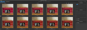
That being said, I tested something as easy (from a colour space requirement point of view) as a colour checker. Image hardly customised in wide and Legacy colour spaces and exported to AdobeRGB and sRGB with the “preserve colour detail” boxe checked as well as not checked. Here is what I got as seen in DPL7:


Top row from left @ Wide: RAW, Tiff in AdobeRGB with “preserve” off, TIFF in AdobeRGB with “preserve” on, Tiff in sRGB with “preserve” off, TIFF in sRGB with “preserve” on
Bottom row from left @ Legacy: RAW, Tiff in AdobeRGB with “preserve” off, TIFF in AdobeRGB with “preserve” on, Tiff in sRGB with “preserve” off, TIFF in sRGB with “preserve” on,

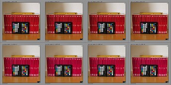
Exported files as seen in Lightroom:


Note that rows are switched.

Exported files - specially the books - match the actual colours better when WCS was set to DxO Wide Gamut. On screen, DxO’s images look a tad more saturated than Lightroom’s… It doesn’t show in the screens though. Differences between AdobeRGB and sRGB exports are hard to ake out, but measuring e.g. the colour patches with macOS’s Digital Colour Meter app reveal differences that can exceed 2% (per colour component).

My lesson(s) learned: Stick to DxO Wide Gamut WCS

Be careful now. What I say here Is that soft proof is of no practical use at all using it with the ICC for monitors like sRGB, Adobe RGB or Display P3. It only has a role to play when testing printer profiles for different paper manufacturers paper/printer-profiles.

I don’t say there are no differences between my hardware calibrated profiles with my Benq SW271 because they give very distinctive differences switching between them. I have sRGB, ARGB and Display P3 that I can toggle between instantly.

What I say is that I can’t see any markup differences at all proofing Photolab’s own ICC-profiles with Photolab´s soft proofing and that is nothing to be expected either.

Don’t confuse that with using different monitor profiles when working with Photolab because those differences are very obvious and easy to see. It is not hard to either understand or see the effects of using different monitor profiles. It is not hard to understand either that each profile used will affect the postprocessing final export files in a distinctive way that reflect the filter bias a certain monitor profile will give.

It is not either the same thing exporting a file with sRGB ICC when it’s postprocessed using a Display P3 monitor profile as when you do it with a file made with an sRGB-profiles monitor. These are different files. Still if you export three files just changing the ICC at export, will give you three distinctive flavours of the same basic image data despite that file might not at all contain image data made with the corresponding monitor profile and there is nothing that stop you from doing this wrong really.

The only way to handle this is to get properly organized - which many are not as can be seen and read in many forums handling printing error matters.

Apols, @Stenis - but I don’t understand you at all.
And that’s OK - if you’re getting results that you’re happy with - then that’s all there is to it.

John

1 Like

You will only see a difference if your image has out of gamut colours that do not fit in the output colour space. These are generally very saturated bright colours like a poppy flower in bright sunlight.

I only use soft proofing if I know a particular image is very saturated and bright which is very rarely.