I think that many people find it easier to edit “up” rather than edit “down”, that is, to add contrast, saturation, etc., rather than subtract. That sentiment, by no means unanimous, has been expressed often by forum members. Just my guess.
1 Like
Geoge the rendering is on in the Wide Gamut image above and Style-Toning too.
If I turn of the color rendering I will just get a color cast in a color image instead:
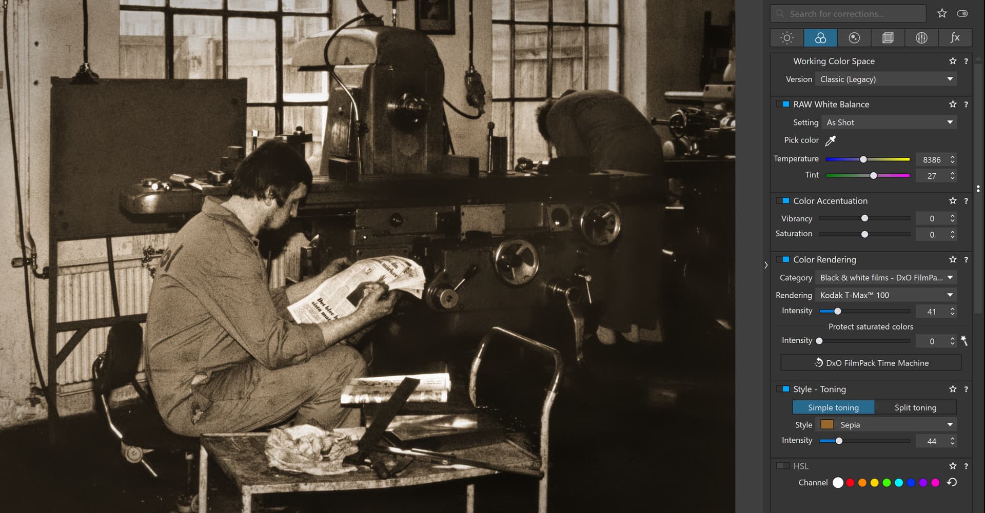
Classic with Color Rendering Off
Wide Gamut Color Rendering Off
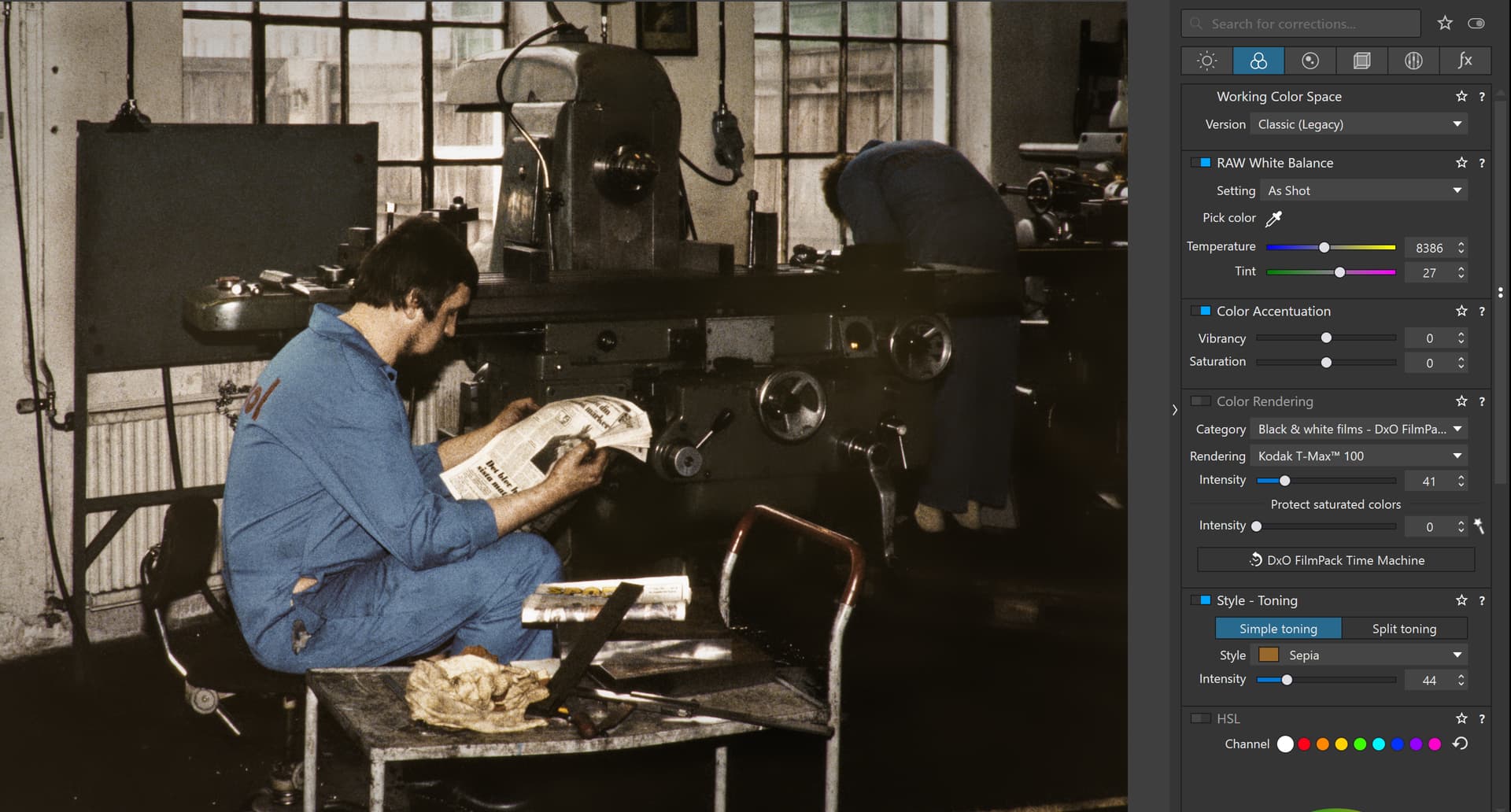
Classic Color Rendering On
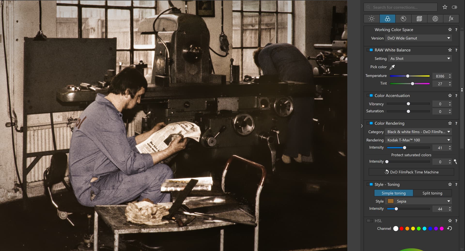
Wide Gamut Color Rendering On
So whatever I do with or without Color Rendering On or Off I will get a color cast on my monitor with DXO Wide Gamut. There is no way I will land in the same brownish color as the one on the last Image if I turn on Wide gamut. I will get a color cast in both cases. So switching on the Color Rendering or not is not a solution at all and it shall be on because that is the way it should be.
In this case it will be totally impossible for me to use Wide Gamut on these converted slides and as you see Photolab can’t even manage to keep the colors stable in the original repro color slide image.
As far as I can see your suggestions and writings haven´t got us any closer to a solution of this issue because there is something fundamentally wrong here in the way Photolab handle this. With my sRGB-monitor I have no problems using the Classic for both Adobe RGB and sRGB JPEG derivates but Wide Gamut will be a problem for me as it is now and I will have to stay away from it at least with my brownish converted color slides. Digitally born images I have to do more tests with before I will try any Wide Gamut more.
No @George, the wider gamut is definitely not my working space yet.
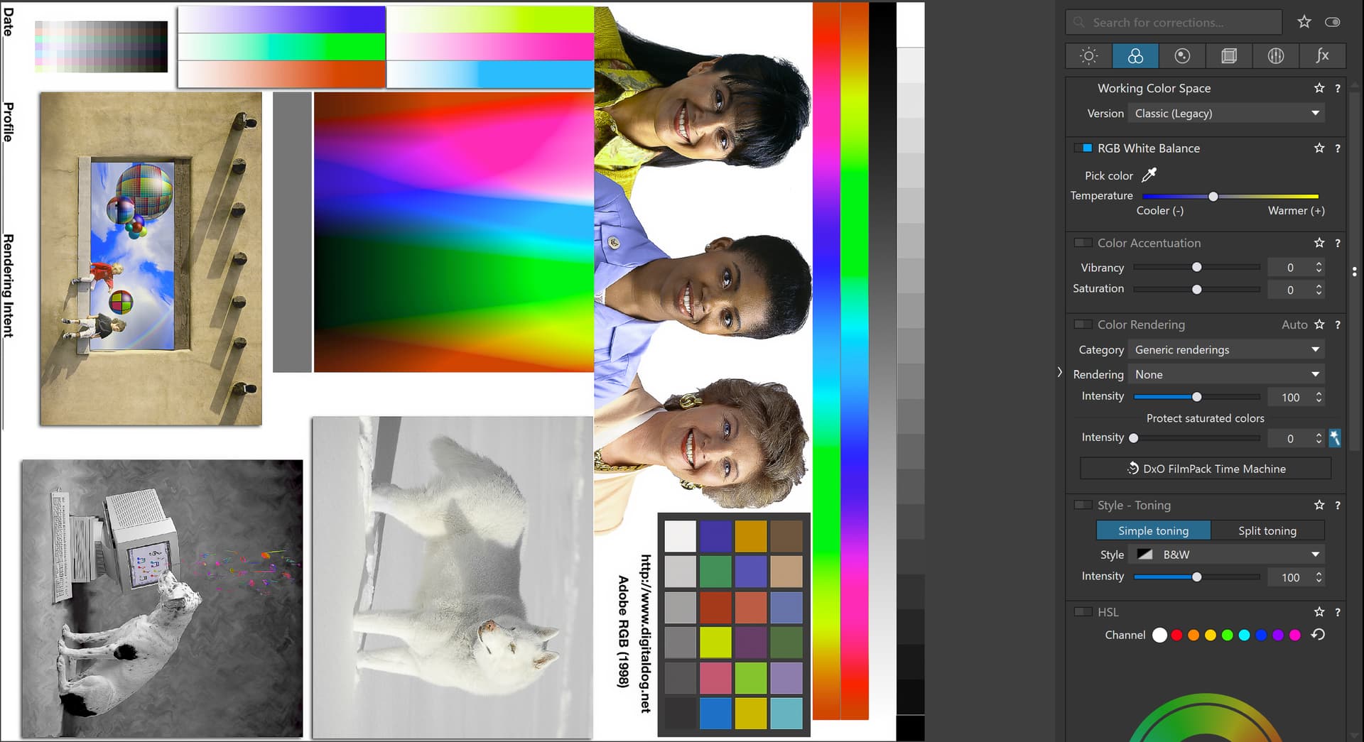
Testchart with Classic

Testchart with Wide Gamut
As you can see you are wrong and your conclusions are not based on any empirics. Both these testcharts looks exactly the same on my sRGB monitor, so it has nothing at all to do with my monitors more limited gamut. The Classic and the DXO Wide Gamut images looks exactly the same!!! - … and that is what I expected it to be even för my brownish images.
So, the problem is the colors and the texture (grain) of the repro photographed color slide images. Photolab can´t handle these images correctly but it works fine to switch gamut on digitally born images - at least my Sony ARW. Maybe I should have expected these problems with my repro slides since neither sharpening or noise reduction works on these pretty special type of images despite they come in a ARW RAW-container.
There doesn´t seem to be any problems at all with my sRGB-monitor and DXO Wide Gamut as long as it is applied on digitally born images and a color slide image is not a digitally born image just because I have taken a repro photograph of it with my A7 III or A7IV.
So, people digitizing analog positive and negative film and processing these images with Photolab 6 is hereby warned to take care before using Wide Gamut. I think a good advise is to stay with Classic.
please check → at the position of the ![]()

You changed the CR intensity, but CR is OFF ( = None ) … and therefore you see no change on your screen.
note – you are showing a pic in TIF or JPEG Format on a screen which can render sRGB max
You are absolutely right – in that you have done the work already and you don’t gain more colours by converting *) them to a wider colour space. So why bother. Export the processed files as they are to store them for your use and you are good.
*) Converting means, colour values are remapped to the new colour spaces … to then represent similar colours as before.
When you simply apply another colour space, the colour values don’t change and most probably look different – as you encountered.
@MSmithy Thank for your response, sorry about the delay in responding!
I thought there was an error in the image DOP I supplied as a result of your comments!
All the settings should have been off and that was the way that I believe that I ran the tests and that is the way that they are in the DOP I uploaded.
I downloaded it and added it to a new test image and all settings are off that can be turned off.
It was deliberate because I was trying to compare base renders between the DxPL(Win) packages and then decided to include FRV RAW rendering and Affinity 2 and Gemstone RAW rendering and exports.
Once any editing settings are being used it becomes difficult/impossible to compare like with like, so I need to verify that my snapshots are as I believe them to be, devoid on any editing. Looking at the first of my snapshots only the ‘Working Color Space’ option appear as being active but- the second snapshot was focussed on the wrong set of options!
Yes which was initially surprising to me but when I see the RAW images from the other packages then they seem more inline with the WG image than with the CL image.
Not on my system and not being selected it would not be active anyway.
I believe that the 50 value was either left behind by your own work or …??
If I set ‘Color Rendering’ ON and select 0 for Intensity with CL then I get a close match between the two but I was not looking for parity, I was trying to investigate an apparent disparity!?
Almost certainly not, i.e. with the item not selected sliding the intensity value will cause a change because it will automatically set ‘Color Rendering’ ON but deselecting will cause the image to revert!
@Wolfgang possibly but what I am seeing are not subtle in any way, that is why I chose the image I did once I had discovered the differences. My screen is only SRGB but the differences are as plain as plain can be, there is no subtlety at play here!
I am not particularly good at the nuances of colour science but the differences are easy to see even on my limited screen with my limited ability!
What I am seeing is not unexpected results because of the limitation of the monitor it is because of the behaviour of the software. Arguably the unedited images are very similar but very different from the CL and pre PL6 images - why!?
Once any edit is applied the image will deviate from the common goal that I am seeking, i.e. the starting point for comparison which is the output before the packages start applying anything that I can select. That doesn’t mean that the various packages are not doing something “underhand”.
I am not looking to achieve a “good” image or similarity between CL and WG at this point, although that would be an interesting next step, but rather, I am trying to understand why the very obvious difference at the start of the process and a disappointment that CL appears so “lack” lustre compared with WG and the outputs from the other packages, all with no “obvious” edits applied.
That the CL image can be improved and the WG image tamed I don’t doubt but I was surprised by the amount of difference from the off and if you want to do that then please do and provide the DOP so that I can see what you have done.
@Stenis If your image is not subject to copyright issues then can you provide a copy of the image so that the assembled audience can see the problem for themselves and seek a solution, if one is possible with WG and if it isn’t then surely we have a question for DxO.
PS:- @Wolfgang how am I supposed to know what the correct colour should be, correct not pleasing?
1 Like
Thanks for responding, but you seem to have missed my point.
The instant you open a RAW file in DxO PL the program applies a demosaicing / “secret sauce” algorithm to provide a unique starting image. You can bias that algorithm (perhaps downstream?) by specifying a preset, etc., but you have no information about and no direct control over it. That algorithm will be different depending on whether the wide gamut or classic working color space is selected, and its specific implementation will also vary from file to file depending on camera data embedded in the file. Ditto for other programs. What exactly will you be comparing?
2 Likes
Interesting discussion this - thanks for starting the thread.
OK, I think I understand how you got to this point given your experiences with the rescued slides, but perhaps this statement is a bit alarmist.
I’ve been running hundreds of scans of positive and negative film through DxO PL for some time now and had a seamless transition to the new wide gamut working color space. No significant problems.
I’m also curious about your decision to brown-tone the deteriorated slides. Was this for artistic reasons? Or just quicker? The classic fix would be to use individual RGB channel adjustments with the histogram and/or curve tools to get a better starting image.
There is no need to worry about digitizing your slides with Photolab - quite the opposite since Photolab Fine Contrast makes wonders for us but we need to look up when Wide Gamut is on. Something rare things happens then and the colors will get affected.
As long as we use Wide Gamaut with digitally born images it looks like it works without affecting the colors.
The reason I use a brownish tone on all of my digitized old color slides is that very often I have lost the whole green RGB channel during 40-50 years of not always all that good storage conditions. I could not motivate the effort of trying to restore the color balance in all of those images. The brownish colors also serves me well when i use them in a coming comparative report of the “death of the kibbutz” I´m working on when I compare a kibbutz development over time between 1972 and 2016.
revisiting this thread I noticed in your post above …, that the first 2 screenshots are identical
– suppose not representing what you intended to show. ![]()
I checked on a raw-file with the adjustments (Kodak TMax and Style toning Sepia) you used
and as you have shown
- the colours you adjusted in Classic Legacy (screenshot 3)
- appeared different / more vivid or saturated … after switching to DxO Wide Gamut (screenshot 4).
Again, stick with the working colour space you have started with – when to avoid reprocessing.
@eriepa I understand your point about the “secret sauce” algorithm but mine is that ‘Wide Gamut’ was intended to increase the colours available to the user but the point I was making is that the WG recipe for the “magic sauce” suggests that the old recipe was doing something distinctly unsubtle with the pre PL6 images.
However, @Stenis experiences seem to indicate that the old recipe seems to work better than the new recipe in certain situations.
Whether WG is a “better” starting point for my “pink” flowers, or not, it is certainly a different one and as a starting point it is closer to what I get from a simple rendering of the RAW image (FRV) and an unedited rendering (Affinity 2 and Gemstone) closer but not identical.
[M]aster is CL and [1] is WG and no other edits applied.
When you (have to) reproduce something, you want to render as close as possible to the original, use controlled light conditions and maybe rely on a trusted colour chart as your reference, but otherwise …?
DxO changed the colour engine from PL5 to 6 and the way it handles different screens. If you don’t like it for some reason, stick with DxO’s Classic Legacy. Otherwise explore the extended possibilities.
You need to experiment to get a feeling what you can (should / should not) do.
The limitation is your screen and / or what you are going to export for.
- For web / online use sRGB is still the recommended colour space.
- When to send out to a printing service depends on their possibilities / requests.
- A modern inkjet printer can reproduce beyond sRGB colour space.
… which is why I said
- Editing in a wide gamut colour space while viewing on a (somewhat) limited monitor
always bears the chance to get unexpected or unwanted results.
To give it maybe a different perspective …
- Let’s say, you take an early morning shot in diffuse light with a distinct colour.
.
You will not be going to develop it to full contrast
and render the colours as if they were lit in full bright day light.
.
Keep the rendition to what you feel is right, to what you want to convey.
Creative work does not necessarily mean ‘reproduction’.
1 Like
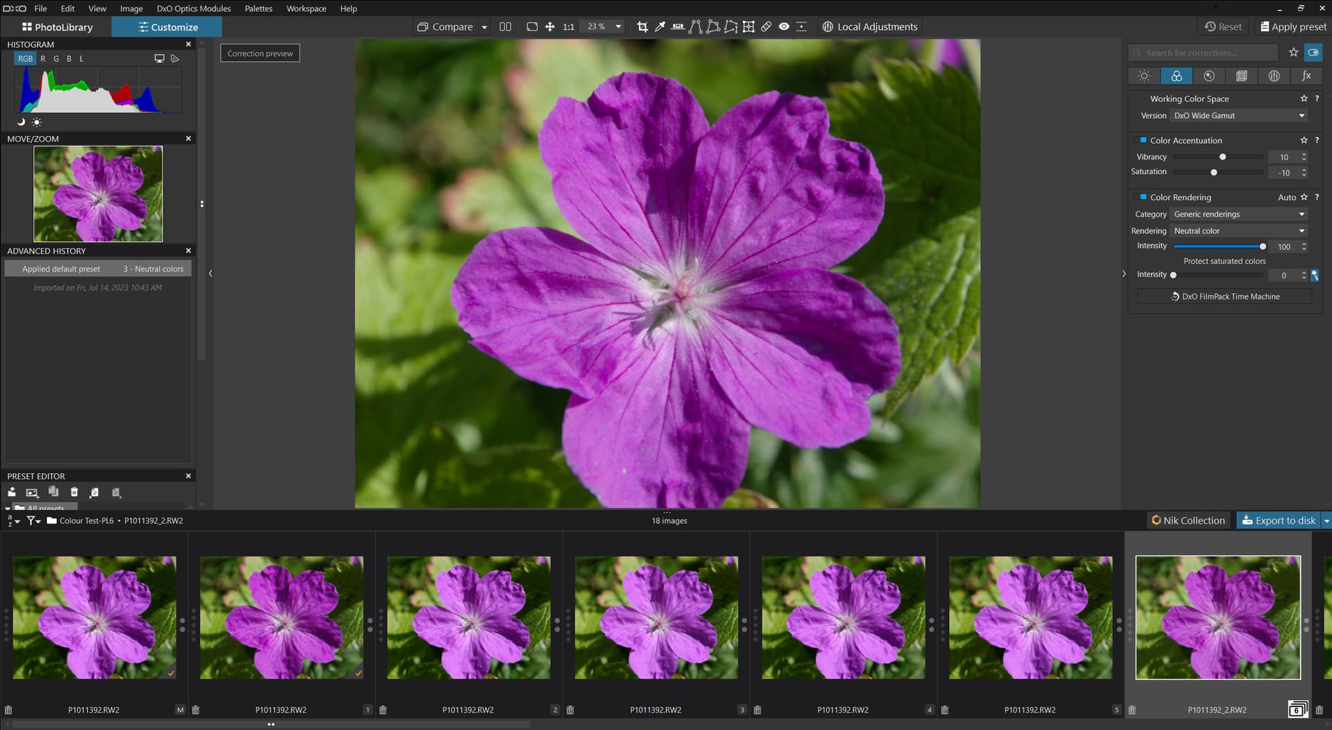
When widegamut is on and color rendering is off it is like wide gamut on with rendering set to neutral.
Or like widegamut on and color rendering set to camera profile and intensity set to 0.
So it is what DxO calls neutral.
At least with my camera nikon D850. And I suppose this is the same with other cameras.
How did you convert your images in browning tone ?
What was the process from the slide to the browning RAW (?) you get ?
I’d like to understand what is the image you used in your example.
So what is this master color RAW ? What is this image you used (as asked above).
How the RAW can be brown ?
Maybe too much to read and I miissed something in this thread.
But :
If I Set color rendering to camera profile of my camera, wide gamut and legacy gamut provides me same colors.
If I set wide gamut and no color rendering, I get same resukt as wide gamut and color rendering set to neutral.
If I set legacy gamut and no color rendering, I get same reult as legacy gamut and color rendering set to my camera color profile.
So I don’t see unconsistency between new and legacy color space.
But color rendering OFF does not have the same behavior. One gives neutral response, and the other gives camera color profile.
(And some tools seems not work with new color space - maybe but maybe not).
Then we could debate about what is or what should be neutral rendering.
And this would be a new and interesting topic.
It seems to me a matter on how to deal with the oog colors or the used rendering intent.
George
1 Like
@Wolfgang agreed but we “collect” geraniums in particular (which have a habit of interbreeding) and while there is room for being creative, accurate recording is also useful.
The issue is less with Wide Gamut which, prior to editing, appears to be a closer match to other products and more with Classic(Legacy)!? Except that CL appears to be a closer match to the JPEG from the camera.
However, when you add in this ‘Color renderings’ setting in particular to both images

the differences between CL and GM diminish/“vanish”, in my case.
In truth they appear to be the same image but a Beyond Compare comparison indicates that they are not identical. What they would look like on a monitor with colour space capabilities beyond sRGB I don’t know.
However anyone with a more advanced monitor than mine (a Dell U2515H) could look and see what they get using this DOP and the previous image.
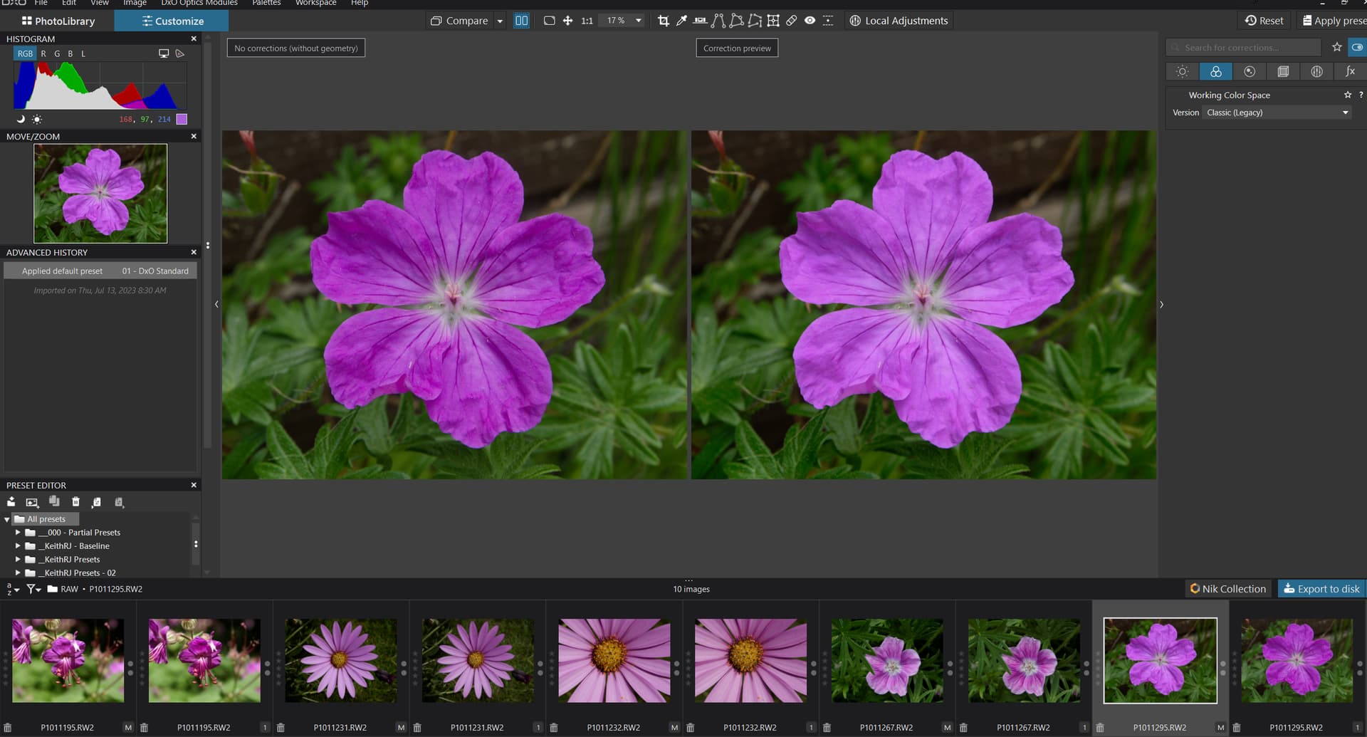
The DOP contains six VCs ([M] + 5 VCs),
P1011392.RW2.dop (68.9 KB)
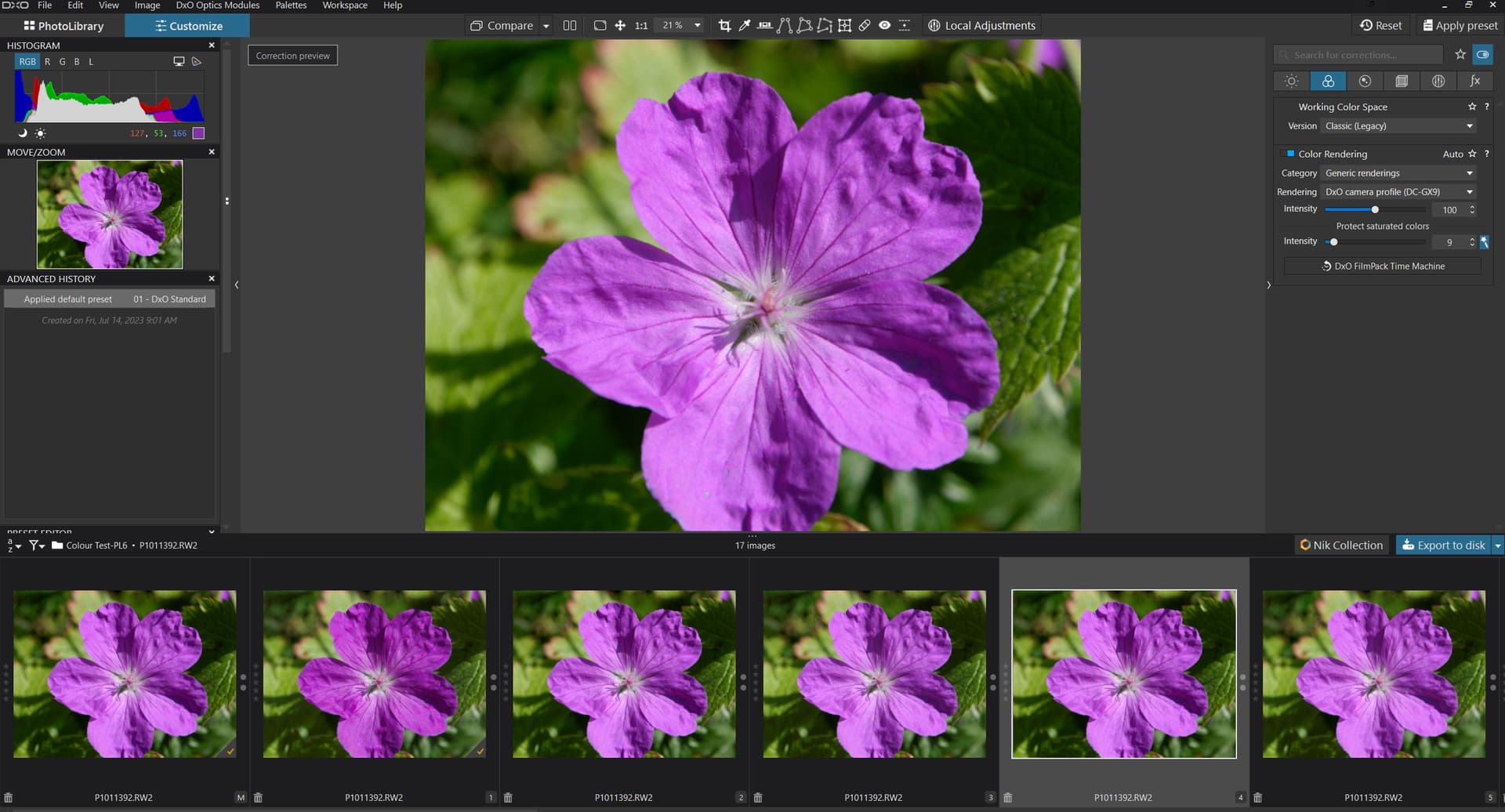
[M] & [1] ‘Classic(Legacy)’ & ‘Wide Gamut’ plus no additional edits set on.
[2] & [3] ‘Classic(Legacy)’ & ‘Wide Gamut’ plus ‘Color renderings’ with settings in fact the '‘Protect saturated colors’ setting has now changed to 9 rather than the 8 snapshotted here!?

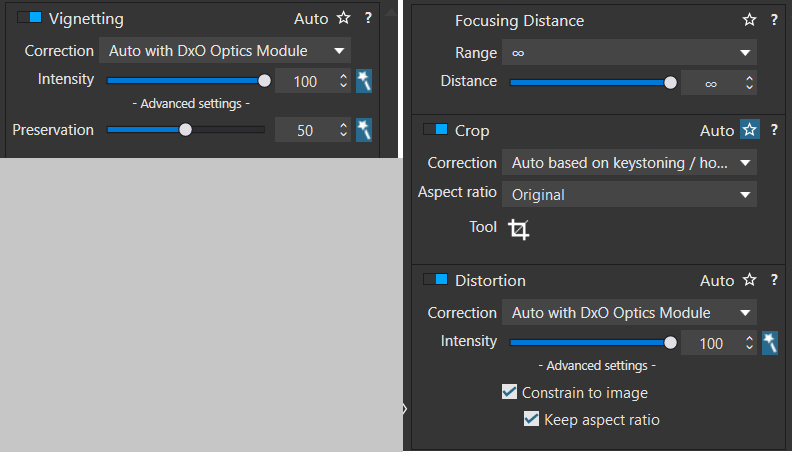
[4] & [5] ‘Classic(Legacy)’ & ‘Wide Gamut’ plus ‘Color renderings’ plus ‘Vignetting’, ‘Crop’ and ‘Distortion’ with settings
Sadly we can’t “rename” copies in Windows!
Renaming and collapsing them would be great.
1 Like
@JoPoV Renaming would be useful, although I sometimes “cheat” and steal the IPTC data fields to describe the specific features I am investigating etc, to help my memory.
Collapsing would be counter-productive in this example but having so many VCs taking up screen space and render/re-render/re-re-render/… time it would be useful to be able to collapse the copies into a single thumbnail which is identified as a “stack” once the editing has been completed, just having 6 copies soon loses its appeal!
This is what I meant.
Double clic on one copy or master collaspse all in one stack (identified as stack of course). Double clic on one stack “reopens” it as copies.
Multiselect several images and right clic → contextal menu - with collapse/uncollapse option for doing this on several images.
For better organisation and clarity.
@JoPoV A bit like this only neater
1 Like