@MSmithy Thank for your response, sorry about the delay in responding!
I thought there was an error in the image DOP I supplied as a result of your comments!
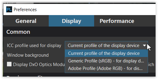
All the settings should have been off and that was the way that I believe that I ran the tests and that is the way that they are in the DOP I uploaded.
I downloaded it and added it to a new test image and all settings are off that can be turned off.
It was deliberate because I was trying to compare base renders between the DxPL(Win) packages and then decided to include FRV RAW rendering and Affinity 2 and Gemstone RAW rendering and exports.
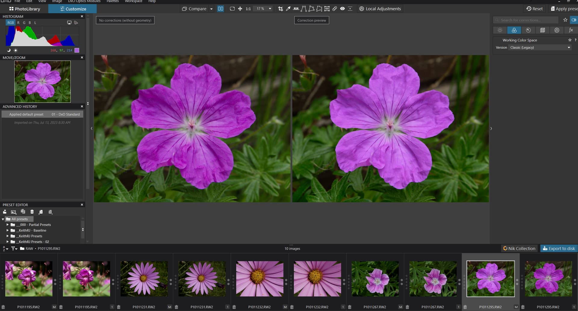
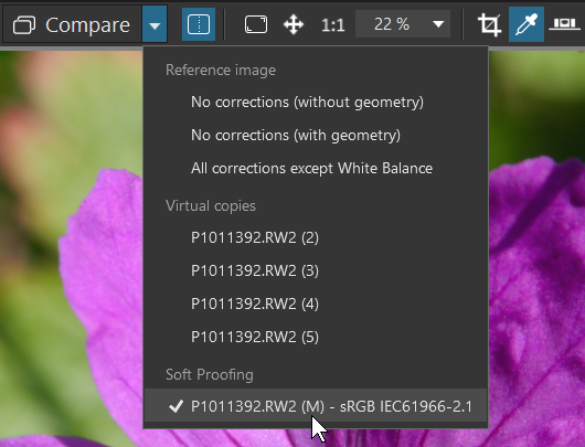
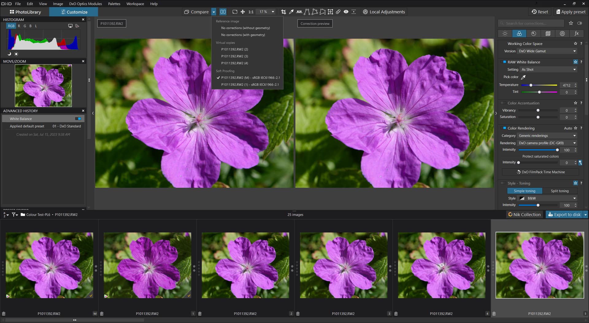
Once any editing settings are being used it becomes difficult/impossible to compare like with like, so I need to verify that my snapshots are as I believe them to be, devoid on any editing. Looking at the first of my snapshots only the ‘Working Color Space’ option appear as being active but- the second snapshot was focussed on the wrong set of options!
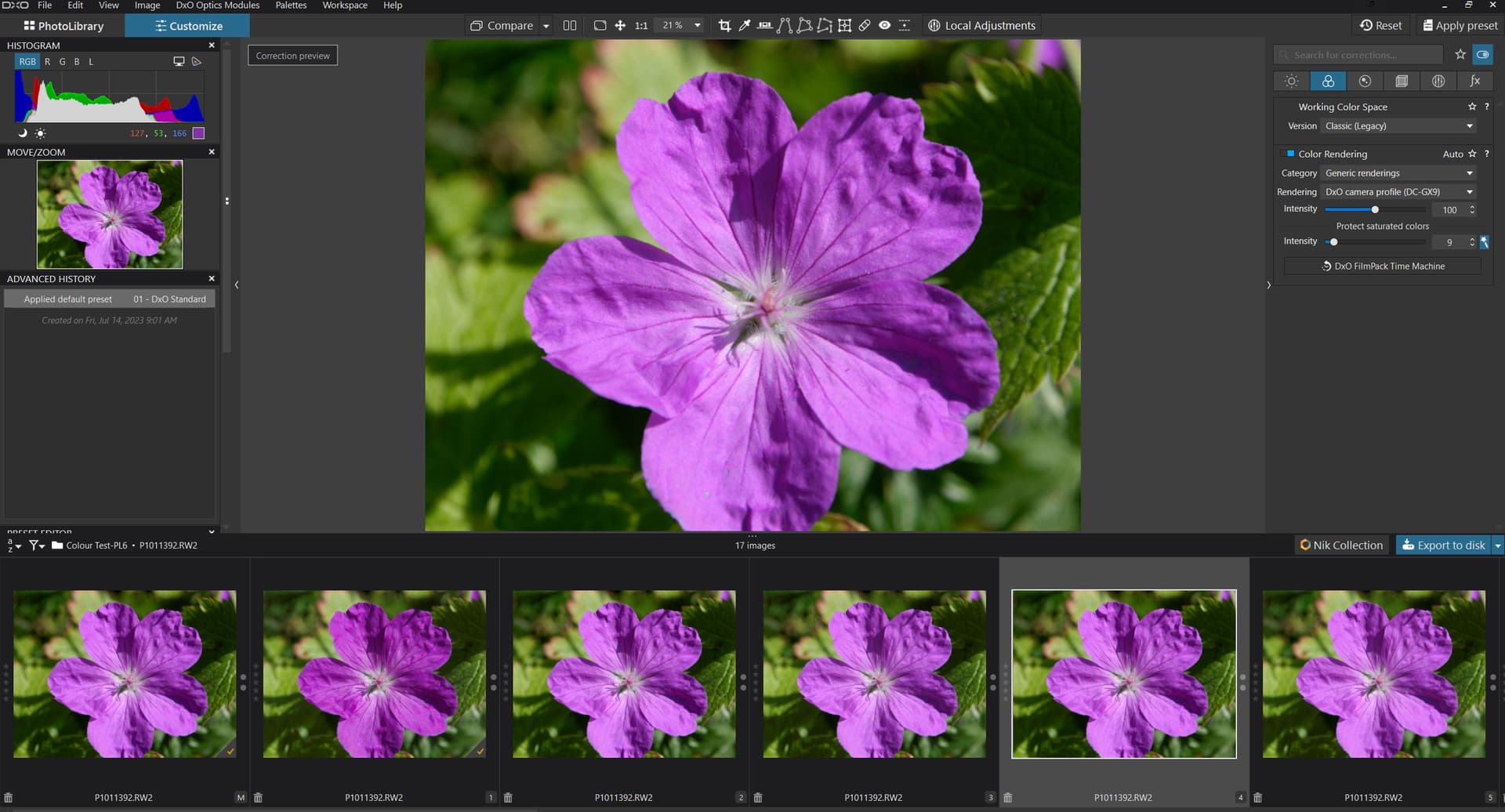
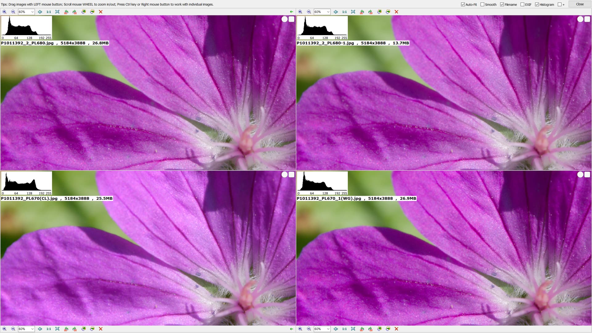
Yes which was initially surprising to me but when I see the RAW images from the other packages then they seem more inline with the WG image than with the CL image.
Not on my system and not being selected it would not be active anyway.
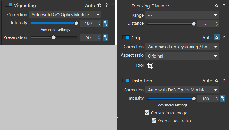
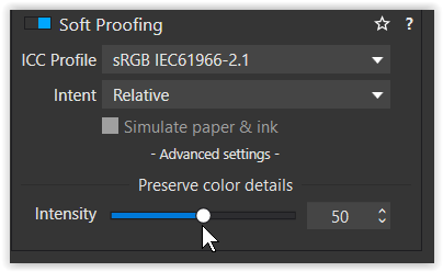
I believe that the 50 value was either left behind by your own work or …??
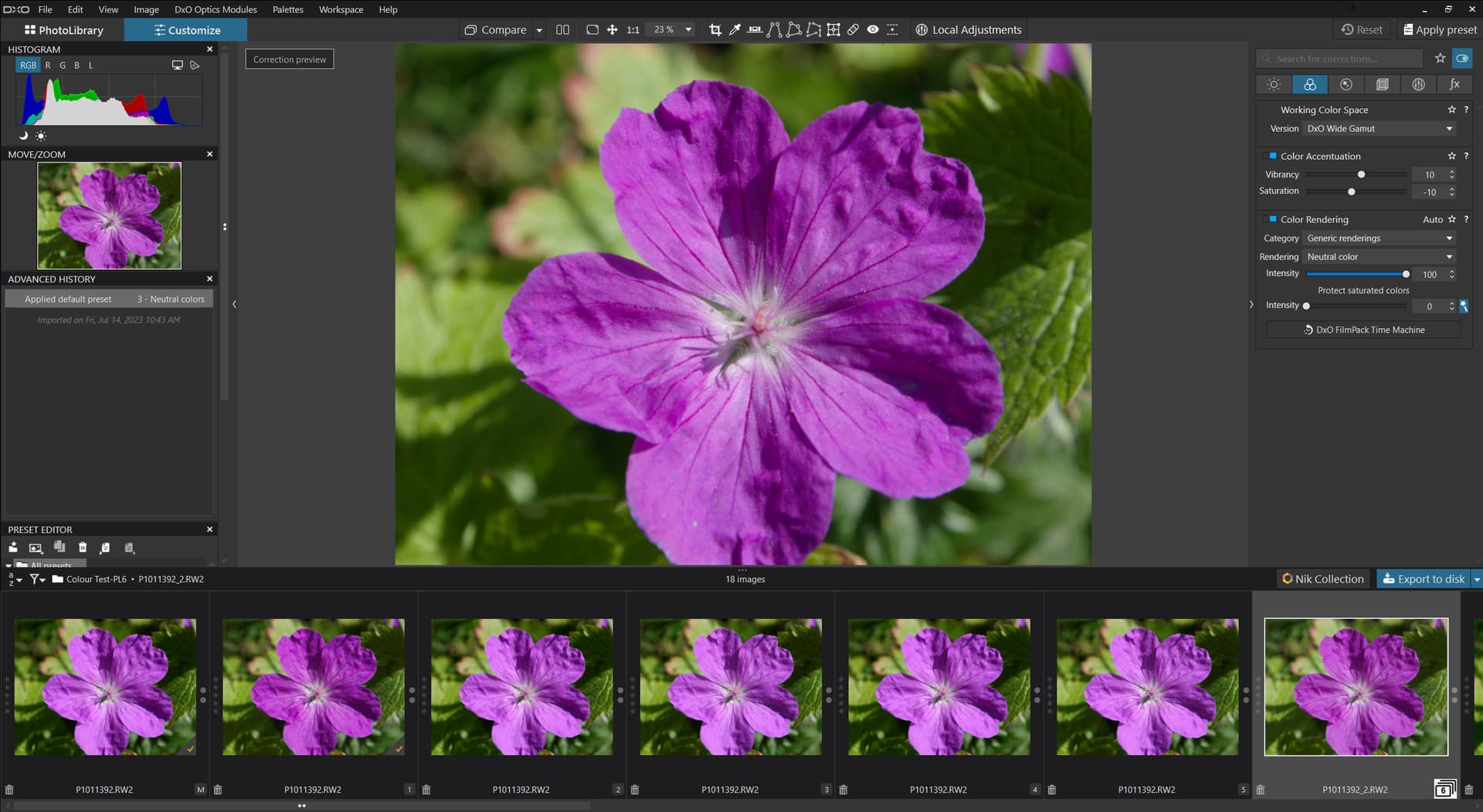
If I set ‘Color Rendering’ ON and select 0 for Intensity with CL then I get a close match between the two but I was not looking for parity, I was trying to investigate an apparent disparity!?
Almost certainly not, i.e. with the item not selected sliding the intensity value will cause a change because it will automatically set ‘Color Rendering’ ON but deselecting will cause the image to revert!
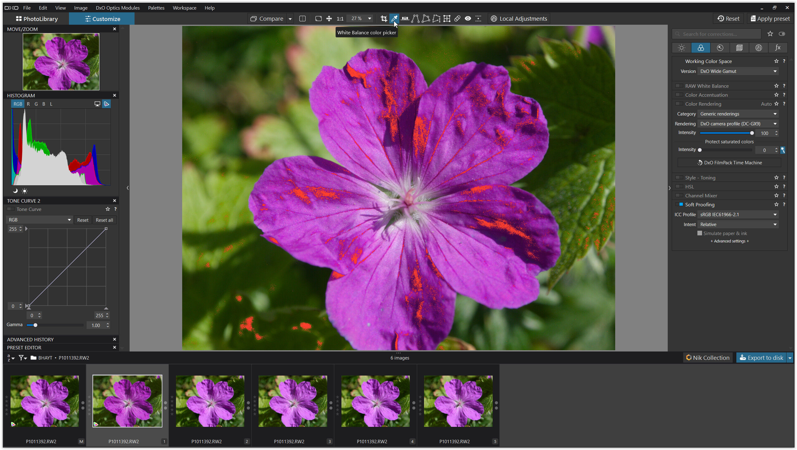
@Wolfgang possibly but what I am seeing are not subtle in any way, that is why I chose the image I did once I had discovered the differences. My screen is only SRGB but the differences are as plain as plain can be, there is no subtlety at play here!
I am not particularly good at the nuances of colour science but the differences are easy to see even on my limited screen with my limited ability!
What I am seeing is not unexpected results because of the limitation of the monitor it is because of the behaviour of the software. Arguably the unedited images are very similar but very different from the CL and pre PL6 images - why!?
Once any edit is applied the image will deviate from the common goal that I am seeking, i.e. the starting point for comparison which is the output before the packages start applying anything that I can select. That doesn’t mean that the various packages are not doing something “underhand”.
I am not looking to achieve a “good” image or similarity between CL and WG at this point, although that would be an interesting next step, but rather, I am trying to understand why the very obvious difference at the start of the process and a disappointment that CL appears so “lack” lustre compared with WG and the outputs from the other packages, all with no “obvious” edits applied.
That the CL image can be improved and the WG image tamed I don’t doubt but I was surprised by the amount of difference from the off and if you want to do that then please do and provide the DOP so that I can see what you have done.
@Stenis If your image is not subject to copyright issues then can you provide a copy of the image so that the assembled audience can see the problem for themselves and seek a solution, if one is possible with WG and if it isn’t then surely we have a question for DxO.
PS:- @Wolfgang how am I supposed to know what the correct colour should be, correct not pleasing?