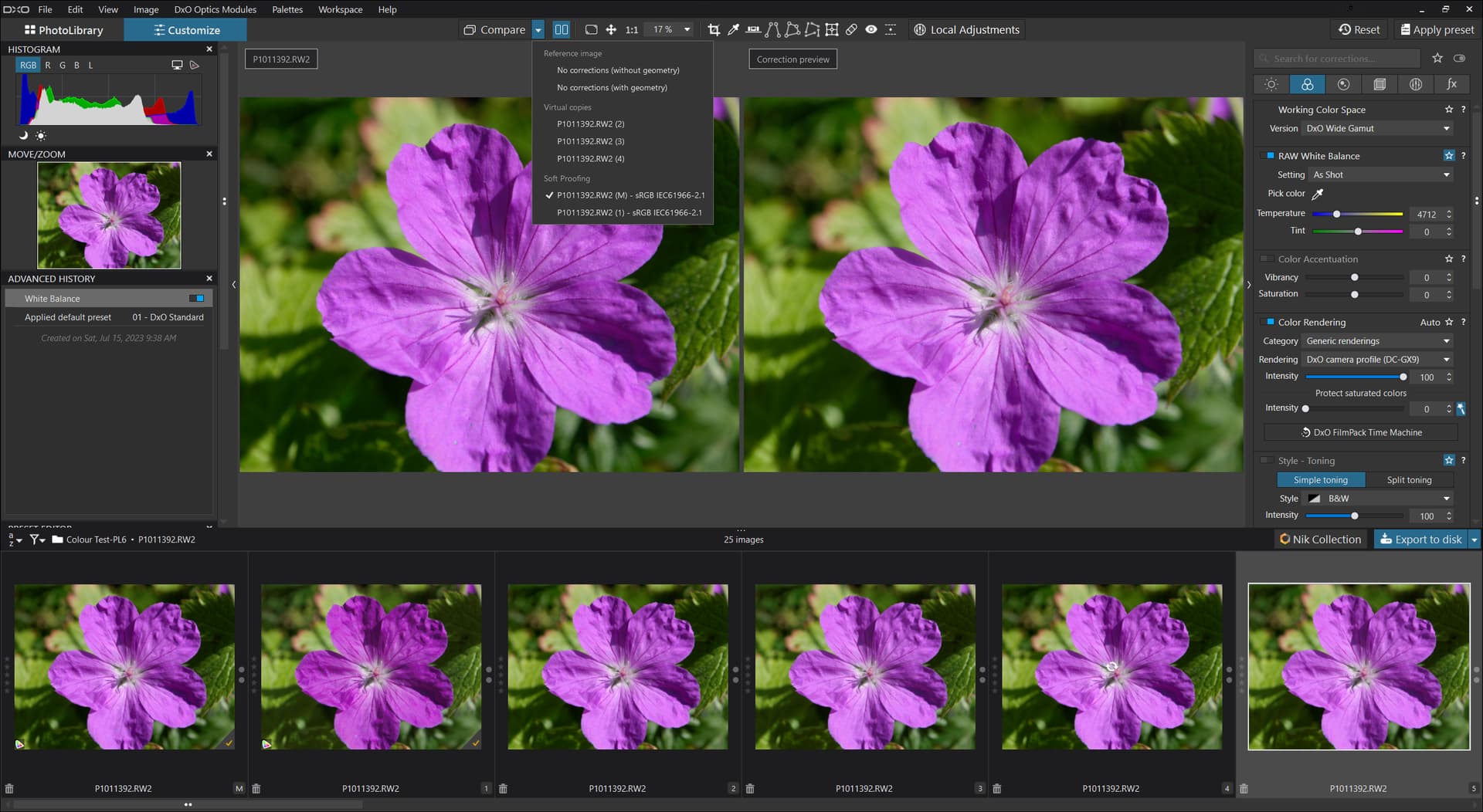
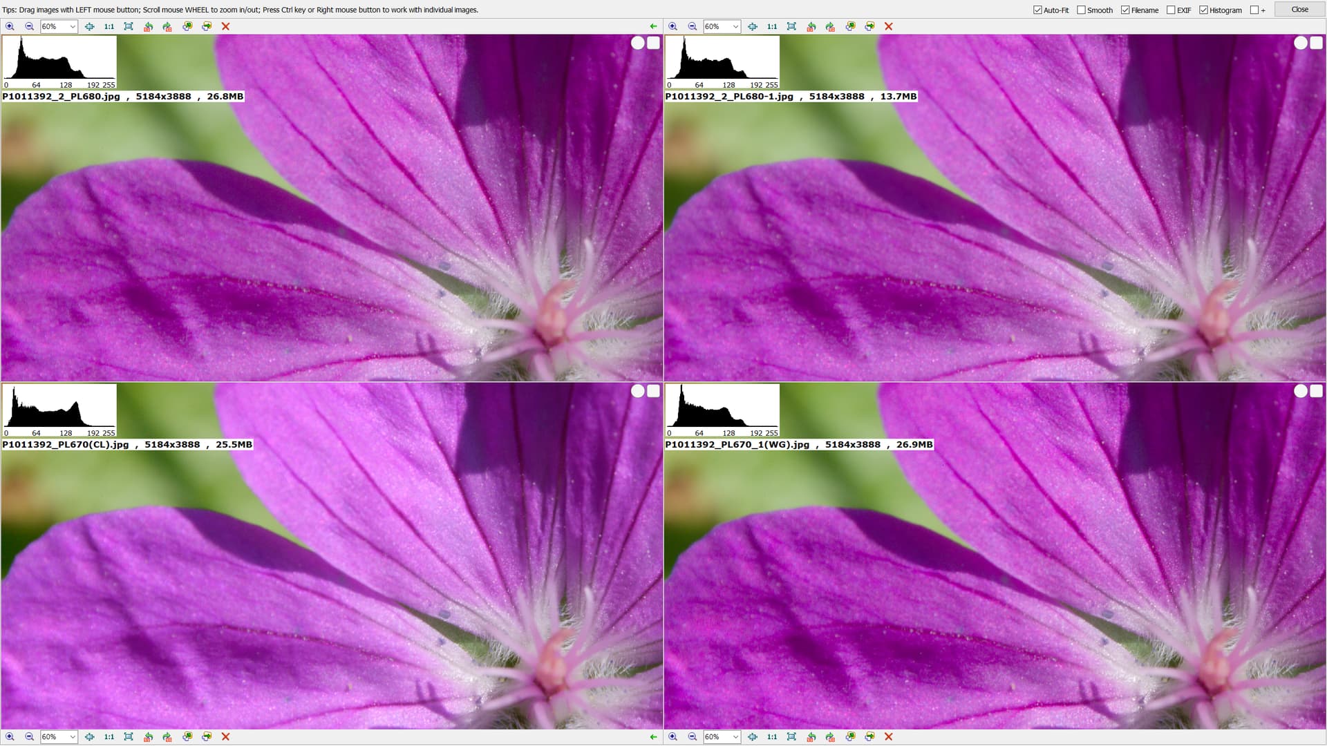
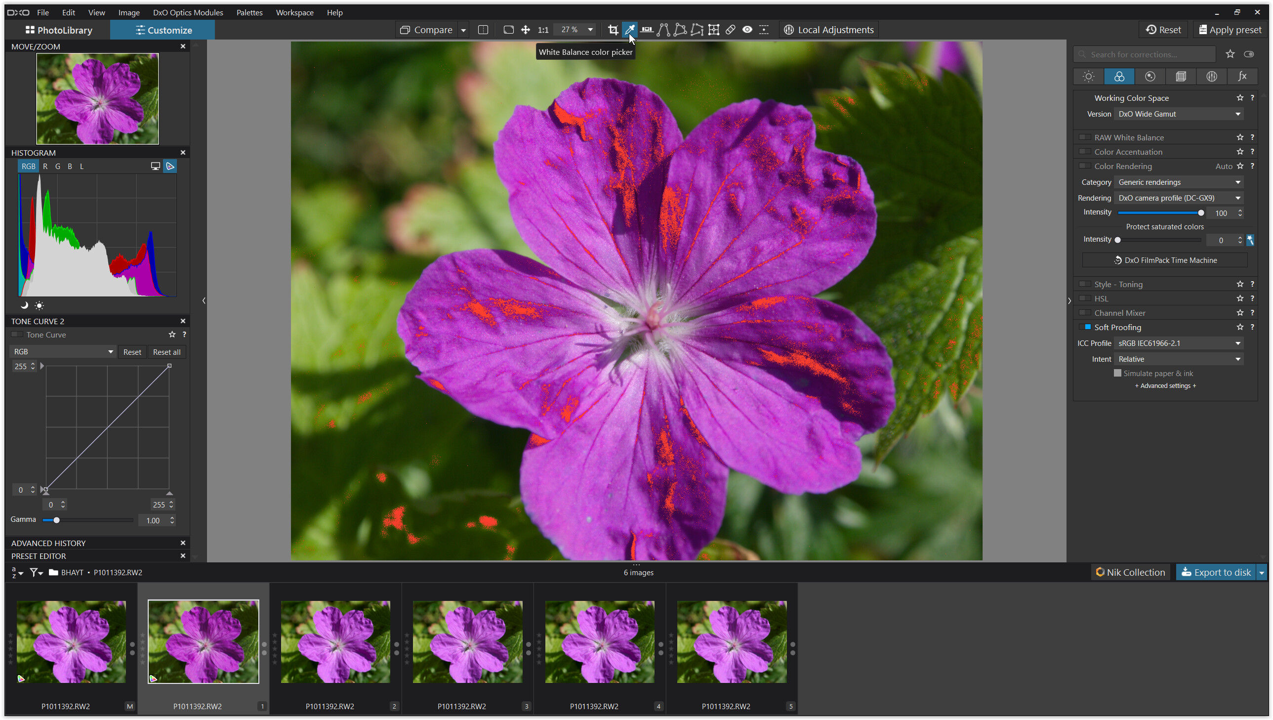
Bryan –thanks for this comment regarding geraniums – it really helps to appreciate what has been motivating your posts. Yes, as you, I, and others here have posted, it is rather easy to get decent on-display matches between files edited in WG or CL color working spaces. You found, however, by using Beyond Compare that while these images appear similar, they are not identical. My methodology is different – exporting uncompressed, 16-bit TIFFs and examining in FRV – but I’ve come to the same conclusion. Aside – I used your image and, as chance would have it, some rather vivid images of orchids in my tests!
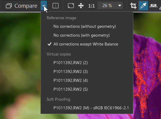
If one of your goals is compare the colors of new geranium hybrids with your past captures, I would suggest sticking with the CL workflow. This limits the range and richness of colors that are in play, sure, but the consistency will be there. Ditto for revisiting older images where you want to retain the original CL edits. For everything else, I suggest moving completely to WG. Either workflow can be reasonably color accurate (consistent at least), but given what DxO has written about this matter and what our experience has told us, mixing and matching is a fool’s errand.