DXO Wide Gamut problems

I have a problem with DXO Wide Gamut and some of repro images of converted Agfa Color -slides that I have converted to a brownish tone because some of them have lost the entire green RGB-channel. Wide gamut is fine for my digitally born images but not for my brownish converted color slides.

If I apply Wide Gamut on the master color RAW the switch from “Classic” to Wide leaves the same image totally unchanged on my monitor. So it´s just the brownish converted image that gets affected.,

DXO Classic - Legacy

DXO Wide Gamut (default)

As you can see the color of the overall has switched from brownish to something greyer, which is unacceptable for me in this case.

I didn´t really see this come :frowning:

Well, without having your ‘converted’ file available, I played around with

grafik

and yes, DxO Wide Gamut changed the colour’s strength (a bit like saturation).


So, stick with Classic Legacy – and thanks to remind us.
:slight_smile:

1 Like

Thank´s for your input Wolfgang!

Same as @Wolfgang.
Do you use any output device that needs a larger color space as AdobeRGB?

George

@Stenis Since you have started a topic about ‘Wide Gamut’ I hope you won’t mind me “gate-crashing” to ask for advice @Wolfgang and others about something that puzzles me!

What is wrong with my logic in the following (which has changed somewhat while writing this post)?

The issue arose while I was toggling the corrections option to view the changes I had made to an image and noticed considerable changes in colour with ‘Classic(Legacy)’ (CL) selected which I had expected to happen with ‘Wide Gamut’ (WG) selected?!

But looking at the following it appears that ‘Wide Gamut’ is “closer” to the outputs from other Raw processors and CL is the odd one out! So why has DxO been using the more muted scheme for so long?

So this is an image with ‘Classic (Legacy)’ selected (PL6.7.0) with all options off (the [M] copy)

and this is the same image with PL5.12.0 where the only scheme is ‘Classic(Legacy)’

and for confirmation this is PL4.3.6

Then things get even more interesting when I compare the original RAW with the exported images from PL5120, PL670(WG) and PL670(CL) in Fast Raw Viewer (FRV) which can show a RAW or the embedded JPG.

and for the sake of completeness this is the comparison with the embedded JPG replacing the rendered RAW in FRV which is much closer to the CL exports from PL5 and PL6

This is Affinity 2 with all options off

and an FRV comparison of the exported image

and ACDSee Gemstone

and RAW versus Gemstone versus Affinity 2 versus PL6.7.0(WG)

This is the image

P1011392.RW2 (23.0 MB)

and the PL6.7.0 DOP

P1011392.RW2.dop (23.4 KB)

1 Like

Not now and often I’m fine even printing in sRGB. I have just done some testing to see how it behaves. I have full control over my color management especially since I bought my Epson P900 for almost a year ago now.

Some people using new Mac-devices claims their devices support wider gamut than Adobe RGB today. Still the webb is sRGB and we have to adapt our image derivates to the environment they are to be used in.

Maybe in a close future some users will need DXO Wide Gamut as a base for high quality derivates to take advantage of what the new displays can handle. Some people will start to demand that their wider gamuts than Adobe RGB should be able to be used throughout their workflows from displays over their converters to their printers. We are not there yet but there is a reason why even DXO took on the task of redesigning Photolab for a wider gamut than Adobe RGB despite most people will consider it a unessessary “overkill”.

For me it will be as important as today to have my calibrated display in sync with what comes out of my printer regardless of the gamut I decide to use in my workflow and of that reason I thought I needed to test even DXO Wide Gamut because if it could be used as a standard gamut in Photolab 6 and later without causing any other visible problems for me and the images I produce, that would be convenient. I can just verify that was not the case for me with my repros of old Agfa slides. Sadly they do get affected in a way I’m notcsatisfied with.

@Wolfgang I always try to get in sync with and take advantage of new functions in Photolab. Sometimes there is an active choise to do so, It might be the need of converting the images to a new upgraded processing engine or to take advantage of Deep Prime XD to get even better details and more clean images. Just to stick with old Legacy tech because its more simple and “good enough” is not anything I like to do.

Very interesting. I had a thought to convert all to Wide Gamut if the working colors would be more natural with that gamut but before that I would gave to test the whole fow to my P900 once more.

I am pretty reluctant to that though since I am very happy with my printing now but I think I will have to do it anyway sooner or later.

Even Adobe RGB won’t be the printing standard for ever, despite it today is considered “good enough”.

2 Likes

Web is not the target for everyone.
Srgb is not able to reproduce all visible colors.
Actual sensors are able to record colors which are out of adobe rgb space. So old photolab color space loose them if existing (depends of your subject).

This is what this new color space is about :
Beeing able to FULLY (I hope) use what digital cameras are now (and later - I hope too) able to record.
I often see poster advertising campaign which most likely could not have used photolab old color space.

You can not claim being a top notch company who do lot of testing to get the best from camera/lens combo and having a result which eliminate some colors actuals sensors are able to record.

That’s all.

This is why old color space is still here :
To keep compatibility with “old” workflows.

Don’t use a hires camera if you only produce images for web, and don’t save in large color space if you only need srgb. No ?

But some other want to be able to FULLY use their equipment when needed.

2 Likes

And I would add it can also have repercussions when processing after demosaicing (in photolab) even with not highly saturated colors.

Imagine a fisrt tool (contrast for example) which, as side effect, saturate too much colors, then a second tool which desaturate colors to put them back ok.

Saturation could go to far in the first stage (contrast) in small color space and some values be clamped, and when desaturating, because of those loosed informations, result can be truncated.
When in a larger color space, this clamping could have be avoid.
So this can even have impact on not too much saturated colors depending on process.

I assume here that functions are applied one after the other in the processing pipeline and not “reduced” to a unique function before applying - which I’m not sure about since I’m not a photolab engineer.
But several clues seems to support the first hypothesis.

1 Like

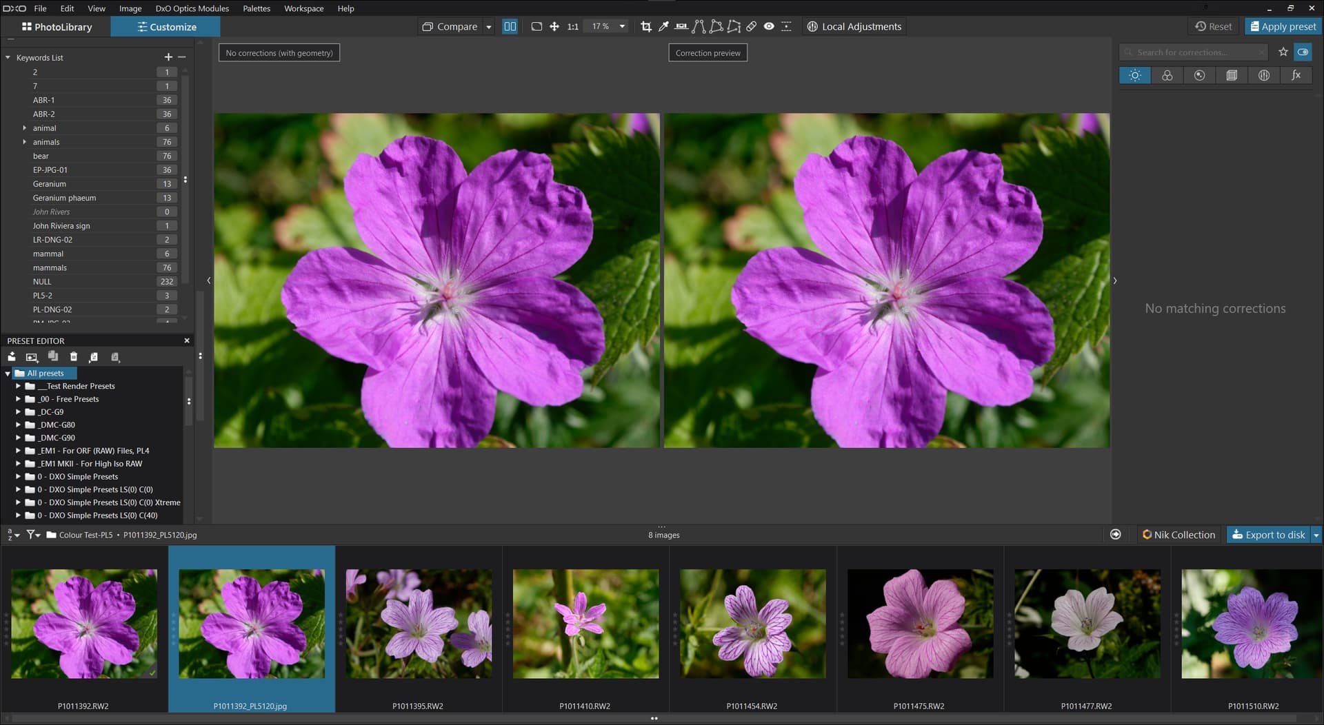
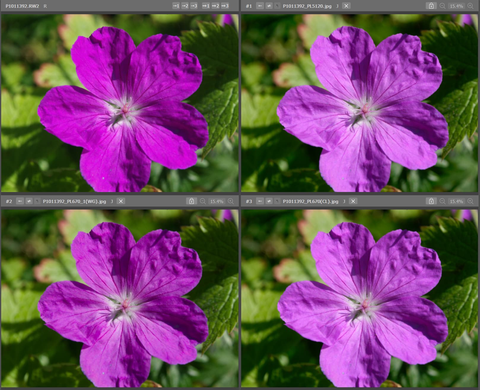
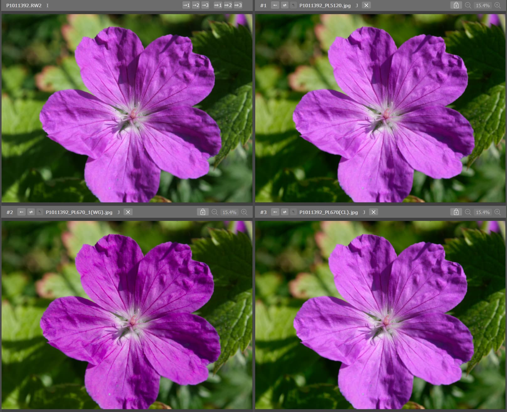
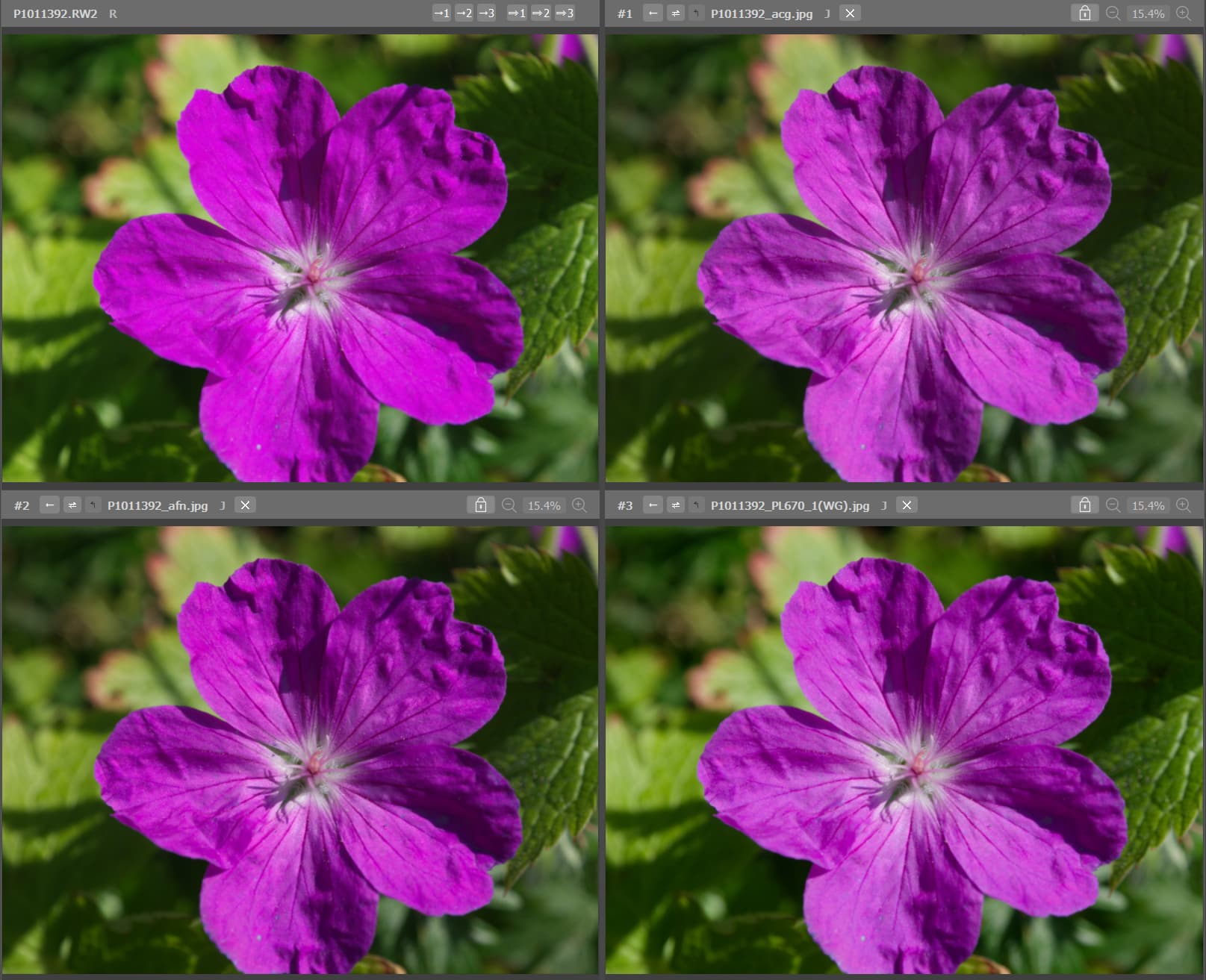
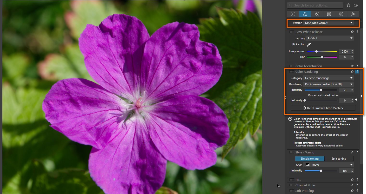
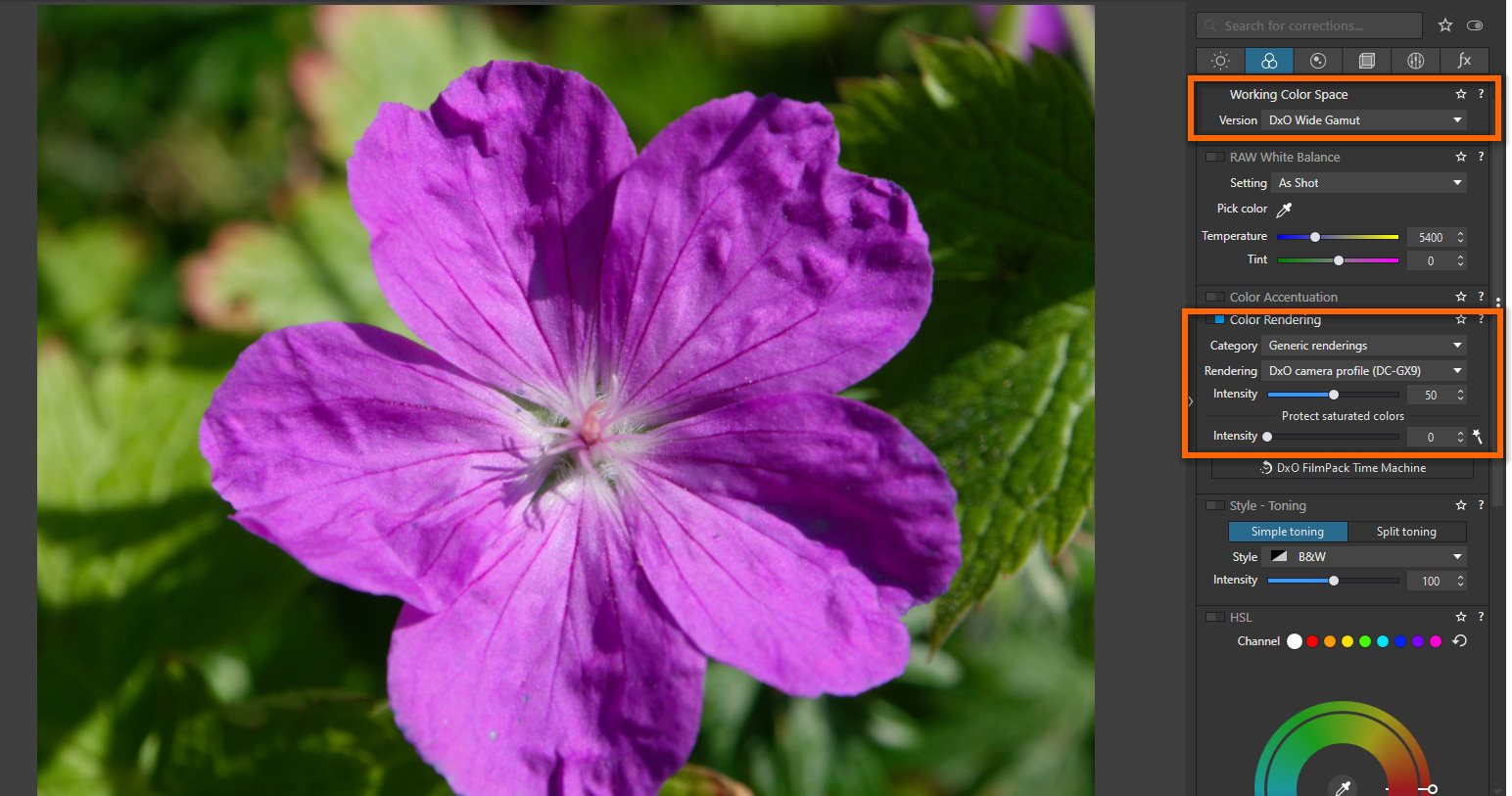
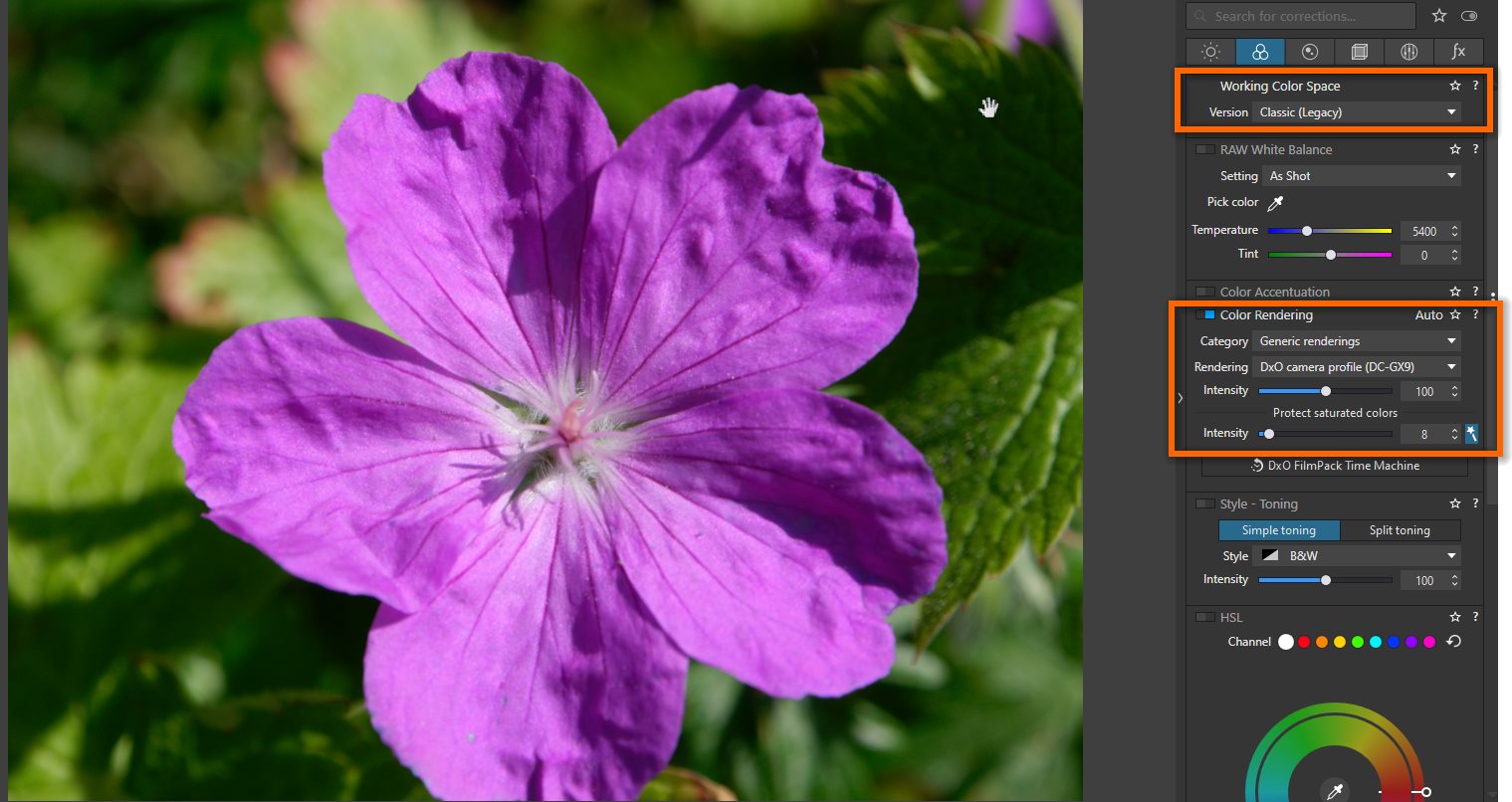
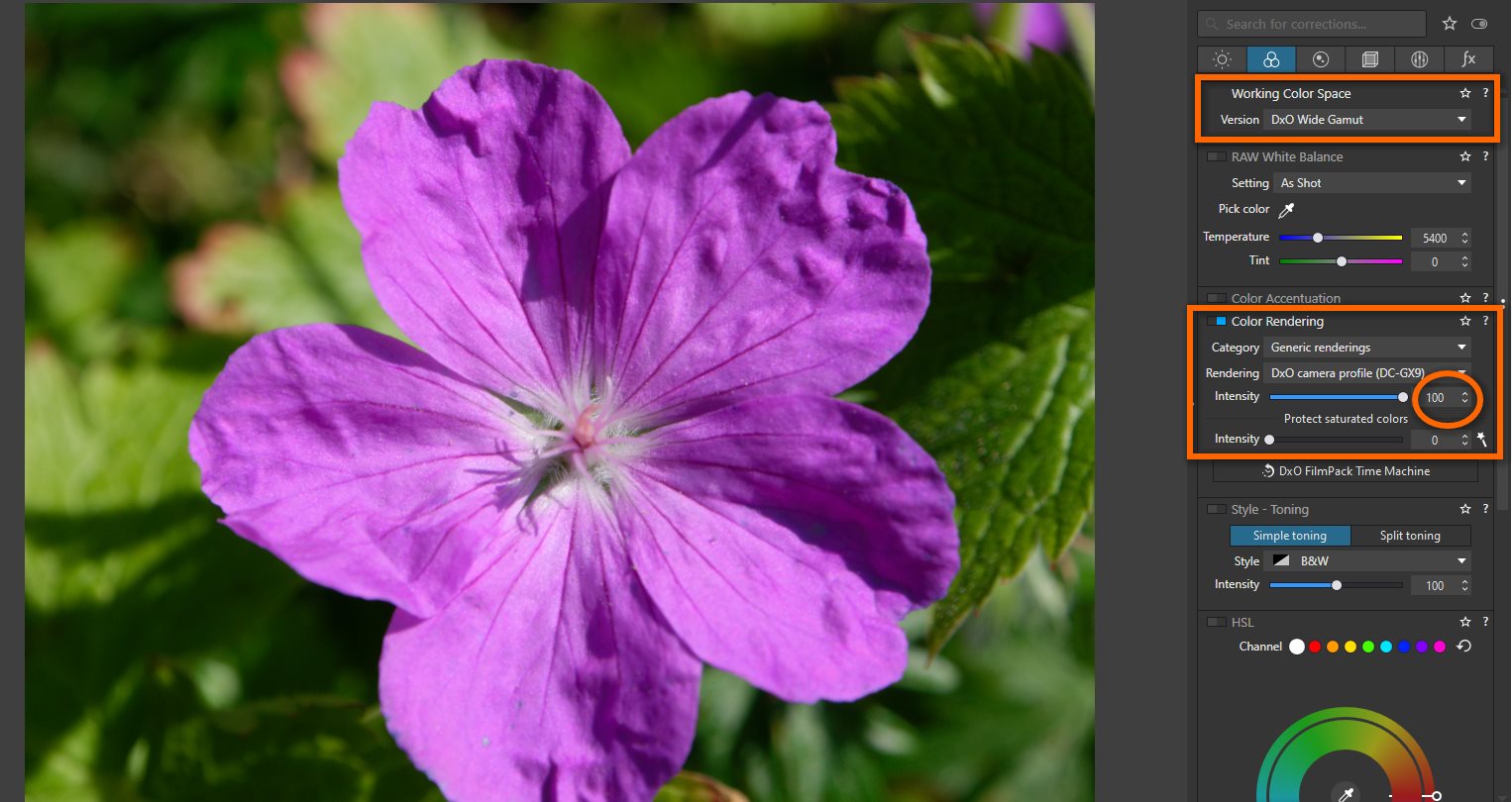
After downloading your raw file and .dop file. I’ve notice that “DXO wide gamut” working color space is displaying darker flower than “Classic” working color space.

It was set to 50 out of 100 for DXO Wide Gamut. When cracked up to 100 on the intensity scale the difference between “DxO Wide Gamut” and “Classic” is very small. When I turn off the rendering intent, I do get darker looking flower image. I am not quite sure how rendering is done in the background.

It would seem that slider for intensity of color rendering pallet was set to 50 instead of what I think was default of 100. Even if color rendering panel is off, I think the intensity slider still applies.

sshot-3289

According to DXO Manual this is what it says:

Working Color Space

DxO PhotoLab (from version 6) uses an extended color workspace: DxO Wide Gamut, in addition to the Classic profile (Legacy), which matches the Adobe RGB 1998 profile, kept to prevent users from applying unwanted changes to images that they have already processed. The Colorimetric Space Subpalette lets you to manage images according to their color profile and convert them:

All images processed in versions prior to DxO PhotoLab 6 will use the Classic colorspace, but you can convert them to the DxO Wide Gamut space.

All new images opened in DxO PhotoLab 6 use the DxO Wide Gamut color space, for even richer colors.

Converting images processed in Adobe RGB to the DxO Wide Gamut profile may change some colors and so, depending on how the picture looks, you may need to redo some corrections.

Indeed, soft proofing is available for the DxO Wide Gamut space, as well as the Legacy colorspace.

Important

Since version 6 (October 2022), DxO PhotoLab is no longer constrained by the color space of the input image, as each one is converted to use the expansive DxO Wide Gamut color space. For most screens with restrained color spaces, out-of-range color warnings may appear in the Soft Proofing tool when correcting images. However, getting rid of these warnings should not be your aim as they do not concern the quality obtained in exported files or prints.

Since DxO PhotoLab 6.3 (February 2023), the DxO Wide Gamut color space applies to both RAW and RGB files (JPEG, TIFF, linear DNG).

Color rendering (DxO FilmPack not activated) – ELITE Edition

Every camera, every processing software, and for traditional photography, every film, has a particular color rendering (and some renderings have contributed positively to their manufacturers’ reputations). The purpose of the Color Rendering palette is to simulate the rendering of a camera or film. Beyond aesthetics, this correction has a practical application for photographers who work with multiple cameras, enabling them to unify the appearance of their images regardless of the camera used. And professionals might also want also to deliver to their customers a neutral set of images that bears no noticeable signature of any particular camera.

Color rendering (DxO FilmPack enabled)

Starting with version 6.0, if FilmPack is enabled, the DxO FilmPack Time Machine button appears in the Color Rendering sub-palette. Clicking on it will open the Time Machine floating window that lets you browse through an illustrated history of photography, from the 19th century to the year 2020. You can also apply directly the presets proposed by Time Machine (see the section on DxO FilmPack and Time Machine for more details).

TIFF or JPEG images

As with several other corrections, Color rendering is inherently limited when applied to TIFF or JPEG images: the images have already been processed to some degree, and thus there is no access to the original file data. So for these formats, only certain film emulations are available.

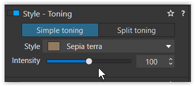
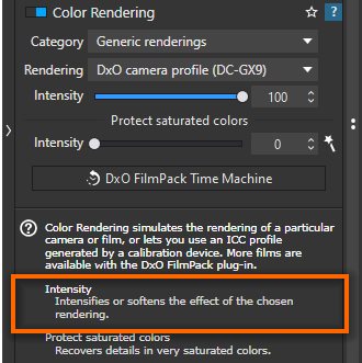
You can access film options by combining certain choices found in the two drop-down menus, Category and Rendering (see below). The Intensity slider allows progressive changing of the original image into the selected emulation. The default setting is 100, with 0 for the original image, and all values above 100 “hyper-correcting” the image.

RAW images

Because RAW images still contain all the luminance information and have never been converted into any color space, they are particularly suitable for the Color rendering correction. This means that many creative opportunities are open to you, as you can see from the contents of the two drop-down menus Category and Rendering:

Generic renderings: Camera Body is the camera default rendering: if you select a JPEG file, the rendering will match the manufacturer’s. In the second dropdown menu, you have the choice between four “neutral color” settings, which differ slightly only in the shape of their tone curves (i.e., contrast levels). Of these, the Neutral color, neutral tonality setting is our baseline for switching from any color rendering to another.

ICC Profile: Choosing ICC Profile opens a dialog box for browsing your file system to find color profiles that you might want to use. Remember that an ICC profile is a set of data that characterizes any visual device such as a camera, a screen, a scanner, etc. As with JPEG or TIFF images, an Intensity slider allows a progressive change of the image’s original color space into another. At 0, only the original image appears; 100 is the default setting; and above 100, the image is “hyper-corrected.”

DCP profile: See Using DCP Profiles for more information.

Intensity Slider: The Intensity slider enables gradual changes to the rendering of the original image in another color render. 0 matches the original image, 100 is the default setting. If the color profile is Classic (old), values above 100 will allow for extreme corrections. If the color profile is DxO Wide Gamut, the maximum value is also the default 100.

Protect saturated colors: The Protect saturated colors correction prevents some specific saturated colors from being clipped, which may lead to unnatural colors and loss of texture when a particular color channel is close to the minimum or to the maximum luminance intensity (0 or 255). This process is performed automatically; you can fine-tune or modify the result with the Intensity slider. Clicking on the magic wand restores the image to the original automatic setting.

https://userguides.dxo.com/photolab/en/general-image-corrections/#color_rendering

You started by converting old Agfa slides, which over the time had lost some colour, and I suppose the colourized output has a limited colour range. In other words, for this source you don’t need a wider colour space, what doesn’t hinder you to make use of it – but then from the very beginning to avoid further colour space conversions and reprocesssing. The question should be to keep your workflow simple.

  1. Depending on the source file
  2. for printing with an Epson P900
  3. on the better papers

it can make sense to work in DxO Wide Gamut and to export in ProPhoto RGB.
But the million dollar question remains, what is your monitor capable of to show you?

  • Editing in a wide gamut colour space while viewing on a (somewhat) limited monitor
    always bears the chance to get unexpected or unwanted results.

@MSmithy already noted, that some setttings have been changed with the introduction of DxO Wide Gamut. As proposed in the quoted DxO manual, for older pics stick with Classic Legacy, which is AdobeRGB maximum. Otherwise one might need to reprocess the pics.

Comparing the developed output of different software doesn’t help to find the ‘truth’, neither does comparison with ooc-JPEGs. – There are (too) many details that need to be clarified first, and unless you are familiar with colour management, it will most likely be confusing.

  • The really interesting (practical) question is, what is your monitor capable of to show you?
    What colour space are you editing in?
    What do you export for?
    Do you use (and understand) softproof?

Note – editing in a wide gamut colour space while viewing on a (somewhat) limited monitor
always bears the chance to get unexpected / unwanted results.

1 Like

Right I just lifted that there might be problems with some images of different reasons to apply a wider gamut wether they will be used on devices that can take advantage of a wider gamut or not. The example I just have shown you is very visible in Photolab 6 of today even on a sRGB-monitor and THAT is the real problem for me. I have a little hard to grasp that a switch from a more narrow gamut like sRGB to DXO Wide Gamut should result in a color cast like that. I would expext something like that to happen if I went from a wider to a more narrow gamut but not the other way around.

The DXO Wide Gamut is the new default wether we like it or not as the base in Photolab. Most of us will still adapt to sRGB or to Adobe RGB because that will still make more sense practically when exporting our image derivates to be used on monitors or printers.

We are not there yet where our complete workfows are adapted to take advantage of DXO Wide Gamut so this discussion is really a theoretical one to a very great extent.

It disturbs me that a switch to a wider gamut on an image with such a limited span of colors as my digitized color slides can’t be managed by Photolab without changing the colors. If I do the same on the master RAW the colors are stable but not on the Virtual Copy!!!

I have a Benq 4 K sRGB that is about 5 years old and I will soon upgrade to an Adobe RGB monitor. Today I use sRGB even for printing since the important thing for me is to have complete sync between minitor and printer outpot - and I have. I never print portraits in Adobe RGB of this reasons since they would get yellowish and reddish color cast.

I’m really fine printing in sRGB and have no problem with the quality I get out of my P900. The qualiity of what is coming out of my P900 most of the times makes me speachless when I print on Canson Infinity Etching Rag (matte). It’s a really white paper and together with the deap matte black of the P900 it really gives a powerful lift even of my color images.

Today I have a really streamlined workflow where I use sRGB for everything without any need to separate two different workflows. I know what I gain and lose with sRGB after extensive testing and I wonder if people really are aware of how these differences really looks.

If I were to set up a blindtest with 20 random Adobe RGB and sRGB–prints (10 of each and 20 different motifs) I wonder how many that would nail them all. I’m pretty sure I would not.

So even with an Adobe RGB compliant monitor I will continue to export 4K JPEG-files in sRGB as my standard and just switch to a wider gamut the fewxtimes I prepare a print. I use far more sRGB derivates for my reports and stories on my photoblog than the few images I print in A2 mostly. I don’t really feel I’ll kill for a new Adobe compliant monitor despite I will buy one anyway soon since I will like a bigger screen too and the later reason is really the more important for me.

I don’t know if it is mentioned already, but when selecting wide gamut color rendering is off by default. Turn it on and see what happens with your image.

George

@George

Have you totally missed my first post???

I don 't understand why you wrote what you wrote.

Can’t you see the color cast Wide Gamut has caused in the second image??

Even Adobe RGB-monitors “is a somewhat limited monitor” in this case. Remember that the Legacy gamut in Photolab is Adobe RGB and that us what we all used to use before PL 6.

The interesting thing here is that a switch of gamut might give unexpected color casts in some images undrr certain conditions. So gamut conversions needs to be tested carefully. So I don’t think it’s a very good idea to mass-convert my old images to Wide Gamut at all.

I just did it read over again.
Did you read my post? :neutral_face:
Wide gamut and color rendering on gives sometime the same result as classic gamut. Wide gamut and color rendering off might give a wrong color.

George

Hi Bryan – try applying the DxO Standard preset to your uncorrected (all options off) image in both DxO Wide Gamut and Classic working color space, then export as uncompressed 16-bit TIFFs. View the exported images on an sRGB or aRGB display – they should all appear the same. This is a demonstration, I think, that the difference you are seeing in the uncorrected image is simply the difference in the “secret sauce” that DxO PL is applying during the initial demosaicing step.

What is the point with a switch like that?? Why have a default with a DXO Wide Gamut selection that doesn’t render the colors that corresponds to the ones displayed with the more narrow gamut used originally? I guess most people would expext a wider gamut would be able to display all the colors visible in a more narrow gamut and hold them stable over the switch,

No. The wider gamut is your working color space. What you see is in the gamut of your output device. The more difference between them, the more correction has to be made. Just try it, and if you don’t want don’t do it.

George