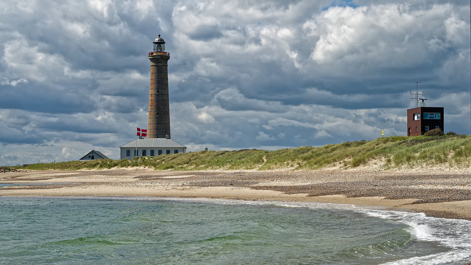
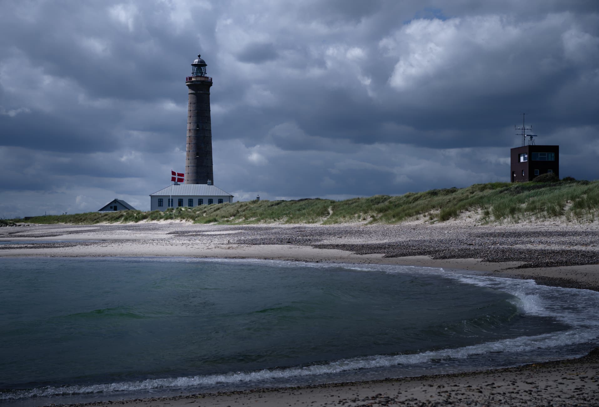
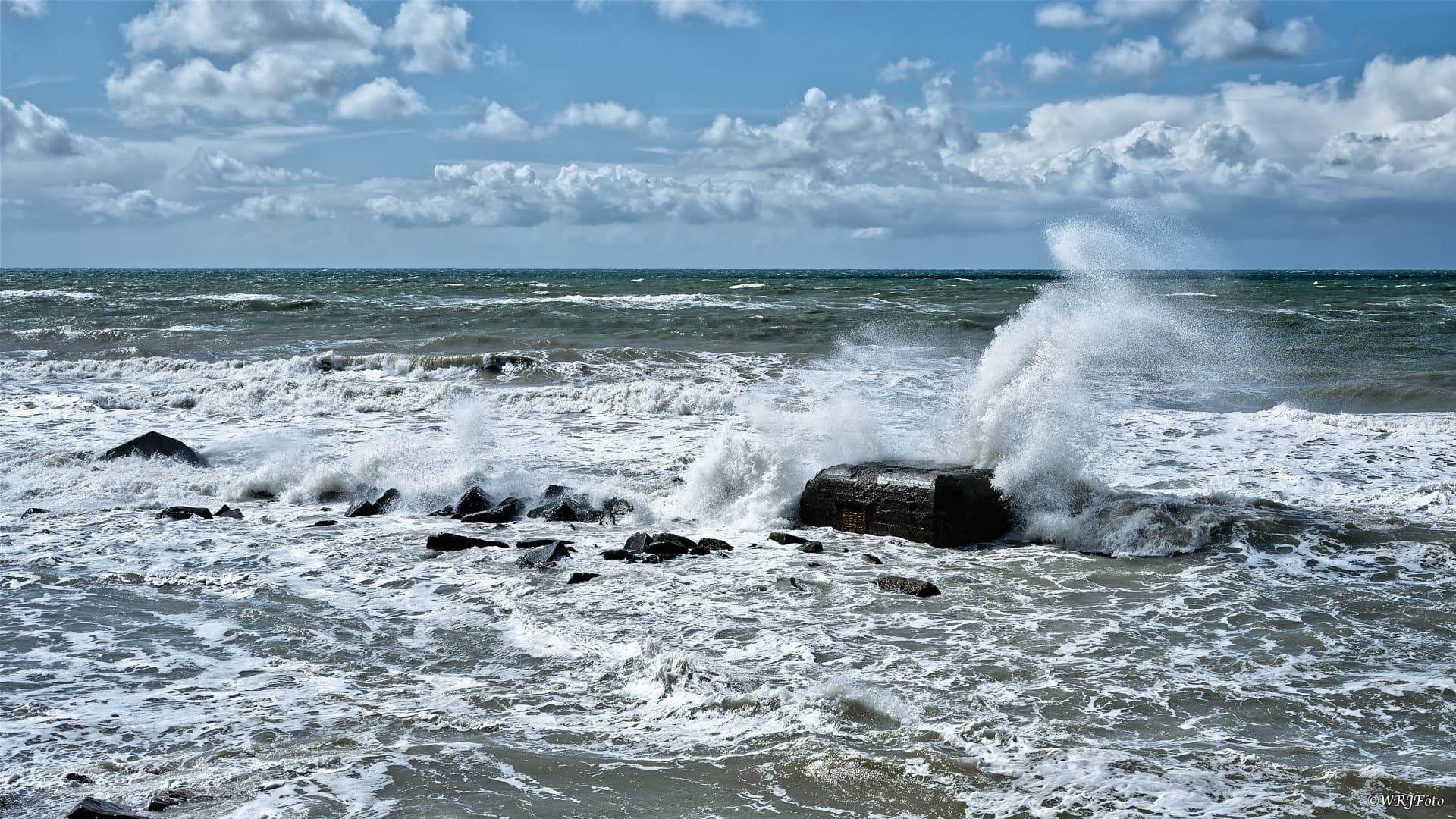
This summer we spent a wonderful holiday in the north of Denmark. This picture of the lighthouse in Skagen was taken there, Skagen is the top of Denmark.
On the road with the Nikon z6II and the Nikkor Z 24-120/4.
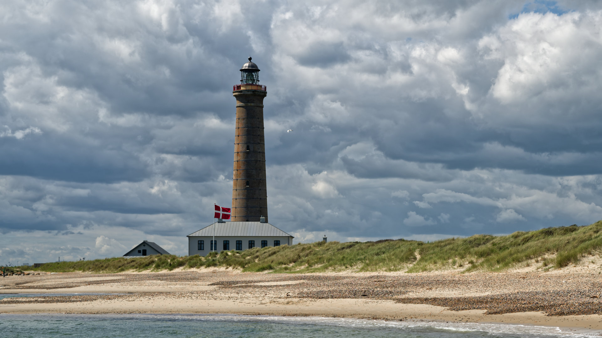
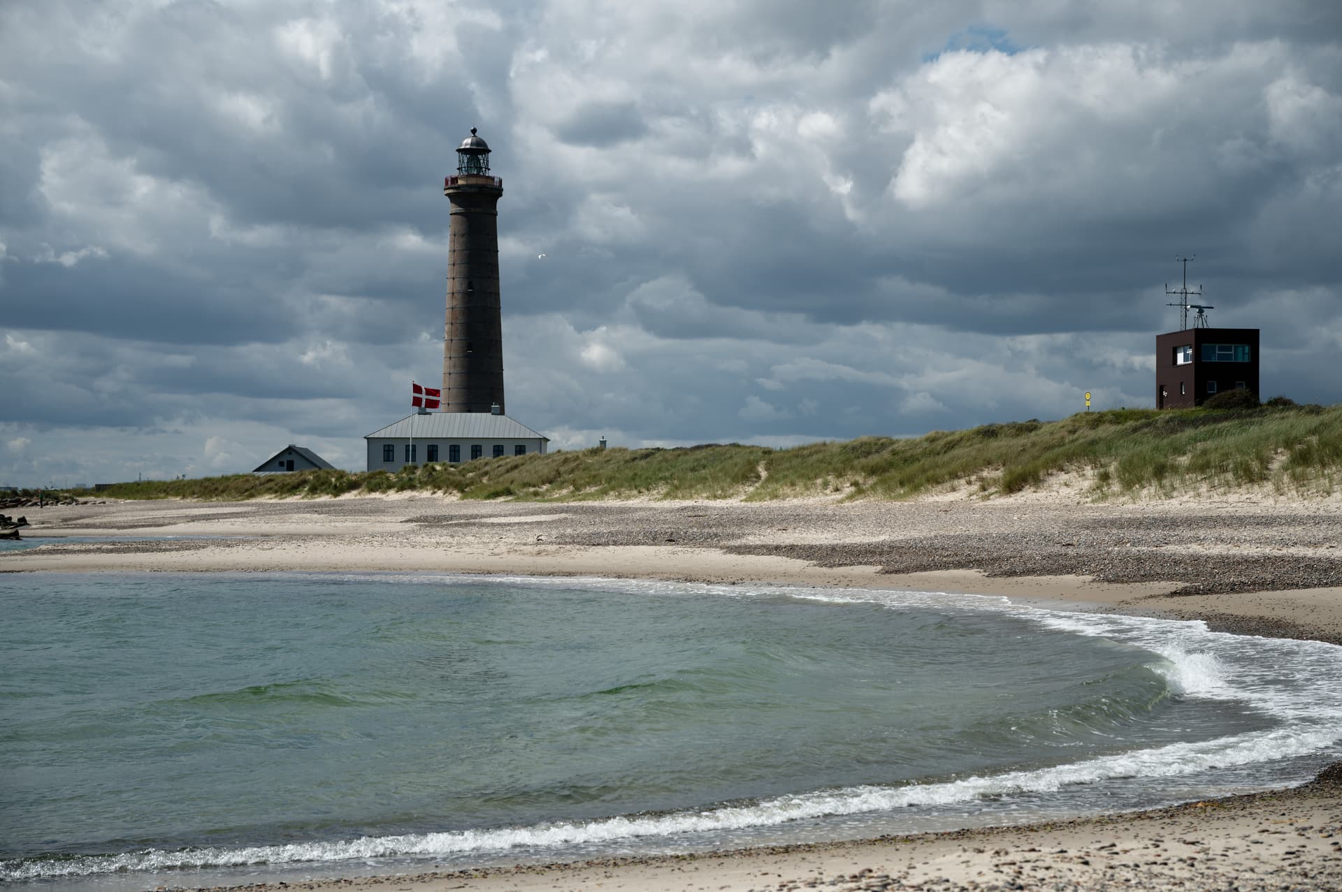
It is a beautiful original photo, but in my eyes it is overprocessed to the point of looking like it was taken with a smartphone rather than a professional camera.
My biggest gripe is the oversharpening. You can see clear outlines around all contrasting edges. There is a bright line on the brighter side and a dark line on the darker side of all edges. Unfortunately, PhotoLab tends to do this in its default settings (especially with already sharp lenses) and you need to drag down the “lens softness correction” quite a bit to get rid of that artifact.
I also sense that there is too much dynamic range compression, with brightened shadows and dampened highlights, which reduces the sensation of 3D depth, making it look flat like a painting or a smartphone photo. This is a matter of taste, of course, but I personally prefer the 3D depth feel that dark shadows create, even they make it harder to make out some of the details there.
Many thanks for the comments.
The oversharpening is not visible in DxO, my mistake was to use “bicubic sharper”.
Otherwise I have edited everything again and hope that it comes off better in your strict eyes
Thanks @Joanna , It looks unusual, but I like your settings. I’ll probably have to get used to it. I’ve never used such high contrast values, for example. I also used to work more with selective tonal values and micro contrast was my all-purpose weapon.
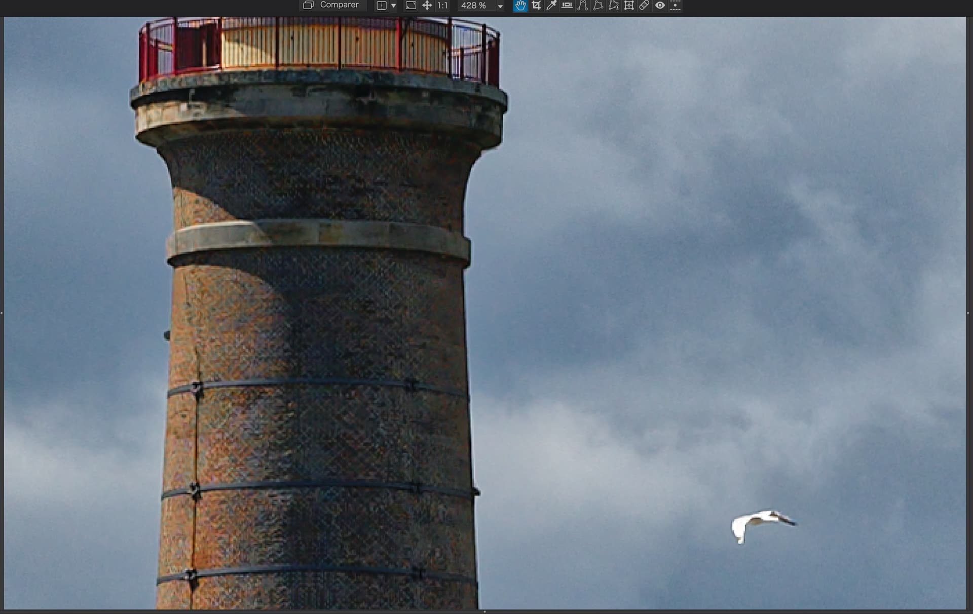
I have never used 400% zoom …
First try: Rendering: DxO – Vibrant at 100%, SmartLighting=Medium (as in OP), Temp=6200K, Contrast=+35, Microcontrast=0 (or slightly negative), plus standard optical corrections (maybe going down to 0 with Lens softness corrections). That’s all.
This photo made me realize that all my landscape photos were taken high in the mountains and ClearVision Plus=50 worked very well for many of them. For this one, I find the mood relaxed, and even CVP=5 spoiled it. For the same reason I have reset the Microcontrast to zero. On the other hand, @Platypus version is interesting to me – doesn’t look like a standard vacation photo and creates another mood. So many ways to see…
Even for mountain photos, CVP rarely goes well with rainy clouds. With white clouds it’s OK for me, just have to counteract sometimes with strongly negative fine contrast Highlights and lowering Microcontrast. Microcontrast and Midtones fine contrast, like CVP, are also very sharp knives, to be careful with.
Thank you very much for your suggestions and elaborations of the Skagen photo. As you can easily see, everyone sees and uses Photolab differently. I can learn a lot from it.
We often had stormy skies, after all the Skagerak is a weather divide. I didn’t have to accentuate it, but I like clouds and skies like that.
Sometimes things don’t have to be special, it’s the view of them that makes them special.
@Joanna We have three interpolation algorithms available for export.
DxO Description:
Interpolation: These are image resampling techniques used to define the output size and resolution as follows:
Bicubic: the default interpolation mode is precise and offers softer tone transitions.
Bicubic sharper: works like bicubic, but with heightened sharpness.
Bilinear: Generates additional pixels based on adjacent pixels.
There are a lot of explanations on the internet about how each algorithm works, but no one gives me guidance on when to use which algorithm. Do you have any experience?
Thanks in advance, best HGF
Thank you @Wolfgang , additional piece of the puzzle. as i understand, each export method should be evaluated individually for each photo, depending on the photo and export medium.
I must admit to always using the default Bicubic for web and email because, as @Wolfgang says in his article, the “sharper” version often produces artefacts and, given that, for most folks viewing our images, their monitors are often the weakest link, it’s really not worth bothering too much.
However, for printing, I wouldn’t dream of using PL’s output sharpening, whilst resizing at the same time.
Instead, if the image has enough pixels to more than cover the print size, I simply export to the lesser (printing) size with Bicubic, as a TIFF file and use Canon’s print manager to print that. If the image is too small, I export to TIFF without resizing and use Topaz Photo AI to both resize and sharpen interactively at the finished printing size.
Thank you @Joanna , 99.9% I do a downsizing when exporting, just to place the photo on the web or to send it by email. So should I best use “bicubic” for this? Of course I want to avoid oversharpening and would avoid “bicubic sharpen”.
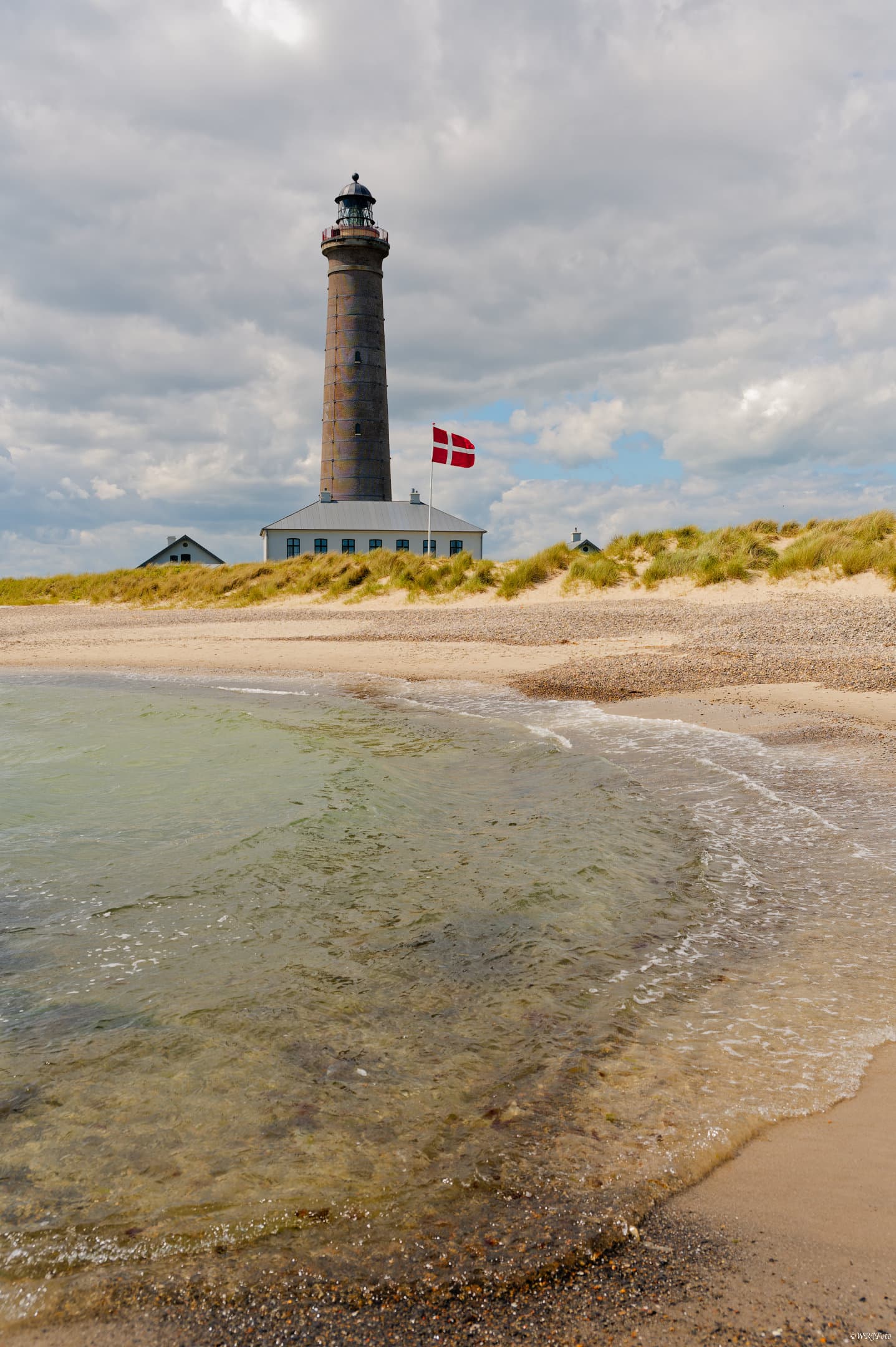
I followed the valuable tips in this thread and edited a few pictures again. Without using Microcontrast and Clearview+ and after Wolfgang reminded me again to use the Output Sharpener I changed my workflow again and send the images to Affinity Photo and after resizing to the Output Sharpener.
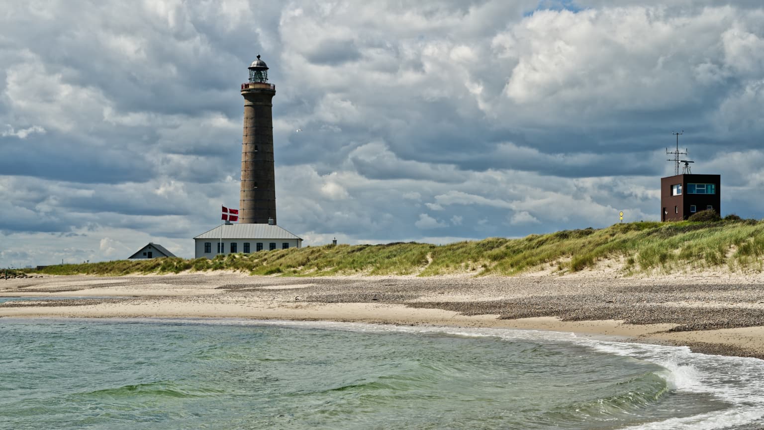
Here is the result
When you watch pics onscreen they look best at 100% without any magnification …
which means, choose the appropriate output size to export them for the web or to send out to friends … As suggested try with bicubic and check the result in PL at 100%. You must see this yourself.
Several factors can determine the outcome ( scenery / subject, light conditions, lens sharpness / by how much you apply DxO’s lens softness correction from their lens profile, your creative sharpening … ).