In LightRoom 5.7 I’ve used ‘sharpening for Web’ when exporting jpegs in FullHD resolution (I don’t remember how exactly the option was called). So the first day trying PhotoLab I’ve used ‘bicubic sharper’ and quickly switched to ‘bicubic’ setting. Personally I found ‘bicubic sharper’ creating distracting, aggressive pictures. I also didn’t like hair looking like wires. But maybe for some type of pictures ‘bicubic sharper’ is the right choice? Depends on your “customer” too. Maybe they use only smartphones to scroll through the pictures?
Actually in this case CVP might work, perhaps together with very slightly raising WB Temp. I would experiment also with Fine Contrast Highlights and maybe lower Selective Tone Highlights (you often get a “better” sky then). There is also a standard way to manipulate the sky – start with HSL global Saturation=-15 and Vibrance=+40 to get the idea.
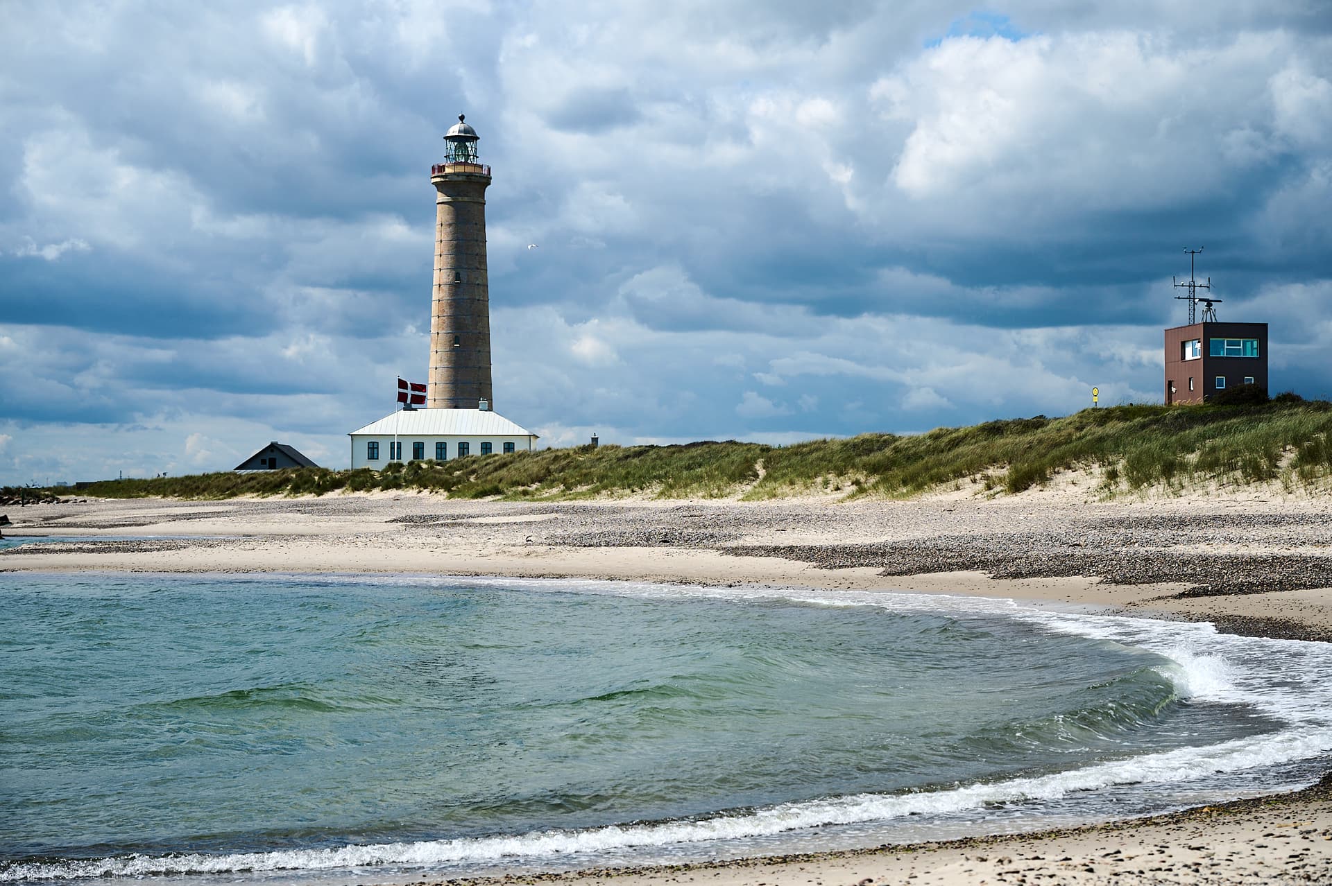
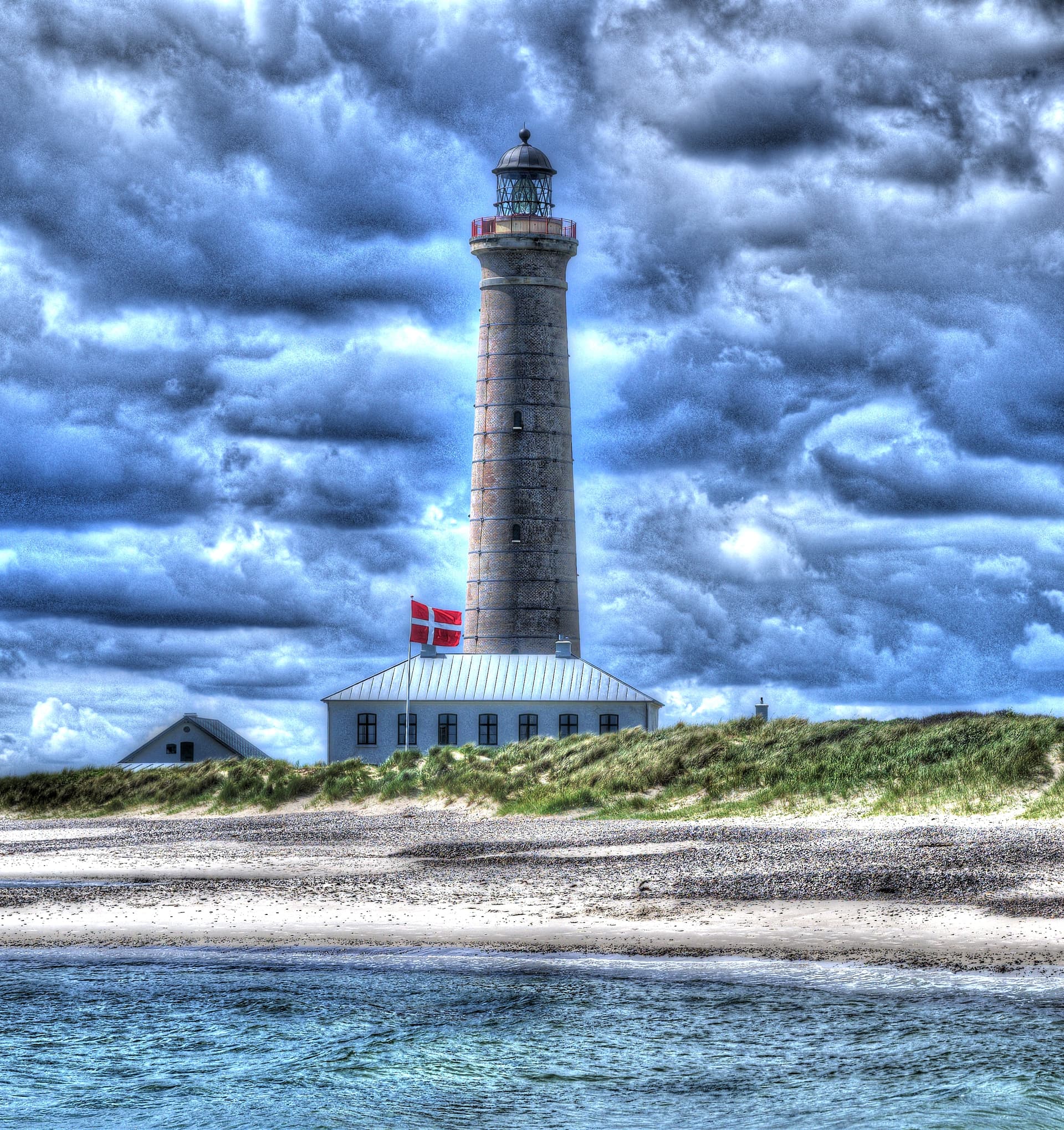
The first thing that captured my attention was the breeze whirl in the middle right – it looks intriguing, perfect moment.
Thanks @Wlodek, the most you have mentioned I have already done in a few photos, but the standard way for sky was new for me. I will try it out.
I’d like to ask a simple question.
Let’s say I am editing an image, and get to where it looks the way I want it to look.
Currently, I click on “export” and get something like this:
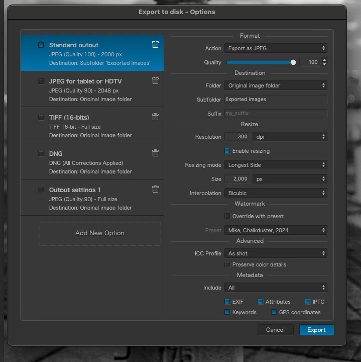
Currently, I then click on “Export” and the exported image goes into my “exported images sub-folder”.
The exported folder might be posted, or emailed, and possibly (unlikely for me) printed.
Is there a better way to do this than just following the default settings ?
I don’t see choices like the things all of you are discussing, and I prefer to do whatever needs doing from inside PhotoLab, and I certainly want the end result to go into the “Exported photos folder” where I may look for it the next day/week/year/whenever - knowing where to find it long after I’ve forgotten the specific image.
For the kind of work you do, there is no need to change anything - except the resolution which only needs to be 72ppi for on-screen display and the ICC profile should be sRGB.
Well, I was able to change them:
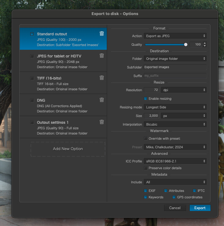
Going from 300 dpi to 72 should make the image appear smaller on my screen when I open it, which it does. I’m not sure what the practical effect of changing the image profile to “sRGB” will be.
This is the color version, exported with the new settings:
Until now, I just left things at the PhotoLab default settings.
Is 2,000 pixels wide a reasonable size for exporting my images?
This is for people to view them online, but I assume they can still zoom in as desired?
I haven’t thought about things like this since I first bought PhotoLab 3.
Please explain the simple reason for why these settings are better.
Regarding export settings, I have numerous presets. Mostly they target different uses — Flickr, my bird photo site, use on other web sites, etc. I use 6 megapixel P3 JPEGs for Flickr, for example, but full resolution 16-bit TIFF overridden to “No watermark” when moving to another application, or 4 megapixel sRGB for some of my old negative scans.
They also go to different folders. The Flickr ones have a special output folder which is watched by the app Hazel. I also export thumbnail versions of the same photos from Lightroom and Hazel copies the keyword tags from the Lightroom versions to the PhotoLab versions and then trashes the former. Most of the rest just go to my Downloads directory.
Something I had been doing and I need to revisit, is “family archive” exports. These are relatively low resolution sRGB JPEGs with no watermark. The intent being if something happens to me, family will have access to straightforward copies of all my photos (no need to wrangle RAW files).
I’ve just switched to a new computer so don’t have as many exports as I used to. I just checked the old one and it has 14 exports defined. Looking at those I see another couple which are targeted at producing suitably sized images for wallpaper on my laptop screen and external monitor.
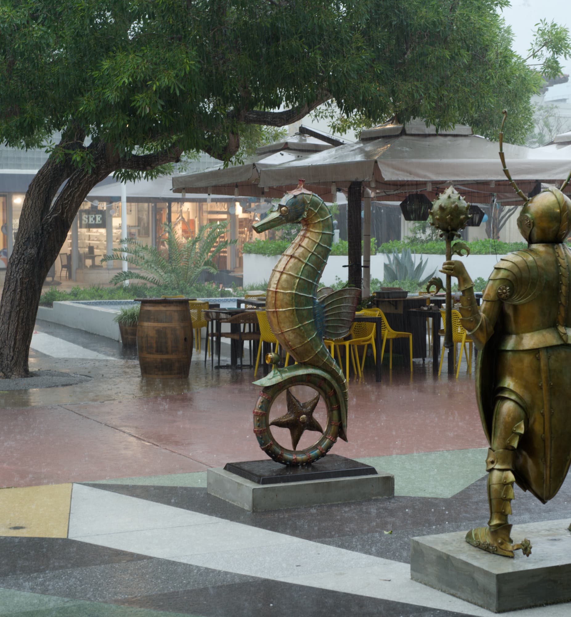
Here are 2 more versions from me.
Sometimes I play around with extreme settings and sometimes quite interesting things come out of it.
In your photo, I only used DxO PL to correct the lens and cut off the house on the right-hand side. Then I created 2 virtual copies, one with the exposure set to -3 and the other to +3. The original file remains at 0. I then exported all 3 versions to Tif in the highest resolution available. I then merged the three versions into one HDR photo in Photomatix.
Here is the result:
Even in black and white, the HRD result is not bad at all.
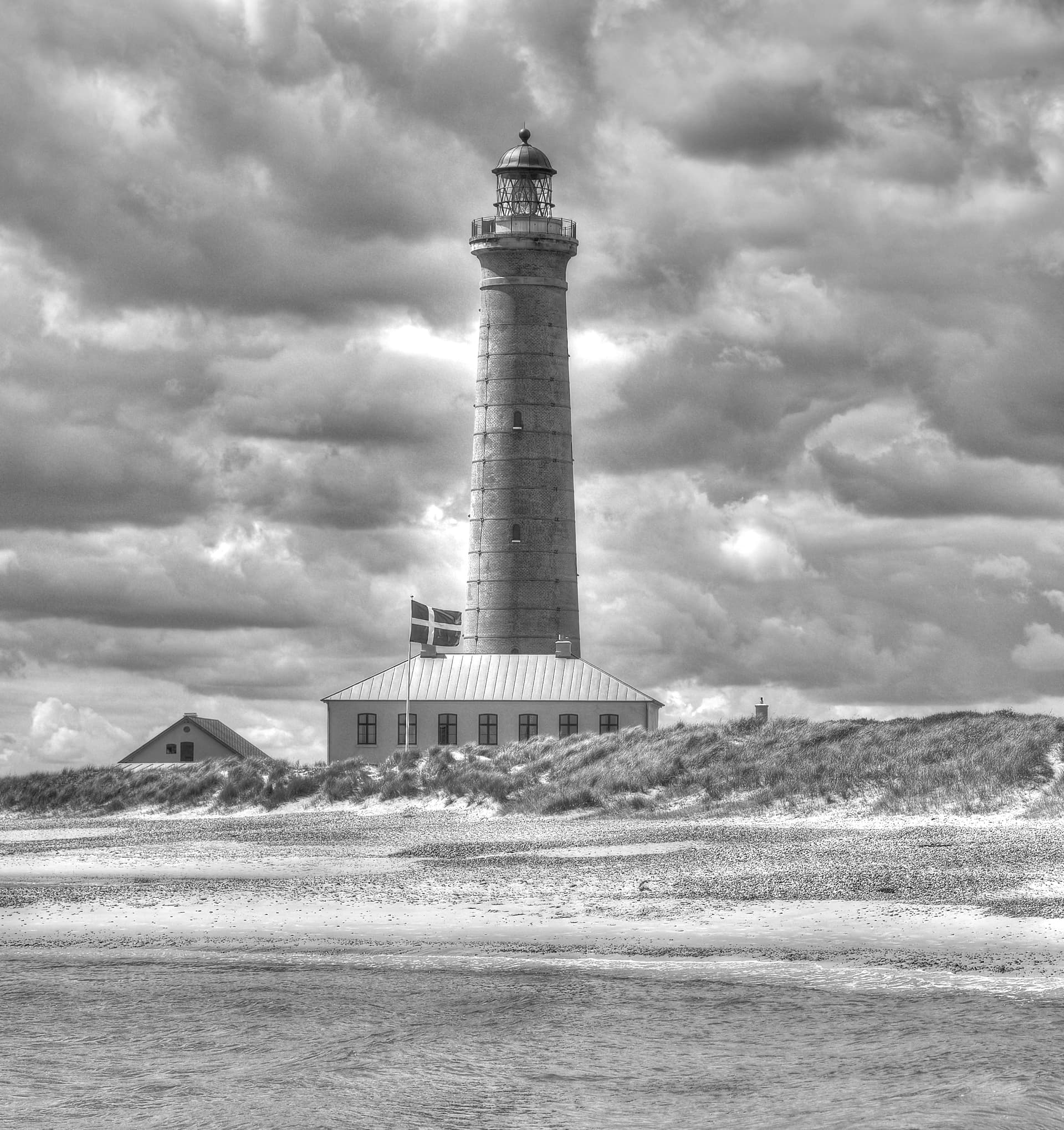
You may like it or not, it’s just an additional variant to those already suggested in this excellent forum.