PL7.5.0 exports "dark" JPGs because the user exported with a different export option

Hi Bryan,

There’s a potential catch in using the “As Shot” option - in that export rendering then depends on the color-space setting of the camera that captured the shot (sRGB or AdobeRGB).

So, if (say) the camera was set to color-space = AdobeRGB - BUT, your monitor is not capable of displaying the full range of colors in the AdobeRGB color-space, then you will probably not get the result you’re expecting.

Your response may be that; “I only ever have my camera set to sRGB - so, no problem” - to which I’d counter by saying, in that case, there’d be no problem in having sRGB explicitly assigned in PL’s export dialogue … along with benefit that you’ll never be caught-out unexpectedly.

John

If by this you mean selecting the PL export option “sRGB IEC61966-2.1”, there is a nuance that should be considered. That is, despite its name, this option only attaches a sRGB tag to the exported file; it does not embed an sRGB ICC color profile. This point, pro and con, has been discussed several times previously in this forum without resolution. My opinion on the matter is unchanged - the safer option is to always embed an ICC color profile in an exported file.

In my view, there is one upside to this situation, namely that PL here actually embeds the aRGB ICC profile at export! Thereafter, there can be no color space preference ambiguity in the exported file. Any properly color managed app or browser should display the file correctly.

No, that’s not all it does - it also (and most importantly) renders one’s image to comply with the sRGB color-space.

Yes - but ONLY if the monitor being used is capable of fully rendering the AdobeRGB color space … which may well not be the case, for other than a well-spec’d monitor.


My point really was this;

  • If you properly understand the implications of using “As Shot” in export parameters (and your equipment capabilities) - then there’s not a problem.

  • Otherwise, tho, there’s a potential catch in doing so - as you may not get the result you’re probably expecting … Or, perhaps even worse, you don’t realise that your exported result is not as good/accurate as it should be.

Agreed. Maybe for another time it would be worth discussing whether the “As Shot” export option needs to be revamped or even removed.

Well dumbing down by removing an important feature in a highly competent software is not something that will enhance the software.

As Shot is quite descriptive in what is does.
So are the text in the user guide, although they could use the identical working as in the menu and explain it better.
But it’s not that bad: …the profile of the source image

The sRGB export option could have a simple checkbox to embed or not embed an sRGB ICC profile. Done, making the As Shot export option superfluous. The current “As Shot” is confusing and often misunderstood as to what it does. There already is an aRGB export option.

@eriepa and @John-M Sorry I have been occupied trying to understand the problem and trying to get on with other household activities. Mainly I am somewhat wary of investigating this subject because I am not confident with what I am seeing and the reasons behind it?

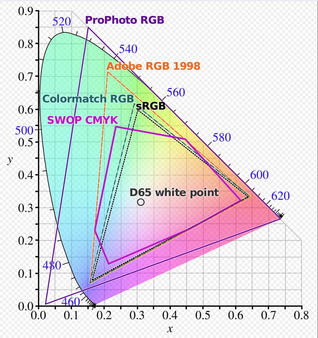
The gamut’s are essentially overlapping with ‘sRGB’ subsumed within ‘Adobe RGB (1998)’ which is itself subsumed within’ ProPhoto RGB’ e.g.

My monitors are all 99% sRGB, 2 x Dell U2515H and a Z24i, so that is all I am going to be able to “see”, i.e. colours within that colour space.

However, there are various recommendations on YouTube for working with RAWs in ‘ProPhoto RGB’ and then exporting in whatever is most useful depending on the target device, in my case that would be ‘sRGB’ because of my screen, tablets etc…

However, with my current monitors I am only ever going to see sRGB so …!?

It was never my intention to create a problem of this nature in the first place, I had (unfortunately) left an old (experimental) export test setting in place and used it for exporting without checking the export options thoroughly thoroughly.

I had compared every edit option carefully but not the export options!

On Sunday I went through the edit options on System 1 (Test) and System 2 (Daily) and simplified them a little and then undertook a number of exports.

@John-M Thank you for your input, so as I see it I can do the following

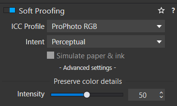
  1. Select a suitable ICC profile in the Soft Proofing options
    image

  2. Then align the export options to the same soft proofing or choose another profile or choose none, i.e. leave it ‘As shot’ (not recommended by you and I understand the reason).

OR

  1. Leave soft-proofing unset, given the limitations of my monitors I am not sure I need to do much more?

  2. Then select a profile as part of the export process (the issue that sparked this topic off in the first place) or not, i.e. leave the option to ‘As shot’.

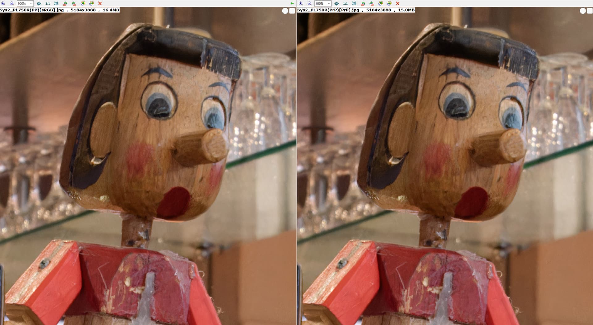
I then thought that I should use ‘Adobe’ with the camera so I tried it and will stick to sRGB (Adobe on the left of the comparison and sRGB on the right)

I have also changed the ‘Color Management’ options in a number of photo programs that showed ‘ProPhoto’ images as “darker” and that has greatly reduced but did not eliminate the “darker” colour of the ‘ProPhoto’ images.

Also exporting in ‘Adobe RGB’ also a gets a “darker” image but with a less pronounced difference compared to ProPhoto.

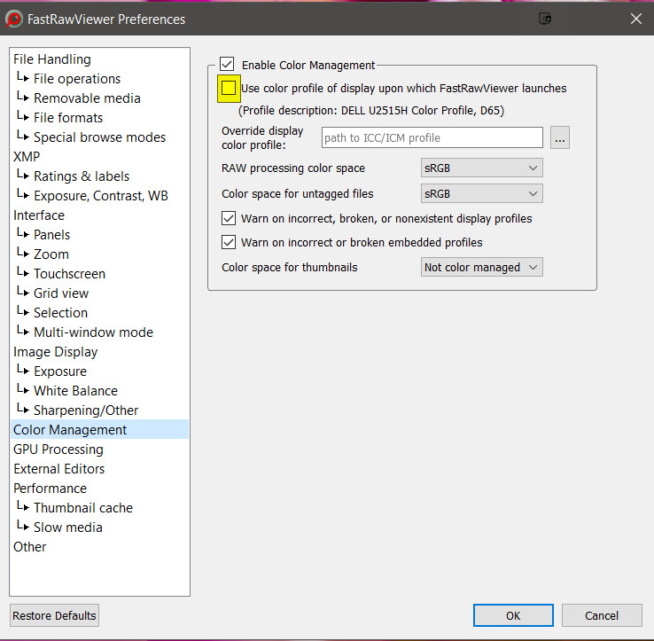
Turning the option highlighted in the snapshot below “off” in FRV reduces the mismatch with FSIV.

It results in this “improved” presentation from FRV

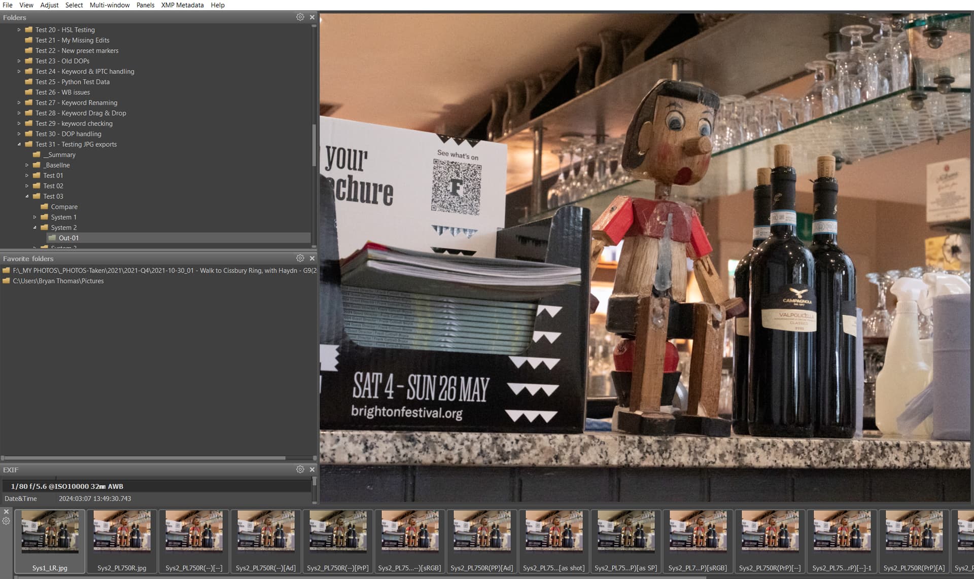
The image used was actually a LightRoom ‘ProPhoto’ export that exhibits the same “darkening” issue as PL7 that started this topic off, which suggests that the darkening is not some error with DxPL.

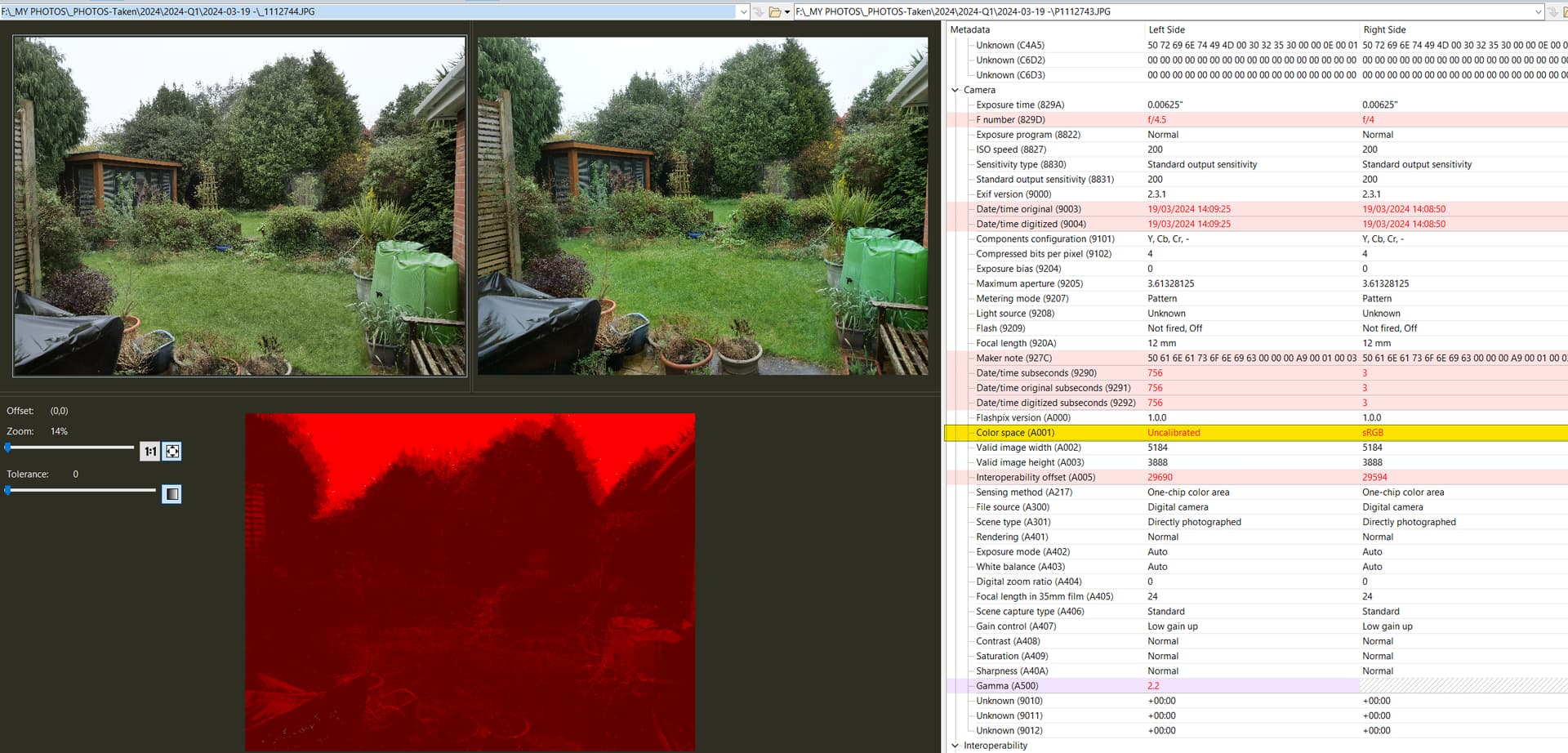
Using the images taken with my G9, one as sRGB (JPEG + RAW) and the other as Adobe RGB (JPG + RAW) the metadata of the original JPG and RAW images gives the following:

For the images taken with Adobe set we have

The ‘Color Space’ shows ‘Uncalibrated’ but the ‘Interoperability Index’ shows ‘R03 - DCF option file (Adobe RGB)’ which could well be used by DxO as the source of the ‘as shot’ (we could ask DxO to confirm that but life is too short!)

For the images taken with sRGB selected in the camera both the ‘Color Space’ and the ‘Interoperability Index’ are both set and indicate that sRGB was used when the picture was taken, either of these fields could be used for the ‘as shot’.

Certainly setting the output to something other than ‘as shot’ is at least ensuring a more certain outcome but currently DxPL seems to be getting it right according to some other tests I have conducted.

Here’s my personal recommendation, Bryan … with aim of simplicity, and so that WYSIWYG !

  1. Determine the color-space capability of your display target;
  • If that’s mainly your own monitor, then it’s most likely to be sRGB … If it’s a monitor with “better” capability than sRGB then you almost certainly know all about color management ('cos, why else would you have gone to the trouble/expense of buying a top-end monitor ?!)

  • If it’s for sharing with others (and/or on social media) then sRGB is the best choice.

  1. Set Soft-Proofing permanently ON (via your standard default preset … the one that PL auto-applies to new images) - and set it for the ICC-Profile as determined in step 1.

  2. Do all your corrections, reviews, etc with SP=ON and set for your intended output target … then you’ll be seeing exactly what you’ll get when you export for that target (WYSIWYG).

  3. Never set Export-to-Disk parameters to anything other than what your output device is capable of displaying … Otherwise, that device will be “clipping” colours in order to fit them into the color-space it’s capable of representing.

And, that’s why I’m wary of using the “As Shot” option with Export-to-Disk … 'cos, if your camera’s Color-Space setting = AdobeRGB - BUT, your monitor is not capable of displaying all of the AdobeRGB color-space then you may not get the best result on that monitor.

  • Note: I say “may not get the best result …” because it depends on the image - Not all images contain colours that will extend beyond the capabilities of sRGB … So, you may not notice any difference, until you do !

Bryan – wow, you’ve given us a lot to chew on! John-M has given you some really great advice. This was right down his alley, not mine. Also, I was hoping you would be willing to share the original raw file, if possible. I’d like to try out a few things before getting back to you on a couple of ideas. Thanks.

@John-M Thanks for the guidance.

Rather than buy a monitor with better capabilities, most of which would have been too big to fit on my by side by side I managed to get a second-hand U2515H which occupies about the same amount of space as the Z24i it replaced and is compatible with my existing U2515H!

I will stay with sRGB in the camera, so end to end “compatibility”

@eriepa Here is the RAW and the simple DOP I was using.

System 2.zip (22.8 MB)

I am off to help our oldest son with rebuilding their house for the next couple of days.

Bye for now

PS:- can anyone explain why the ProPhoto export (from DxPL and LR) appear darker in some software (I understand the need to configure that software) but appears to look “normal” in FSIV?

If the sRGB display etc. is clipping colours as a result of the “restricted” sRGB colour space why is that not visible in FSIV, i.e. to the eye a sRGB export looks pretty much the same (not entirely identical) as the ProPhoto RGB image when they are viewed in FSIV?

  1. Your sRGB monitor is not capable of displaying an image created with the ProPhoto color-space.
  1. From what you describe, it seems that “some software” is interpreting the ProPhoto color-space differently from some-other software.

Essentially, don’t expect to see correct and consistent colours unless your display device is capable of rendering the color-space used (via related ICC-profile) to create the image you’re displaying.

Umm, that’s not my understanding of how colour management works. The whole point of a fully colour managed workflow is to get consistent colours. If CM is working as it should then an image with a wide gamut ICC profile, like ProPhoto, profile will be ‘managed down’ to fit the gamut of the monitor, be that sRGB or Adobe RGB or Display P3. Thus two properly calibrated sRGB monitors should display a ProPhoto image in the same way.

1 Like

correct


The thing is, that not all apps are color managed OR are only partly color managed
and (some of) the topic has been covered here and here …

It’s not my intention to open that can of worms again. When the monitor is able to present colors in sRGB, best bet (the simplest) is to stay in that color space.

Yes, that should be the case.

In Bryan’s example, tho, it appears that some (or all ?) of the software he’s using is not correctly managing the image he created with ProPhoto color-space.

:white_check_mark:

Bryan – thank-you for providing your original raw file. In PL 7.5.0 beginning with no corrections applied, I exported a series of full-size TIFFs with the various ICC profiles, i.e., from sRGB tag through embedded ProPhoto, and a couple of third-party ICC profiles that I use. Each of these exports appeared the same on my display in PL and in several other color managed apps when viewed in both sRGB and in aRGB mode. Ditto when the DxO Standard preset was my starting point – the exports were brighter, but all appeared the same within the series.

I mentioned in an earlier post that I thought the embedded ProPhoto ICC profile might be a ”red herring” and these latest results buttress that view.

I know that you said you checked to see that edits were the same in your darker and brighter exports. But is it possible that the darker (ProPhoto) export had either no preset, no corrections, or optical correction only applied, and that the brighter (sRGB tag) export had a different preset applied that included color and tonal corrections?

Colour management - aargh!

There’s just one typical colour manager:

  • Two-legged, head scratching, looking into monitors, wondering…

The chance of getting the same begins with doing the same thing with the same ingredients…and using different export options does not look like a good start.

There are a few tricks that can help to get more consistent results

  • Use CM throughout from RAW to PRINT (Windows does not seem to provide this per se)
  • Stick to a wide gamut as long as possible (every change comes with some loss)
  • Stick to one pipeline (every change…)
  • Adopt “LIKE” instead of “CORRECT” (unless you can make sure of the above

Ha! Agree with all of your pointers. People within Apple-land may not realize what a “wild west” CM can be in Win 10 and prior. Win 11 does seem to improve things a bit, however.

The darker image is the “correct” one. When FSIV sees the embedded PP profile it will use that as your rendering intent. When there is no embedded profile or when you turn CM off, FSIV looks for other color info in the file, like sRGB tags, etc. Or may just assume sRGB in the absence of other clues. Then you will get the brighter image as it will assume you meant to render in sRGB.

… wild west, and even without Wayne, Stewart and the others.

My somewhat hidden point is to get one pipeline working and use it. If other pipelines aren’t behaving the same, why bother?

Keeping several PCs in technical harmony is nice, but takes a lot of effort and feels like a fool’s errand at times. I’d not consider it a must-have for personal use. Things might look different in a profit oriented production facility though. Nevertheless, the weakest link prevails