Inevitable in what way? Is anyone actually engaging with what I have posted or is it just a case of pushing their own preferences. There is no such thing as inevitable. Three are no code restrictions or tech which may ‘inevitably’ push to one way rather than a multi way. There are many applications across many disciplines that offer their user customisation of the work space. As I mentioned earlier the code for on image manipulation already exists ( previous versions is evidence of this) The colour wheel is a very specific function with multiple options, that clearly needs its own space and the panel is appropriate for that. But for the straight forward adjustment that are used most of the time particularly with images which are almost camera ready the on image sliders are far quicker. And for B&W which I do by the ton load nothing beats it for efficacy and time efficiently. If a picture needs more than 5-7 minutes work then there is something wrong with it. Not everyone wants to spend hours in front of a screen. My suggestions are both more inclusive and would give the product an extra point of difference.DXO will not beat Adobe in the market place. It can however be a very credible alternative particularly if it is customer responsive and adaptable
As a consultant software engineer, I was often called in to “modularise” and “simplify” code.
Something as “simple” as having two visual mechanisms to adjust various settings is not as simple as you might think. There is the need, not only to respond to changes in the visual “component”, there is also the need to synchronise both visual components with each other. This entails sending a signal from visual component one to the adjustment model, which then gets forwarded to any visual components that are observing the model. But that change then has to be forwarded in such a way that you don’t end up with infinite recursion, where the visual that sent the change doesn’t get called in response to the callback from the model.
In theory, this is simple to get right for a single visual control, which directly calls the model and requires no feedback. But so many companies don’t plan for this multi-broadcast model and then have to completely re-write the entire mechanism to include the broadcasting element without breaking the simple model they already have.
But you need to consider having to have the sidebar available for the list of local adjustments, plus the “complex” tools, which effectively means having both the equaliser and the sidebar visible at the same time, taking up even more precious screen estate.
Then you need to consider that the Control Point and Control Line tools are no longer “simple”. In PL4, the beginnings of the LA palette gave us just an Opacity slider in the “new” LA palette, followed by the Chroma and Luma selectivity sliders in PL5, none of which were available with the equaliser prior to that.
The question arises for those who don’t like the to-ing an fro-ing from tool to sidebar, weren’t you already doing that for Selectivity and Opacity? Or weren’t you using those new features that made the Control Line and Point tools so much more powerful?
The obvious counter is that the equaliser often gets in the way of the part of the image that you want to change, so you end up having to hide it to see the effect, followed by re-showing it to make a further adjustment, followed by hiding it…
As has been mentioned, the “sidebar” is also available as a floating palette, which can be positioned near the area to be affected, at any position. Thus you do have the “best of both worlds” with the sliders or complex tools available right next to where you are working.
What is more, you can create several floating palettes, each with part of the LA toolset, a bit like you can hide or show the different sections of the equaliser.
Have you tried the idea of using a custom floating palette?
Excellent and logical analysis.
I do agree with you, as I much prefer to keep the equalizer and I don’t see why a solution to add the color wheel could not be done, ie expanding a panel when clicking on the equalizer corresponding option?
I think there is a “simple” solution to let the LA toolset not in the way of the normal palette tools and mixup the right toolpalette side which can give confusion which is LA and which is Global.
On the left side most of us have
Histogram, image exifdata, history, presetmanager visual.
So when i activate LA then a floating toolset (LA palette) could be layed over the left side leaving only the histogram visible, which you need for overal view.
In this way left is LA tools and right is Global.
(Leave the list of masks on the right side so you can see them when LA engine is off.)
Confusion solved.
Turn off LA?
Popup floating LA palette disapears again.

but then some may have repurposed the left and right sides. For instance I have no need to have the preset manager always available (only when I am creating presets, which I have already done).
So I have on the left: Exposure Tools (Histogram, Smart Lighting, Contrast, Tone Curve, Vignetting, etc) and Denoising.
On the right: Colour Tools (White Balance, Rendering, Soft Proofing, Colour Wheel, Channel Mixer, etc) and Crop & Geometry.
This arrangement has much reduced my scrolling and I would not welcome adding all the LA tools to either side. A floating palette will probably be my solution despite having to enable/disable it and move it around quite a bit. A shortcut key to toggle the LA palette would be welcome but I’ll not hold my breath on that one.
David McA
I agree that there are challenges and you laid them out succinctly and I have learned something for which I am grateful for. That said the starting point is where the problem lies. At the top of the decision making tree of a brand which is not a market leader should be. How do I make this so uniquely usable and different ? that the consumer becomes a advocate and a follower. Adobe will be the leaders and only they alone can mess their position by doing something daft, which is unlikely. So everyone else needs to offer differentiation. To catch a younger and more agile user who does not wish to be paying rent to Adobe and does not have to spend the time to become an expert to a platform which is not intuitive but requires considerable skill a product like DXO has the ability to deliver early results can be reasonably easy to obtain. U points are a fantastic way of doing that.
I abandoned PS the moment NIK arrived. As photographer and not digital artist PS was too complex and too expensive. DXO buying the NIK collection offered great raw conversion and very accessible image manipulation. For years there was a synergy between LA Viveza and FX no it has gone backwards by removing it rather than offering a choice…So my point is yes there are challenges but there are not insurmountable. I agree simplicity takes more effort in any form of design but it sought and achived there is an elegance to final result. For what is worth, I would pay more to get it, if it gave me that degree of customisation of the user interface and I loved it I would become the kind of customer brands crave a non incentivised advocate. At the moment I have bought 7 which totally useless to my needs, 6 was near perfect…
Since Nik 6 we have both, on the pic as well at the RHS – but it took DxO about 2 years …
And @Joanna, we don’t need everything to be right on the pic.
.
.
note
The (only) Local Adjustments in the Nik tools are Control points and Control lines,
while a coupe of tools work selectively by design.
.
… how to integrate the Tone Curve with a Control Point

Hello Constie,
Thank you for your clear statements, which I agree with 100%. My understanding for the omission of the floating palettes goes towards 0 and I have already expressed this several times.
And it pleases me immensely that there are still more users here who do not let themselves be brought down by the eternal mantra of the same users.
I am convinced that with a little creativity a very good solution could have been found for the illustration of HSL and the tone value curve.
As suggested before, a simple solution would have been to simply map the complex functional elements like HSL 1:1 in the floating palette. I would have given the palette a transparent background, because the part of the photo behind the floating palette is hardly visible to the user anyway.
And so that the floating palette can be moved out of the way if needed, I would have just given it a handle to move the palette.
But one has decided for the unfortunately worse standard of other programs and that not even well implemented. One of the USPs of Photolab is lost.
And the proposal to place the current implementation of the LA in PL7 as a separate palette in the middle of the photo (so that you can see it directly) is of course a completely useless solution, because the palette does not disappear automatically when it is no longer needed. So you have to move it back and forth all the time.
In addition, this palette is much too large and does not have anything like the ergonomics of the previous floating palette, I don’t know why this suggestion keeps coming up, it’s just a crutch and not a replacement.
As long as i can have it popup and disapear automaticly i am fine with it.
@David_McA that’s why i want that automated popup and disapear function when i place that LA tool menu floating.
At this moment when i detach a palette it stays visual where it floats.
But all it takes is to hide the palette.
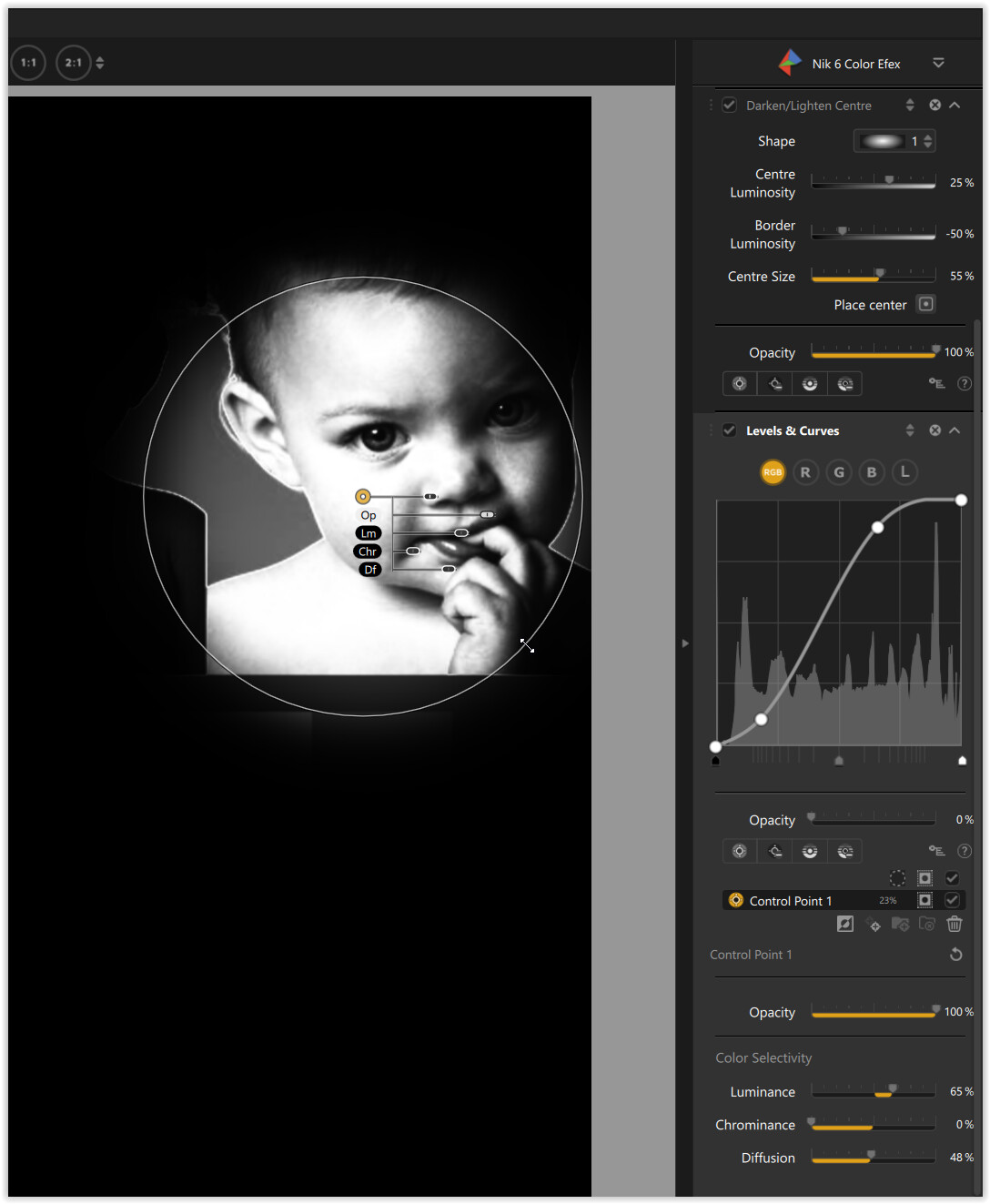
Here is the minimum screen estate it takes to access all the relevant LA tools for Light and Detail, for a Control Point on PL6…
The bottom bar has to be visible because it contains the show/hide masks button for the B&W mask…

… but there is no way to see the image with a translucent mask.
There is also no way to see the effect of the mask without the outline of the mask being visible, unless you hold the mouse on a slider. And there is no indication of the setting for a slider unless you hover over the slider.
Notice how relatively difficult it is to see the sliders against a complex B&W background, unless you show the B&W mask.
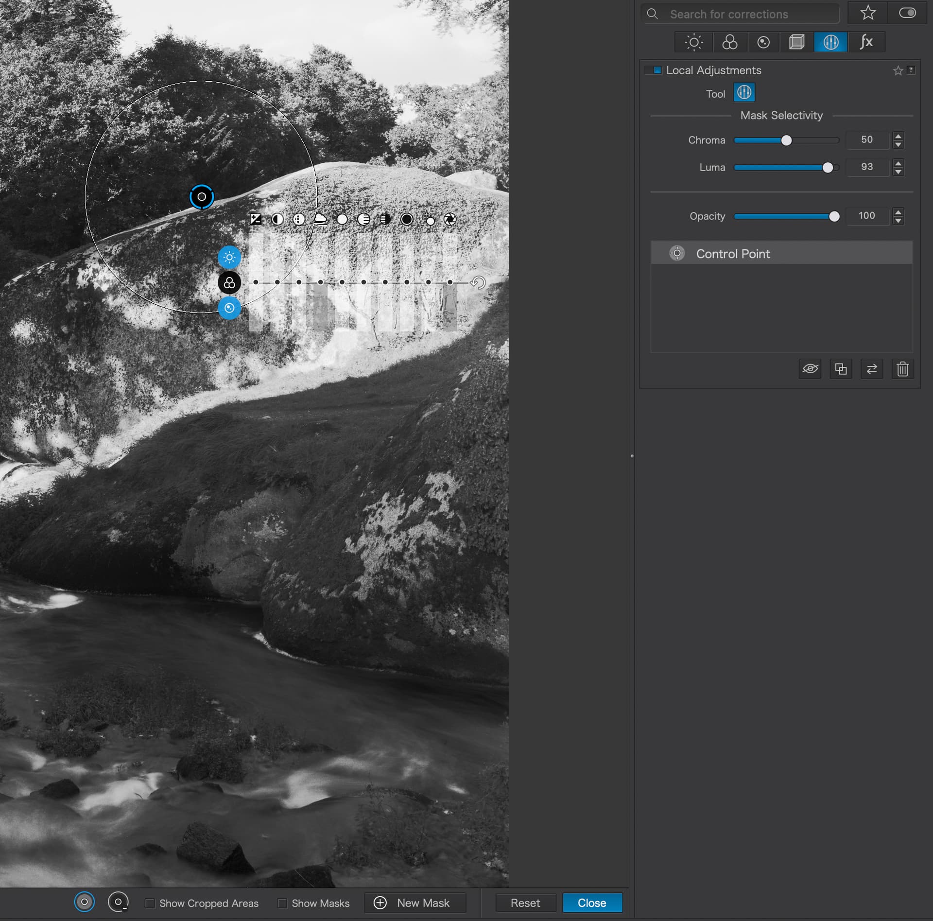
For PL7, the minimum screen estate, with a floating palette for Light and Detail sliders is less…
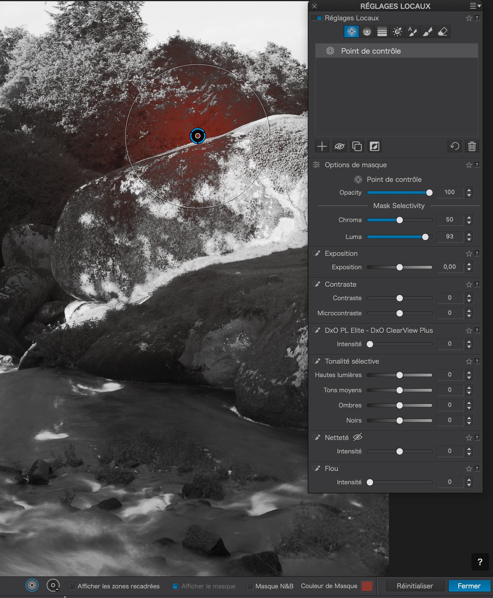
Note that the translucent mask is visible as a selectable colour in PL7, but can be hidden to reveal the image without the mask…

… and, when using the B&W mask view, the selection is even more localised and clear than with PL6…

This is exactly, what the CP / CL in Nik 6 do.
When you are over the pic area, the (vertical) “equalizer” is visible
and as soon you move the mouse over to the RHS the EQ is hidden
and only the center CP / the CL gizmo stays visible (no masks, just the gizmo)
→ see here …
I totally agree. The bit I really dont get is the somewhat fanatical belief that we should all work the same way. Very strange. I am simply advocating customised options to suit everyone’s needs but somehow that seems to bring up all sorts of negativity… weird.
I have no idea if anyone from the marketing / brand level reads these rather than the tech and beta testers because in many respects I want the the brand’s view as to what customer they are seeking to attract… if they say everyone, then that would a good case to expand the user interface, ditto if they say newcomers. I have no doubt that U points are friendlier and more intuitive which allows one to get into the platform and then learn the more advanced features… For the moment I am happy with 6 and NIK it works perfectly for me…
PhotoLab is fairly customisable and can be tailored to exactly show the things that we really need - and the forum has a few posts with examples. Nevertheless, the workspace building blocks are standardised in most applications. Whether someone likes floating sliders like e.g. in Nik Collection or solid panels as in most other apps is a matter of taste too. Moreover, providing variations of panels represents some effort and I think that DxO has reached the limits of what can be asked for PhotoLab and the other apps. Maybe that dropping those apps might free some resources for DxO to provide a greater variety of panel designs - including a more easily readable UI ![]()
I’m sure that’s a nice hint, but not really helpful in this case, because I have to right-click on the palette and then select the command “hide”, which is two clicks too many. And how do I get the palette back then? Under Windows only via the menu. Very cumbersome.
Or has that changed something in PL7, I have it no longer in memory.
I don’t think you can reduce the way of operation to “taste”, this makes it bagetellized and then it’s just a matter of habit. But it’s mainly about usability here and that has quite something objective ![]()
And the customizability of PL is unfortunately not present in the area of keyboard shortcuts, that is really a shortcoming.
no one seems to count or care about how much energy is used to achieve something Take for example the new LUTs unlike ON1 where you can hover over any of the presets and see the effect without letting go the new LUT list of which there 17 you have to actually select one let go see it then do the next 17 times by the end you have forgotten what the first was like… madness
That describes it very well, it seems that no one at DxO is concerned with the processes, especially in terms of ease and speed of use. In my experience, this is typical of programmers who often only have the single task in mind. This is where good UX designers are needed, but there I repeat myself from other threads.