You very much reflect my thoughts particularly on UX issue which is very much needed. I describe DXO like a Trabant with a Mercedes engine great tech with clunky usability…
I will look out for your other threads…may be we should collect these thoughts and put them in one place although I am not sure who is listening fro the brand end?
Is this just a Windows thing? I can’t seen to be able to get floating pallet on M1 or Mac Book Pro? -Not that I would want to, since from the screen grabs I have seen it obscures too match of the image are there any tutorials out there on usability of tools or are they all glorified promos tweaking simple images?
…and I don’t, if you read the post carefully.
So far, PhotoLab has been easy to use, but some of it was lost by changing the ui text size and colour, showing items that are not licensed, by seemingly random combinations of tools into a tool panel and the somewhat complicated logic of when a local adjustment mask is shown or not shown.
1 Like
Oh, sorry, I misunderstood you there.
Unfortunately, the topic or the contributions to this topic triggers an unusual amount of emotion in me. That is certainly not good, I must be careful that I still find the right tone.
You should use the hamburger menu to “fold up” the menu…
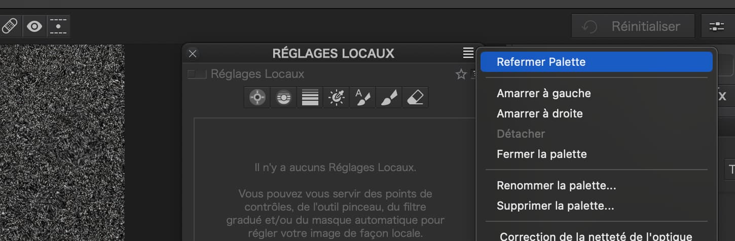
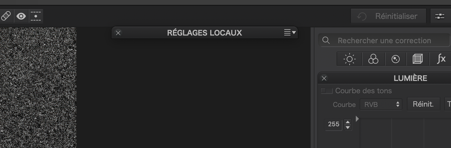
And then use it again to “unfold” it…
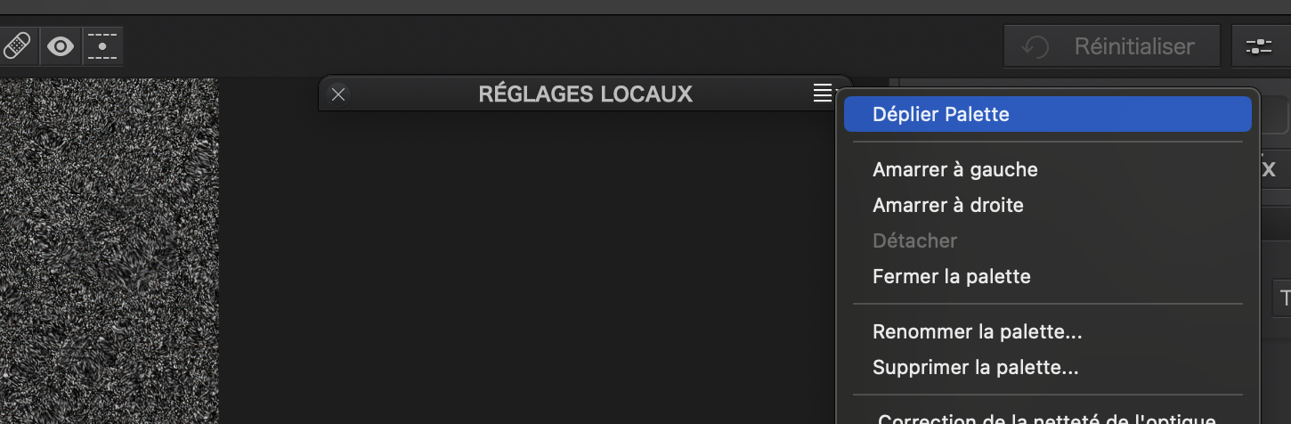
Or, even simpler, a single click on the palette title will do the same thing.
The palette stays where you put it and all but disappears, but can be shown from the same place. Is that really too hard?
It’s all about space and how it’s used.
What most users want is
1 as much space on your screen reserved for the image as possible
2 if something is poping up in the image blokking the pixels of the image be able to move it around and let it disapear when needed.
3 as les scrolling around as possible without losing the ease of oversight adjustments.
4 easy acces of most used tools
5 certainly in the beginning, fast links to the manual how to use something,(nothing is more irritating to launch 400 page’s and search through them to find your answer in the middle of a edit.
6 offcoarse fluid view of the app. No waiting time and preview delay.
7 logic spread of all the tools and info.
8 possibility to modify this spread and layout
9 possibility to modify the behaviour in the userinterface when we hoover/rightclick and such.
10 i forget maybe some more important things.
But in this list there are some what DxO can be/need to be? Improving.
Most important is the screen is becomming too crowded with tools this eats up the image space.
There are some double acces points.
Topbar for instance.
One suggestion is let the tool popup at the top paletterow when i hit in the top bar repair or leveling or crop or… And when i deactivate let it close/collaps and disapear to the place it’s seated in a (personal) palette.
Quite easy screenspace recovery or not?
Second: Place keywords/tags editing in a different tab.(in my eyes it’s a library function not a edit function.)
Third: Now i have to collaps and open a palette myself always or use the workspace click off click on to close/collaps/open all palettes to my startingpoint of oversight.
Why not a option build in.
-Default open.
-Default closed
-Auto closing when other palette is used.
Same for the tools.
- default open or closed
-Always open when activated.
-closing when an other tool is selected.
This would help to minimise my scrolling and stil i have full control over my oversight demand.
At least something i would like:
Detach and floating toolset?
- after use return to place in paletterow. (when i click close => close(collaps) and return to the original place in the palette.)
- keep it floating but collaps when i am not hoovering over it. (less image loss)
Maybe they did already some of the behaviours , i am not that buzy and seaking behaviour in DxOPL this season. (yesterday i was acting on the W.I.I.L.)
Wife’s Interiour Improvement List. ![]()
Creating a new hallway wardrobe.
Needs some modification… Some coats, not mine ![]() , are longer then the space it has.
, are longer then the space it has.
So solution is change layout, create more hangingspace left and add drawers for gloves and such at the bottom.
Use top right for the lost hangingspace. At bottom left.
Longtherm improvement, create some drawers for shoes. Now it’s a hole of 58cm deep.
See i am an expert in developing userinterfaces… ![]()
1 Like
But I notice that it took more than one attempt ![]()
![]()
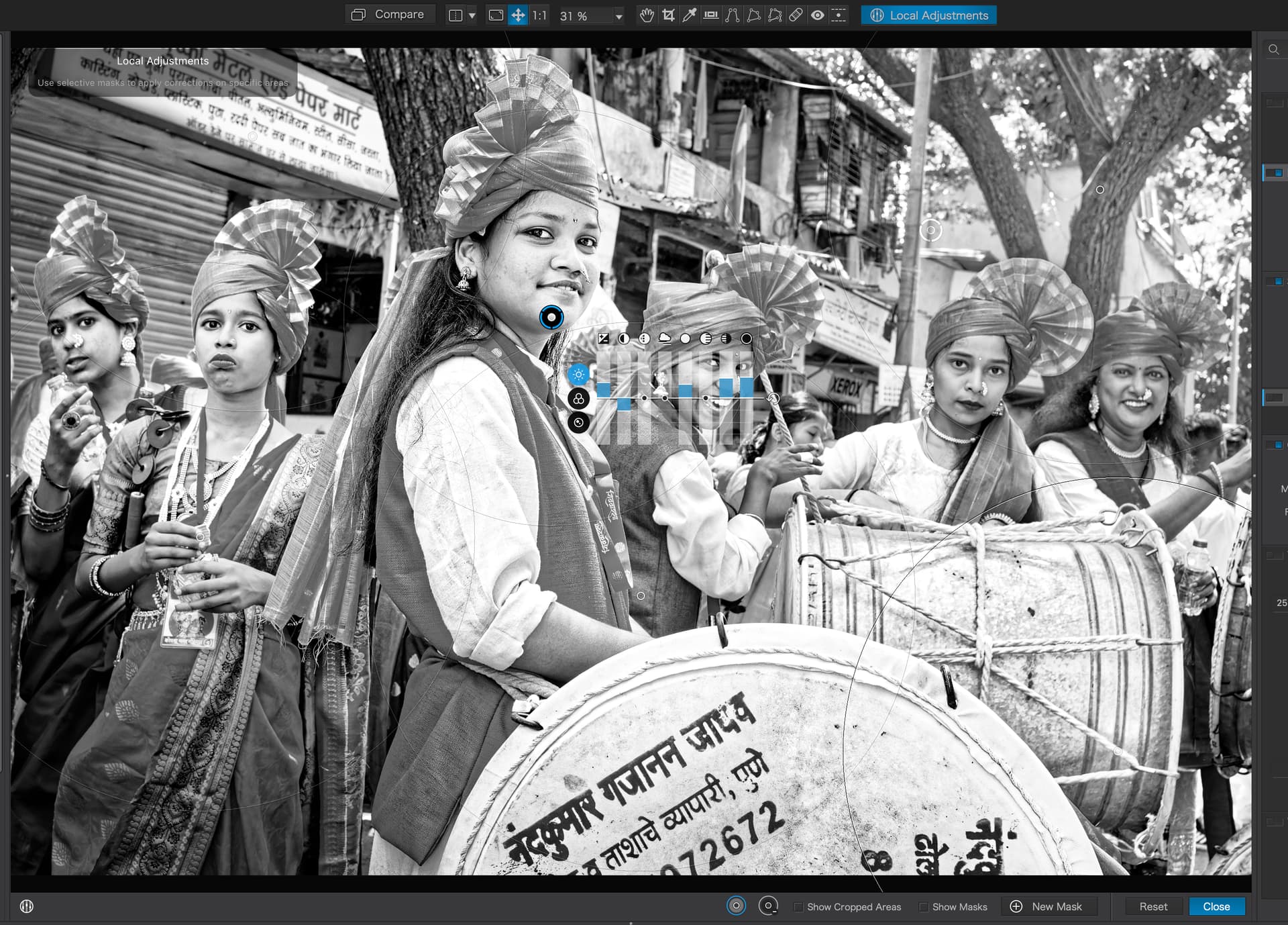
In this image there are 8 points on one adjustment an 2 on another. this took less than 1 minute to achieve and at all at times i can see the WHOLE image and the effect the adjustments are having across the WHOLE of the image. The cursor hardly moves from the point of adjustment everything is viewable from a vary narrow POV
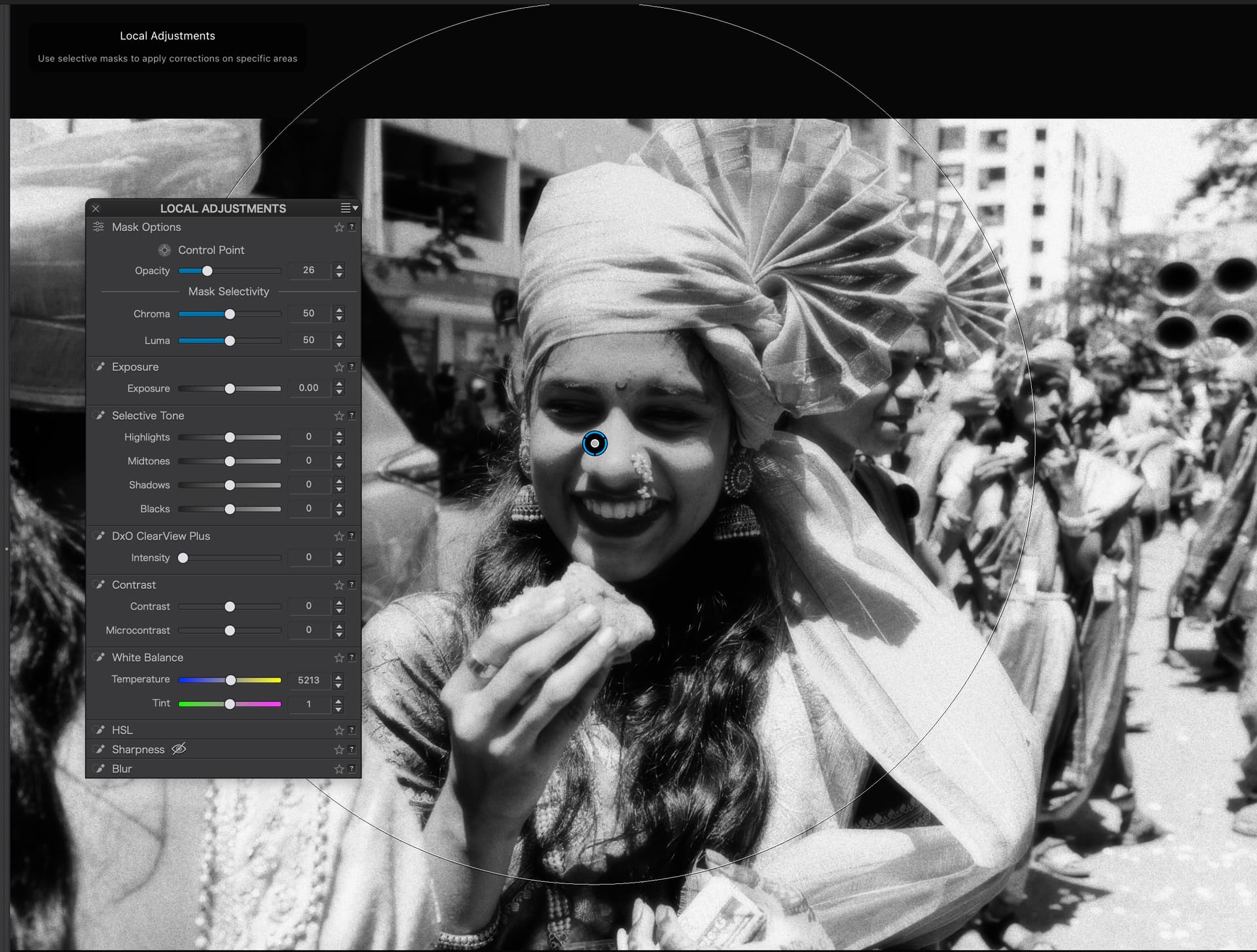
On this image, having now worked out how to get the floater to work, I am obscuring a considerable percentage of the image area. To assess it I either have to keep moving around or swicthing it on and off. I can not think of a more tedious way of dodging and burning 90-100 images which I often do in about 2 hours including import, rename, select, edit and export. The floating panels are absolutely diabolically bad from an ergonomic and efficiency test. they seem to me to have come about from the development end. Whatever the technical justifications / complexities might be, from UX they are well short of being leading edge / better than the competition, or anything of the sort. In many respects those responsible for the manipulation of DXO’s engine are doing a disservice to the benefits the platform brings to the market which is recognised as being exceptional. There is no doubt in my mind that Upoints with sliders on the image, are by far a better solution. the viewing of the image is far far less obscured. Perhaps not for the colour wheel, but that should have its own solution without compromising everything else… I really do hope someone is listening, because there is a great danger that the Brand will drift into obscurity unless it offers clear difference to the market.
2 Likes
I already thought that in this case “hide” was not meant, but “fold”, but even then the bar is permanently visible in the photos, even if you don’t need it. This doesn’t match what the previous floating palette did.
And then when I unfold it, I have a big panel over the image. And if I collapse everything before, it becomes clickaroo until I have the functions available that I need.
The issue here isn’t whether it’s “hard” to use a single function, I’m concerned with how much time and effort it takes me per photo to fully edit it. PL is from my point of view not a software that is meant for editing single photos -so for example like Nik Collection or Luminar Neo- and with the new version I simply need more time per photo than before and that is mainly due to the new handling of LA. I already edited a lot of photos in the beta phase with the 7 version (I already know that you shouldn’t), also in the hope that I would already get used to it, but now I’m back to the version 6 in the daily doing, because it’s just faster.
Many people probably don’t care that something takes longer, or they don’t even perceive it that way.
That’s because i listend to my wife first instead of my own experience…
![]()
![]()
I wanted to build it myself custommade but she wanted quick result.
So we bought a “ikea like become in packages and build it yourself”
And a new design radiator so the pipes needed some modification as well.
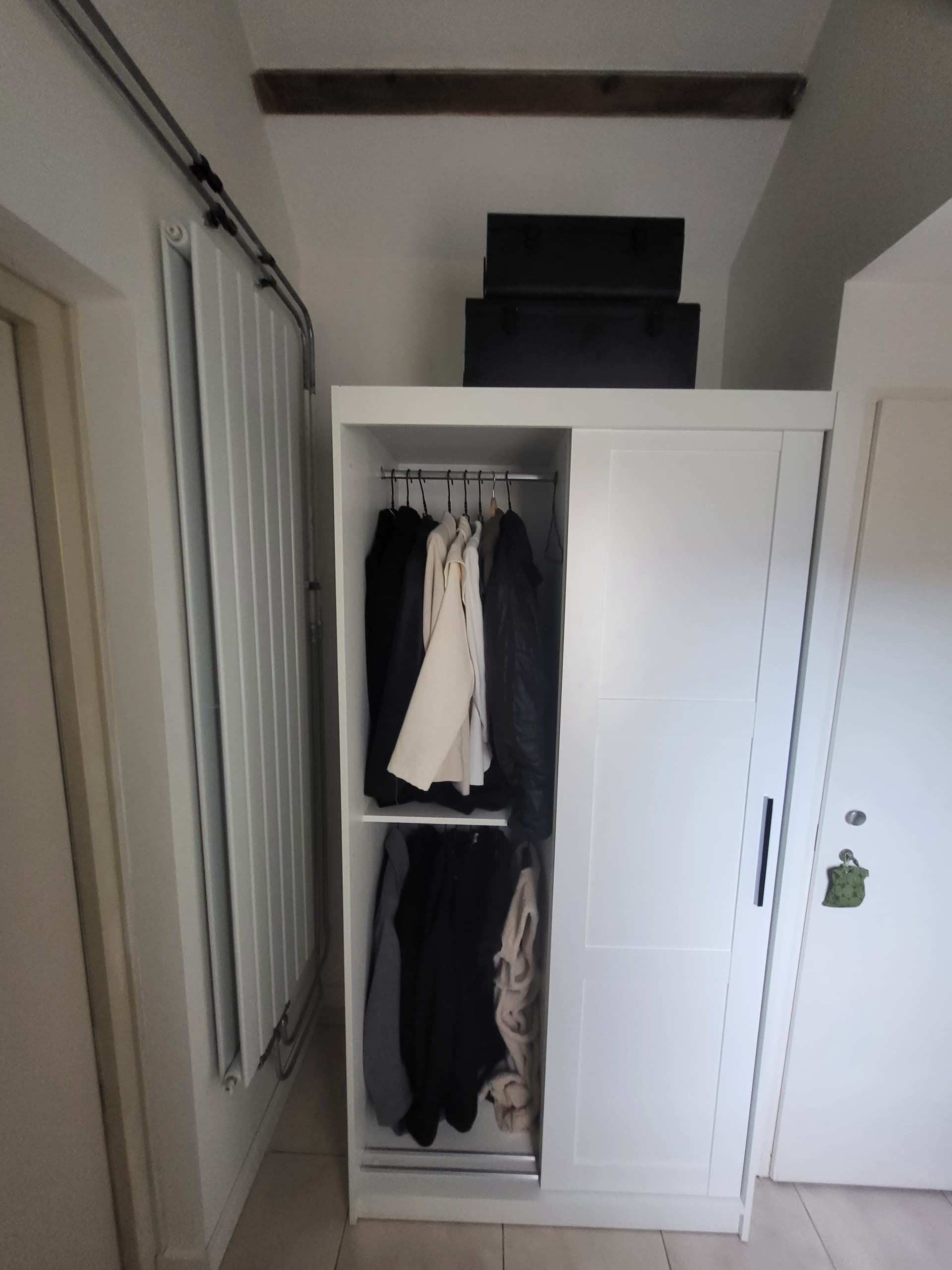

See: It was original a wardropecloset for a restroom.
Give me few day’s and it’s finished.
![]()
I’m sorry but that is patently not true. How do you accurately judge the effect on the face behind the equaliser without hiding, judging, showing, altering, hiding, judging, showing, altering, etc?

Simple. Move it out of the way once and leave it there. It then takes just as much effort to hide and show the palette as it does to hide and show the equaliser.
And if you place the palette header over the top bar of the viewer, then it occupies zero space over the image when it is hidden.
By the way, I see from your second screenshot that you haven’t used the selectivity sliders. These are not accessible on the equaliser, so it still takes moving to the sidebar to adjust those.
Unless, of course, you never bother using one of the more useful aspects of LAs since PL5.
@constie your right as in the former Equalizer format was quite good aldoh we always complained about the fact you couldn’t move it around. It was stuck to the upoint.
I see you didn’t unfold the hole equalizer (alt/crtl click) on the three nutches)
It would be fair to compare those full unfolded menu’s.
Problem 1: Apperantly they cant add tools like HSL to that equalizer.
Problem 2: Slider sensitivity and accuracy was always a thing in dxo equalizer.
(the NIC version is larger and better to handle.)
So they discarded this equalizer. And it is not comming back i am afraid.
So now we need to figurout how to improve this blob of LA tools which are a second image of the global one’s.
A form of autocollaps/unfold to save image space?
An change in preview modes so every time we activate LA modes all global tools/palettes disapear and only the localtoolset is in a row left or right?
It’s a new concept and yes it is not as we like it.
Only thing we can do is show dxo staff possibility’s how to improve.
Some “improvements” don’t even get to the releasecandidate’s and are discarded in the bin before that. Others are like my closet above. It works for the moment but it is not ideal.
1 Like
In addition, the list of adjustments, the opacity slider and the selectivity sliders have been in the sidebar since PL5. They give you much more control over Control Points and Control Lines. Have you used them yet?
well to start with I have been doing this for about 10 years and as we speak I have an exhibition on as distillation of my street photography in India over 10 year and around 60K images or around 2TB so I do know what I am doing. To your point about the floater well the answer is lies in the phrase
Move it out of the way once and leave it there… it is not possible to leave it there or anywhere for that matter when you need to assess the image after each adjustment you would need to switch it off SEVERAL TIMES… then you say place the palette header over the top bar of the viewer, that means moving your eyes away and starting again… it is tedious to the extreme. Then again I see from your second screenshot that you haven’t used the selectivity sliderssometimes I do and sometimes i dont they are not always required …I don’t know what kind of work you do, perhaps it suits your needs and that is splendid… please do not patronise me and try tell me how I should do mine… what I am asking is not either or but both to suit the needs of the user not the development team. Ta
1 Like
Nobody is patronising you. Just pointing out that this is the way it is going to be from now on.
What would you rather have? The limited set of adjustments that are on the equaliser, or the ability to use the colour wheel and, possibly, every other tool that you can only currently use globally?
And, if we have to pull the “I’ve been doing this for…” card, I have been doing photography for almost 60 years, including large format film work, then digital since 2001 (22 years) ![]()
I think the discussion should be less emotional.
I don’t see Joanna’s advice as paternalism, but as friendly help to find suitable workarounds.
Everyone can decide for themselves whether this is sufficient.
For me it is unfortunately not so, I have already tried everything and it does not really get better.
I find the suggestion of OXiDant very good to think about how the new palette can possibly be improved so that you get the advantages of the Equilizer back. I’ll have to think about that some more. I had already started some wireframes, but I haven’t had time to complete them yet
1 Like
I think most of the pain of moving it constant around is when you are on a monoscreen system.
A laptop for instance. When you have a 32inch 4k or 2k screen this is much less a problem and having two screens it’s a non issue because you can use one for tools and one for image.
One of the solutions could be “laptopmode”.
Which is switching to a equalizer mode with the remark you lose some of the tools in LA. (You can’t have it all i am afraid.)
1 Like
The discussion is also not about getting the old Equilizer back in the same form. Of course, I also see its disadvantages. The point is to save the advantages of the Equilizer, and according to my ideas, this would have taken the form of an improved Equilizer.
As already written:
For example, by giving the Equilizer a possibility to move it if needed, which is often not necessary.
Or by transferring the tools from the sidebar almost 1:1 into the equilizer to allow more precise settings, of course in a more compact representation. Or to take over the HSL tool as well.
There it needs certainly a little creativity and above all a good UX designer.
2 Likes
This is not quite true, of course:
The Equilizer is displayed by itself and also disappears by itself when the LA mode is closed.
And the top of the edge is of course no substitute for a central position directly in the environment of the editing, especially on 4K screens the panel has to be moved again awkwardly somewhere.
But thanks anyway for the efforts here to help further.
Thank you, that’s how I intend everything I contribute here.
Well, I guess you’re going to have to come up with some kind of visual prototype, so that folks can see what it is you are after.
I can see your point but I still think that having any panel/gizmo anywhere in the image is always going to be a compromise when you want to adjust something that appears under the panel/gizmo, even if it is translucent. And I would be very interested to see how you would mock up such a tool that can also manage the Tone Curve and Colour Wheel tools - they are hard enough to use at their present size - I would hate to have them any smaller.