Is anyone else as frustrated as I am with the heavy-handed color intensity DXO Photolab 8 applies to all images? It seems they’re trying to keep pace with the overblown colors on the iPhone. I want reality and they’re making that difficult to obtain. I’ve tried the suggestion in the email from Kim in Support below. I’ve read this Forum post Auto-adjustments when first loading - cannot seem to deactivate that. Nothing seems to work. I’ve moved back over to Lightroom for the time being since LR colors are much more natural. Anyone out there have any suggestions?
I’ve emailed support and got the response below.
Hello Daniel,
Thank you for reaching out with your concern about the saturation levels in DxO PhotoLab 6. I understand how important it is to achieve the right color balance in your images.
To address the over-saturation issue, you can try the following steps:
Adjust the Color Rendering Settings: Go to the “Color” palette and select “Color Rendering.” Here, you can choose a different camera profile or adjust the intensity to achieve a more subtle color theme.
Fine-Tune the HSL (Hue, Saturation, Luminance) Tool: This tool allows you to individually adjust the saturation of specific colors. You can reduce the saturation of the colors that appear too intense.
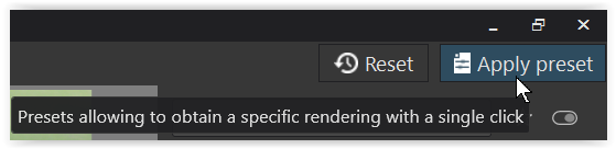
Check the Preset Applied: Ensure that no preset with high saturation is being applied automatically to your images.
If these steps do not resolve the issue, please ensure that your software is updated to the latest version, DxO PhotoLab 8, as updates often include improvements and bug fixes.
Feel free to reach out if you need further assistance.
There are many presets and none will suite everyone or everything.
I use many I’ve created myself which I then apply afterwards or have selected as default.
Some are clean simulations of the Nikon classic D2Xs mode 1-3 and others are tuned for something else.
Moving away from an application due to a default setting which can be tuned to pretty much what ever one like seems a bit extreme and a huge loss in missing out of everything else that PL offers and others don’t.
The default preset is causing your troubles. Change it to e.g. DxO Standard and things return to the looks of earlier versions of PhotoLab… but only for new images that PhotoLab has never seen before.
The default preset automatically applied to all new photos in PL8 is oversaturated, especially in reds.
Change the default to eg ‘neutral colours’ to fix the problem.
But that wont affect existing photos. Easiest way to reset is to delete the database, then each pic will have new preset applied when you open it. Or tun an index to apply new preset to all pics.
Deleting database does delete projects too - not a problem for me, but could affect you.
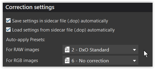
To start with you can set your preferences e.g. to “2 - DxO Standard”
to get less oversaturated colors in your raw files, but continue to apply the DxO profiles (optical corrections, cropping in the original ratio…)
.
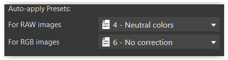
or e.g. “4 – Neutral Colors”
to apply
.
or … …
.
To check out yourself ( and compare ) apply different presets
to the Master and some Virtual Copies.
PL’s WG working space is very different but I wouldn’t call it a problem. Quite the contrary in my case. PL legacy working colour space is hopeless at rendering the colours from a Canon 90D, greens in particular. Skin tones too are often too yellow. I often found it was hard work to get acceptable colours.
Using the WG working colour space in conjunction with ‘neutral colors’ rendering is a different world. Colours are far more accurate, and pleasing.
@danieljcox As others have already explained it’s a safe bet that if you stop using PL’s ‘natural’ preset as your starting point you’ll find the colours are superior. What you use in it’s place will be a matter of your taste. For me, as already indicated, I settled on the WG working space and ‘neutral colors’ rendering.
In my pictures with that problem, orange caps showing red, it was the Wide Gamut. With Classic gamut no problem. And with Wide Gamut and Color /B&W Rendering no problem either.
I won’t say it’s a problem but it’s gamut related. A wider gamut means more out off gamut colors that has to be forced in a smaller gamut.
Yes, using the DxO Wide Gamut working color space can introduce this problem. But in my experience, the real issue is in the color rendering settings. I used to have the same problem with pictures of daylilies and other orange/yellow/red subjects. The camera would render them pretty well. PhotoLab, reading the RAW file, would render everything in an over-saturated red by default with DxO Wide Gamut. But then I noticed that with the legacy/classic working color space, the colors would be better defined but there’d also be a significant loss of detail, especially in highlights. If I use Wide Gamut with better Color Rendering settings, I end up with good colors and more detail. But it’s important to (a) turn on soft proofing for the display color space (I use sRGB) and (b) make sure that settings to protect saturated colors in Color Rendering and in Soft Proofing are set appropriately. These days, I don’t have to think about it - my current default preset for RAW files gets me off to a good start with the DxO Wide Gamut w.c.s. (My default Color Rendering is generic / DxO camera profile [for my camera]). When necessary, I switch to the neutral rendering or to a FilmPack color film emulation.
This is basically true. The legacy working color space compresses the camera’s own color space (interpreted from the RAW data) into Adobe RGB before you start working on the image. The DxO Wide Gamut working color space takes the RAW data without compressing it. It has to be rendered properly in Adobe RGB or sRGB later in the pipeline - which is why I say keep Soft Proofing on or change the Color Rendering settings from your current defaults.
Whereas I never use soft-proofing and the colours that come out of my printer are a good match to what I see on screen. Perhaps because I have an Adobe RGB compliant monitor?
I don’t understand this claim. I believe it, if you are editing on a sRGB monitor, since it won’t display colors outside of that space, you have no need to account for the alternate working color space in soft proofing. But if you are editing on a wide gamut monitor with the intent of displaying on the internet, wouldn’t sRGB soft-proofing be the best way to edit for your final environment?
I think these sum it up well. The DxO gamut includes all colors your sensor should encounter in “the real world” as well as a bunch more, without faking any colors. If your RAW gamut is larger, the part lost is probably outside of the eye’s ability to detect.
Fig 9: DxO Wide Gamut (the green triangle) encompasses every possible color that a photographer might encounter in nature
The DxO PhotoLab 6 working color space uses spectral colors as its primaries. It is big enough to contain all real-world surface colors, and it achieves this without imaginary colors — i.e., every combination of R, G, and B in this color space represents an actual color.
The article by DxO (as it’s currently written) is interesting, because it reflects an evolution in thinking since PhotoLab 6 was developed. When PL6 was first released, DxO publicly stated that the new DxO Wide Gamut working color space was large enough to contain not only Pointer’s Gamut but the sensor color space for all cameras then supported by PL. Now DxO says this:
…as well as what’s in the larger article previously mentioned - that “if necessary,” colors are desaturated only a little bit to fit into the DxO Wide Gamut working color space. That they still state that the DxO Wide Gamut w.c.s. includes 100% of colors found in nature is reassuring.
No - these are misunderstandings. It’s been explained a lot in the forum, but also by DxO - for example, in this simple Q&A about sRGB:
Absolutely, yes … Those are my standard/by-default settings with the WG-CS.
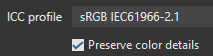
For the setting of “Preserve colour details” in Soft Proofing I find the default of 50 is a reliably good setting … and, it’s also important to retain this setting when exporting to disk - - Then, the entire process of processing and editing one’s images is WYSIWYG.
Which camera do you use?
What kind of subjects?
What are your auto-apply PL settings?
Did you try to use DCP profiles from Adobe (available in free Adobe DNG Converter)?
Can you post a “bad” and a “good” samples?
The topic is about images without any images, so like blind talking about colors
Can be a PL “bug” in camera profile.
With LR 5.7 compared to Nikon CaptureNX2 (and compared later with PL7,8), I would say it was the opposite. Ok, it was long time ago, and current LR might be different. But they still use ancient DCP files, some of which have really bad colors, like first versions of Nikon D700 profiles (final version also isn’t perfect, though). LR contrast sliders changed colors in a way I didn’t like, I prefer the way PL does it, but that’s individual taste. Before switching to PL, I had to use LR, which was much faster than CNX2 or NX Studio (a key thing for me, dealing mostly with “mass production”), while being good enough.