I only use soft proofing for images that I think have highly saturated colours and this is just to check. I have a P3 monitor and only a small handful of my images require SP.
1 Like
It’s mainly needed for sRGB or for printing when using the DxO Wide Gamut working color space, and just to make sure that what you see is what you get. Mostly when reds are very saturated (as they can be with my Olympus cameras). Wider gamut output devices seem to benefit less often. However, I find it doesn’t hurt to keep Soft Proofing on all the time. Whether or not you ever need it might depend on the camera used as well as the monitor’s/printer’s gamut.
@danieljcox , can you share one of your oversaturated images and its .dop sidecar?
We’ve had a lot of guessing and ideas…and I think it would help to see what you are confronted with. Perception and taste are quite personal, an example (or more) could shed some light into the mystery.
If you can’t attach the files (they might be to big) to a post, you can use a sharing service like wetransfer.com or a share in some cloud storage that you might use.
2 Likes
Hi Daniel
You have already had good advice on this thread. I would like to suggest that you try a camera body Colour rendering setting (Leica Q)
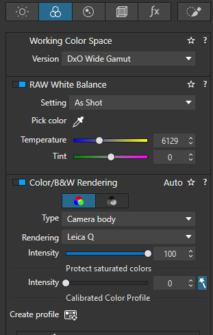
just to see if it helps. The Leica Q profile does not saturate reds so much and the tonal curve is more gentle than a lot of the colour renderings and may give you a better starting point.
The other thing to remember is that as you increase contrast for example with the contrast slider or a curve, then contrast impacts colour. That’s the way it’s supposed to work ![]()
You can avoid this with a luma curve which only increases contrast.
With this in mind you might want to set up your own default preset with contrast, microcontrast, Selective tone, ClearViewPlus, and Smart Lighting all at zero. This will allow you to see the image and Histogram without any contrast adjustments. This might give you some insight into where the excess saturation/contrast is coming from.
When you have created your new preset then you can include it in the Preferences for raw Images and then it will apply to all new images. As others have said existing images will retain the old preset starting point so that you would need to apply the new preset manually to an image.
1 Like
Personally, I don´t like the concept of “working color space” at all. It is definitely confusing and misleading calling for example DXO WG this since that is NOT what I am working with. In my view Display P3 is my working color space both for display and print. Isn´t the purpose of DXO WG just to be as wide as it is just to be able to cater for the development of pictures with gamuts not covered by “Classic”, which is essentially Adobe RGB. In short to be able to represent a wider set of colors that is falling outside “Classic” DXO WG was developed - in my case to handle the needs Display P3 has created.
What gives my pictures a Display P3 bias is basically my use of the Display P3 profile I have made during the calibration of my Benq-monitor but that is not all! Photolab is also using the camera profile matching the camera code in the files produced by the camera. On top of that we often have the import profile. So, what we see and use during postprocessing is a joint filter effect bias built on the triumvirate of monitor profile, camera profile codes in the files and import preset in PL. When I export these files they have been affected by what I have described above and I finish by exporting with a Disply P3 ICC.
Before printing I have found that Soft Proof with a matching profile for your paper and printer can help especially in getting some more contrast and “black” in the pictures that often are lost a bit because the various used papers various different properties but Soft Proof is rarely enough if I for example should be new to a certain paper and what it demands. For me Soft Proofs are rarely enough. Testprints are far more important and Soft Proof I think is more a tool for people who don´t have a printer and are forced to outsource the printing.
I don´t understand why some would have to lose confidence in Photolab over oversaturated colors really. A very simple way to fix that is just to pick another camera profile than the one you are dissatisfied with. There are houndreds to pick from.
1 Like
Yes, that’s usually the case … until it isn’t !
I would rather not be surprised when it’s not - especially as there’s no “cost” in prevention.
From Wikipedia

I wouldn’t call P3 a wide gamut compared to AdobeRGB. Just a little bit less green and a little bit more red.
George
1 Like
I may be a luddite, but my camera will save data in Adobe RGB. For me there is no reason to use DXO wide gamut. I am happy with classic color space.
I wouldn’t call you a luddite, but I do infer that you haven’t yet experienced the benefit of a larger working color space. My camera makes jpegs in Adobe RGB, but its RAW data can fit into a wider range of color. Because of where in the pipeline colors are being translated to Adobe RGB, the legacy working color space doesn’t preserve as much detail as DxO Wide Gamut. That isn’t just in theory, it’s actual when colors are saturated, even though my output is sRGB. Still, I didn’t notice until I compared results. Legacy is as fine as it was in PhotoLab 5. Nothing wrong with using it. But DxO Wide Gamut is technically better even if it requires some adjustments to workflow to tame saturated colors.
For a while there were some color rendering settings that didn’t work properly with DxO Wide Gamut. Hopefully those bugs are all fixed now, as they were reported to DxO.
Thank you for the information.
Which micro 4/3 camera do you use?
AdobeRGB is the color space in which the jpg is created. The raw data has its sensor color space whatever that may be.
The working color space in PL is its wide gamut. Well, you can choose legacy gamut too.
I don’t agree with that. A wider gamut doesn’t result in more details. On contrary.
George
That your camera can save files in Adobe RGB is only of any importance for the in-camera generated JPEG. RAW files from your camera have no colour space as such, the data in RAW files is a record of what the camera sensor captured.
It’s only when the RAW data is read by PL / [insert name of any RAW processing software] that the sensor data is mapped into a colour space. If during that mapping process PL / [insert name of any RAW processing software] encounters RAW data that corresponds to a colour that is outside the colour space into which it is mapping the RAW data then a decision has to made as to how best to fit that out-of-gamut colour into the working colour-space.
By using PL’s Wide Gamut working colour space it is less likely that the mapping of the RAW data into a colour space will encounter out-of-gamut colours compared to mapping the RAW data into PL’s legacy working colour space. Thus using PL’s Wide Gamut working space ‘preserves’ more of the colours captured by the camera sensor.
Being able to see the colours that result from the RAW to working colour space mapping process is another matter. Regardless you how wide the gamut of the working colour space you will only be able to see the colours that are within the gamut of your monitor or your printer. Meaning once again a decision has to be made about how to best present colours that your monitor or printer can’t display within the gamut they can show. That decision is otherwise known as colour management and involves calibrating and profiling your monitor (and ideally your printer as well) and ensuring that these devices use the ICC profiles that are obtain by the calibration an profiling process.
Purists here will take me to task for over simplifying the above process but I think it’s near enough to at least get people started on their understanding of what can be a confusing subject.
4 Likes
But then the conversion from wide gamut to output gamut will contain more of out of gamut colors.
George
From the former link to DxO wide gamut
To fully exploit the capacity of a monitor, photo editing software should use a working color space with a gamut which at least matches that of the monitor. When we created our first RAW converter almost two decades ago, it was safe to assume that monitors would be either sRGB or – for the high-end, color-critical models – AdobeRGB. Choosing AdobeRGB as our working color space seemed to cover all needs, so that is what we did.
Since then, technology has evolved and monitors have improved. With Display P3 monitors used in recent Apple computers, their native red is “redder” than the “reddest red” that DxO PhotoLab 5 could produce. In order to simulate pure AdobeRGB red on such a monitor, the color management system must dilute it slightly and make it less intense by adding a small amount of blue. The much wider working color space of DxO PhotoLab 6 — which comprises both AdobeRGB and Display P3 — solves this and can produce pure, native color on such a display.
That’s the idea behind choosing a working color space. Stay as close as possible to the output color space. Anyway the largest where the program is focussing on.
George
1 Like
Did you not read the next paragraph? Where in I explained that point.
I did read that. But that’s something else. You’re explaining that whatever you see is in the monitors gamut. And in colors as exact as possible thanks to the color managing system, if that’s on.
But what the article says is something different. The working color space must at least cover the largest possible color space the program can expect/is build for. Or more specific all the color spaces the program can expect/is build for.
When I understood you.
George
Where is Daniel? Looks like he disappeared.
@danieljcox To keep it simple – create your own preset you like and make it the default. That preset can include the Color/B&W Rendering you prefer, as well as the saturation levels you like. Depending on how you build the preset (some colour renderings will put you in Legacy Colour Space), you will end up in either Wide Gamut or Legacy Colour Space.
My monitors are sRGB, my exhibition space is the web (effectively sRGB) and I haven’t noticed any difference and I’m happy with the colours. One can overthink these vagaries. I’d like to get the forty hours back I wasted on trying to implement AdobeRGB into my workflow about 2008.
That is right but it fell outside Adobe RGB/Classic and that was my point. Classic could not cater for that need could it?
Exactly what I was trying to say above.