Editing high dynamic range images in PhotoLab 5

Hello Jeroen,
in order to help you as good as possible we need to know which configuration you have.
PLv5 elite and Filmpack v5 elite?
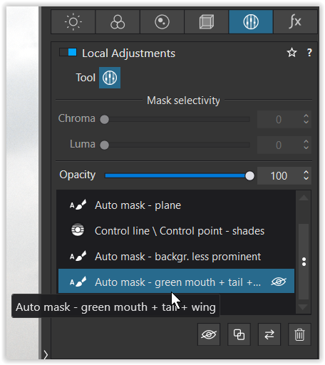
if so then you can filter, mask out the sky by local control line.
and turn up blacks and touch up colors by saturation, clearview ,
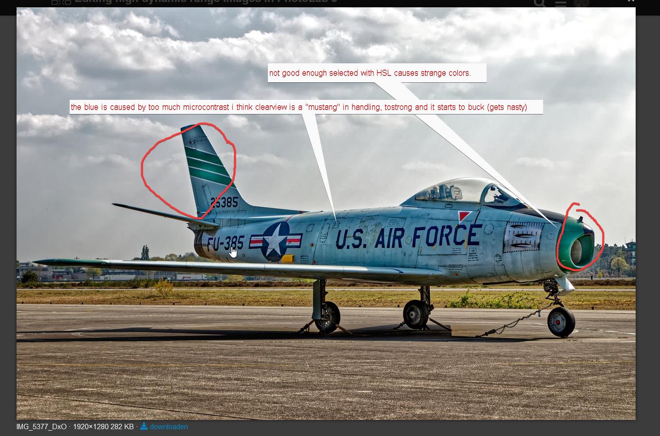
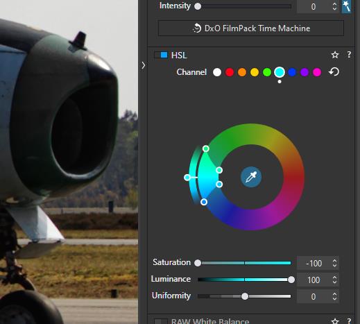
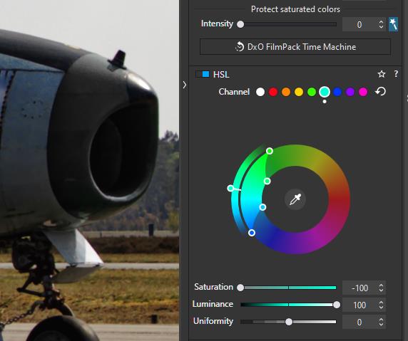
fine contrast, vibrance. green of the nose touching up by HSL. about 5 min work.
IMG_5377.CR2.dop (21,3 KB)

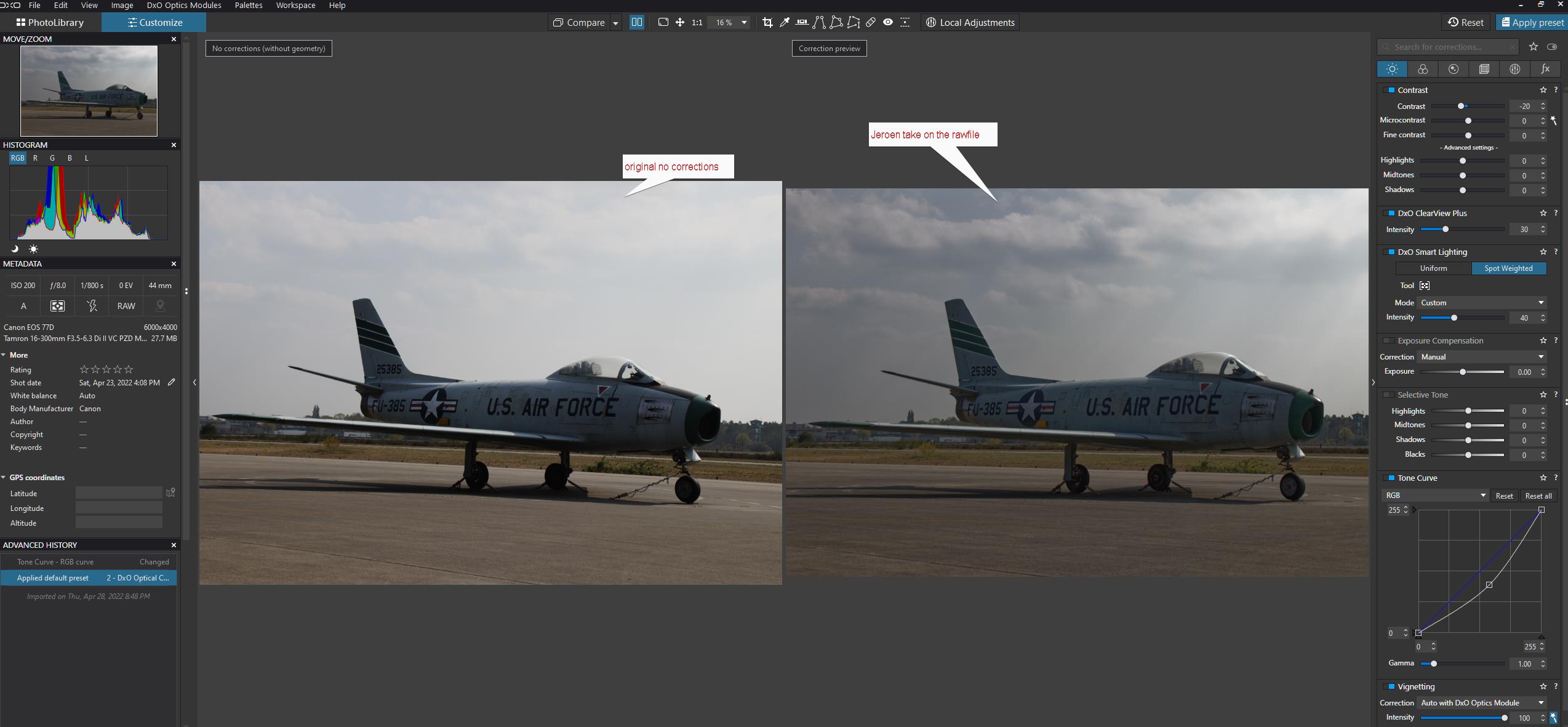
didn’t bother to level out, just colors and lumination.
ok did some more finetuning and on my 2k BenQ it looks as vibrant i can make it. looks a bit CPL kind but still good , and forgot no deepprime so now deepprime added.


IMG_5377.CR2.dop (21,9 KB)

about this: (personal opinion no professional skills what so ever in photography)
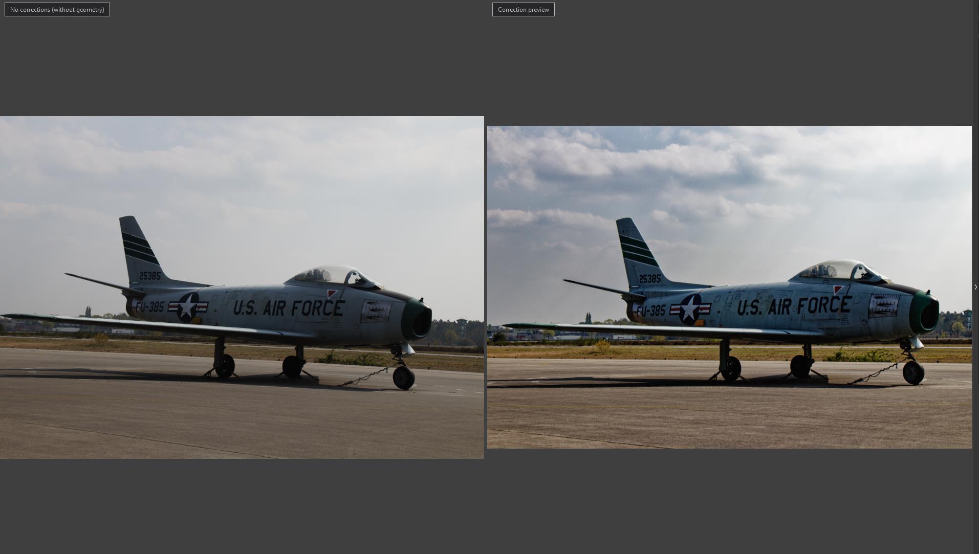
sky looks abit too dramatic and doesn’t align with the foreground, (no shadows of clouds) Those streaks of sunbeams distract me. the sky looks like the main subject now.
colors; plain is somehow a bit flattend, washed out. if that’s the main subject that should be shining.

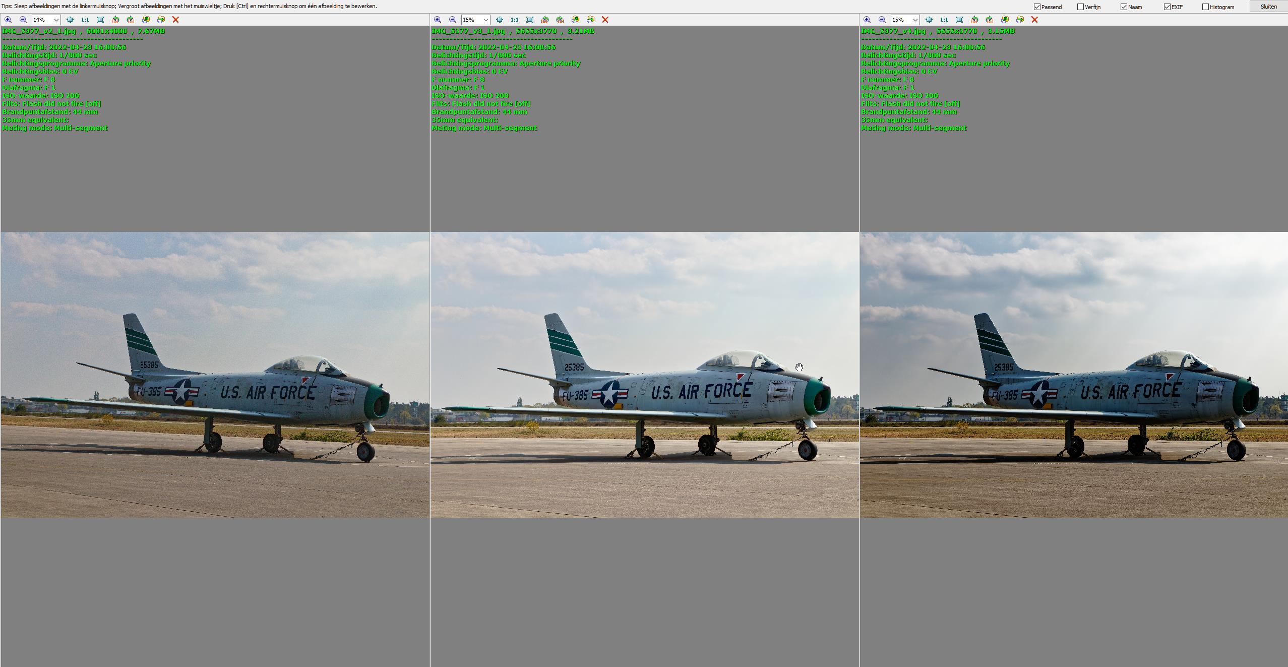
in my take v3 i tried to visualize what you would see with your own eye’s. (you can HDR in your brain) so i used a pull (highlights down) and lift (shadows) to lower dynamic range in the image.(white/black)
brushed up the colors tickled the details with fine contrast instead of hars clearview/microcontrast globally and used local on the sky to get some structure in the clouds for decoration.

Hello Peter,

Many thanks for your good criticism, this I can learn from. Yes, all depends on personal taste and perception. However, your results look more natural whereas mine are more on the dramatic side of the spectrum. I see the differences between them. I’ll try replicating your versions. Done a bit already.

IMG_5352.CR2 (27,1 MB)
IMG_5352.CR2.dop (10,4 KB)

IMG_5383.CR2 (29,2 MB)
IMG_5383.CR2.dop (9,4 KB)

Thanks again Peter.

1 Like

My first thought was what a beautiful sky! The clouds, and the sunbeams - lovely. Second thought was that the plane was too dark, obviously because it is in the shade, not in the sunlit area, but a little lightening like what @OXiDant did made the plane much better - but then the image was very boring without the sky which “made” the original image.

Second thought was the horizon was tilted, so the plane appeared to be moving downhill to the right, and if I squint my eyes, the whole image is “offset” to the right - if you had more space there, it would be balanced better. His second image fixes the plane and the horizon, but to me, what was so unique about the photo is lost.

I guess what @GIBF4 wrote is true, but for better or worse, that sky and the sunbeams are what “made” the original photograph. Without them, it’s just a boring photo of a plane. If the photo was being made for an album of different kinds of airplanes, the modified version is likely better, but I prefer the first image (and would like it even more if there was more “space” in front of the plane).

1 Like

yes and no.
yes as in if the sky was like that.
no if it’s “arteficial brought in” to make it more dramatic.
i took a look at @GIBF4 his adjustments.
1 drag down tone curve mid section.
2 40% spot weighted smartlighting (that’s why the plane looks washed out.)
3 contrast -20 even more details turned down.
4 vibrance 10 saturation -10 (can’t say why this would be a choice)
rendering also neutral color and tonality.


i tried to get those streaks out but those are that deep hidden.

thus now i chose to keep lumination level on plain as much as possible the same.
dramatised the sky as much as possible and keep contrast and color vibrance on the plane as good as possible.

IMG_5377.CR2.dop (22,9 KB)
it looks like i used a CPL and turned it to the max.
so i backed down a bit and the streaks are gone.
v4 is modified as much as possible keeping the sky as it is.
IMG_5377.CR2.dop (22,8 KB)

if the plane is the subject: left is too flat, right is too dark contrasty.
Jeroen is the one who is remembering how it looked for real.
probably the middle but slightly darker.
i do acknowledge that the framing could be wider to create more “natural space” but maybe there where distracting people or objects which would enter the framing at a 24mm.

my take …
different White point, reduced Contrast, high Clearview but reduced colour (HSL), Local adjustments


VC2 → IMG_5377.CR2.dop (155,3 KB)

1 Like

Nice one. (didn’t download the dop. Different pc.)
By white point you mean lumination? Brightnes? Or more WB?

I always have a love hate relationship with clearview.
I use it global often at 15% but not more for saturation, clarity, sharpening.
But to gain structure in the sky it’s often a mis and hit. (local adjustment.)
I would love to have the advanged contrast sliders in local adjustment.
Fine contrast would be much more gentle to use in higher levels then microcontrast/clearviewplus.

1 Like

Hi Peter – check …

  • Horizon + Crop
  • TonCurve (White Point + Gamma) + SmartLighting Spot Weigthed + Contrast
  • ClearView + HSL (multiple)
  • Local Adjustments (multiple)
  • :slight_smile:
1 Like

Good afternoon ya’ll :slight_smile:

Thanks for all the extra information; seems I have some homework later this evening…
Again, each their own flavors, tastes, and interpretations. However, I’ll try replicating what you’ve done for me to make some further assessments and steeping up my learning curves.

Thanks again for putting effort into arranging all the different solutions based on my earlier, quite basic and mediocre, RAW file. I’ll go sit and rethink how to establish the same, or close results. Those being a mix of yours. You see, I quite like the somewhat dramatic look in photos, but should better not overdo it. :slight_smile:

PS: @Peter; I’m on PL5.2.0-4732 Elite with Filmpack v6

2 Likes

Practicing at the moment. Some results. Don’t mind the composition, its a bit off (Canopy and fuselage had to be covering the building (slightly higher) in my opinion).

IMG_5307.CR2 (27,5 MB)
IMG_5307.CR2.dop (10,1 KB)

Jeroen

Back to initial subject and composition.
Done renewed approach. Too much? or more in line with what is should be (focus on the plane, shining more and more attracting the eyes?) Agreed, the earlier one was too dark (Thanks Mike :-))

Jeroen

Hi Jeroen,
when you use a high amount of ClearView like I did to quickly enhance structure on the plane and for the sky, what I normally don’t do at all (you wanted some ‘drama’), you get a darker pic and stronger colours.

To see the effect, check with my version and disable / enable the HSL tool and adjust the settings to taste. Strong colours look catching for the moment … Do the same with Local Adjustments. Disable them all and enable them step by step. With your mouse over the pic, press [ M ] to see the mask.

It all depends, what you want to convey – a military jet, a big toy … whatever.

have fun, Wolfgang

2 Likes


@Wolfgang 's version “my take…” is just a bit more natural.
HSL, by dragging the pins around you can select more carefully a group of colors
1 use colorpicker for the initial colorselection.
2 shift saturation to -100 (selection gets grey) (if not visible enough shift lumination to 100.
3 use pins to get all you want “grey”.
selection HSL
selection HSL 2
4 check by choose a daft color the selection (first set sat and lum back to 0)

5 adjust accordenly in what you see.

6 double click on colorpin (outer wheel) to reset colorchange choice and use the three sliders saturation, lumination and uniformity to finalize desired color.

7 pick one of the other channels and proceed for say “red” repeat step 1 to 6.

Clearviewplus has some “intelligents” in choosing where to place microcontrast to enhance sharpening and saturation.
see this post to see which slider and contrast type does what.

Have Fun!

1 Like

I guess my problem is me, not the editing. All the. edits make the plane look better, but if I was going to hang one of them on my wall, it would be the original version, with the lovely sky.

I guess I’m either ignorant, or spoiled.

nothing to do with both.

compare it with the old VOC- warschip paintings.
those are all dramatic in colors and waves and sky.
paste this in google “voc war paintings” hit show images and you know what i mean.
(Do you think that they never had a battle in plain blue sky and low windstrenght?)
everyone is free how to interpret a taken rawfile.
1 by memory for the reality you witnessed (not the actual reality because that’s mostly the oocjpeg (edit if you have “natural” profile active.)
2 what you intended to capture, sunset? awb does a trick with you.so you need to go by memory.
3 what you like to show.
4 goofing around to create something new.

Your head is wired for “true images” wile now a day’s “true” means natural looking.image atered in covering flaws.

In this case the take away was sky or plain? which is the lead subject to catch the eye?
how far can you go in contrasting, edging out, lines in the image before it brakes?
You can only find the center if you know where the edges are. :slight_smile:

the lovely sky is the result of @GIBF4’s first edit ( easily to see when opening his files ! ),
as the original photo shows a bright sky.


A simple correction
I’ve been a bit sloopy and ‘supressed’ the green painting on the jet’s mouth, tail and wing …


the new Auto mask – covering mouth, tail and wing


Screen Shot 05-01-22 at 12.05 PM
plus increased Vibrancy and Tint – 60 ‘restored’ the green paint

and also refined the → “Auto mask - backgr. less prominent”


VC3 → IMG_5377.CR2.dop (485,9 KB)

note

  • while I didn’t care about the lacking green paint → just showing how to with a simple correction …
  • always download when to judge colour rendition – not the Forum
1 Like

I did as you suggested, and am now looking at a large collection of paintings of ships. To me, none of them are “real”, as paintings are interpretations of the scene, as seen by the artist. So, I enjoy the colors, and the action, and how much detail there may be, which I’m interested in as I’ve never seen “the real thing” and I suspect there may not be any photographs - maybe I’m wrong on that point.

Some I like more than others. Some I don’t enjoy, and some are done in a manner that I can almost think of them as photographs.

For me, I guess I agree with the first thing you wrote, but not with the second. Once the “flaws” are “corrected”, it is no longer a “real” interpretation of reality. While an altered version may look much prettier, it is no longer “true” to me.

Fast forward to today. Given my 'druthers, I’d rather see images that look like a PL5 image on my screen, showing the “reality” but correcting for flaws from the camera (distortion, brightness, and so on). Personal choice, but to me, that is a good starting point.

I agree with your conclusion, along with what I wrote. To me, the sky is far more interesting than the airplane. Maybe if I was an expert on planes, I’d feel differently, and I might be intrigued with all the detail of the plane shown in the photo, but I’m not, and to me it’s just an annoying photo of a plane which is cropped too much at the right, so now “breathing room”. Meanwhile I see lots of interesting things in the sky.

What I think or feel is unimportant. I keep “seeing” this beautiful sky, and the plane doesn’t quite fit. If it was taken from a few feet back, maybe the image would have been more “balanced” to me.

So true - and for me, the “edges” are outside of what was captured, but maybe there is a very good reason why no more space could have been provided at the right. Again, to me, if I was able to see all that, I’d have concentrated on the sky, and positioned the plane in my photo to be more “balanced”. I certainly agree that the edits that people have done to the plane improve the plane, as we can see it better, but for me, I would prefer all that work, along with keeping the beautiful and dynamic sky. With the capability of PhotoLab, it doesn’t have to be one or the other - it can be both.

I love what @Wolfgang did to get such a good image of the plane. What I would really like to see is “the plane” as edited by Wolfgang, and “the background” as shown in the image I like so much.

@mikemyers – download the files and start yourself.

Just don’t mind should things come out different than imagined. We always learn something.

The artists where never on site and never seen that battle them selfs and painted them in Amsterdam as told to them how it “was” . “Dutch sky’s” where a very famous technique and Monet was travelt specially to Holland to learn to paint “dutch Sky’s”.
The high waves and dark sky’s are emphases the heroism of the sailors in there battle.
battling in a smooth sea and sunny weather looks to “holiday-isch”. It’s the era of dutch sky’s with streaks of sunbeams and drama.
When you living here you see those cloudy windy sunbeamed sky’s often. But they are very hard to capture correct in there full glory.

if the plain was covering less of the frame you could say it was more balanced but i think there where distracting objects around the plain which he tried to eliminate out the frame.

anyway it’s about controlling the tools to get what your brain likes to make of the file. Different views means different approaches of the same data. that’s the beauty of rawfiles and a good rawdeveloper.
:slight_smile:

I’m sure I would, but my first priority is to work on the photos I took in Colorado over the past few weeks.

Looking forward to seeing one or two of them…