Kodak Portra 400 is a color negative film preset included with FilmPack.
Mark
Kodak Portra 400 is a color negative film preset included with FilmPack.
Mark
I never heard of that film until a few minutes ago - tried it, but didn’t get very excited…
For a while, I want to continue with B&W until I’m comfortable with it.
I’d also like to eventually get involved again with Infrared B&W. I just need to use my Leica M8.2 to do so. None of my other cameras can do it, unless I get the anti-infrared hardware removed.
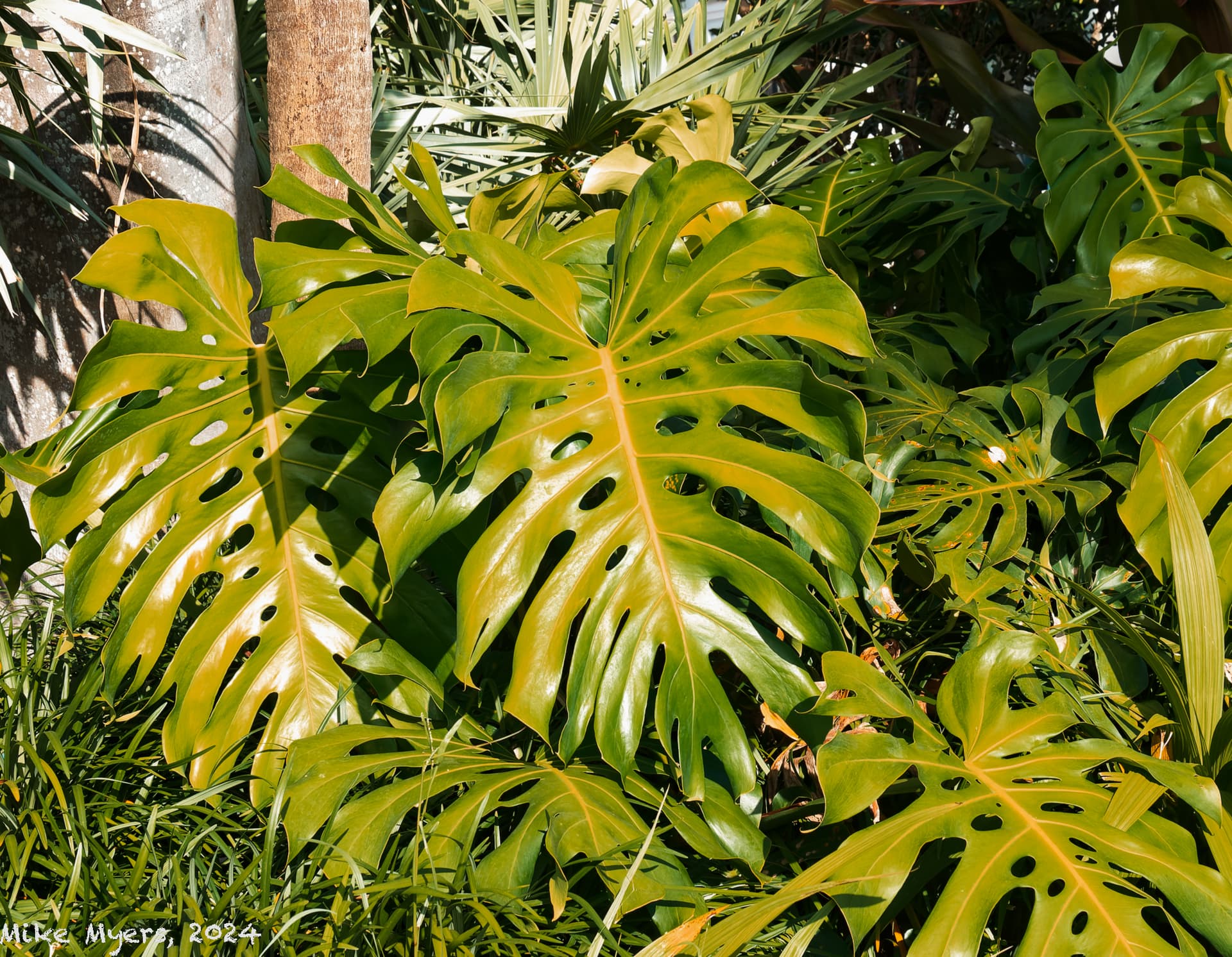
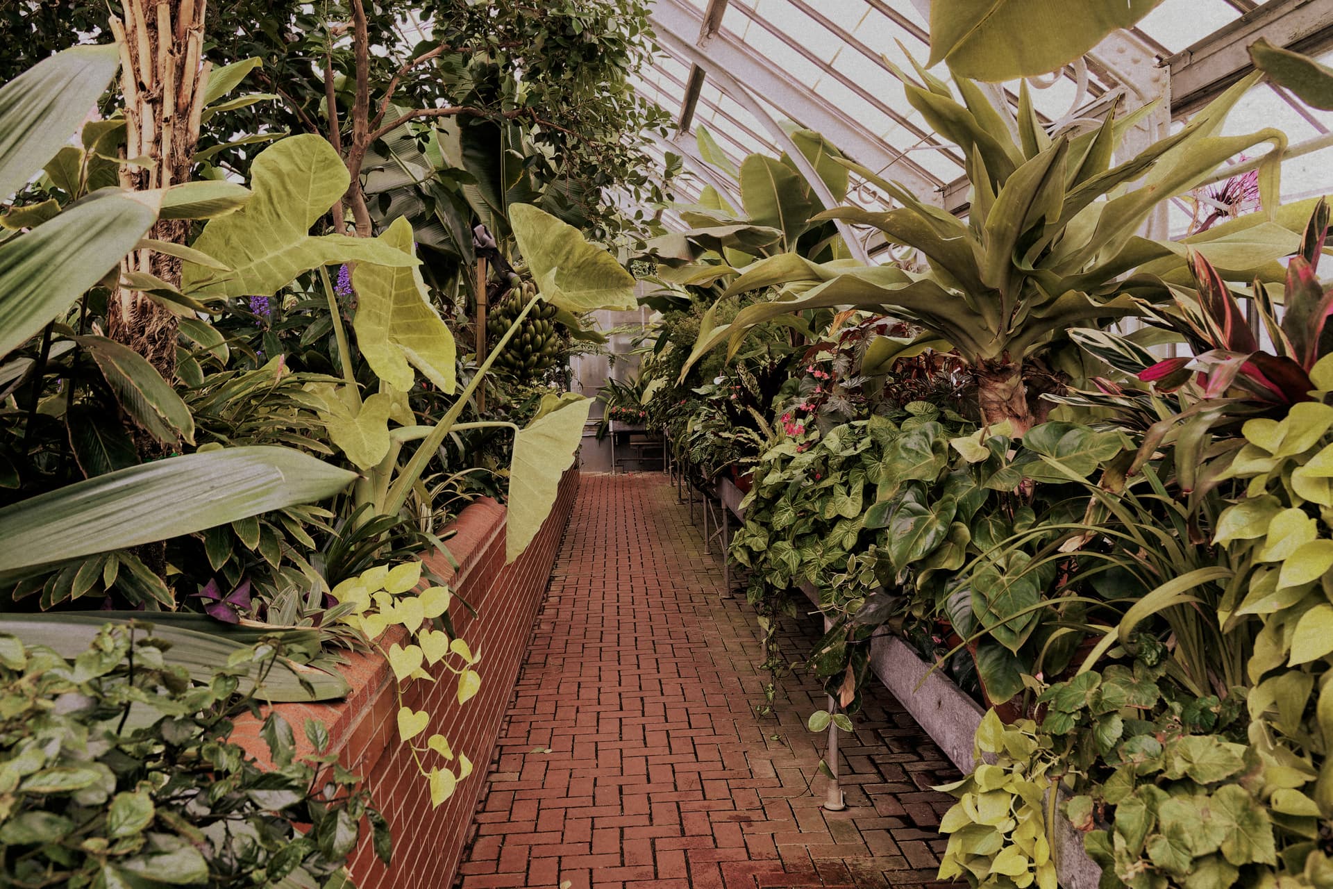
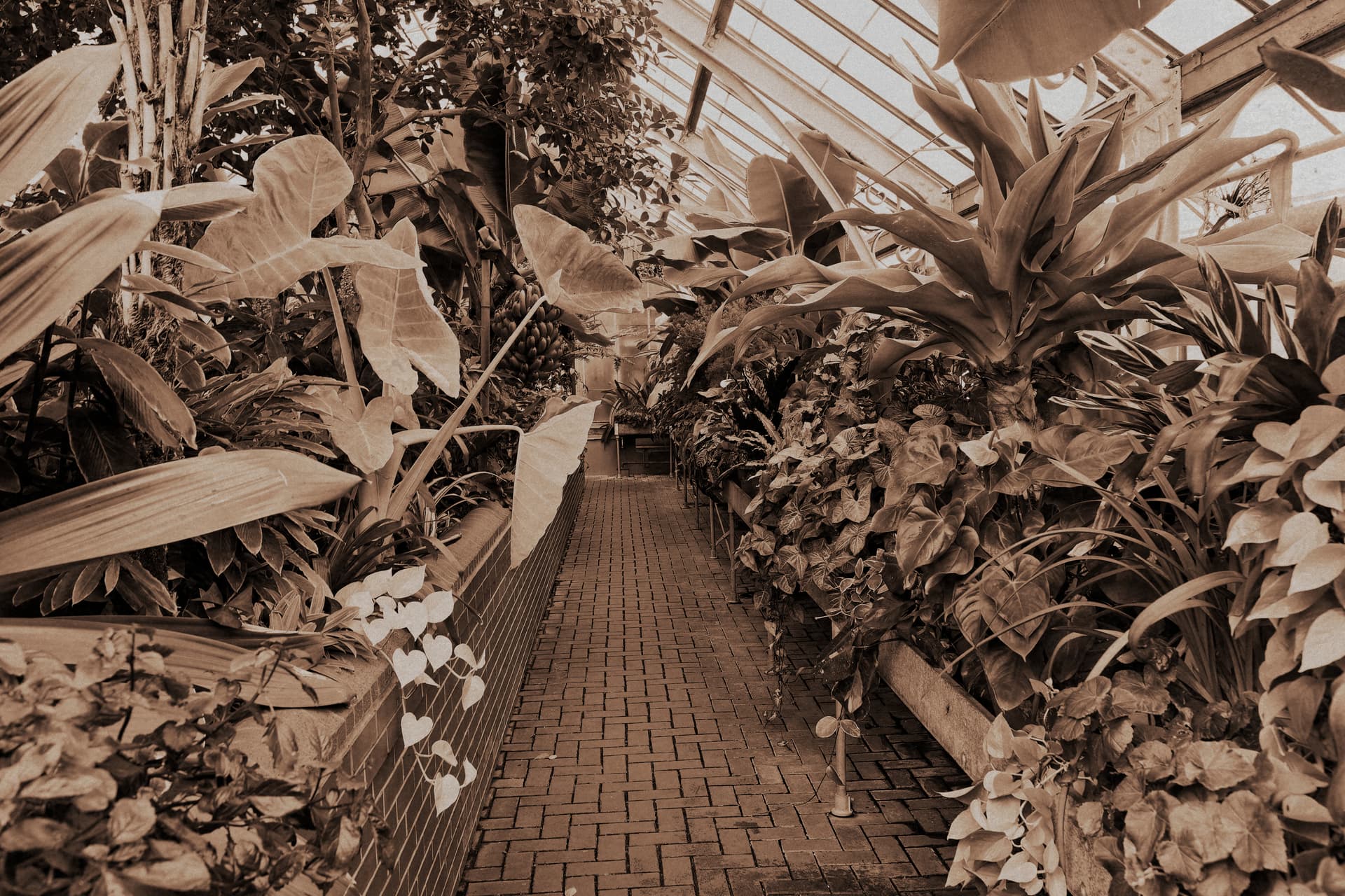
As a comparative, here is one of mine. The first version is finished with Fuji Velvia Vivid. And, since this is a Black and White thread, I am also including a second version finished with the DxO Time Machine’s 1930 Contrasted Sepia. It was taken in the garden greenhouse of the Biltmore mansion in Asheville, North Carolina with my long gone Canon 7D Mark II and Sigma 18-35 mm f/1.8 lens.
Mark
Fuji Velvia Vivid
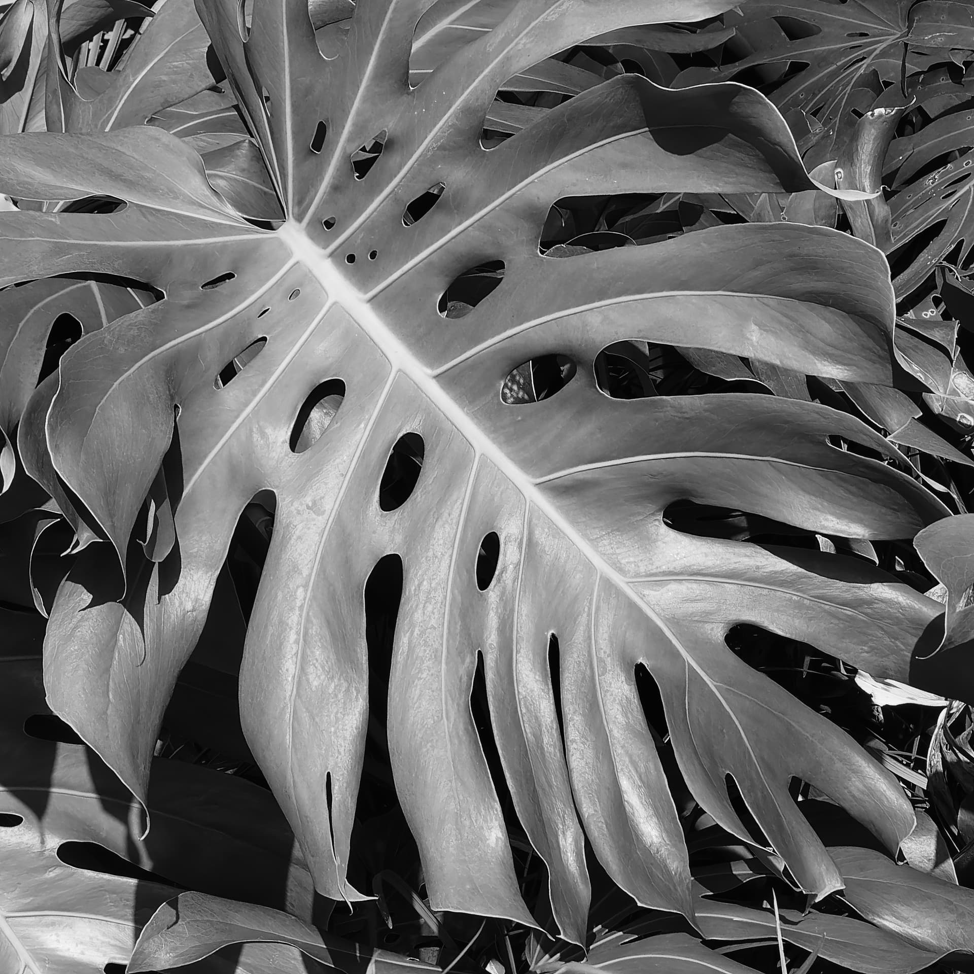
One of the keys to good B&W is not just adjusting the levels, etc - it’s looking for good composition, contrasts, patterns, repeats, etc.
Your image is a bit of a jumble with too much in it. Here’s my version…
Still too much clutter but, at least, this almost isolates one leaf and makes it a separate, principal subject.
Wow, seeing is believing. Makes the more full version look like a waste. I also like the way you set the angle. I never even thought of doing something like that, but what you showed is the heart of the image.
Mark, the top photo looks “alive”.
The lower photo looks “dead”. …but I know why.
That old Canon you had was supposed to be a fantastic camera, as I recall. This was back in the days of “Canon vs. Nikon” and nothing else counted.
Having fun with images that I had given up on…
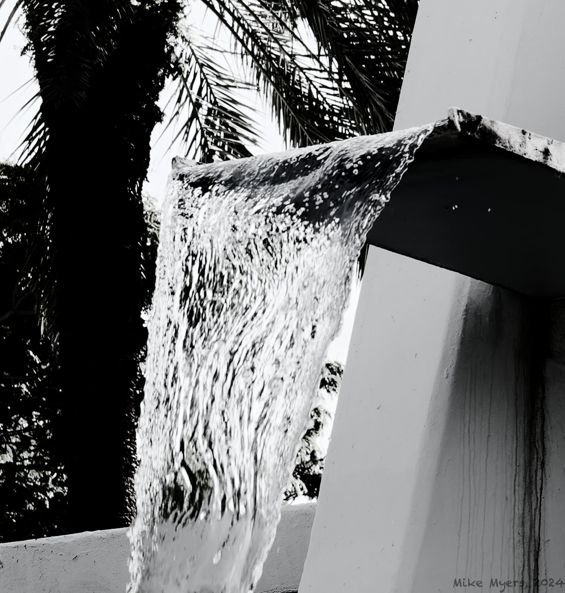
The image really is vertical, proven by the tree.
Two minutes earlier, a bird had flown into the waterfall to get a drink. ![]()
Not sure if I should have used a higher, or slower, shutter speed.
780_5977 | 2024-07-07.nef (31.4 MB)
780_5977 | 2024-07-07.nef.dop (13.9 KB)
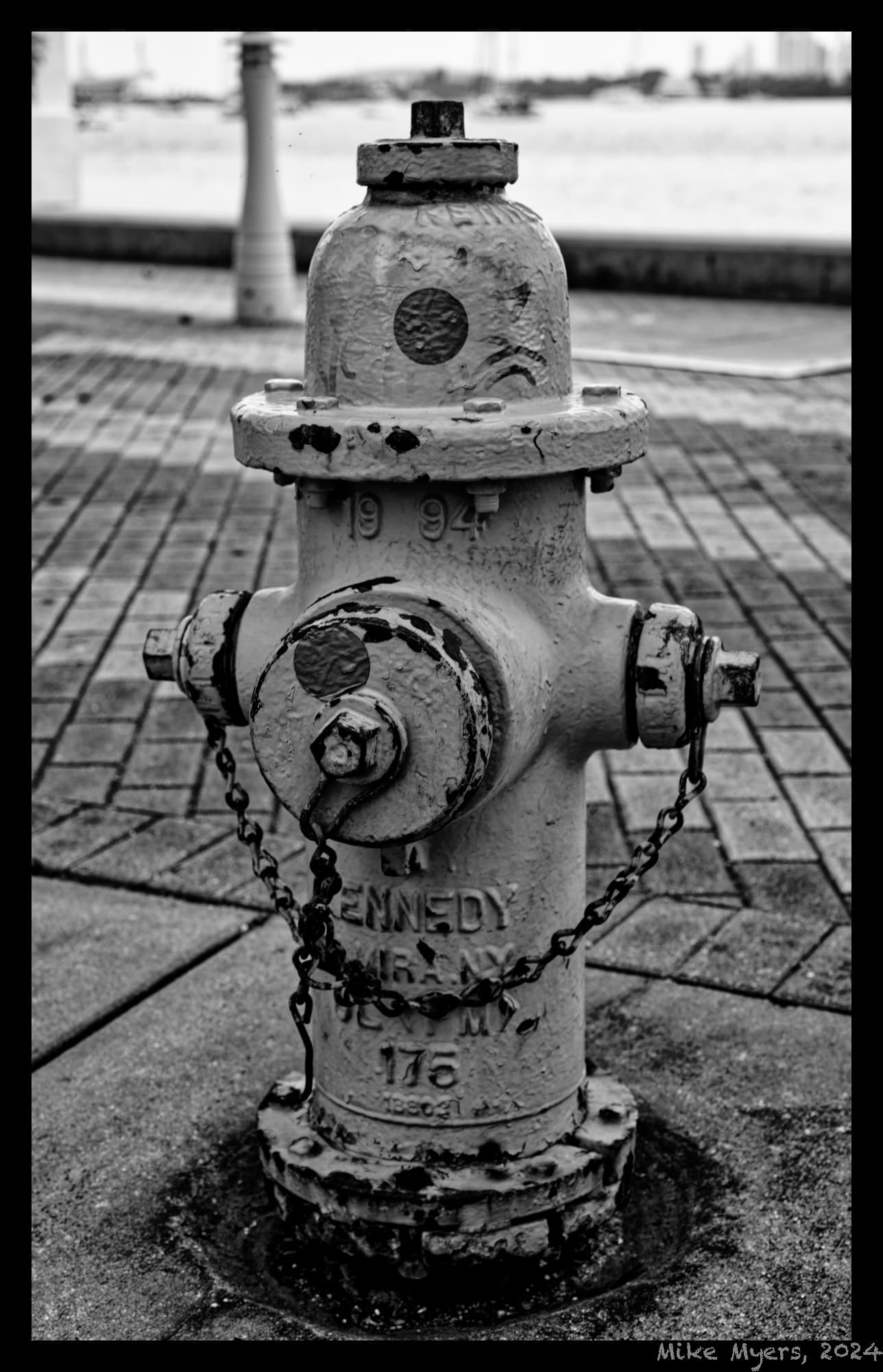
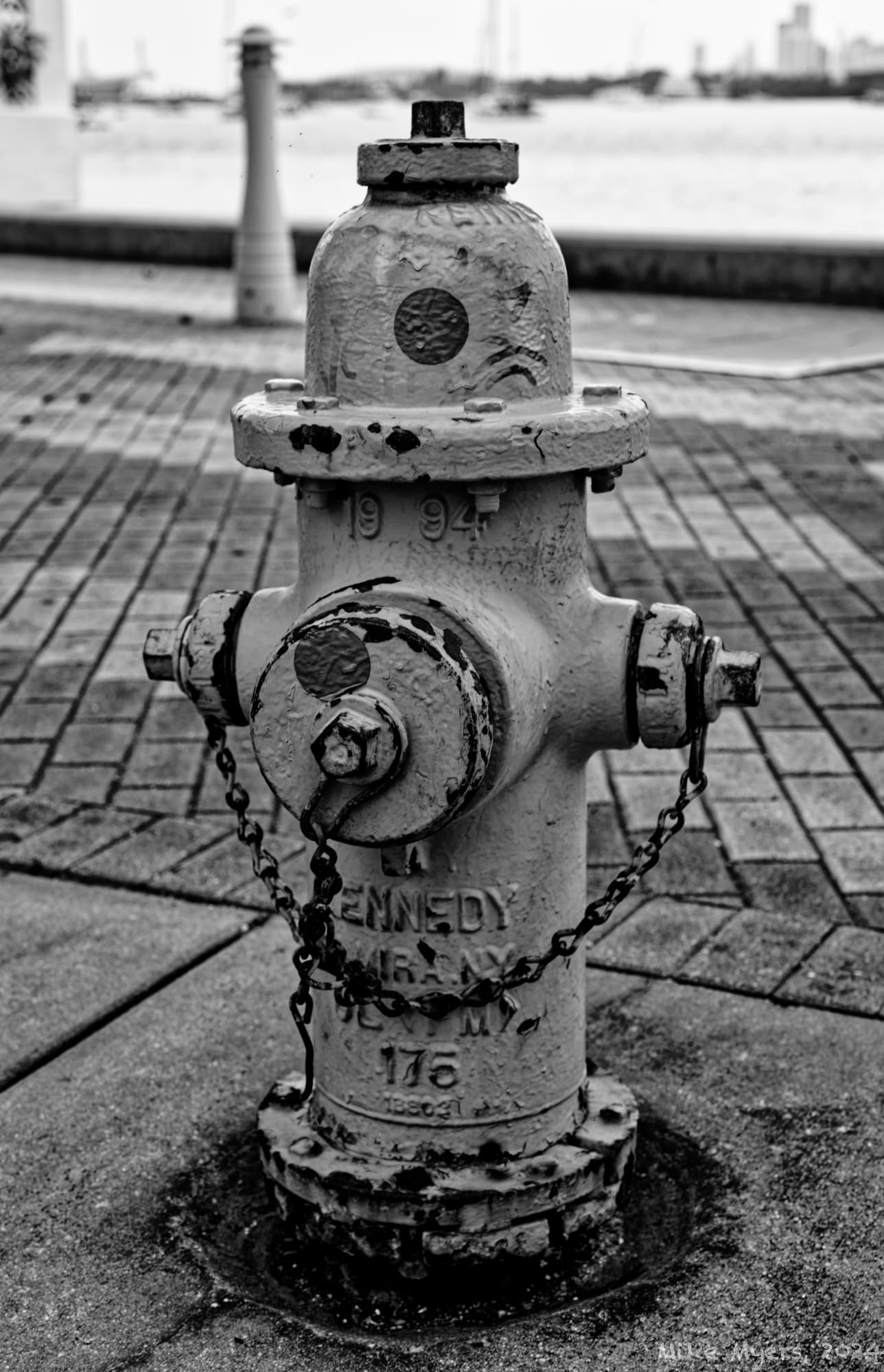
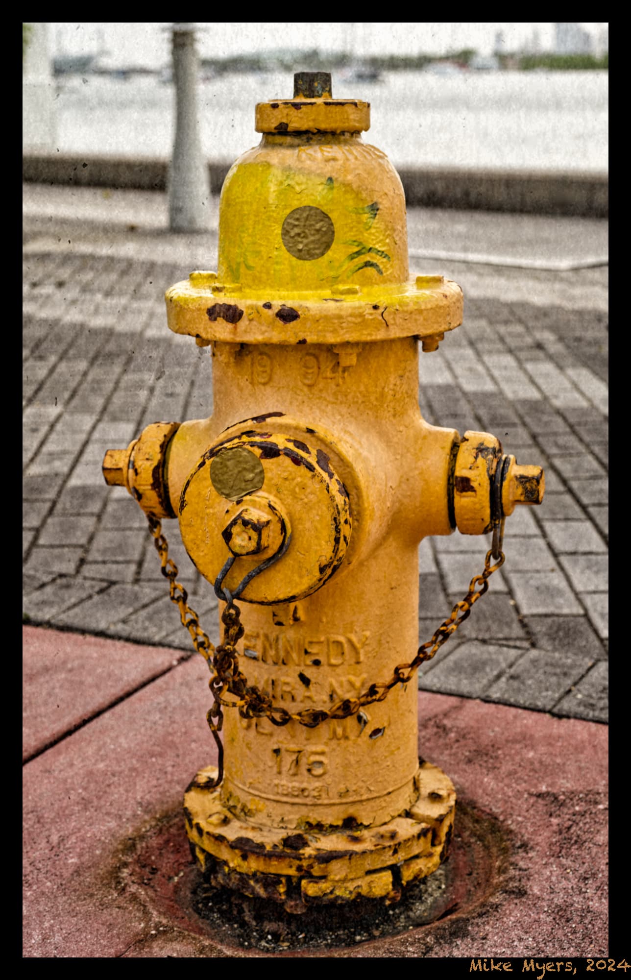
Just having fun. Went outside my building to Biscayne Bay, and was just trying different things on my Leica M10, so I feel as comfortable with it as with my D780. It will never catch up, but I’m improving. I found this fire hydrant that was just begging for a photo. It wanted to show off its colors, but I wanted to use B&W.
I think I can now create better images than I did back in the 1970’s in my darkroom. I would dream Ansel Adams, but make prints like kids in the third grade. Eventually, learning more and more about how to properly print negatives, I got to where things were at least acceptable.
I never could have made a print as good as what I’m posting now though. PhotoLab may be a challenge, but I never got good feedback when I was a kid. Not like what I get here, that’s for sure!
L1004798 | 2024-07-09.dng (26.4 MB)
L1004798 | 2024-07-09.dng.dop (13.8 KB)
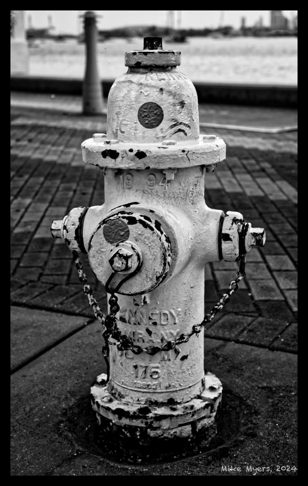
I like it more without the frame. I think I’ll stop using frames.
Woke up this morning with a fresh view on all of this, and realized that much of what I liked about this image was shown better in the color version. I need to do more thinking about “why” to use gray-scale photos, rather than “how”.
Even for Joanna’s beautiful b&w renderings, I’m curious about how and why to switch back to B&W.
I deliberately shot this photo last night, intending it to be a b&w photo, but in retrospect, I think I was wrong. A few minutes ago, I just removed the settings that made it B&W, and got this result.
So, maybe this thread 'Creating B&W Photos - good techniques" ought to be:
When/Why to use B&W for rendering photos.
Perhaps Google (or Ken Rockwell) is your friend…
https://www.kenrockwell.com/tech/photoshop/b-w.htm
https://photographylife.com/black-and-white-photography
https://photographylife.com/when-why-to-shoot-black-and-white
Perhaps, after reading these resources, and trying to create some B&W photos yourself you can come back with more targeted questions or request feedback. You are selfishly tying up other’s valuable time when you don’t do some homework yourself.
Some people don’t need advice but attention.
Mike,
With regard to frames you have an option to place them inside the image or outside. In this case you placed the frame inside which cropped the edges of the image. I don’t know if that was your intention but I just wanted to point that out in case you were not aware of that feature.
Mark
Amazing - I used ‘frames’ for the first time many years ago, and since then I never really checked the wording for the tool:
This means I can put my watermark on the frame, rather than on the image.
Thank you once again!
I agree.
Ken’s article didn’t say much, the second article was wonderful, and the third was just about as good.
Both of them left me thinking about “why” create an image in B&W rather than color. My reasoning was wrong - I just wanted to create some B&W images. More important to find an image first, and consider how well it would work in B&W.
The “techniques” part, (assuming I’m using PhotoLab), are starting to make sense to me, so it hasn’t been a total waste. “How to do it” comes before “How to do it well”.
I guess you can. I never thought of that. However, if your purpose for using a watermark is to protect your images, sticking it on a frame outside of your image’s boundaries makes it even easier for someone to remove it.
Mark
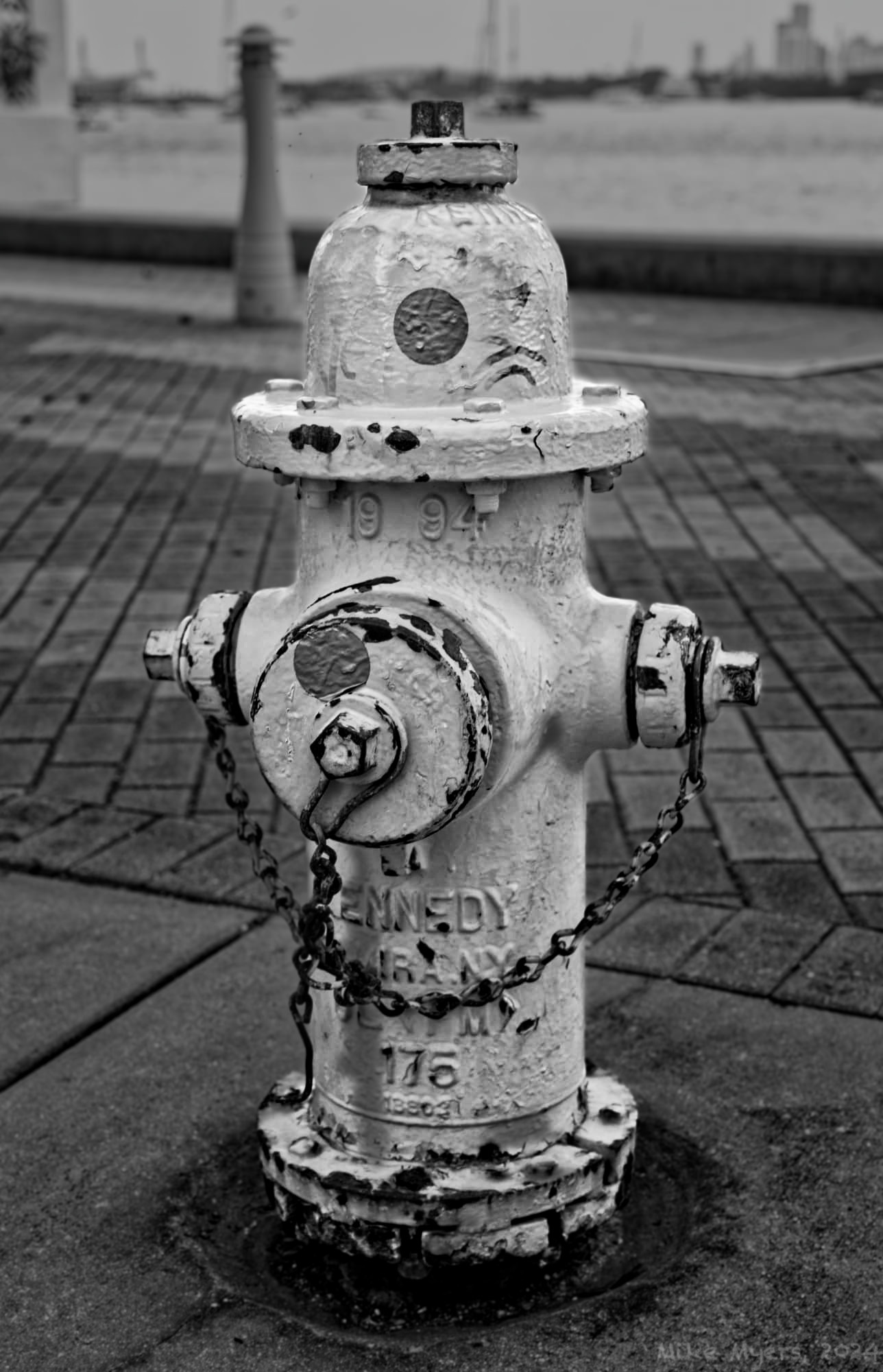
What I like about your interpretation is that the hydrant stands out as fairly bright (which it was) against a rather darker scene. For two hours I’ve been playing with settings, most of which was just finding out what not to do. I got to something close, but not good enough, so I started at the list of B&W films, and one by one, moved up from the bottom. I finally selected “Roller IR 400” which I never heard of. After that the rest of the editing seemed to fit in nicely, but I wanted the hydrant to be brighter than what you picked. I couldn’t find an easy way to darken the top of the image as you seem to have done, but by the time I finished, I thought I was satisfied. But my version didn’t show the “roughness” of the fire hydrant. So I added more contrast. Better, but not good enough. I thought you over-did it, but when I added some Micro-Contrast (first time in years) I got what I wanted, and more like what you did. To be honest, until I saw your version, I didn’t realize all that “roughness” was there. I wasn’t looking for it, but now I feel it belongs.
L1004798 | 2024-07-09.dng.dop (46.8 KB)
Good thing I don’t get headaches - if I did, I would surely have one by now.
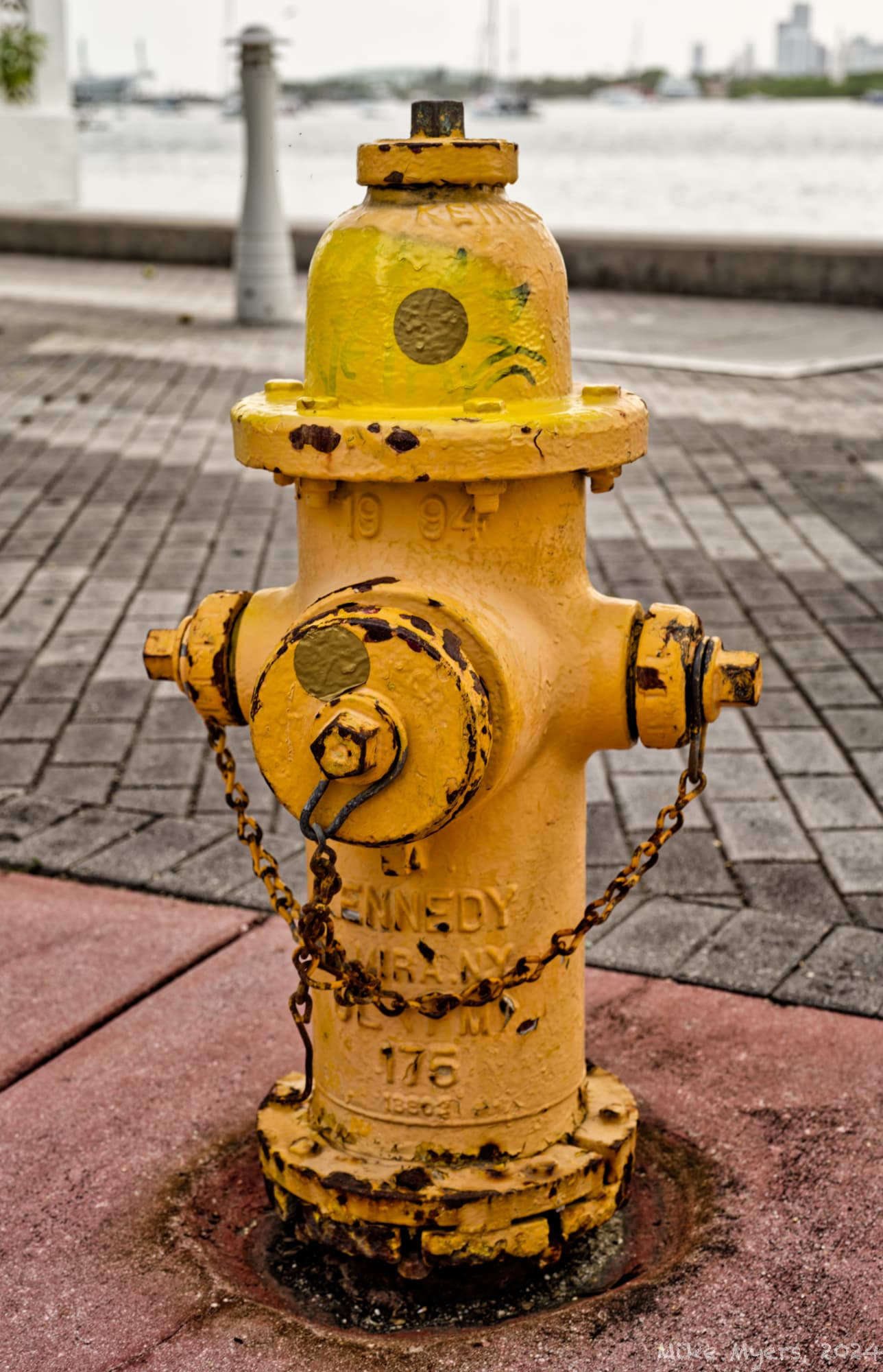
You’ll likely like it. I think Mark will like it. I suspect @Joanna will tell me it wasn’t necessary, as in the color version it doesn’t look at all like this to me, standing there. Should I show what I “see”, or what I accept is “real”. It sure do add to the photo!! Can’t miss it.
I built my first darkroom in 1957, and have been shooting ever since. B&W was all I did back then, and as a photographer, you have to “learn to see in gray scale”. In those days we learned the tonal ranges of various films and the effects filters, chemicals, timing, and printing with an enlarger.
My point is that photography, both color and BW require learning to see (previsualize) the scene as you want it to appear.
With digital, and literally decades of BW experience, I’m in hog-heaven. I’m delighted to be able to shoot in color, and convert to BW in a dozen different ways on the same image and digital tools.
By shooting in color you gain a massive amount of control. If you shoot a BW Leica you get what you get.
Color digital is the best thing that ever happened to B&W photography.
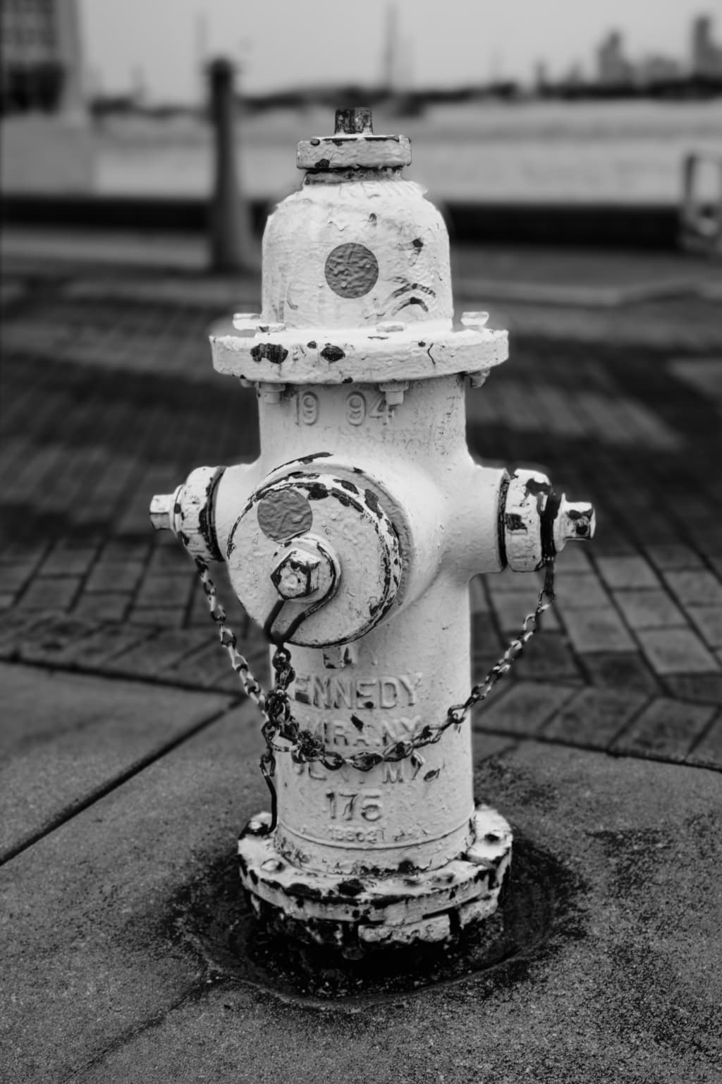
The biggest problem with this shot, colour or B&W, is the depth of field is too great, thus making the background too sharp and distracting.
This can be fixed in post-processing but truly should have been sorted when you shot it with a much larger aperture and moving the focus so that the back of the DoF was only just behind the subject.
Here is a mockup of what it could look like…
… although the artificial blur doesn’t have the same quality as true bokeh.
I also darkened the background like @swmurray did to further separate it. But I didn’t use any contrast enhancements.
After all this practice, I have to agree with you, but isn’t the best way to do that, to practice, practice, and more practice? Learning how to program my cameras so I can see the result in B&W is only a small start. But had I thought to do that, I’d have adjusted the aperture for less depth of field, as Joanna explained and illustrated. Had my camera been on a tripod, I might have been aware of that issue. I suppose I can re-take it, opening my lens wide open, or whatever I needed to get that depth of field.
“Should have’s” only work for future images Seeing results is a very strong reinforcement. I guess ML cameras make this easier to visualize - or LF cameras - or experience.
Amen. More things to learn, and consider, and seriously think about while capturing an image.
That becomes a good, solid, useful, reason not to buy the “Monochrom” without even considering the cost. Others here already knew/know that. Not me. My experiences with B&W film are just like with a Monochrom, excluding the ability to enhance the image, using the “color” information recorded by the camera.
I can’t afford to spend $5,000+ on a Monochrom, but after all this, my desire for one just evaporated.
As a test, I want to shoot this the same way, late this afternoon, with the lens wide open instead of f/5.6, and try focusing on the front of the hydrant.
Guilty - I never even considered that. Seeing the results now, it’s obvious…
Curious, was this with control points?
Contrast enhancements - I like all the detail on the hydrant that wasn’t really visible until I enhanced the image. Your result is “prettier” than mine, but the way I did it, the hydrant looks ancient, and shows it clearly.
Did you deliberately want the hydrant to look “tilted”? It was only a mockup, so you probably didn’t care.
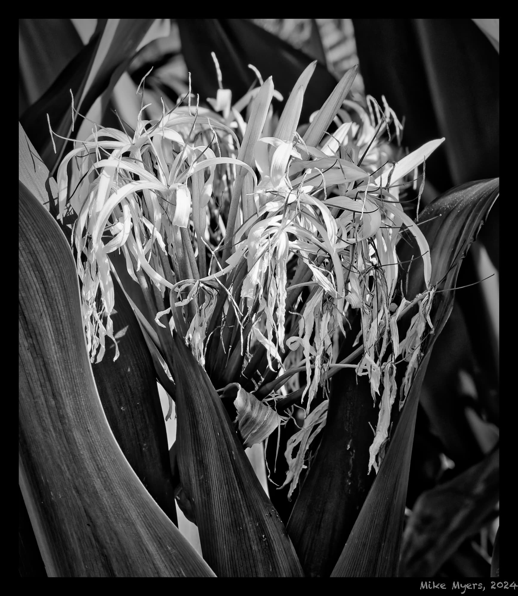
It’s not very “exciting” but this flower caught my eye. I tried to edit it twice before, then this morning. It never looked the way I wanted it to look, and I went back to trying one film after another. Fuji Neapan Across 100 was the only one that looked “close” to my imagination, and after a lot more testing things, I ended up with this.
I’m not sure if B&W is appropriate for plants, flowers, etc., but I changed my mind after switching to the Fuji film. I like it, but I like it even more when I change my computer background from white to black - or make it big.
780_5975 | 2024-07-07.nef (26.6 MB)
780_5975 | 2024-07-07.nef.dop (14.6 KB)