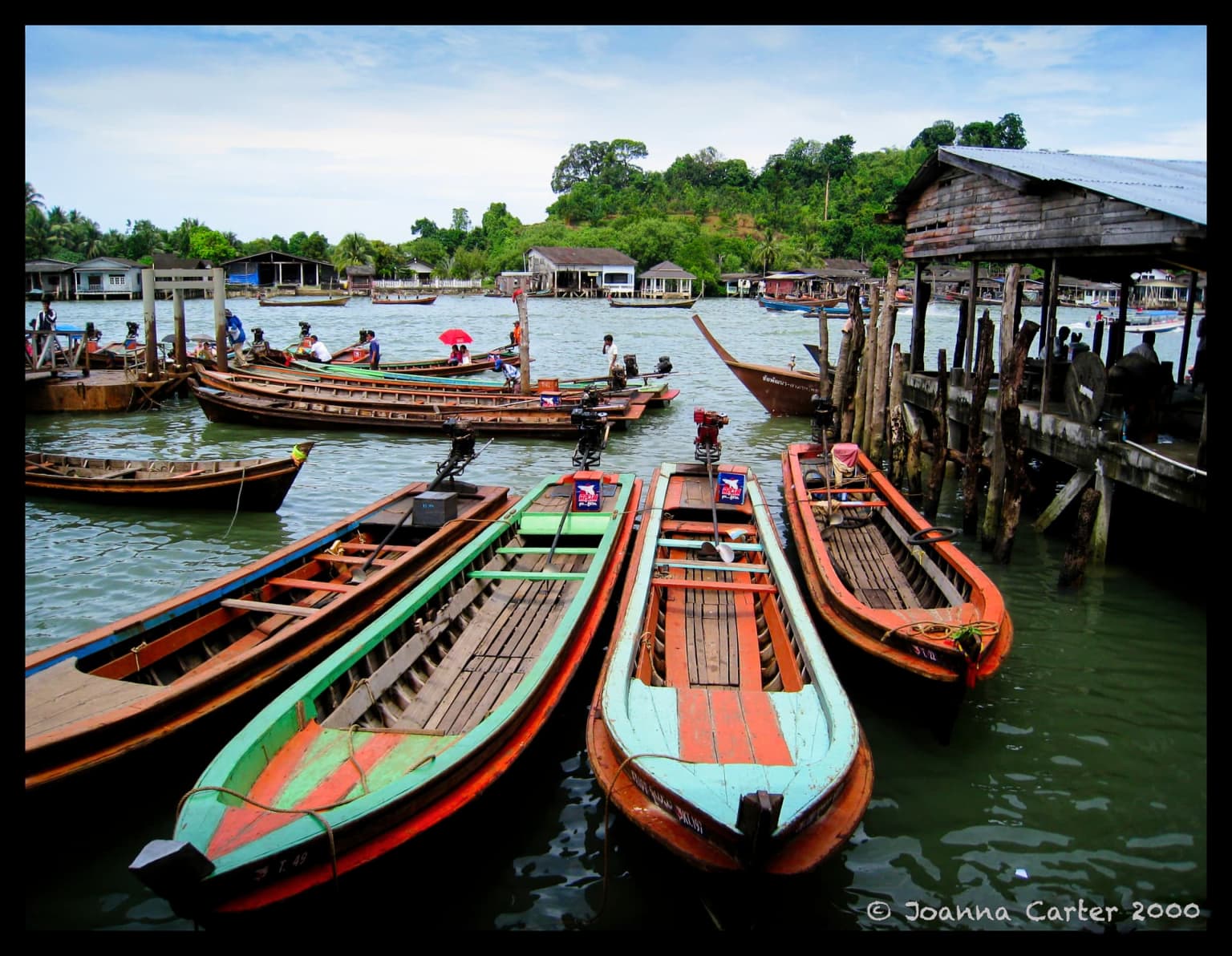
I wanted to take a photo of the brightly colored boats in the foreground, but there was no way to exclude the rest of the scene. So, I tried to get the rest of the scene to “wrap around” the boats that I wanted the photo to be of.
What I ended up with is three photos in one, the “background”, all the other stuff in the image “wrapped” around the boats I wanted the photo to be of, and of course those boats.
I like the end result because of the size differences - I think the photo was obviously taken of the boats in the foreground, and the rest of the photo is, well, just random “stuff”. I couldn’t exclude the other stuff, but it’s so small and lacking in detail, that I think people will mostly “see” the boats in the foreground.
Note - notice the the boat motors are turned 180 degrees, so the propeller and shaft are now inside the boat.
I don’t think there anything really random about this image. It looks very balanced to me. The surrounding boats and structures make an ideal backdrop for the four colorful boats which not only gives us context but emphasizes the colors, shapes and textures against a more subdued background. I like it the way it is.
Nothing much that could be improved. Maybe there is some headroom with a) the crop and b) the capture, which is sharp from front to back. A wider open aperture might have gotten you some background blur, which could have added some notion of depth.
Well, if you really wanted to separate these boats from everything else Photoshop would be your friend, and you could replace reality with whatever you could come up with.
But! It would have been a tragedy if you had separated these characteristic boats from an environment that shows the whole adventure. This time by unwillingly braking your dogma this image was saved for the world.
Btw., signatures in images make them look artificial imo, destroys the illusion, and it smells of marketing. Copyrights can be added invisibly.
And, since my copyright date is earlier than Mike’s, that now gives me a claim of prior art
And, @mikemyers, I really don’t know why you’ve started putting that horrible black border on your images. It is totally unnecessary and is just as easy for folks to change the background if they want to
Understood, but I liked the photo as-is, with a few minor edits.
Agreed - and I try to keep an “open mind” as to what I may, or may not, do.
Very important to keep an open mind, and not go off and do inappropriate things.
Signatures - I post my photos here, and send them to family and friends, and eventually SmugMug, and the hospital I volunteer at posts the photos in their clinics. I made the signatures much smaller, based on feedback here. I understand what you wrote, and each of us should do things the way we feel is “best”.
I enjoy the borders, and anyone who cares to, can remove them should they want to. But the only people who edit my photos are those in the hospital, where they get posted on the clinic walls, and they get adjusted to fit the place the photo is going to be mounted.
I like the borders, and I like the signature, and lately I’ve been enjoying the photos more than I used to. I used to dry-mount my photos, giving me a white border. I still have the dry mounting press, but haven’t touched it in 20 or 30 years…
If it can’t be avoided - a very small signature in a neutral color and only readable up close has a better commercial effect, because the people who would care about decoding it, are those who were in dialog with the image.
Without a photo title, I’d guess at the scene being somewhere in South-east Asia from that background and it looks rather inviting. If it were just the boats, I might have guessed India.
I don’t think it’s that cut-and-dried.
Yes it is, and I would agree that a signature that isn’t easy to remove will almost certainly detract significantly from the image.
I started out trying to make un-removable signatures until I realised I was ruining my images. Then I started adding tiny adornments in the corners (pre-PhotoLab signatures, it was very consistent in location and colour). Now I have a larger signature plate with some amount of flair to it, and I usually put it in a corner that does not compete with the subject. I also set the opacity to “visible, but not imposing.”
Why do I still do this when people can remove the signature? Because if someone wants to steal my photo, they’re going to do it no matter what I do. I include it for all the other people… the vast majority… who won’t steal it and may want to know who took the photo.
Not including a signature because it’s easily removed is like not voting because your vote doesn’t matter.
Probably not.
When I distribute images, I am always proud of having made them. They are like my children, they have invisible names.
When Mike shows his images in this facility he may have added a separate introduction with his name, intention, philosophy, price, contact data, etc.
Thus there’s no idea in letting an eye-catching signature compete with each single image.
I am a bit sensitive about this, because I have witnessed all kinds of narcissistic signatures that totally diverted the point of interest from a photographic image. And for some obscure reason the photograph suddenly becomes a painting to me. At pro exibitions the signature of the author is often places on a paspartout and has low impact.
Actually, I like “simplicity”. I usually end up with a single finished image, which I email to family and friends, post here, and (as soon as get caught up again) submit to my SmugMug account m.smugmug.com .
I grudgingly reduced the size of my signature, as so many people suggested. Since PhotoLab adds the ability to add a “frame”, I decided I liked that, and have used it ever since. It’s the closest I can come to “mounting” my images. I realize some people don’t like the frames - go write DxO and ask them to delete that from the available options. As for me, on my cluttered computer screen, they do a great job of isolating my photos from everything else on the computer screen. I use the simplest frame I could find, a black rectangle.
As you noted, I almost always post a short summary of what I was/am thinking, and how the photo came to be. I have no idea if others read it; there is no need for anyone to do so. I believe a photo speaks for itself, but I have decided that adding a “caption” is a good idea, for those people who don’t want to bother reading an explanation.
I have settled on a very simple signature, in a very boring “chalk-like” font, followed by the date. My second choice was a “newspaper font”.
Sorry, I’m not good enough to give my photos a look like a painting. If I knew how, I’d probably be trying to do it deliberately. The only person in this forum who I think could do that is Joanna, but that’s just a guess. Most of the time, I just want my photos to show what I “saw/imagined” with my own eyes, and replicate that in a photograph. This thought process usually starts when I’m first capturing the image. I’m also not good enough to know for a fact that my captured image is good enough, so I usually include a little “wiggle room” in case my camera was tilted, or whatever. With what I will call “toy/hobby” cameras, I no longer believe wysiwyg. What You See is What You Get". With my Leica, and the tiny viewfinder, I am mostly looking at things within the image, not the composition. With my DSLR cameras, if I have time to make everything just like what I want, the final composition is supposed to be completed in the camera. Supposedly.
As for simplifying the image, that is done twice, once with the camera, and again with the computer.
Guilty as charged. I finally understood what people here were telling me about my signature messing up my images. My solution, was to greatly reduce the size of the signature. If I was smarter, I’d have caught on much sooner. As I see it, the tiny signatures I’m now using aren’t big enough mess anything up.
Especially so, as I post the .dop files here, along with the originals.
I feel the same way sometimes, sort of, but to me, once I press the REPLY button, they are off on their own, to either swim, or sink.
Feedback can be helpful, or hurtful. But regardless of which, it is ALWAYS useful (eventually), although it too me a long time to make the signatures as small as I could, while leaving them legible.
Well, if for whatever reason, the borders bother you that much, I can stop adding them, just for you. No, it’s not just as easy for folks to add or remove borders - 99.9% of the wouldn’t have a clue as to how to do so, other than with scissors.
But from now on, maybe I’ll leave them off, while posting here in this forum. It’s not that big of a deal to me.
Don’t do it just for @joanna. They really look inappropriate and detract from all the images to which you have so far applied them. You feel strongly about cropping to remove objects that don’t belong in an image. Those black frames don’t belong.
They don’t annoy me at all and I really don’t care If you remove them or keep them. I think those of us who have commented on it are just trying to let you know that they detract from otherwise nice images. If you’re happy with them, keep them.