Carlingford, County Louth, Ireland

You said it far more eloquently than I did. That’s pretty much what I should have said when I referred to Mike’s version as a holiday snapshot. You hit the nail on the head. He cut out too many of the interesting bits in his crop of this attractive landscape, but not enough of the extraneous objects if his primary focus was the castle since the presence of the modern boats detracts from it.

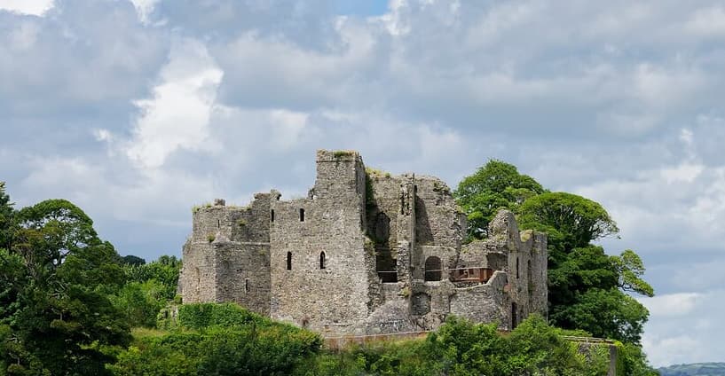
This is low resolution version and is pixelized when zooming in, but if I just wanted to see the castle this is possibly close the type of crop I would have done. Of course it required the removal of some objects which were in the way which is something that Mike is dead against doing. The removal was done in haste and is just an example of what I would have done. The result would have been much better If I had spent more time on it. But, in any case, I still like @mrcrustacean’s original version the best.

Mark

After

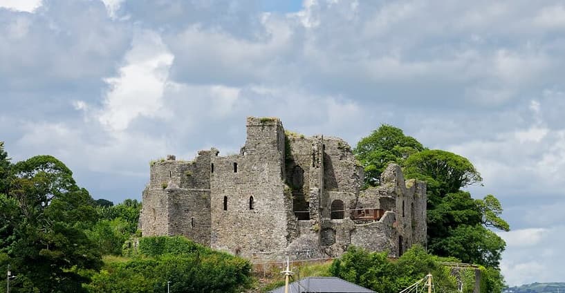
Before

Well, we all have our own ways of seeing things, but based on the title of the image, I wanted the castle big and clear, and while I couldn’t get rid of the boat in front, I did get rid of all the distractions (as I saw them).

Of the various versions now posted, I prefer the version I made, but I’d rather have excluded the ship and the “boathouse”. Mark did that just great, but the resulting photo feels “off-balance” being cut off at the bottom.

To me, the original photo shows a blue boat in front of a castle, with a lot of other stuff all over. My mind wants to exclude everything except the castle, but that’s not possible, and if the blue boat wasn’t there, then there would be very distracting tan colored structure - yuck. The boat being there blocks that tan structure.

Nobody is “right” or “wrong”. Just different ways of “seeing”. :slight_smile:

A lot of people want to include so much in a photo, even if it has nothing to do with the subject. To me, the less there is in the photo, the better the main subject stands out. Simplify. Even when it hurts.

If I was interested in making a more serious attempt I would have extended the bottom more and perhaps cropped a bit more of the sky, but that would have required much more work to remove the overlaying objects. Since my version was only intended as a quick example of what could have been done to remove the boats I wanted to limit the amount of effort.

Mark

That proves my point, Mike. Statistically you have chosen to be hurt more than 50 percent of the times.
You probably know this silly joke:
Beat me hard! the machocist urged the sadist. No, the sadist replied, for she was are genuine sadist.

Goes with the territory. Suggesting people leave out beautiful or interesting things in a photograph almost guarantees that they will reply about how fascinating, or beautiful, or necessary they are. Photographers, me included years ago, are that way. But to me, and the articles I’ve read, including all that extra “stuff” weakens the message being given to viewers of the photo.

Here’s yet another example:
https://washingtonphotosafari.com/news/the-art-of-exclusion-in-photography/#:~:text=To%20create%20a%20compelling%20image,in%20the%20image%20is%20diluted.

I understand the reluctance to crop all those details out of the above image, but if the photo is intended to be a photograph of the castle, all that other stuff does is give the viewer a chance to look at all the “small” and not very detailed “other stuff”. So, the question becomes is that other stuff really needed/relevant to the photograph? The title of the photo says it all. By including the other things the size of the castle is reduced, and it becomes just one more object in the photo.

Look at all of the representations of the photo posted up above. If you were creating a booklet about the castle, which of all the photos shows the best view of the castle, while still maintaining all the rules/suggestions about composition, and so on.

To me, the original photo is a standard “tourist photo” - aim camera at subject, and capture photo of subject and everything around subject. By zooming, or cropping, leaving out all the other stuff makes the photo stronger.

Anyway, that’s what I’ve been taught, and that’s what I usually try to do, even if/when it hurts. Leave out all the “extra” stuff, unless it helps show the subject of the photo better.

I’d have cut out the boat, and the ugly “boat-house” thing, but at least the boat hides the ugly structure in front of the castle.

It’s all a matter of compromises, for better or worse - or, to avoid compromising, leave everything else in the photo, as it hurts too much to leave things out. Been there, done that, got criticized by people better than me at this sort of thing.

Most of that “other stuff” is irrelevant to the photo of the castle. And, by including that other stuff, the castle gets smaller and smaller in the photo.

About getting hurt - I suspect that eventually, people will learn what I was taught, especially if they look this up on the internet and get enough feedback.
That article gives a few examples of how to isolate subjects. But that doesn’t mean you should imitate it like a headless chicken.

George

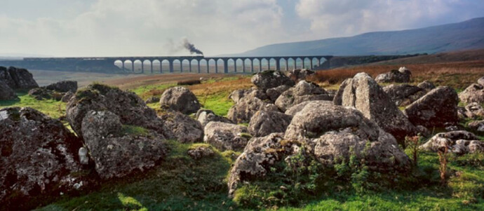
So, with a title of simply “Ribblehead”, how would you evaluate this…

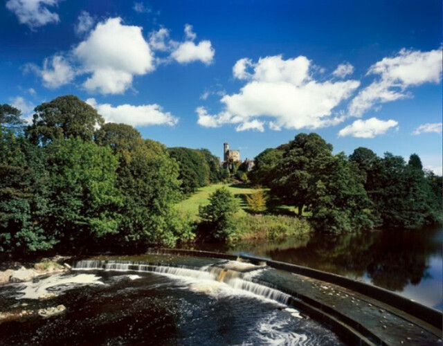
… or, with a title of “The View From Hornby Bridge”, this…

1 Like

Let’s rename the image Carlingford Harbour :grinning: This is an image of a small harbour in the north of Ireland, that just happens to have a castle in the background. It is possible we will be in Carlingford later this year and if so, I will try and get some decent images of the castle.

Patrick

That is not a fair comparison. In both of the photos Joanna posted, the “other stuff” in the photo directs a person’s eye right to the subject of the photo. Beautifully done. It’s like a giant pointer aimed at the subject. Wonderful examples of how to do this best.

Both are wonderful, and the “extra” stuff helps direct the viewer’s eye right to the subject. That was no accident. Those are a good examples of how to achieve this magical effect.

I wish I was good enough to be able to do this deliberately.

“if the photo is intended to be a photograph of the castle”

Intention is the most important factor. We should not assume a photographer’s intent for their photograph based merely on our interpretation of descriptive text pinpointing its location.

Mark

1 Like

Yes, sometimes it works that way. It depends of the purpose and how you valuate the “other stuff”.
If you plan a postcard, which btw. can be a professional job, you’ll try to include the other stuff in a positive way to demonstrate the beauty around the old castle in order to stimulate tourisme.
If you are me, you’ll try not to mix the other stuff with the era of the historical castle.
If you are you, you’ll follow a rigid rule as cited above hoping to make the photo stronger.
But by excluding some distracting stuff and leaving the most distracting stuff in the photo, you shoot yourself in the foot with that rule.
Sometimes it works, sometimes it doesn’t. That’s why you get beaten up in 50 percent of the cases, Mike ;O)
From your clinging to such a rule I suspect you have learned from the same basic photo course that I had for free education during my time in the Danish navy in the 70’s. The course was in Swedish and your rule was one of the basics. Then through the next 50 years, actually within the first decade, I learned that the rule has to be moderated for different scenes.

4 Likes

One small change:
If you are you, you’ll TRY TO follow a rigid rule as cited above hoping to make the photo stronger.

Sometimes it works, sometimes I simply can’t make it work.
If it doesn’t work, my second choice is to try to use the technique Joanna showed in two photos she posted. I’m editing a photo right now, which I will post later today or tomorrow, of some brightly colored boats in Cambodia. The best I know how to do, is to get all the other “stuff” to wrap around these boats, trying to emulate Joanna’s technique. I haven’t given up, or stopped, yet.

Oh well, I just posted the other image:
Cambodian Work Boats

I can’t always do what I’d like to do. So I need to “cheat” I guess.

I suspect people will eventually figure out what I’m trying to say, and why. But everyone is different, with their own ideas on how to do things.

Not exactly - I learned it from “composition” in art school, and from many articles in the old photography magazines I used to read. Obviously, sometimes I can’t do things that way, all the time, or even “most of the time”.

I assume most people just look at an image, ignore any caption, and “see” what their own imagionation (sp) wants to see. To me, the photo has to stand on its own, with no help from written explanations. I learned that from photojournalism, where an accurate and descriptive caption is required, but many people just look at the picture.

The above quote is what this discussion is about, and why we’re discussing it.

It is not because I was confused.

It is because to me, the photo is stronger without all that irrelevant stuff, that is too small to really see anyway.

If the photo had been titled the harbor, not “King John’s Castle or Carlingford Castle, County Louth”, I wouldn’t have changed anything regardless of what I felt.

Mike,

You keep referring to this as if it is a formal title. It isn’t. It is only a description of the most prominent feature of the image and where it was captured. Most of us don’t title our photos. I certainly don’t. Any text associated with them, as in this case, is usually to give some context to the viewer. Don’t confuse descriptive text with a formal title.

But beyond that, even if it was a formal title, it is within the purview of the artist or photographer to decide what should or should not be included, not you. By removing elements of the original work you have destroyed the photographer’s original vision and replaced it with your own vision. Whether your vision is superior is strictly a matter of opinion.

Mark

1 Like

:grimacing:
What a discusion about castle’s and point of view.
Non of what i write below is criticsism only what i am telling my self when i would edit the raw file.

When i see your image i think 3 things. (if i would took this image myself i would say to myself what would i do next time?
1 it’s low tide. Or gona be soon but that’s not the subject i was after.
2 i would shift a bit to the right so the bow of te boat on the right edge is not clipped.(and you lose those poles of electricity on the left)
3 i think if i watch this on a 16:9 smart tv i would try to crop it down to 16:9 but sadly then you lose the blue sky. So i think then the clouds are getting a “dull grey mass” without the blue as contrast.
Clouds i can’t change i can only wait to change for them selfs so it’s is what it is.

Editing wise i think i would try to mask out the foreground and first horizon.
And use fine contrast and some clearview to edge up the details.
And leave the back ground and clouds hazy, flat.
(the hils in the back with the sailingmasts would be distracting more if they where “dehazed”. )

The clouds are looking a bit darkend to me. (Wasn’t there don’t know if they wherelike that or this is due contrasting of microdots by clearview plus.)

Two quick thoughts…

First, my opinion, which isn’t worth anything, is that all photographs should have a caption. I was taught that ages ago, along with making sure that the caption was accurate, spelled correctly, and easily understood. If a photo was submitted without that, it was not accepted. This was at www.sportsshooter.com which used to be a very popular website, and people need to contribute $25 per year to be a member.

Whether anyone else wants to post a caption is up to them, certainly not up to me; to me it’s important, and obviously not to you.

Second,

Of course that is the case, but in this forum I’ve always thought that anyone in the forum was welcome to post their own opinions of the image. I’m not “destroying” anything, just expressing what I think about the images.

Anyone/everyone in this forum is welcome to change any of my images however they feel would be better, which is why for raw images I always post both the original image file and my .dop file. I can do that with ‘jpg’ images too, but that clutters up the post with two images. Any and all feedback is appreciated, and if someone thinks one of my images is a pathetic waste of time and computer space, they are more than welcome to say that. The forum should be more than a place for each of us to say how wonderful other people’s images are. At least that’s how I see it. Constructive criticism (of which I’ve received a LOT from Joanna) is more than welcome. …doesn’t mean I will necessarily agree, but I would like to hear it anyway.

Your problem, I think, is that you rely more on what others write than on what you yourself see.

2 Likes

Both. Feedback is usually helpful. Not always, but sometimes. Not sure I would call that a “problem”, just a fact of life. Maybe you can elaborate?

If I wasn’t for what others write, I would still be in PhotoLab Kindergarten Class, like I am now in with DarkTable.

If what you wrote were true, others would likely be much happier, but my photos are from what I believe - which is why I often get dumped on. Usually there is no “right” and “wrong”, just different shades of gray.

As to “others”, 98% of the time I eventually agree with @Joanna.

But you’re correct in one way - as in I stopped using the black frame around my images, for what I post in this forum. I prefer the frame, but I’m apparently in the minority.

Against my better judgment, but here goes:

When you say, “Nobody ever likes my crops” and then justify those crops not by demonstrating your personal, artistic vision but by citing articles about simplicity, then I believe that’s all the elaboration needed.

This is not a democratic process according to which the version with the most likes wins; as you pointed out correctly, there is no absolute right or wrong in this. However, the fact that nobody likes your crops should at least give you something to think about. In this particular case, my opinion is that the original poster showed a beautifully composed landscape putting the main subject, i.e., the castle, into an appealing context. By your crop, I feel you destroyed the composition and turned this into a mediocre shot of a castle, and you justify this by things you have been told or have read about simplicity. Oh, and in the original photos, the boats are part of the composition; in your crop, they are a distraction that takes away from the main subject.

Again, this is not a matter of “the most votes win,” but the fact that you are alone in your assessment should at least give you something to think about. I won’t elaborate further, so if you want to have the last word on this, you can as I will not contribute to this exchange any longer…

4 Likes

Well, my “crops” were my “personal artistic vision”, but the obvious solution is to never again suggest crops of other people’s photos. This doesn’t apply to me - anyone is free to suggest different crops of any images I post. I won’t be bothered, or upset. But I will no longer do so to other people’s images. It’s not anything to argue about, we all see things differently. Thanks for your post - simple answer, if nobody likes my suggested crops, I won’t post any more of them.