Well, over the years I tried to learn & understand. ![]()
There is Gamutvision 1.4 to compare different profiles – and for now, I take this “merry-go-roundtrip” with LR, when to prepare photobooks ( → still missing softproof in PL ).
Colour space comparison – from practice shows some examples, what to achieve when printing with two different papers.
As my screen is (only) AdobeRGB compatible and I want to see what’s going on, I never printed in ProPhoto RGB – just until these days, when I tried to find out if & what I’m missing …
-
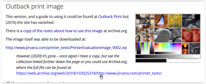
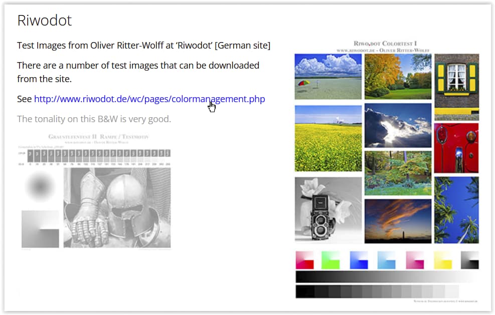
I used test pics in ProPhotoRGB colour space, converted a copy of each into AdobeRGB and printed out all versions (w/ PS & custom paper profile for my ‘best’ paper).
-
As said before, it depends on the subject …
There are some colours like the deep blue sky or a saturated red & yellow, which in direct comparison to the AdobeRGB versions seem to ‘jump out of the page’, while onscreen I mainly noticed increased luminosity.
Thing is, apart from some higher saturation there seem to be a ‘better’ gradation, leading to more ‘plasticity’ (like some more 3D). I still have to test this with real size prints (but no friend of HDR).
And no, a wider colour space doesn’t turn a mediocre pic all magically into something beautiful
– or vice versa, and not to forget great B&W pics.
addendum
From → here … I got test pics in ProPhoto RGB colour space
and

