Colour space comparison – from practice
I’ll try to show, how the monitor colour spaces
- ProPhoto RGB
- AdobeRGB
- sRGB
compare to the colour rendition of 2 different inkjet print papers
- Canson Platine Fibre Rag – Semigloss paper (neutral white)
- Tecco PCR 310 – Matte paper (almost neutral white)
which I actually use with my own profiles / Epson P800.
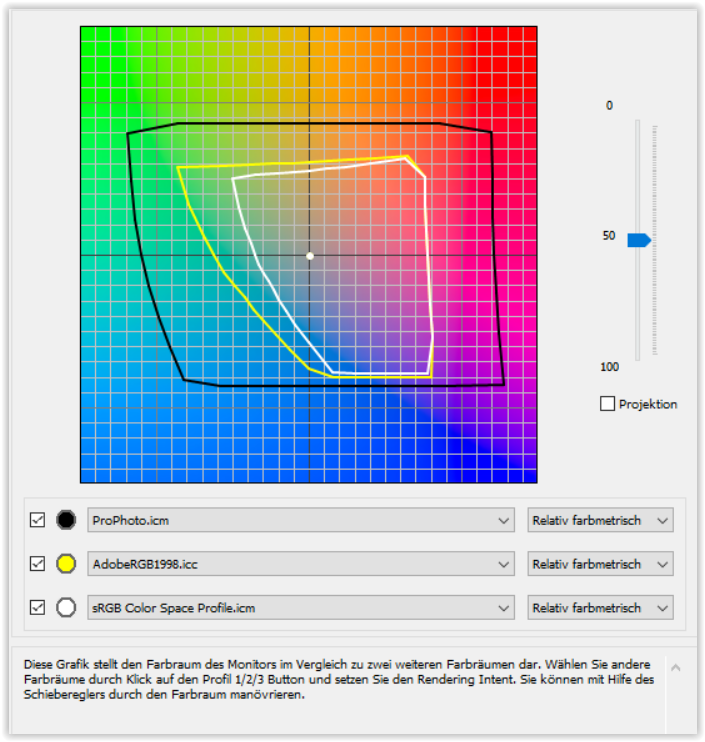
A. – Monitor colour spaces
- black – ProPhoto RGB
- yellow – AdobeRGB
- white – sRGB
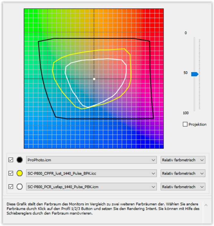
B. – ProPhoto RGB vs. Paper
- black – ProPhoto RGB
- yellow – Semigloss paper
- white – Matte paper
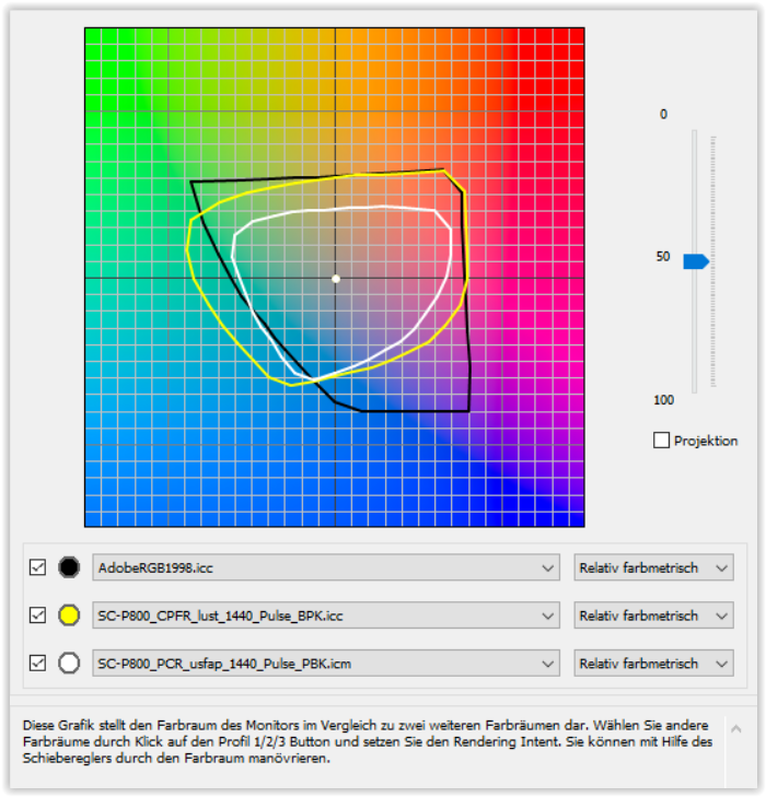
C. – AdobeRGB vs. Paper
- black – AdobeRGB ( → Eizo CG2730)
- yellow – Semigloss paper
- white – Matte paper
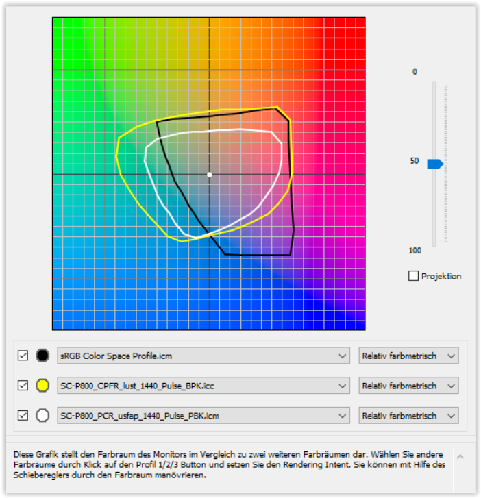
D. – sRGB vs. Paper
- black – sRGB ( → Eizo CG2730 + L767)
- yellow – Semigloss paper
- white – Matte paper
B – a monitor with ProPhoto RGB colour space would be ideal 
C – represents my monitor
D – editing in sRGB for web and some printing