Street workers

Here is a photo that I took in Antwerp in 2014. In color it is a motif as we all know it, not particularly exciting. I used a crop to highlight the workers and shaped them into shadows or almost silhouettes with a hard black and white. I then tried to add some drama with a coarse grain. The water jet is interesting, because it is only through the water and the broom that it becomes clear that they are street workers. I’m looking forward to the comments.

2014_03_07_Antwerpen_0072.ARW (24,0 MB)
2014_03_07_Antwerpen_0072.ARW.dop (21,1 KB)

1 Like

With PhotoLab, can you lighten the workers so we can see them, not just an outline?

@HGF Firstly I do not like B/W images, a personal preference and since most of my subject matter is plants, gardens and landscape colour is the order of my day.

In colour we have

Uncropped and in colour we have the context, the correct attire (fluorescent jacket), the road blocked (to protect the workers (?) and a single bicycle leaning on (probably locked to) a lamppost/street sign.

But if we apply the chosen B/W filmpack we have

It is the ‘N-Graphite’ that is creating the “overpowering” black and white!

If B/W is the choice then something a little less “grungy” like ‘Fuji Monochrome’ might be "“nice”!?

I deliberately kept the road workers dark to add more drama to the picture. I find the picture in color boring. A simple conversion to b&w makes the image even flatter and more boring. Hence my attempt with extreme values. But of course that has to be considered individually.

I’m not in any way suggesting you change anything.
It’s your photo, and your editing.

I’ll add though that I find it annoying that I can see everything in the above photo, except my problem that the guys and their faces are almost all “black”. Just my opinion. Other people here may tell you your version is excellent.

Maybe don’t listen to me - I’m 80, and somewhat fixed in my ways, and if I look at a photo, I want to see the details in the photo, regardless of whether it’s color or b&w. Maybe everyone else is going to love your photo as-is.

Maybe there’s a way in which you can satisfy everyone, me included, and still add more “drama”.

Maybe ask Mark (@mwsilvers).

I’m tempted to suggest you stand back ten or fifteen feet away from your image, and just look at it, but maybe the effect that bothers me is exactly what you want.

Thank you very much @BHAYT for your response.

I’ve also been annoyed about this, it’s a clear mistake on the part of the photographer. A slight change of position would have brought the bike a little more into the picture. Now it’s stuck somewhere on the edge :frowning:

I agree with you, the world is colorful and about 90% of my photos are in color. Nevertheless, in my opinion, B&W has a meaning, namely whenever I want to bring a certain expression into the picture. Sometimes I try to achieve this with B&W or extreme HDR settings. And in the flora world, I agree with you, B&W usually makes no sense. I could imagine exceptions if, for example, there is a single tree in front of a panorama. Or the elephant that was posted in another thread in this forum. This feedback helps me to understand how other people see my photos and my experience is that “experiments” are usually not well received. Or the results of my “experiments” are too poor.

Same here from time to time, so you are not the only one. There was a British photographer (forgot his name), using idiots camera with flash, who made ugly photos look stylish. It was an interesting social experiment.

So, I thought that OP is just another provocative joke :wink: . Here is my “counter-joke”, showing how to isolate subject using extreme ‘Unsharp mask’, DP negative ‘Force details’, and some blur. Unfortunately, I’m too lazy to use ‘Local Adjustments’ to make the picture look even better (yet another joke, to be sure).

Aaarrrggghhh!!! Doctor- my eyes :face_with_spiral_eyes: :laughing:

So it works, it works! :wink: :wink:

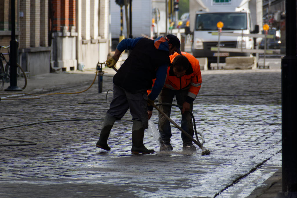
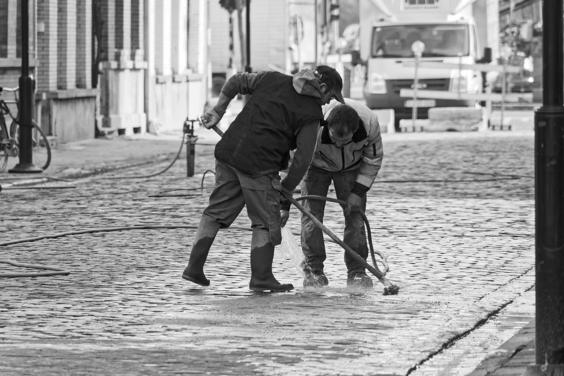
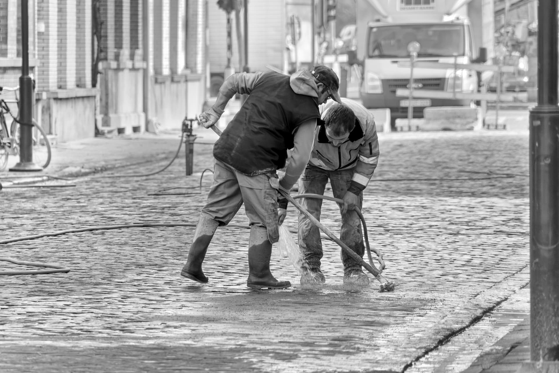
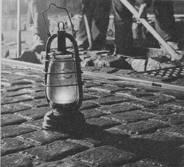
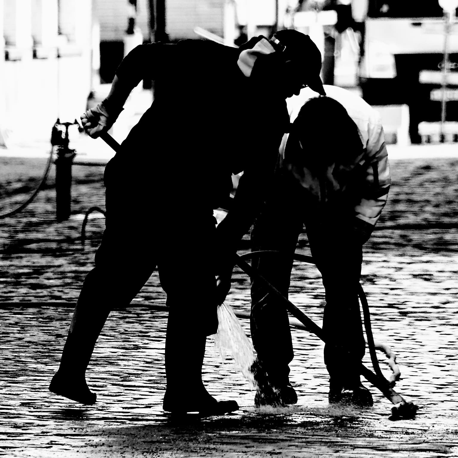
@HGF Your picture tells a simple story of ?? trying to make it “dramatic” results (perhaps) in changing that story, although there may actually be a real drama unfolding or this is just a clean-up after a real drama, the photo can never tell us, only the two workers could have done that!

It is a picture of a moment in time when you were there and took it, why does there have to be more?

The picture is probably what I would have taken and you were focussing on the workers and the rest (context) got into the photo by “accident” but once there they are part of the story.

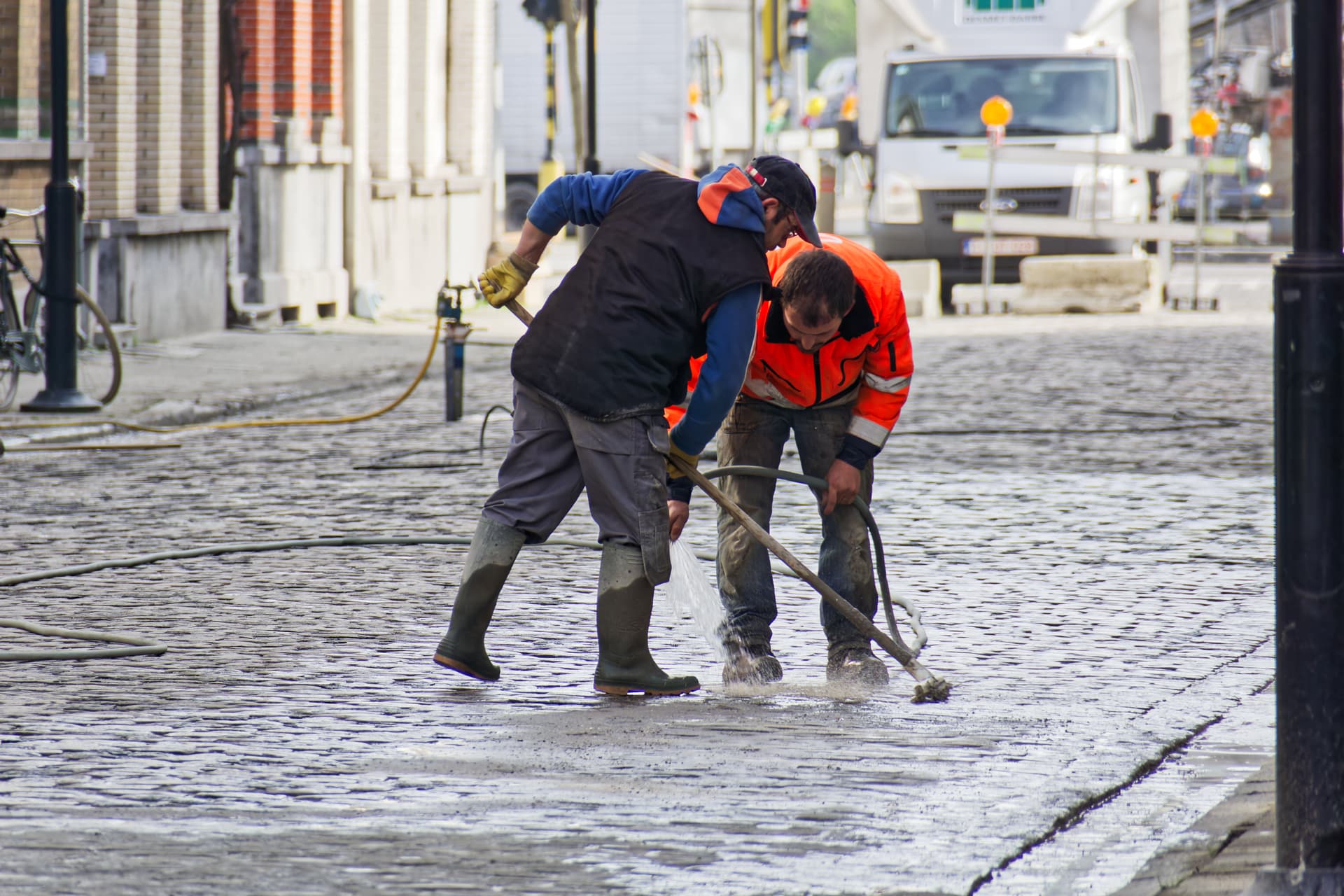
The bike appears to be padlocked to the lamppost.

Is the barrier a temporary one or has it been there for some time?

What are they washing so intently and why?

I don’t do much street photography but when I do it is normally the parts of the scene I captured by accident that I find particularly interesting.

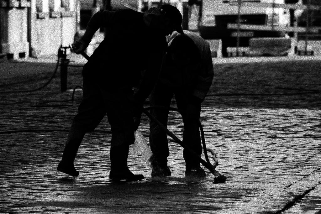
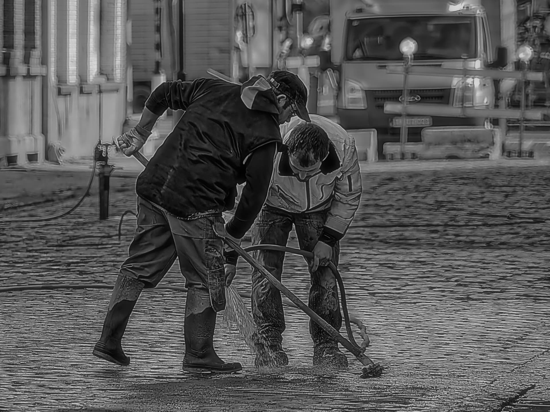
@Wlodek your update was a little extreme in retrieving the outline. As for criticism I am sorry if I gave “offence” but I actually prefer the original image in its entirety and in colour, it is as simple as that.

My “prejudice” with (not) cropping images and also (not) rendering them in black and white is something I will have to live with and occasionally inflict upon others, as in this case.

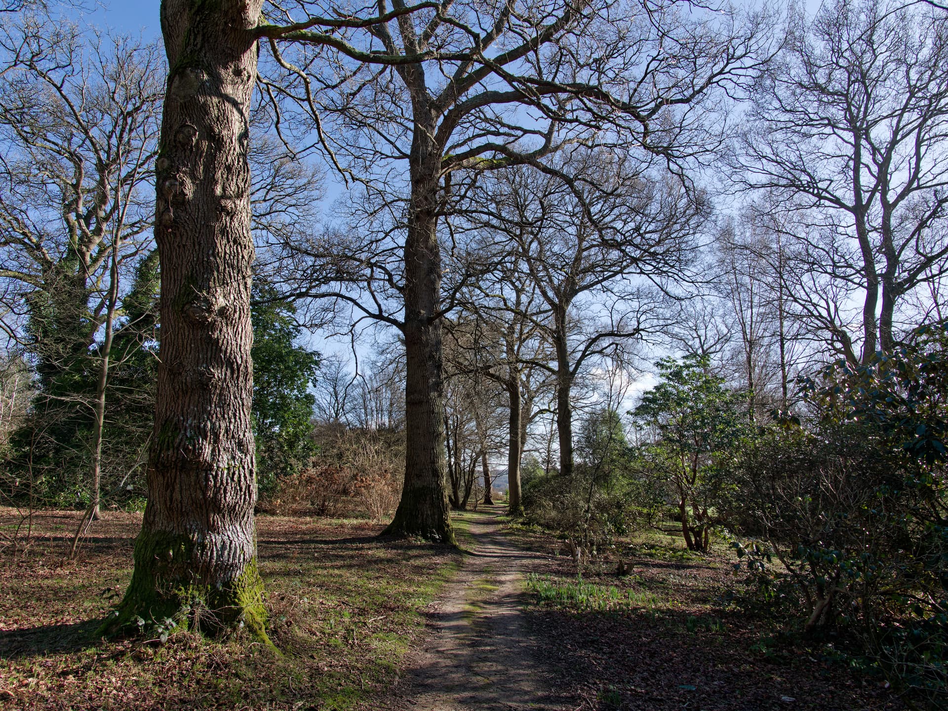
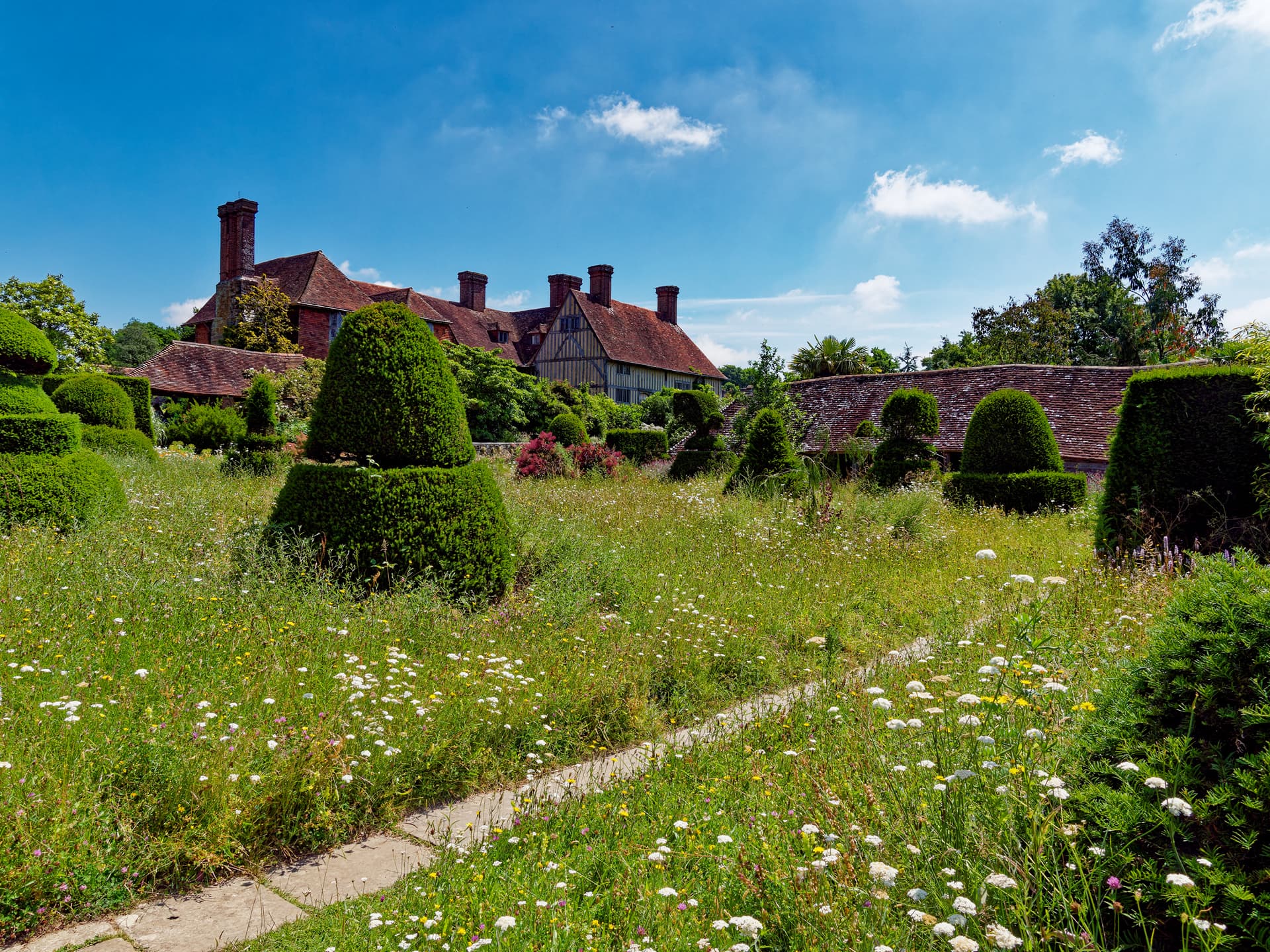
This is a picture I took earlier this year , it reminds me of an unusually sunny day early in the year and the “grandeur” of nature as it begins to wake up (and the inadequacy of DxPL Chromatic Aberration?)

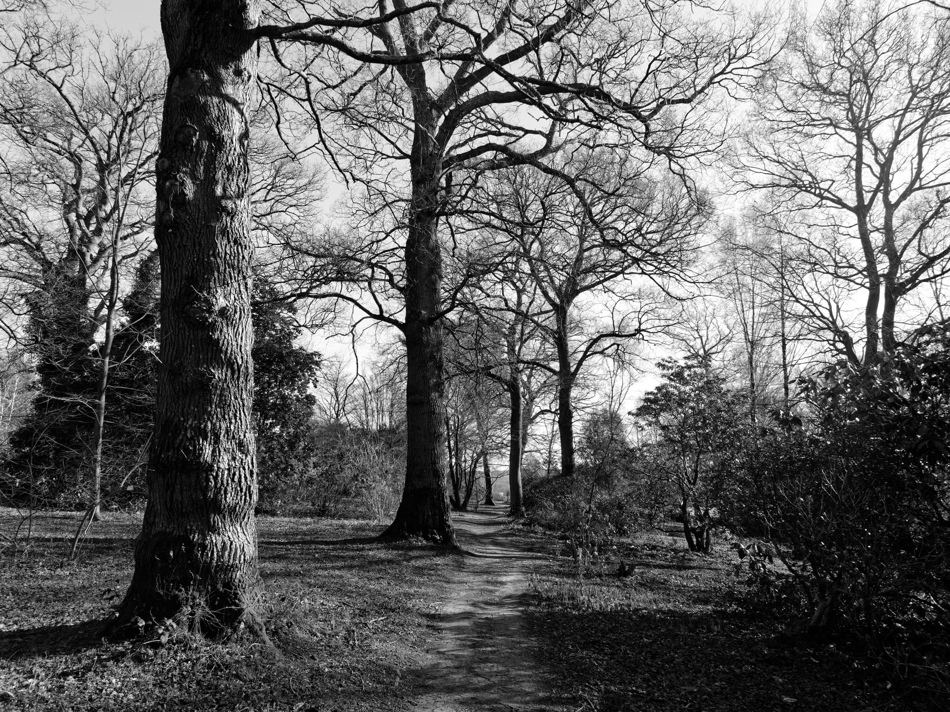
Black & White does something to it but I am not entirely sure that it is good and it is certainly “false”, i.e. it is not what I saw and not what I photographed and certainly not street photography so no interesting extraneous elements!

.

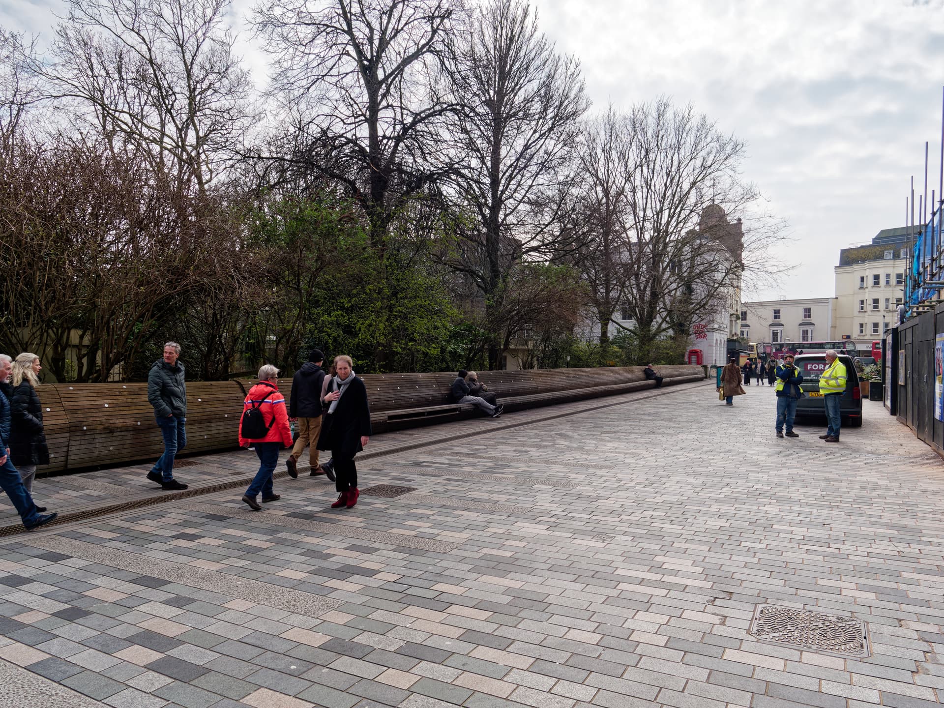
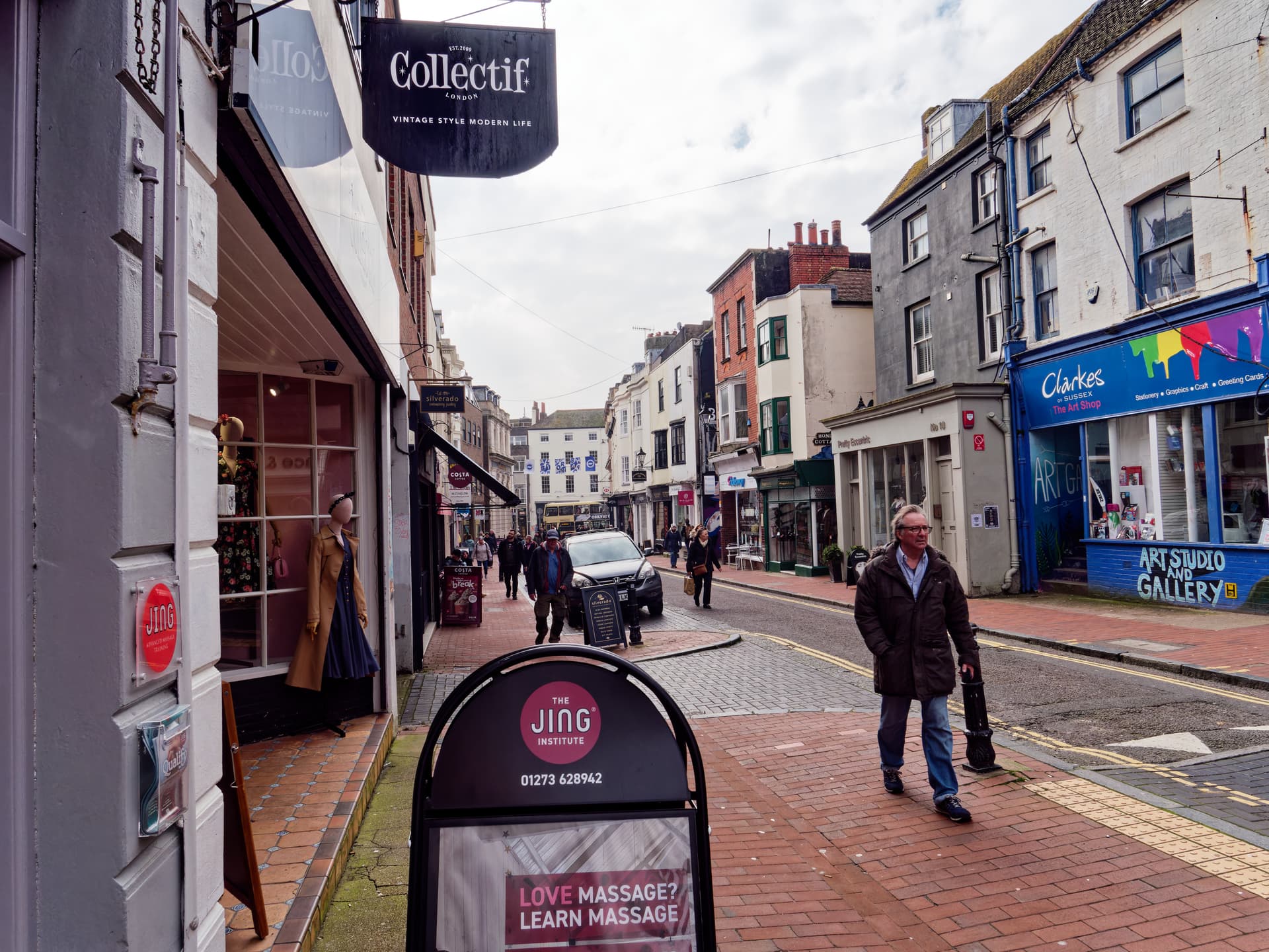
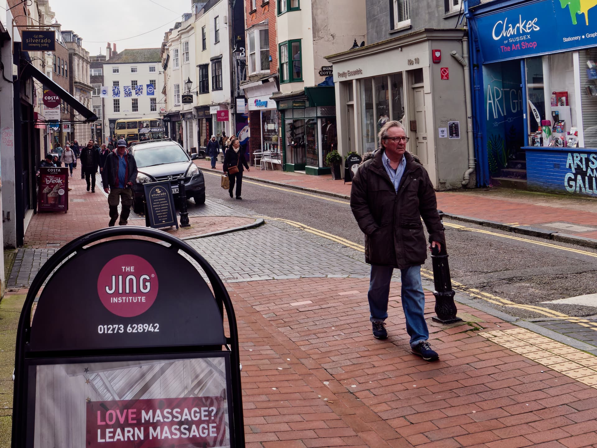
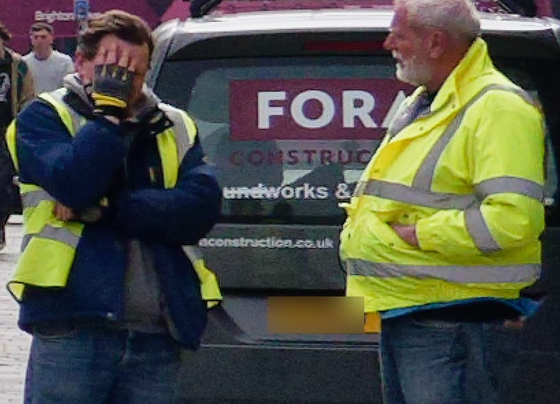
As for street photography, still uncropped and in colour, a visit to Brighton to the Theatre Royal provided an opportunity to take the GX 9 and a tiny zoom lens for a day out, these are a few images from that day.

Some street “art”

but you never know who is actually watching you, or saw you with the camera!

or who you might photograph by accident

This photo was simply one of the street (which used to be a leather shop where I bought leather during my belt making days) taken before we went to lunch and I couldn’t be bothered to wait for the gentleman to clear the scene!

We then saw him twice (actually a lot more than twice) after lunch, during the comedy we had come to see at the Theatre Royal, i.e. Neil Pearson in “Drop the Dead Donkey - The Re-Awakening” and while I was waiting for my wife outside the front of the theatre I saw him looking for someone and recognised him but was not so obvious as to take a picture of him.

My wife then came out of the theatre and saw him and congratulated him on the play!

When I checked my photos the following day I realised I had inadvertently taken a picture of him at the back of the theatre before lunch, i.e. before the performance!

… by fixing the street?

The ‘real drama’ is that the OP took a backlit photo and severely underexposed the subject … only to darken it even more.

@HGF
Despite spending way too much time on it, I was curious to see what PL can do and “deconstructed” the image using a series of LAs,


2014_03_07_Antwerpen_0072.ARW.dop (1,5 MB)

while the subsequent B&W rendering in Nik Silver Efex was relatively quick.

Now the road workers stand out well from the backdrop (didn’t crop to show the effect).

Many thanks to all contributors.
My intention was not to turn a boring color photo with backlight, bicycle and safety vest into a boring black and white photo.
There are plenty of options for this in DxO PL, such as SW presets, Time Machine, B&W rendering or Nik Collecktion. Yes, my photo is probably too dark, but it should also be dark and grainy. (Maybe not as dark as it currently is). The coarse grain should add drama or mystique to the image. The attempt seems to have failed.
If I hadn’t written that the photo was taken in Antwerp, it could have been taken anywhere in the world. It simply shows two road workers grouting what must have been newly laid paving in the early morning in a still shady street. I was inspired by a photo by Werner Koblizek from Heinz Temmler’s great photo guide from 1954. I can’t answer the question about the story, perhaps there isn’t one. Maybe it’s just a snapshot. Does every photo have to tell a story? Is it appropriate to refer to Brits with idiotic cameras with flash and call the whole thing a “provocative joke”? If it’s below your level, you don’t have to deal with it, it’s up to each individual.
In any case, I have learned something about the expectations of viewers and will follow the trend I have identified more closely in any future publications of photos.

Werner Koblizek

@HGF Don’t follow a “trend” simply display your photos the way you feel they should be shown.

If others offer advice or criticism or make complaints then treat them in the same way that they treated you polite or rude or whatever.

If we all follow the same path then there is a risk that we will all wind up in the same wrong place.

No but street photography in particular captures photos which represent a moment in time, frequently with people in it and your image captured two workers doing something.

Mine was of what was once a road, that had become a pavement that had been revamped since I was there last.

When I looked at the photo one lady was looking directly at me (probably at the camera)

2024-07-16_083049_

and I don’t know if the worker was reacting to the camera or more likely at something being discussed with a colleague/boss etc.

I would have been happy with a picture with no people but …

More my scene

1 Like

To bring the conversation back on to the topic of your street workers…

I thought I would have a play with “max drama” and make it a very graphic, almost abstract, silhouette image…

Now this I absolutely adore :clap: Framing, tonality, composition, story telling - what’s not to like.

I am guessing this is of workers on the tram tracks? It has the feel of a mid-20th century scene.

@Joanna , yes, this foto was taken before 1954, because the book from where I copied it was published in 1954. I think this photo reflects the style of the early 50s. And I like the grain, it’s part of it. That’s what I wanted to repeat or copy in my photo.

… then don’t post it (just saying). :wink:

@Joanna , please could you share the dop with us. I would like to see how you realized this and I would like to play more with grains. Thank you.

@Wolfgang , I guess you are right. I posted the colour first followed by the b&w to demonstrate what I did. My fault.

This was the goal with the “half silhouette” as the overall shape is not clear enough to work as a silhouette.