Hi,
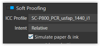
I have created my own paper profile for printing monochrome images to matt photo paper. When I select this printer profile in the soft proofing dialog the image changes indicating that it has been applied. When I select the check box “simulate paper and ink” the image changes again and receives a veil of grey or a reduced contrast wash which I suppose is an attempt at replicating the reduced range of tones and brightness of the print when compared with the screen.
Unfortunately, I find that the “simulate paper & ink” option is to heavy handed and that in reality my prints fall somewhere between it being off and on. I wonder if others see this when using the feature and if there are any work arounds ?
Thanks for your detailed reply. I don’t see a difference between the two rendering settings but I have just recalibrated my display to D50 (5000K) which it seems if what my Canon printer uses, I chose 100 cd/m2 but may also try 80 as you have. Since the recalibration the soft proofing with “Simulate paper & ink” OFF looks closer to the final print than when it is on. Odd but usable.
I have to admit to still being confused as to what the two settings are doing : my simple thought is that selection of the ICC paper/printer profile should be adjusting the display to show the image as close to the final print as possible. If this is not the case then what is it doing and what happens when the “simulate paper & ink” is switched on?
Two screen shots the first with the simulate paper & ink off, the second with it on.
The manual just adds to the confusion Soft Proofing :
“White background of the image to simulate the visual impact of the white paper (also visible in the Full Screen Viewer).”
But the background may be changed from white in the preferences.
Starting with the ‘easy’ one. – Like in the old LR 5.7 (still use it) in PL’s softproof the pic appears by default on a white background to signalize “hey, you are in softproof mode”, mimicking a white paper / passepartout. I always change it to my standard middle grey background – to not getting distracted.
Then, there are several reasons to restrict brightness (80 cd/m²) and contrast (1:400 / 500).
Reflective media naturally have less brightness and contrast as light emitting screens.
With an ‘adjusted’ screen, it’s easier to avoid to dark prints.
.
The ‘adjusted’ preview is close to my best paper (gloss / semigloss type), that I even could do without softproofing.
.
The softproof for printing on matte paper mirrors the lighter blackpoint of the matte media. When so presented on a high contrast screen, especially B&W pics look greyish & washed out. – With an ‘adjusted’ screen that difference is somewhat smaller / less ‘shocking’ and I find it easier to (carefully) readjust the dark tones, that otherwise get crushed / don’t differentiate on matte paper.
.
Apart from brightness & contrast levels, the softproof also shows the paper’s whitepoint
(which I want to see → especially for B&W).
To work intensively / long hours on bright high contrast screens strains my eyes.
With restricted brightness the monitor (hopefully) lasts longer.
I’ve also tried the D50, but can’t get along with it.
Usually the eyes/brain need some time to adjust for the change in contrast. Usually what is good practice is to look away when you apply the simulation for printing and walk away from the desk. Come back 5-10 min later and than try to judge. If you do it too quickly, it will appear that the image has lost too much of contrast, if you do it slower it will be easier to judge more accurately the soft proof.
Off course appropriate color managed workflow is needed as well. Proper calibration of the monitor, proper use of color profiles and appropriate lighting. I assume you have done all that.
Well, actually as I can see white background is just maximum white, not really soft proofed, while ink and paper simulation does work on the image itself.
No problem – then use it with “Simulate paper & ink” OFF.
You are doing monochrome work.
Just don’t export with the applied paper profile.
[ when to work in colour things are different … ]
please note
The above post (now corrected) describes printing with the printer’s standard colour set.
[ I often use Epson’s ABW mode for B&W, which mainly uses the neutral grey(s) & black and adds colours to trim the print for a cooler / neutral / warmer rendition, while it avoids mixing the grey tones from colours. Apart from lesser metamerism, on semi/glossy type papers it gives even deeper blacks
→ an ‘extended’ shadow rendition, but not on this matte paper.
The Advanced Black & White mode is a separate modul within the Epson printer driver and does not allow softproof via CM … while one can get a simulation from Epson’s revised Print Layout … or in PS by using a special ABW profile, which I customized for my current printer – well, a very special use ]
As I have always understood calibrating to D65 or D50 is related to the colour temperature of the illuminant lighting for the print, not th eprinter?
From X-Rite
For one, the white point of most photographic paper is very blue when viewed under a D50 illuminant. On most displays it is harder to achieve high luminance levels at D50. It is for these reasons that, when working with photographic paper, calibrating to D65 may produce a better screen-to-print match.
[ Understanding Color Management: X-Rite Photo & Video
Two white points were proposed: D65 and D50. The set of chromaticity coordinates for CIE standard illuminant D65 was the standard white point for CRT-based color video systems, with roots in color television. CIE standard illuminant D50 was the standard illuminant for viewing prepress proofs in a professional printing workflow.
I always use a white background, set to 250 if the software allows, as it always gives me a “true white reference”. I switched to this when I realised that if I edited with a dark background the prints ended up duller. If you put the same image on a black background and a white one they look different as the black background seems to increase contrast and pop. Just my observation/funny eyes
Indeed. And for which I have never used an ICC profile, which is usually intended for colour work.
Like you Wolfgang, I use the dedicated B&W mode on my printer, except mine is the Canon instead of the Epson.
When I did use the Epson SC-P600, I created my own printer preset for B&W instead of a colour profile, which can wreak havoc with tints and metamerism. As yet, I haven’t needed to do that with my Canon, which seems to turn out stunning B&W prints all on its own, on both Canson Baryta Photographique II and Fotospeed PF Lustre 275 papers.
As for soft proofing B&W, I’ve never found it necessary as there are no saturated or out-of-gamut colours to manage, only the limits of the tone curve to deal with and a well edited curve to redistribute the tones for each individual image.
And, above all, turn off auto-brightness on your monitor, set it to 80cd/m² for calibrating it.
The advantage of semi/gloss type papers, allowing deeper blacks and more contrast especially with B&W, is all too easily lost in unfavourable lighting conditions – reflecting vagrant light. That includes Luster surfaces to some degree, which on PE stabilized papers are insensitive for fingerprints and quite scratch resistant.
Matte surfaces are much more delicate, but don’t reflect vagrant light at all. Cause of their different rendition, I don’t want to miss softproof.