Yes – to the first 3 paragraphs
Now, if I activate PCD during export with a compatible target profile, what about the corrections I have made when soft proofing with a target profile not compatible with PCD ?
When softproofing with a non-matrix profile profile (that is any RGB or CMYK paper profile) all other corrections except the then deactivated PCD can be applied with export, which in case of a raw-file includes Color Rendering → Intensity / Protect Saturated Colors – additionally to Exposure, Vibrancy, HSL etc.
Using any of these tools affects the output, which when running a monitor that renders (almost) all colour spaces, can be done visually, but when restricted e.g. to sRGB, one has to rely on the Destination gamut warning – which is more a ‘blind flight’ than real help.
I understand that some users may need to soft proof …
…
So, if I understand you well, when printing, PCD is actually here to replace Soft Proofing and the Perceptual / Relative options. We can either blindly trust PCD when exporting or we can still use the good old Soft Proofing method but without the benefit of the PCD algorithm.
As mentioned, exporting to sRGB is recommended for any social media use and more than often can be necessary for sending out to a printing provider – as I did for photobooks.
Softproofing with a matrix profile then also allows to use PCD and visibly decide between colour saturation and/or texture – no ‘blind flight’ with the right monitor.
if I were printing from PL6
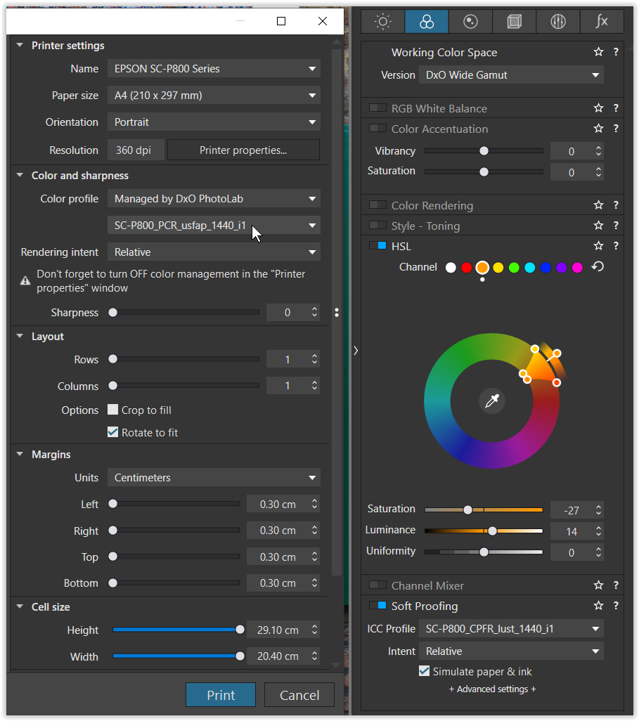
using the very same paper profile in the print dialogue as in the softproof
→ I’ve never exported with the paper profile, but to AdobeRGB (or now to ProPhotoRGB).
a few schemes to (roughly) visualize colour spaces
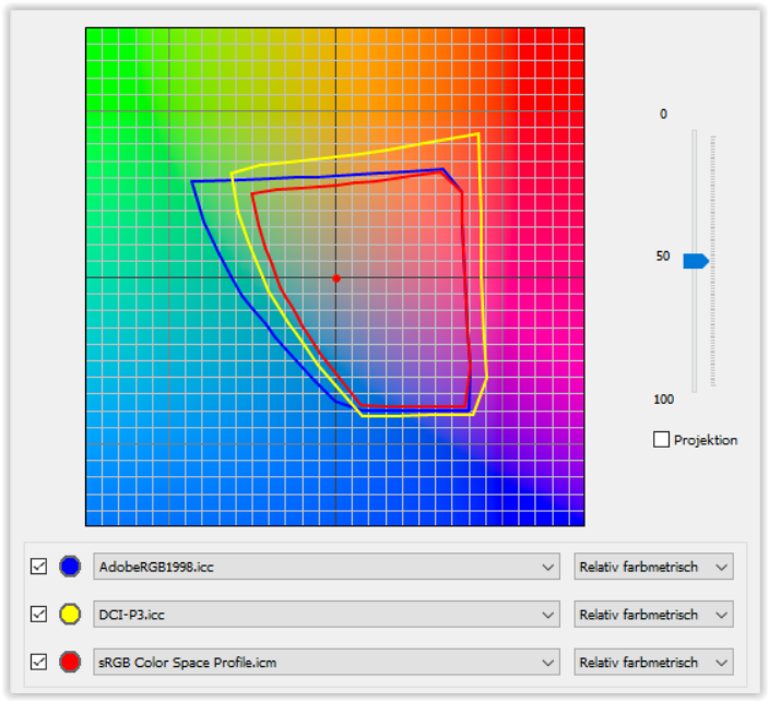
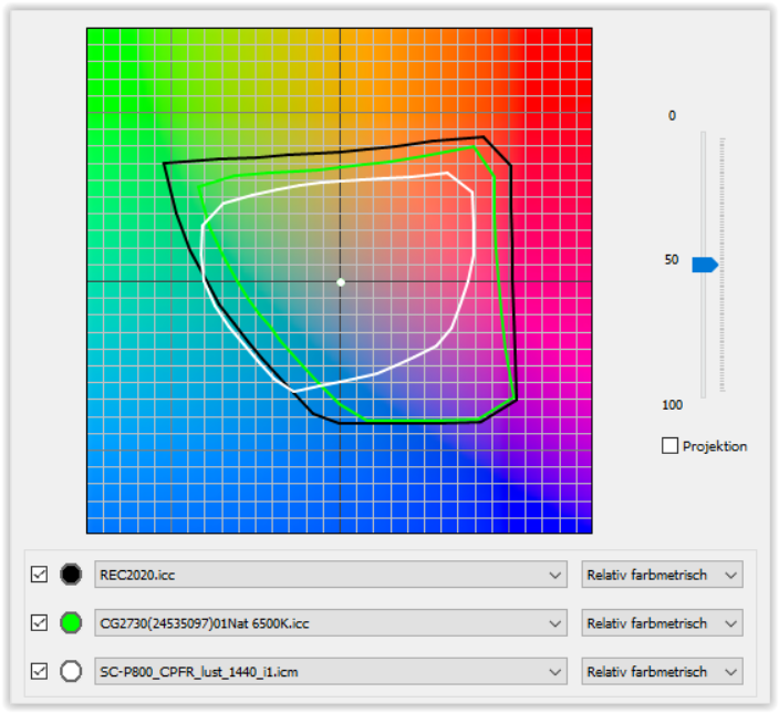
REC2020 = is said to be the closest representation to ‘unofficial’ DxO Wide Gamut
CG2730 Nat 6500K = my monitor’s native colour space (containing AdobeRGB + DCI-P3) *)
SC-P800 CPFR = my ‘best’ paper (semi/glossy type)
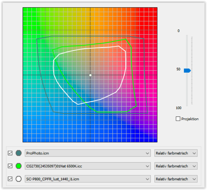
ProPhotoRGB = covers everything
CG2730 Nat 6500K = my monitor’s native colour space (containing AdobeRGB + DCI-P3) *)
SC-P800 CPFR = my ‘best’ paper (semi/glossy type)
*) easy to see, how the print output exceeds my monitor’s rendition
see → about to adjust the monitor for printing and some more