Update: Unfortunately, I have been too busy with other things to get to the bottom of the problem today. But I continue to work on it. I am grateful for any advice.
@erlepa: In the absence of any advice I could find, those settings seemed like the right ones. Yes, the jpeg does seem a little too red/purple also. I will try the others tomorrow and compare – but I usually use the raw file. (Curiously, I have no problems with green/blue.) I did notice today that both red and green traffic lights look quite glaring in real life. But then, I also notice on my photos that stop and other traffic signs appear more red than in real life. I have one shot that shows that well. (It was taken through a window that was not conspicuously clean!)
@platypus: Thanks for your helpful pointers. I am stil reading the manual – am up to p.187. HSL starts on p.237! I will look for details that I may hve missed on the first three readings of the manual!
I have invested a lot of time in PhotoLab and like the interface much better than Photoshop CS5, which I also use. How do I get to the developers to ask them to take another look at the algorithm they use to establish colour balance for Q3 raw files?
I do not know how to create my own profiles.
The weather here at present is totally overcast, apart from an occasional break in the clouds, which then close up again.
I shall take more photos today, concentrating on reds. I may even download a copy of Capture One., and if it works better than PL, change to it.
Don’t give up - your problem is fixable within PL7. Instructions for creating your own dcp profiles are included in the online and in-program user guide. Use the OOC corrections for the Leica Q3 with your own dcp profile. Save as a preset that you can then use each time you edit a file from that camera. Download a trial copy of PL7 and try!
It’s true that there is an underlying tone curve that DxO is applying that will not be moderated by the dcp profiles but I suspect you will be able to live with it. Or try something else of course.
for that he needs CFA to be also the same as in R6
to simplify [ like y = f(x) ] “color” = “color transform” (“CFA”)
so same color transform “applied to different CFA” will result in different “colors”
but of course it might turned out to be OK for his taste regardless ( or some other profile ) … DxO offers a lot of profiles to experiment including various “film emulations” and recently introduced LUTs that can be piled on top
Do you have a color checker or other reference you could take a snap off? That could help to see if your Q3 does something unexpected.
Without color checker, you could use this: ColorCheckerValues.pdf (17.2 KB)
Display it on a calibrated screen, pick WB from a neutral patch, avoiding the ones next to the blue and yellow patches. Expose measuring from the big grey patch on page 2. Colours won’t be perfect (specially on Windows if its color management is not set properly), but close to get a first idea.
why 'd Q3 do something like that ? one can try to find ( or just ask in various Leica forums for a owner to do a favor and share ) a RAW shot of some color target ( ideally under some flavor of a daylight illumination ) done with either Q3 or for that matter M11 ( non monochrome ) … M11 shall have the same CFA as Q3 as I doubt Leica will spend money ( even w/ their Leica prices for a camera that certainly allows that ) altering that part between sensors for non monochrome M11 and Q3
shame that Imaging Resource is in zombie state - that was a good source of such raws and DPReview with recent near death experience is not up to speed with studio scene shots
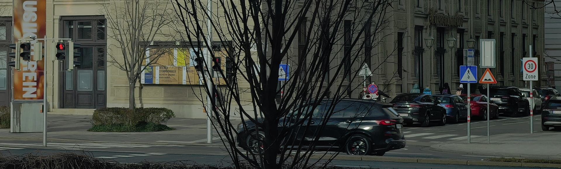
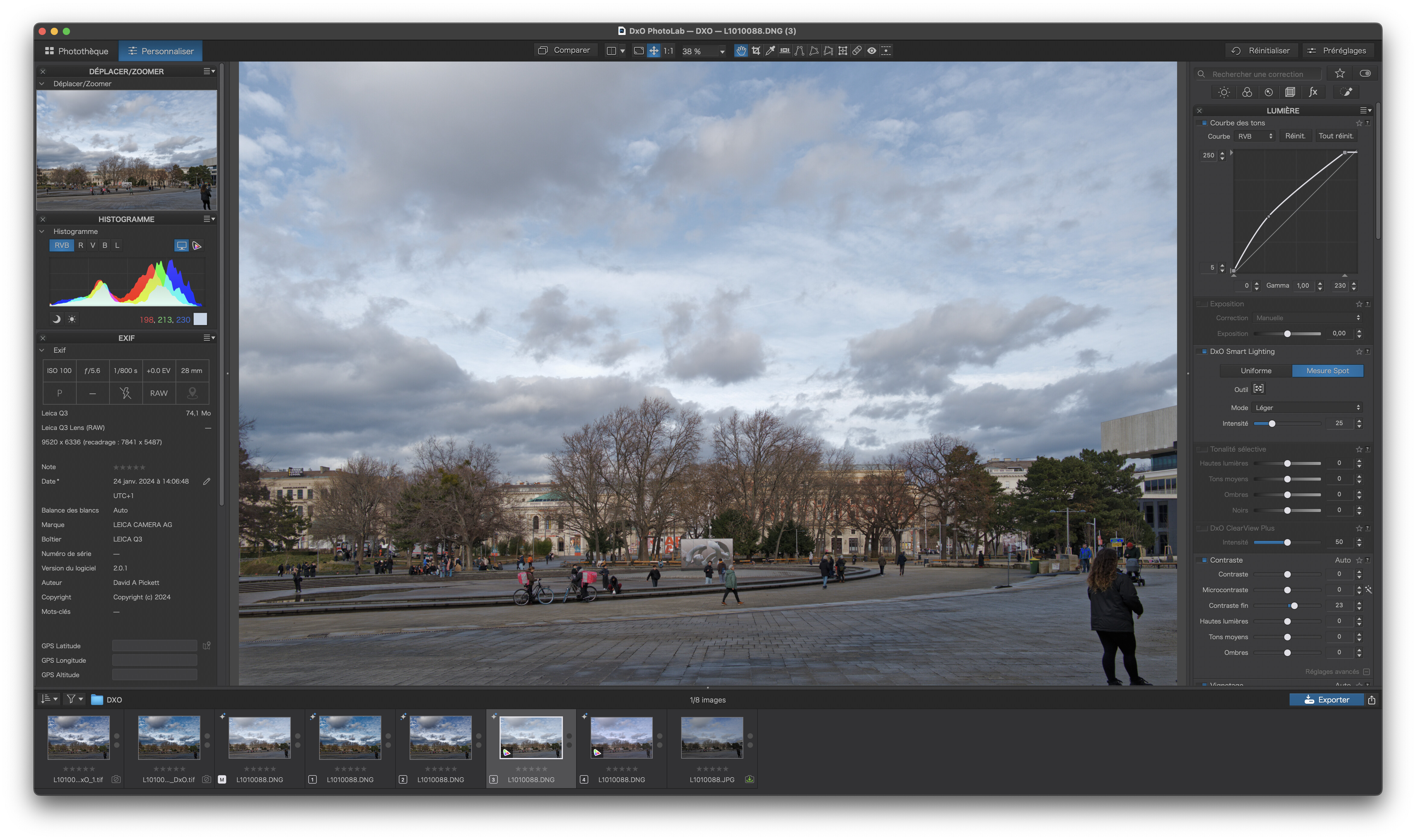
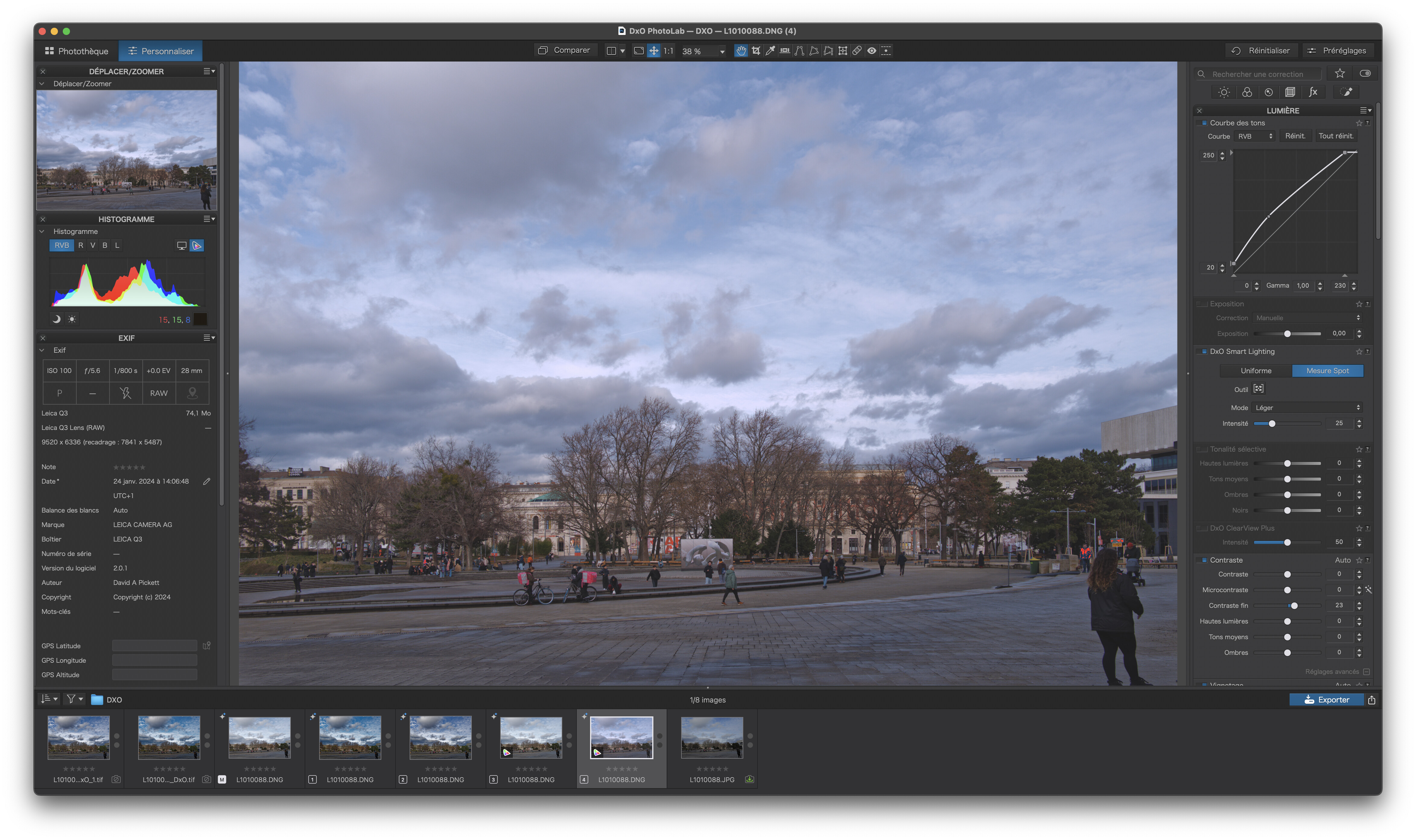
After now checking the location, I think you were lured in by the reddish signal colors (the signature on the museum, as well as the lettering on those construction containers, is strikingly bright, not to mention the pink fast food delivery backpacks in the foreground).
In contrast, the overall lighting was a bit dull and your JPEG appeared underexposed and quite flat (also checked with different viewers / screen calibrated to sRGB D65).
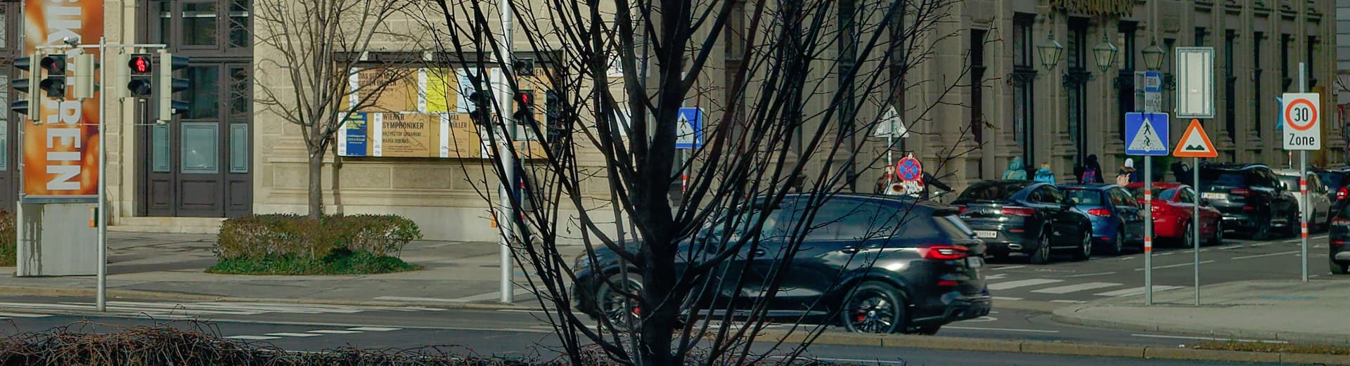
After working a bit on your file (virtual copy), the red is still strong but fits “better”.
then the contrast using DxO Smart Lighting / SpotWeighted
(click on Tool to see the boxes)
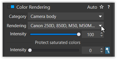
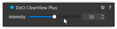
Nevertheless, check the overall color reproduction, e.g. as suggested by @platypus, be careful with DxO ClearView Plus as mentioned before and try different profiles (e.g. for Canon R6).
Wolfgang - the main result of your tone curve adjustment seems to be a general increase in luminance with perhaps some minor change in the relative “redness”. Are you thinking here that the “red” in the OOC jpg file is not far off the mark in terms of color accuracy? Perhaps you have seen this museum? I have not. Online images, if they can be believed, do seem to indicate a bright orangish red is the signature color.
I just took your original DNG file, stripped it of any changes you had made and started from scratch.
Apart from the fact that it is definitely under-exposed, which does affect the saturation of all colours.
All I did was apply Smart Lighting and a slight tone curve, I used the generic DxO rendering for your camera, default optical corrections for your lens and I corrected the geometry to straighten the verticals.
Thank you all for your kind replies, which have been much more friendly and less patronising than other fora that I inhabit! I will work my way through them. I am very happy that the conclusion seems to be that the problem is finger trouble on my part rather than a DXO inaccuracy.
The exposure in these two jpegs is soo different… The OOC jpeg is a bit greenish. Looks like Smart Lighting or ClearView was applied, perhaps a small amount of WB correction. What are your PL6 defaults?
Personally, I like the PL version better, so why worry?
it is always funny when people say “have a calibrated”… calibrated to what ? ( that is even before having a quality profile matching that calibration / because every display is always calibrated to something at any moment in time even if a user did not do anything and that display is decades old junk picked from some thrash heap/ and using applications that are capable to use display profiles - it is not to imply that you have not, just that the phrase needs to be extended w/ more details - white point, gamut, luminance, contrast, etc - to be a proper statement and with what device/software calibration and profiling and verification was executed - because it matters ) …
I started again from scratch and can duplicate Joanna’s experiments – either with a tone curve or the selective tone faders (which I prefer) . I do not know why the jpeg is 2 stops underexposed, as my experience with this camera is that it usually over exposes highlights (though there were really none in this shot), and I had no exposure compensation dialled in. There is no doubt that the light was quite odd that day – very grey behind me with the threatening clouds ahead of me. I also made the mistake of engaging ClearView Plus, which I now see after further reading can have unpredictable effects. I shall avoid it in future, unless definitely called for! I observed several of the Foodora workers yesterday: their bags are a light purple or mauve (in itself a vague description) and not a “neon/screaming” tint. I now have this memorized and can easily correct for it.
This kind of problem can drive one crazy: thank you for preserving my sanity! I shall continue to rely on the DXO Q3 colour profile, as up to now it has given satisfaction.