In Nik 7, the preset thumbnails are in one column on the left. In Nik 8, they are in two columns, making them hard to visualize and truncating their names. I can’t tell which is which. I’d like to be able to see the preview and read the entire name. The behavior I’m seeing is on a Mac Studio Display, with Nik in full screen mode.
Subject
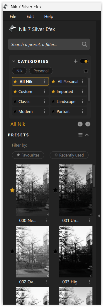
Silver Efex Pro – Option to enlarge preset thumbnails or switch to single-column preset list
Feature Request / Description
In Silver Efex Pro, the preset browser on the left is currently fixed to two narrow columns with very small thumbnails and truncated text. On high-resolution displays, this makes presets difficult to visually evaluate and preset names hard to read.
I would like to request one or more of the following UI options:
-
An option to switch the preset browser to a single-column list
-
A thumbnail size control (small / medium / large)
-
Or a resizable preset panel that allows larger previews and readable names
This would significantly improve usability, accessibility, and workflow efficiency, especially for users working on Retina / 4K displays or laptops.