Part 2 - Off-Topic - advice, experiences, and examples for images being processed in DxO Photolab

Mike,

You also posted the following :

“… I always try to shoot in ‘raw’. I only shoot ‘jpg’ images in my Fuji X100f, using the “film simulations””

Given that you say you are primarily a raw shooter, I am surprised about your trust and admiration for Ken Rockwell who is not a raw shooter and has never been shy about dismissing the value of the raw format.

In a 2009 article on his website Rockwell stated:

“I never shoot raw. Why would I? Raw is a waste of time and space, and doesn’t look any better than JPG even when you can open the files.”

Here is a link to that article.
https://www.kenrockwell.com/tech/raw.htm

While I have occasionally used Ken Rockwell as a resource over the years, his site is among many I use to get a general consensus on a variety of topics . However, many of his opinions are somewhat misleading and need to be taken with a “grain of salt”.

Mark

1 Like

It’s worth repeating, the problem with Mr Rockwell is that he presents opinion as fact.

1 Like

Mmuahhh, almost fell off my chair – the joke of the day !!


If you set your Nikon to AdobeRGB or sRGB – for your raw-file there is no difference
and with both settings you get exactly the same result in PL.

Details are well described in the above article ( cited by @underexposed ),
see e.g. this excerpt

.
What you need to consider if your camera is set to AdobeRGB,
DO NOT USE “As shot”
Screen Shot 03-23-24 at 11.23 AM
when exporting as JPEG for internet use (social media, smug mug, even this forum),
but make sure they are converted to sRGB.

( more about Embedded color space information as → cited by @eriepa ! )

1 Like

Ken writes mostly for the “average person”, and of all the people I know who are involved in photography, very few shoot in ‘raw’. They are satisfied with what they get. Several of the best photographers I know understand this, and shoot anything serious in ‘raw’.

Ken posted an image at the end of the article I quoted from. There were two gradients in the image, one taken with sRGB, and the other in AdobeRGB. The upper gradient looked “normal”, and the lower gradient looked degraded.

As a very quick test, I took two photos of Ken’s image on my 27" Asus screen, one with my D780 in sRGB and another with my D780 in AdobeRGB.

When I shot in sRGB, my captured image appeared like what Ken posted, the top image better, and the lower image degraded.

When I shot in AdobeRGB, the colors in both my gradients were now degraded.

Do this yourselves, being more careful than I was. To me, my own test shows what Ken described, degraded color.

Again, the sRGB gradient on top, and the Adobe RGB gradient below.

Of the two images I posted, my camera was set for sRGB for the first image, and then I changed my camera to AdobeRGB for the second image.

To my eyes, I see what Ken described (and was rather surprised to see a difference, despite thinking I should…

I also accept that if these images were to be printed, rather than shared digitally, I should have used AdobeRGB, which I assume is why @Joanna shoots that way.

Added later - I can see the boundary between red and violet in the sRGB images, but not in the AdobeRGB images. This was very clear in the original image posted by Ken.

Is that really applicable to your raw files?

What Ken Rockwell is really good at is driving traffic to his site*. I also like a lot of his photos, though I wouldn’t place him on my favourites list.

When you print the colour space depends on what the printer** handles best.

*Or getting others to do it for him. **Your physical printer or printing service.

1 Like

Mark, there are many reasons why I trust and admire Ken Rockwell. His information is a giant library of cameras, lenses, and so on, information that is durn near impossible to find. I sometimes disagree with his reviews, but eventually I realize what he meant, and why, and he has saved me a lot of $$$ by pointing things out I was unaware of - like the Nikon Zf I was almost prepared to buy. Almost.

I suspect most people, given a link to a raw image, would not be able to open the image on their computer. Same for me, until/unless I download software able to do so.

…and if they do manage to open the image, it will likely look “flat”, and horrible. Raw photos are intended to be edited. The overwhelming majority of people I know have no desire to edit their photos - they want to just email them or post online.

Sounds awful, but there’s a lot of truth there.

As for photographs, I enjoy the style Ken likes, but it’s still not for me. Vivid+9 is something I don’t know how to react to. It’s not what I want to do, but in its own way, it’s beautiful. Overall, Ken’s photos are wonderful - or maybe I’ve just gotten used to them.

Ken also points out flaws in cameras, and the next version of the camera often includes a fix for what Ken complained about.

I don’t always agree with him - he absolutely hated Leica’s first digital M camera, which in no way stopped me from buying one.

What camera do you usually shoot with?

In the past, I always used sRGB. Over the past few days, I switched to AdobeRGB, but have changed back.

To answer your question - based on my test today, yes. sRGB worked better for my photo of my monitor screen than AdobeRGB.

Until now, I haven’t really thought much about it - but it’s important to remember that I have been shooting digital images to be viewed digitally, not printed. When I made trips around the world for magazines, I realize now I should have changed the camera to AdobeRGB, as the images were to be printed. My fault. Yet one more mistake, to add to all the others…

You poor sweet child. DxO PhotoLab is not the software for you.

I suspect that’s because you don’t understand colour management.

2 Likes

This seems a gratuitous, personal remark. Mike is a fine gentleman. There are better ways to make your point.

See also: FAQ - DxO Forums

I defy you to suggest anything better. :slight_smile:
DxO and PhotoLab have nothing to do with this.
I took a photo of Ken’s image with my camera, using sRGB and AdobeRGB, and compared them, as-is, no editing.
You may be right, who knows, but if you are sure about this, why don’t you repeat my test, and then post your results?

For this test, yes. For my other images, I dunno. I wanted to see if the result would or would not be what Ken wrote. It was exactly what he wrote. …for decades, I’ve used sRGB because everyone seemed to think like Ken. Maybe it matters, maybe not - but unless @Joanna shows me an error in this, I will simply use sRGB (unless my images are for printing, or magazines). To answer your question though, yes, it seems it would be applicable to any raw image I capture, but logically that is obvious. And while I haven’t looked, there probably articles available on how to take images shot in AdobeRGB in the camera, and convert them to look like images shot in sRGB. I suppose I should search for that. Everyone seems to agree that the images will NOT look the same. What are your thoughts?

ADDED LATER:
Here’s how to convert back to sRGB. from AdobeRGB

[(convert back to sRGB from AdobeRGB](https://community.adobe.com/t5/photoshop-ecosystem-discussions/how-to-quot-best-quot-convert-adobe-rgb-images-to-srgb/td-p/13269296#:~:text=Open%20the%20Adobe%20RGB%20image%20>%20Edit%20>%20Convert%20to%20Profile%20(,Color%20Profile%2C%20Convert%20to%20sRGB.)

Guilty as charged, I don’t, but all I did was take two photos and compare them. No color management involved. True, I don’t know more than the very basics about color/colour management. Maybe eventually I will learn, and it will stick with me. Maybe.

Thank you for pointing that out, and he might even be right, but PhotoLab is by far the best editing software I have ever found or used, and I’ve tried probably a dozen programs in the past. PhotoLab almost always does what I think I want, but then people here point out the errors - like when I thought so much about ClearView Plus. Then I viewed my images at 100%, and found them to be horrible. I still have trouble with some of the basics, like understanding what @Wolfgang wants me to do, and showed me how to do, with my Pelican photo, but I feel like I’m trying to read a book written in Greek. Eventually, I always, eventually, get things figured out, but it takes time. …I’m not sure if I qualify as a “fine gentleman”; a photographic enthusiast might be better. Heck, I’m just as happy with my 2007 D3 as with my 2023 D780. You all know better, but I don’t think like most people. I’m also way too obstinate and stubborn, and I still think Ken Rockwell is a great source of information. I guess I’m hopeless…

Dear @mikemyers , PhotoLab’s advantage lies in processing raw files. If after all this time* you are still not able to understand what the difference between raw and jpeg is and why colour spaces matter, you should spend more time on learning that rather than posting here and using PhotoLab. The people you have been listening to, have obviously not been teaching you the correct things for that. If you want to continue to religiously follow the same sources, then you might be better served using software other than PhotoLab for your photos.

*Had a look at the stats and saw you and Joanna have been at this for years.

@eriepa Is that better? Also this a public site about DxO software / photography. The only interaction I’ve had with you so far, is you addressing me because you feel offended on other people’s behalf. What gives?

DxO and PhotoLab have a lot to do with processing raw. For my personal purposes and the way I process raw, I wouldn’t suggest anything else. But you are obviously not really interested in processing raw files.

If you want to make use of what a software is best for, it’s a good idea to understand something about what that is - and again, you are letting yourself be mislead.

To answer you truthfully, my difference between raw and jpg is that the raw file includes far more data about the original image I captured, so I can edit raw files in ways that I cannot edit in jpg images. Doing things correctly, I get better results from raw. With a raw image I can usually correct mistakes I made, such as exposure. So, I decided maybe ten years ago to switch to raw for any pictures that I care about. (With my Fuji, to use the film simulations, I can’t use raw. I enjoyed doing that stuff, but I now think I could shoot in ‘raw’ and then use PhotoLab for my film simulations.)

As to color spaces, please tell me why you think I should understand them? What difference does it make? Well, for me, creating images for online use, sRGB has been recommended by “everyone”. I guess I’d like to understand more, but I have always thought everything I need to “see” is on my computer screen, so if my gear is calibrated, anyone with calibrated gear ought to see what I see.

IF I was taking photos for a book, then I agree with you completely, I want the reader of the book or magazine to see the same thing I see when I look at the picture. Apparently, if I shoot in sRGB, the photos when printed are likely to be dull, and lifeless - unless the printer of the book or magazine is aware of all these things, and adjusts the image such that they will print correctly. That’s their job. And IF I was like @Joanna, before I printed a huge mural (expensive) I would want to know all the information such that the print came out perfectly.

…but I’m not. So please elaborate on why I need to be an expert at color spaces, before I email my photographs?

What I feel I need to do properly, is select the appropriate choice in the camera between sRGB and AdobeRGB…

Not sure why you think that way - I am very interested, as I need to process most of my images, and I enjoy doing this in PhotoLab. I’m probably not interested in some things you really care about, as if I was, I’d already be doing so.

This is in my opinion also the most basic thing to understand - you get more to work with.

Also a raw file contains the data that the camera took off the sensor(simplified choice of words), as well as a jpeg (you will have often read the term embedded jpeg).

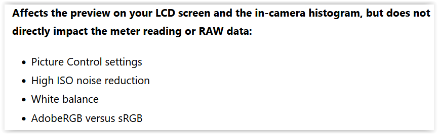
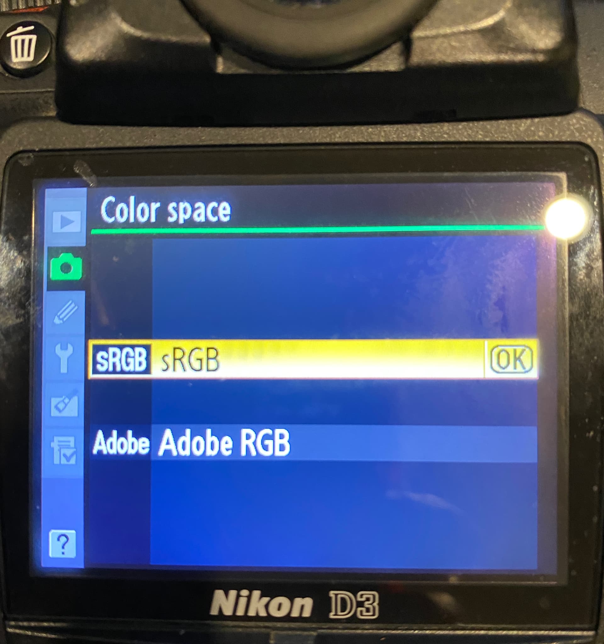
How that jpeg looks is influenced by in-camera settings such as AdobeRGB vs sRGB. Such setting do not however influence the raw data you use to create your image in PhotoLab.

It is not just about having more flexibility to correct mistakes (which yes, is an element) it’s also about turning that raw file into your photo to (re)create the image of what you perceived when deciding to release the shutter. Or perhaps to better convey a mood you felt that may not be immediately apparent through an inappropriately processed image.

You can intentionally expose in such a way which would be wrong if you wanted an out of camera jpg in srgb for example, but then by making an adjustment (not correction) when processing the raw file, you are making the raw file into your photo to convey more of what you perceived in the scene.

As mentioned above, your selected colour space in the camera when shooting raw, will only influence the embedded jpg.

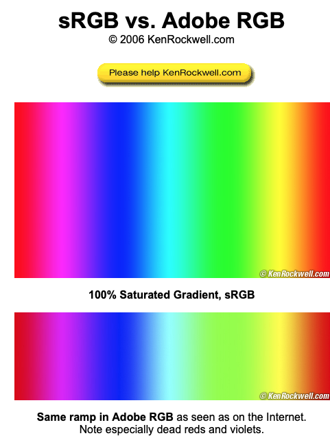
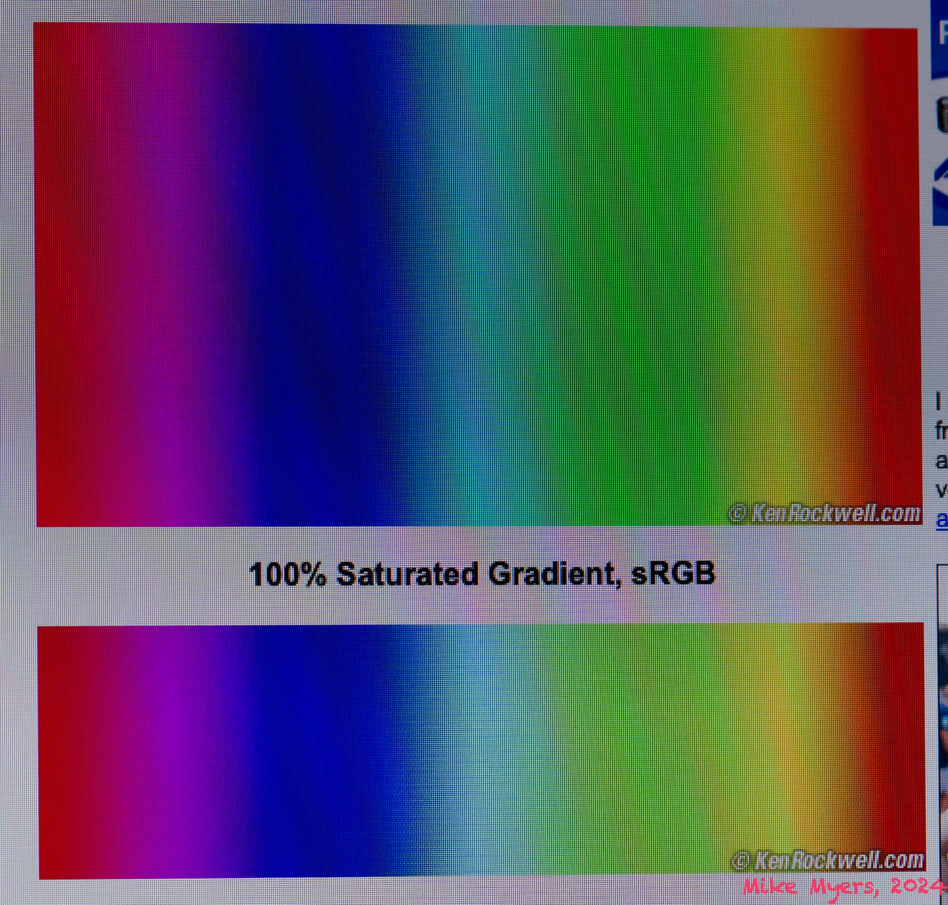
The colour space starts to matter when you start doing something with the raw data, which is why DxO created their own colour space to work with inside PhotoLab. It has a much larger dynamic range than sRGB for example. Though at this stage you don’t need to take the colour space into consideration (DxO has made the best decision for use with their software for you).

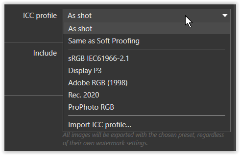
Due to the output limitations of mediums, i.e. screens or paper, you need to convert to the correct colour profile, which will then also limit the dynamic range of the colours of your image to that profile. This is when you need to decide about colour profile and file format.

For your intended use(screen as medium) jpg with sRGB is indeed the best. For printing - it depends. Personally, I would not assign an sRGB profile to an image for printing. However there are printing services that use jpgs at 100% quality and sRGB. With printing it is all not as straight forward or simple as with screen output.

Depending on your screen, yes

No, screen calibration does not mean you will see exactly the same thing. It will likely mean you see the same details, provided the screen has the same colour reproduction ability. When you calibrate your screen you should for example also consider your final output.

I used to also only have screens as a medium and had calibrated my screen accordingly.

But since getting a printer (again) I recalibrated the screen with a warmer and darker target. It instantly got my screen closer to my prints, however it took me some time to get used to the change in brightness and warmer colours, letting me feel the white was yellowish. If I now switch back the profile used when I was only doing things for screen, I perceive it as bright and bluish.

If sRGB made printed photos look dull and lifeless in general, I doubt so many people would get shots with bright colours from their point and shoots. I don’t see an “unless” there. Though I have done a u-turn out a shop where I was told “…we print the entire RGB colour space”.

Some service appear to be setup for sRGB because that is what most of their customers’ files have assigned and if you go to them with another colour space, they will mess up your print which would have looked better if you gave them sRGB. What I’m trying to say is, printing opens another whole can of worms … colour profiles for the paper you are using with your printer… . I went the easy route and made sure I got paper I can have acces to regularly where the manufacturer provides profiles for my printer.

I get this impression because you have ignored multiple people in this thread (who are likely laughing if they read any of this) and have so far been, almost religiously, quoting only two names as your sources of correct information. One of them internationally known for not being the best resource for people interested in raw. Again - this is not anything negative about the images produced.

And judging by how long you appear to have been at the same stage you seem to be quite content in a place where the headaches that come with raw are not necessary.

However you have now explicitly expressed the desire to do so and I hope this post helps you a bit. I also hope it is somewhat cohesive, as I have left this tab open in the browser for few hours and came back to it here and then and have not bothered to review it as a whole.

3 Likes

Fascinating. You said it all.

  • My captured images are intended for internet use.
  • As you wrote, I should make sure they are converted to sRGB
  • But why not take the pictures in sRGB to begin with, so there is no need to convert them?
  • That chart you posted is something I have never seen. Where would you want me to go to, to tell the system to "not use “As shot”? If that question never shows up for me, I have no way to select anything.

The only thing I get to see, is this screen on the back of my camera, and I used to, and expect to continue, selecting sRGB:

All of you seem to be talking about some mysterious settings I have never seen before, and have no idea what they do, or how to find them. If I simply select sRGB, life (for me) is so much simpler.

If this stuff is buried away someplace within PhotoLab, I’ve never seen it.

About Ken Rockwell - he wrote more about my new/old D3 than everyone else put together, and I learned things from him that I didn’t know before. Perhaps I could have found that in the user manual, or the books written about the camera, but Ken made it all so easy, and explained the “why” which the manual did not. So many choices - and as I went through them, I found I selected the wrong ones, likely because at the time I didn’t understand. I’ll post the link to the one I just found earlier this evening.

And to repeat - 99% of my photos are intended to be viewed digitally. (In the past, they were to be printed, but I didn’t know anything about RGB choices. Had I understood this stuff then, I would have shot in AdobeRGB, which is what the magazines probably preferred - although they never said anything.)

You can laugh at the guy, but the following is just one of the dozen or so pages Ken wrote about all the controls on the D3, the menu settings, and so on. If you (or anyone) knows someone better at this, please let me know. I wish Ken had done this for the D780. He is opinionated - but so what.

https://www.kenrockwell.com/nikon/d3/users-guide/controls-back.htm

Time for sleep. I also found I never updated the firmware. Need to do that soon.

His “opinions” leave a lot of people with incorrect information. There are certain things you cannot have opinions about from a logical perspective. In my opinion some of his opinions are akin to saying “In my opinion, a wheel should actually be square shaped and not circular.” And because he is not a bad writer and can produce good photos, we end up with people quoting his opinions as though they are fact.

Actually a good way to sum up Ken Rockwell: Good photos and successful website but appears to confuse facts and opinions.

Not only has PhotoLab now got the new Wide Gamut colour space, it also introduces the ability to soft proof to both screen and printer.

Let’s start with this lovely image of James Compton from Fest Jazz 2017. It was taken with the camera set to sRGB.

Here it is in the “Classic” (AdobeRGB) colour space…

Now, my monitor is an Apple, which runs in the P3 colour space. In order to make sure that colours are accurately reproduced on other people’s sRGB monitors, I need to soft proof it with the sRGB profile. Here is what I get…

The differences are slight but, if you look just above James’ hand, you will see a slight change in tone of the orange background.


Now, in the “Wide Gamut” colour space, without soft proofing, the image looks like this…

However, if I take that image and apply soft proofing for an sRGB screen, I get the following false colour indicators, telling me that those areas are “out of gamut”, which means that those colours cannot be guaranteed to be reproduced accurately when shown on an sRGB monitor.

And here is the same image, corrected with the HSL Colour Wheel by increasing the luminosity and reducing the saturation slightly for the red channel, sampled from the back of his shirt…


So, it may not matter what colour space you use in camera for a RAW file, but it certainly matters which colour space you use in PhotoLab and you may also need to soft proof if you really want to be sure that folks viewing on sRGB monitors will see what you are seeing.

The most noticeable problem with out of gamut colours tends to be that you can lose detail in those colours - for example the folds in the shirt in this image as shown in the wide gamut space.

1 Like

@underexposed – a great post! Let’s hope that Mr. MM understands a bit better.