Off-Topic - advice, experiences and examples, for images that will be processed in PhotoLab

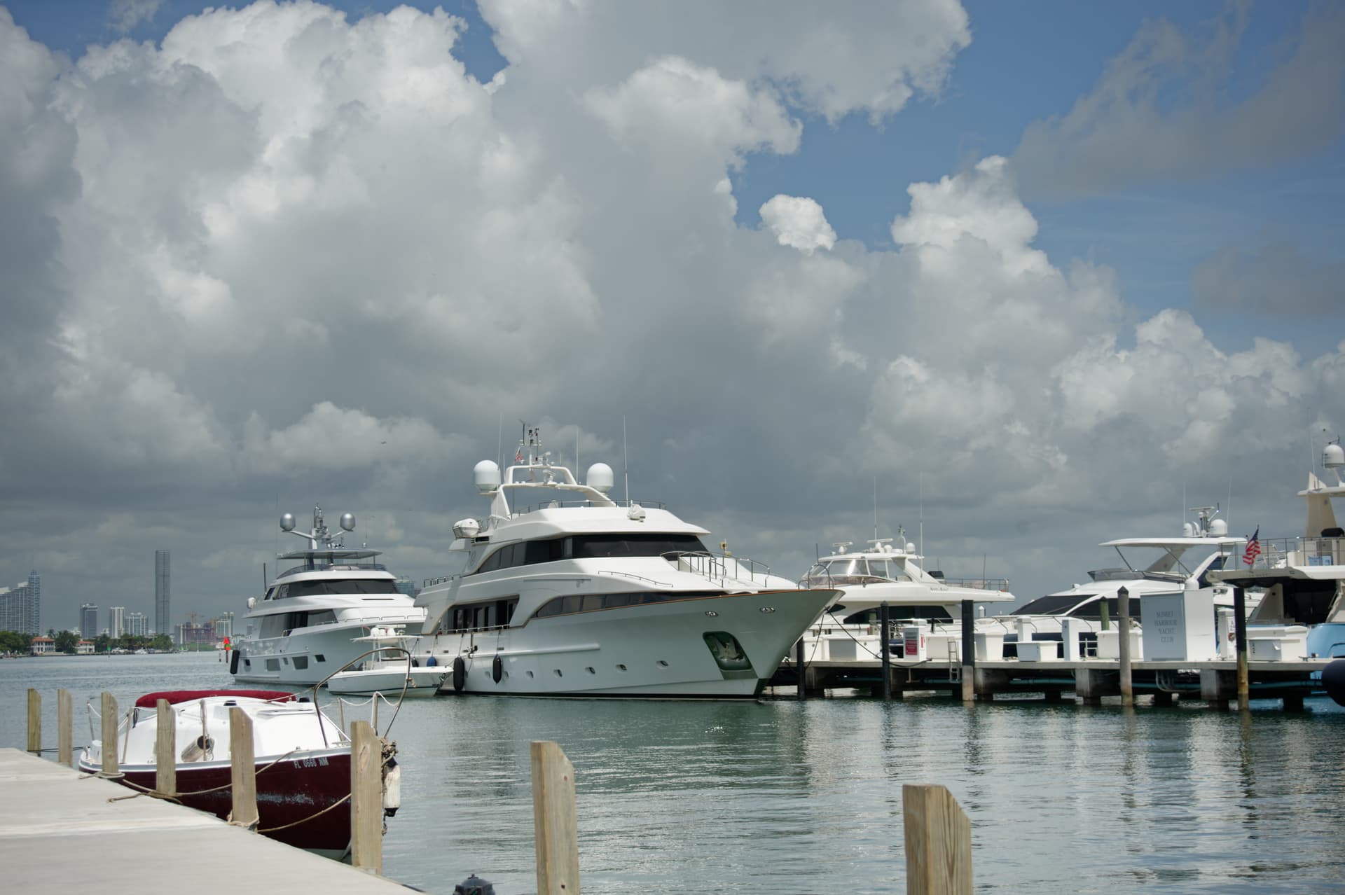
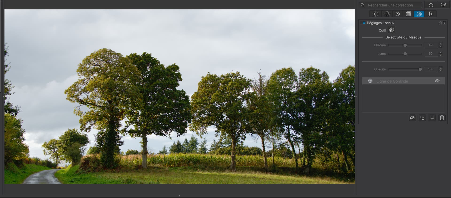
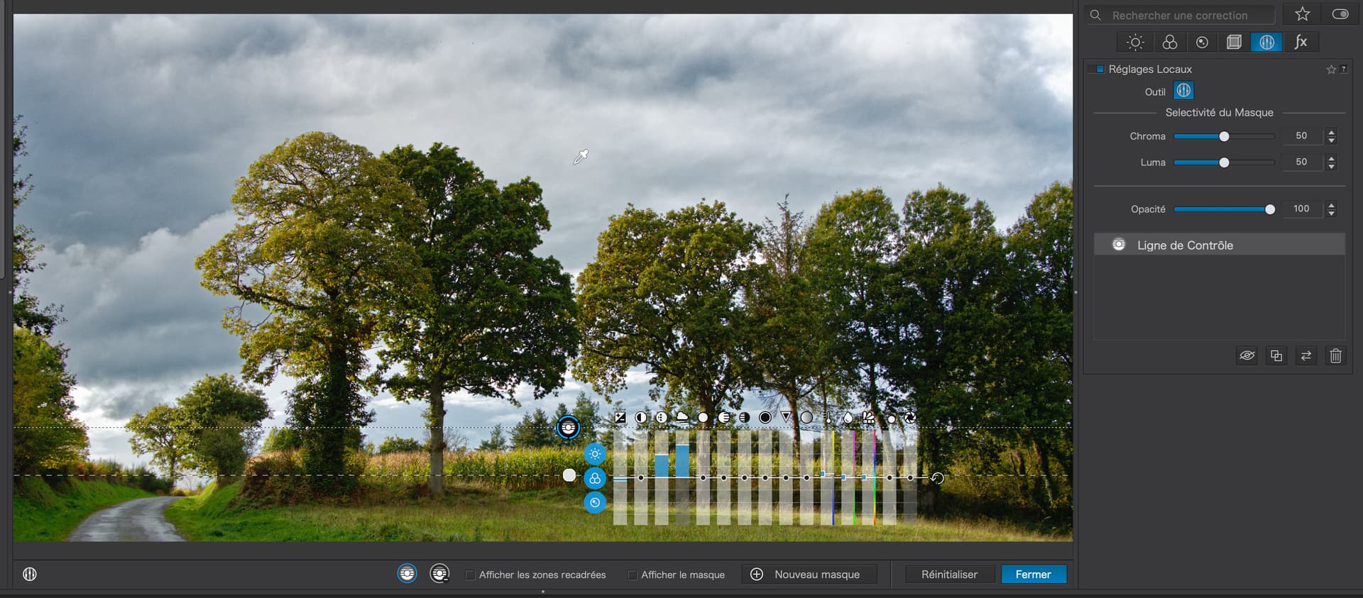
Starting with your “master”…

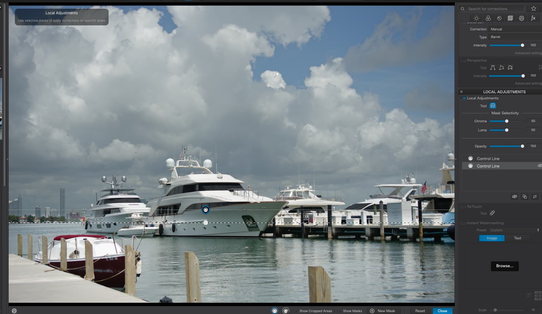
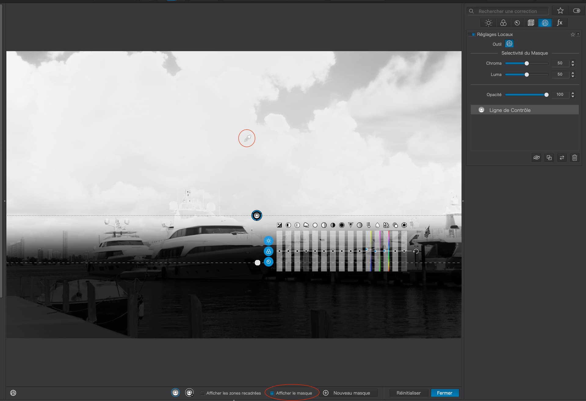
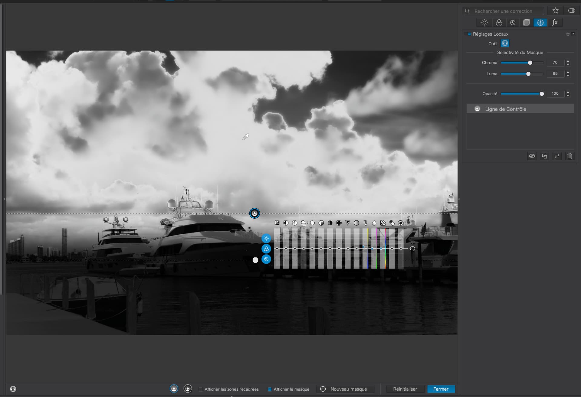
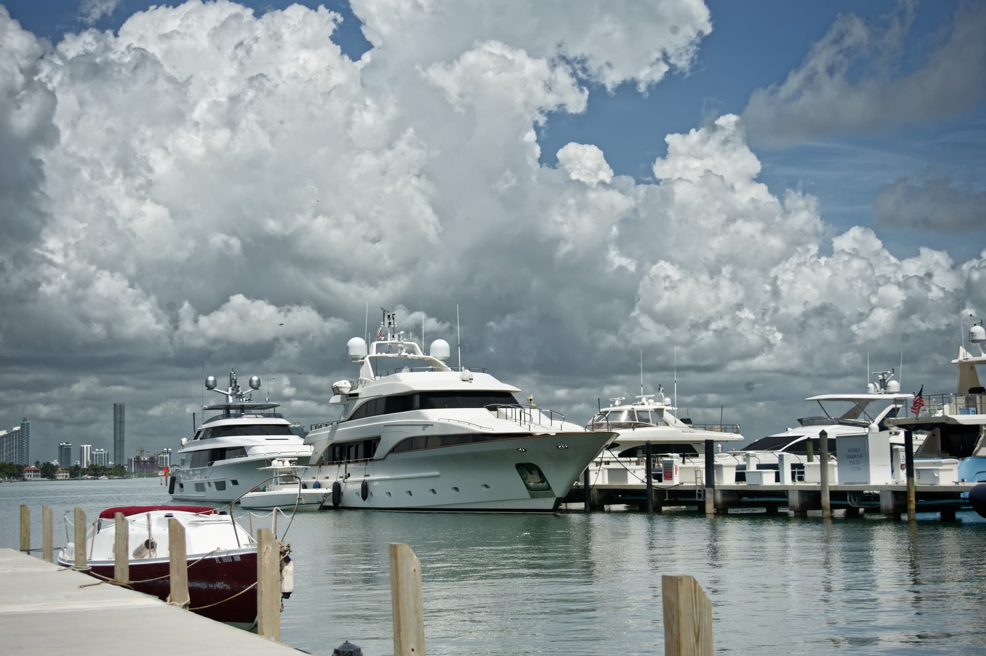
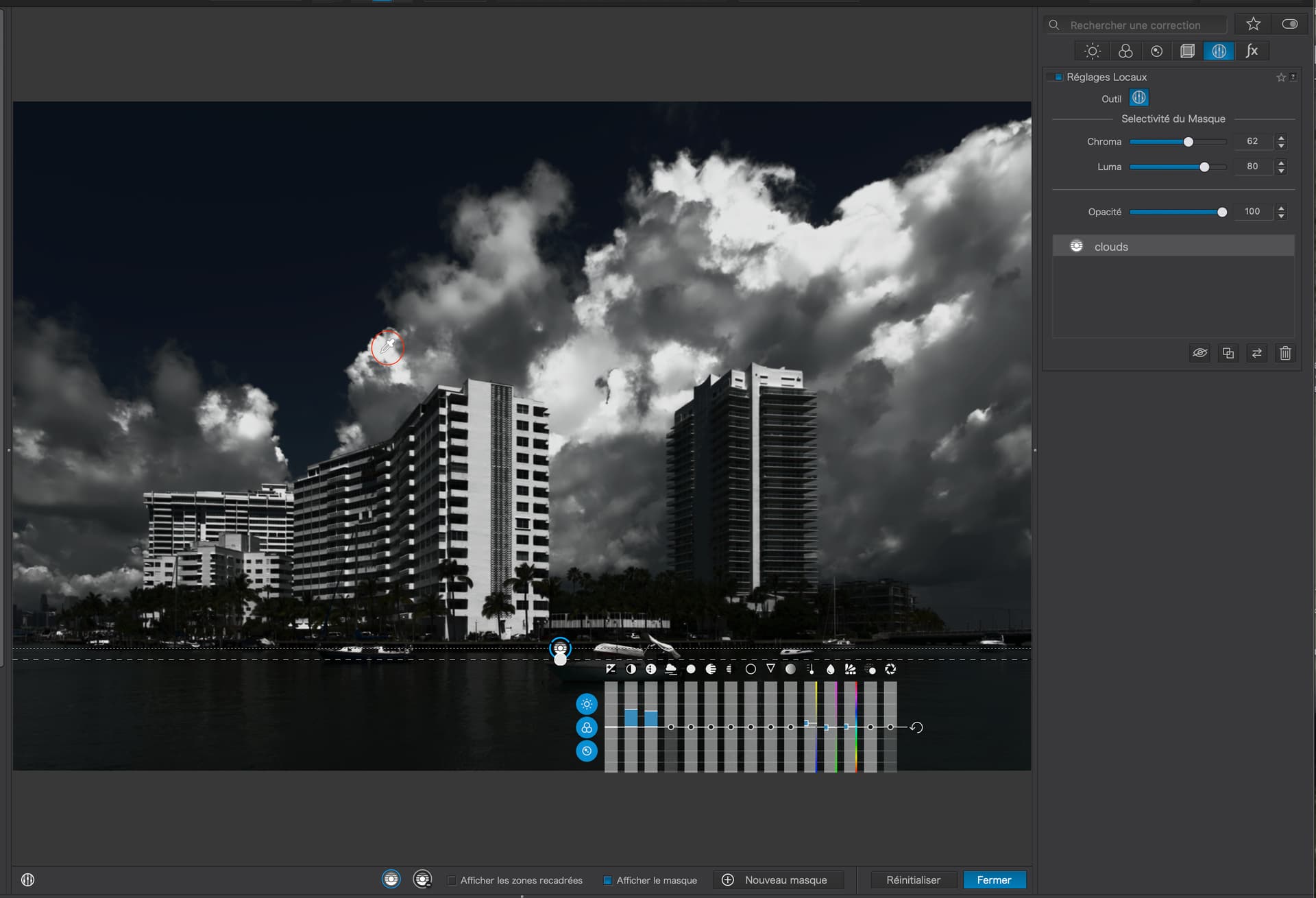
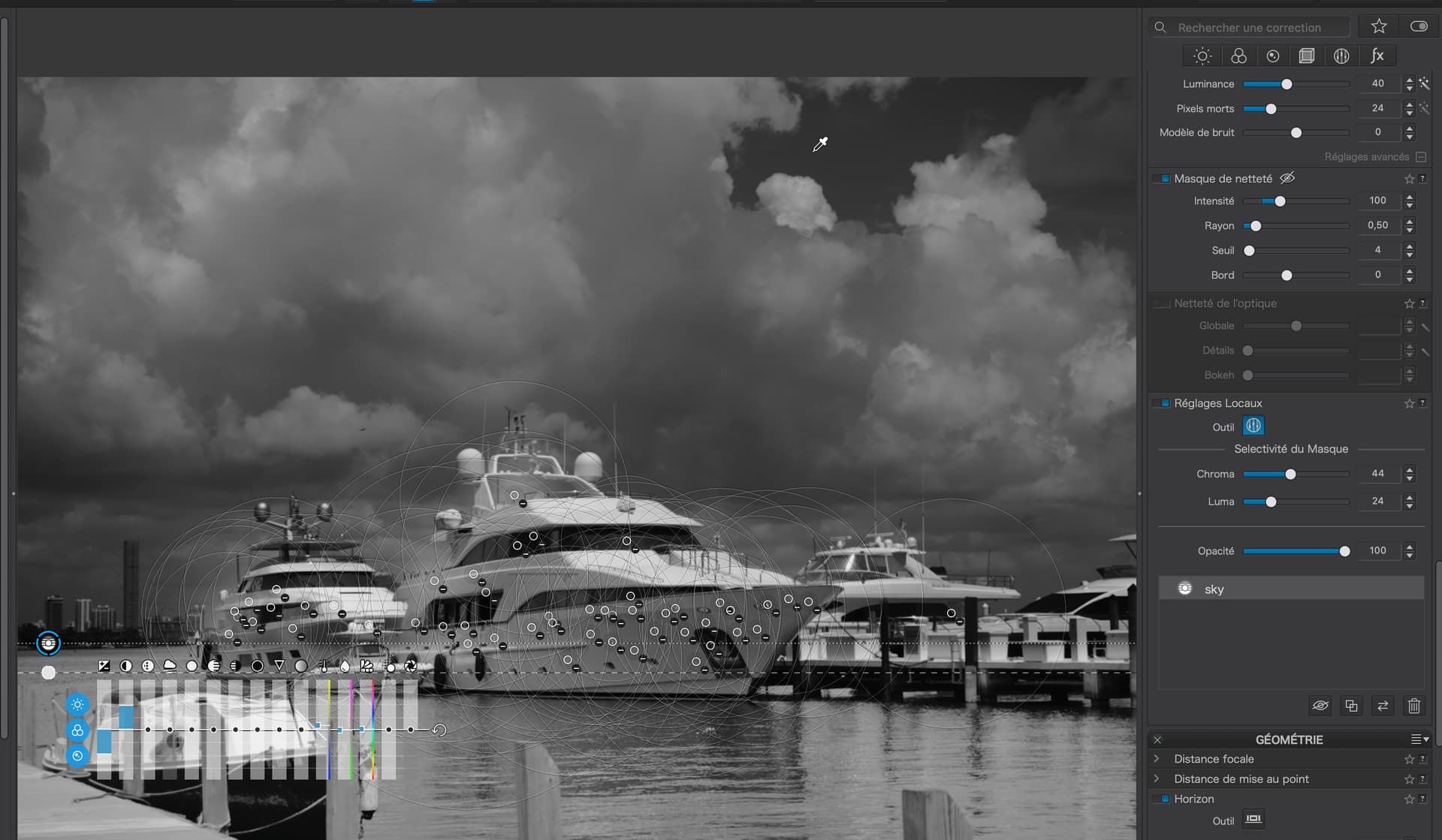
You have tried to apply a Control Line to the sky but, if you look at the mask, you will see that the only parts affected are those that are the darker parts of the sky…

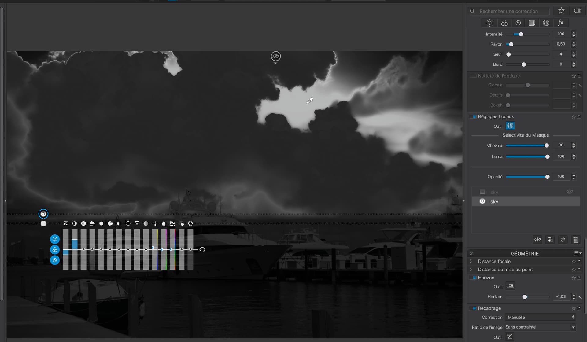
If you really want to bring out detail in the clouds, then you need to select the clouds, not the blue sky…

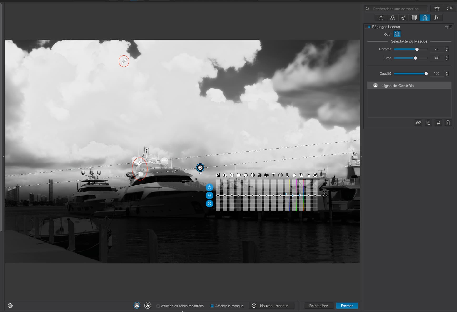
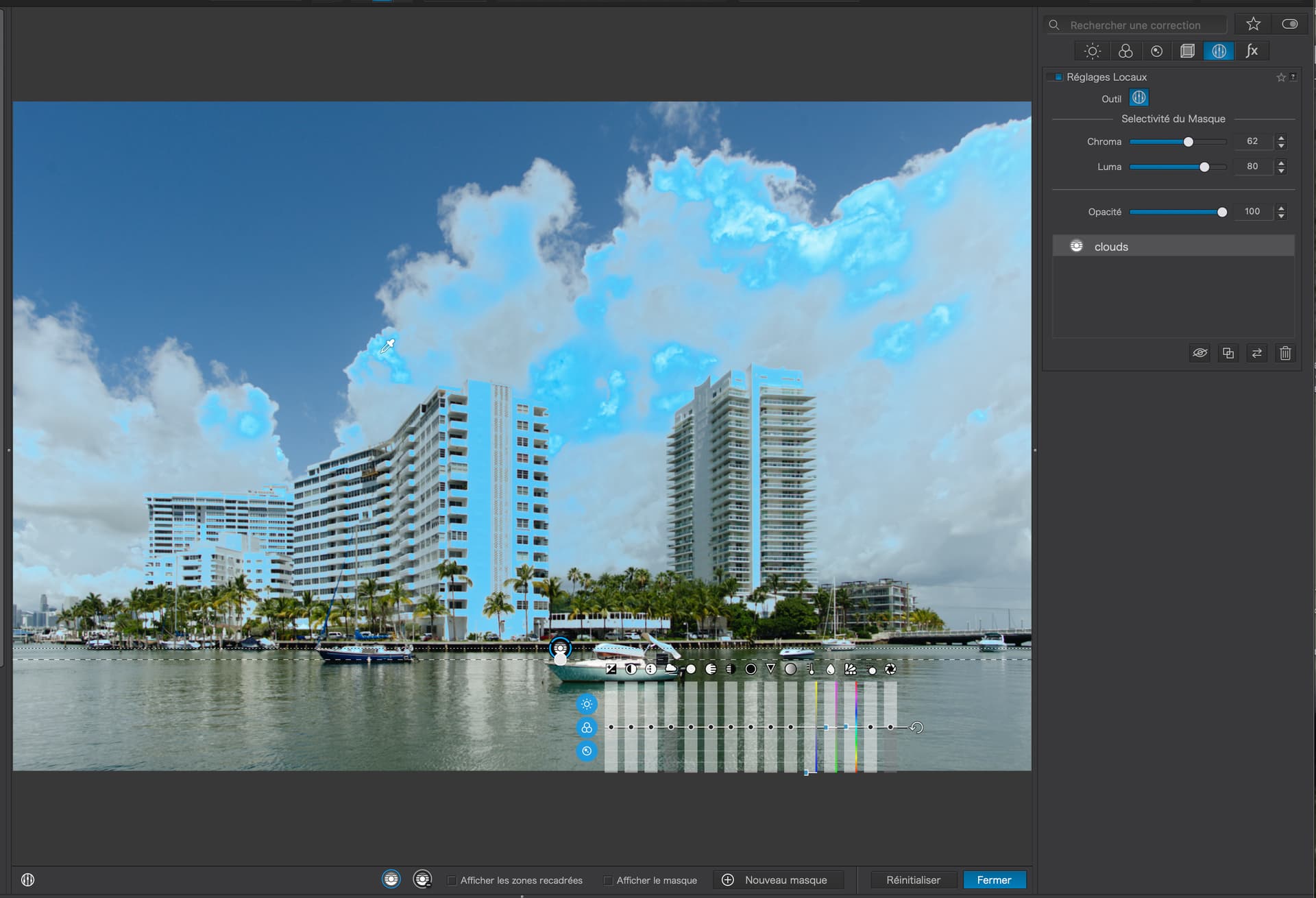
Note the second Control Line that adds in more of the clouds. See where I have placed the second pipette on a part of the clouds that was not affected by the first pipette.


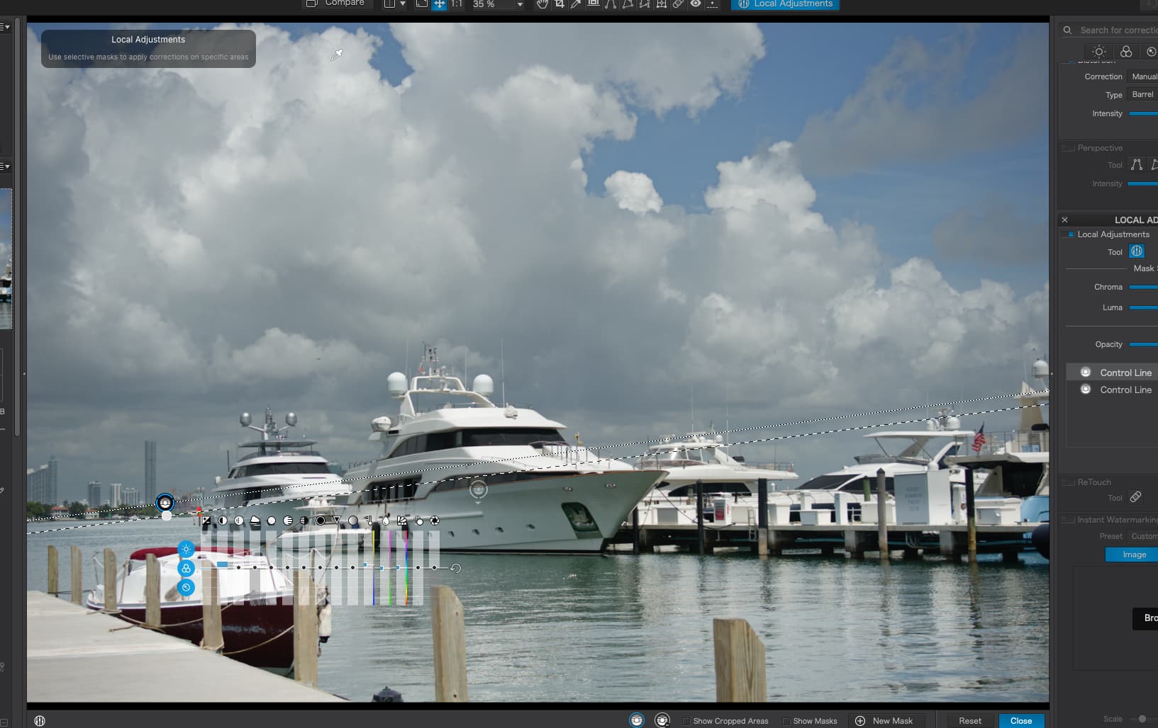
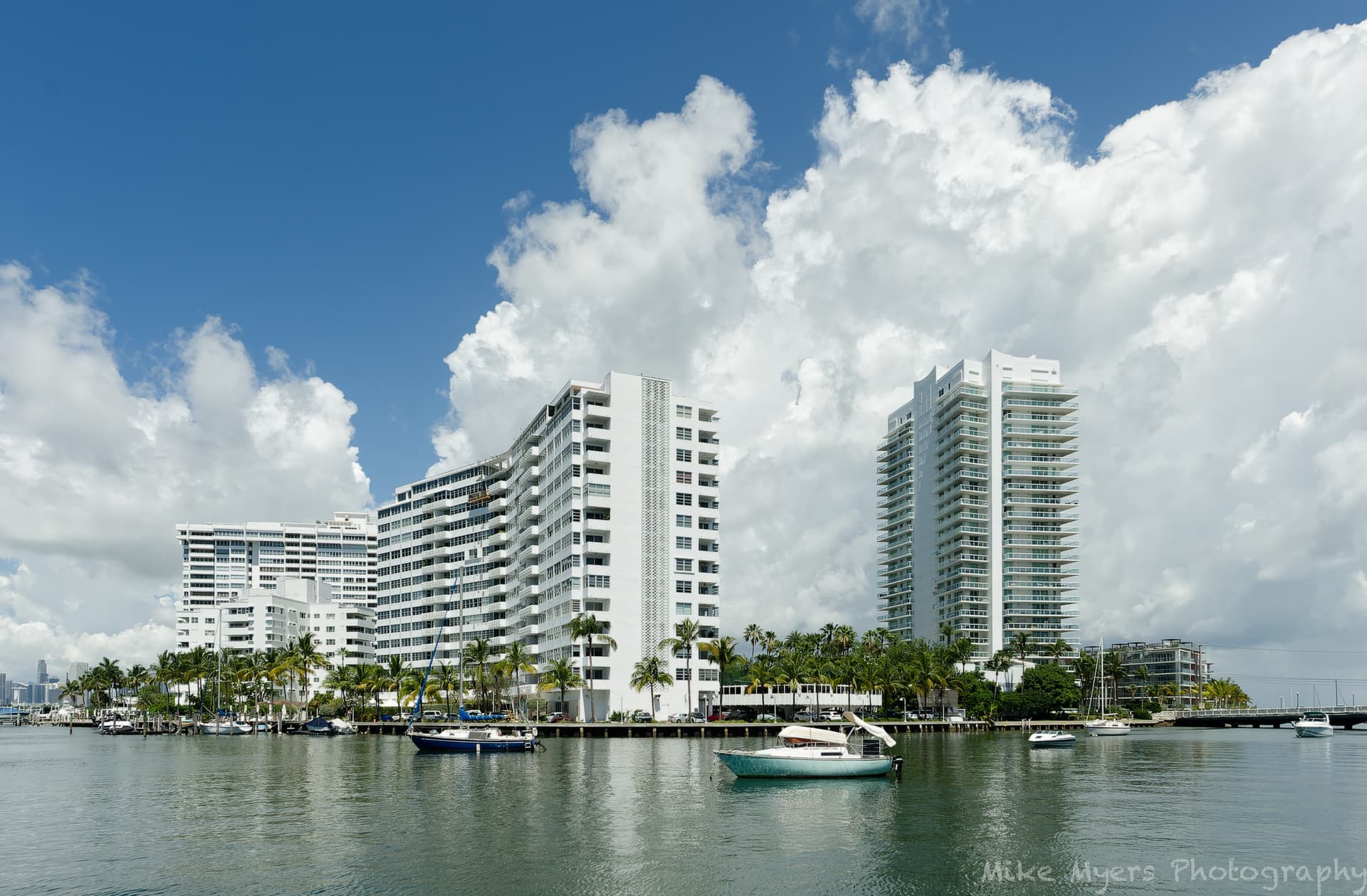
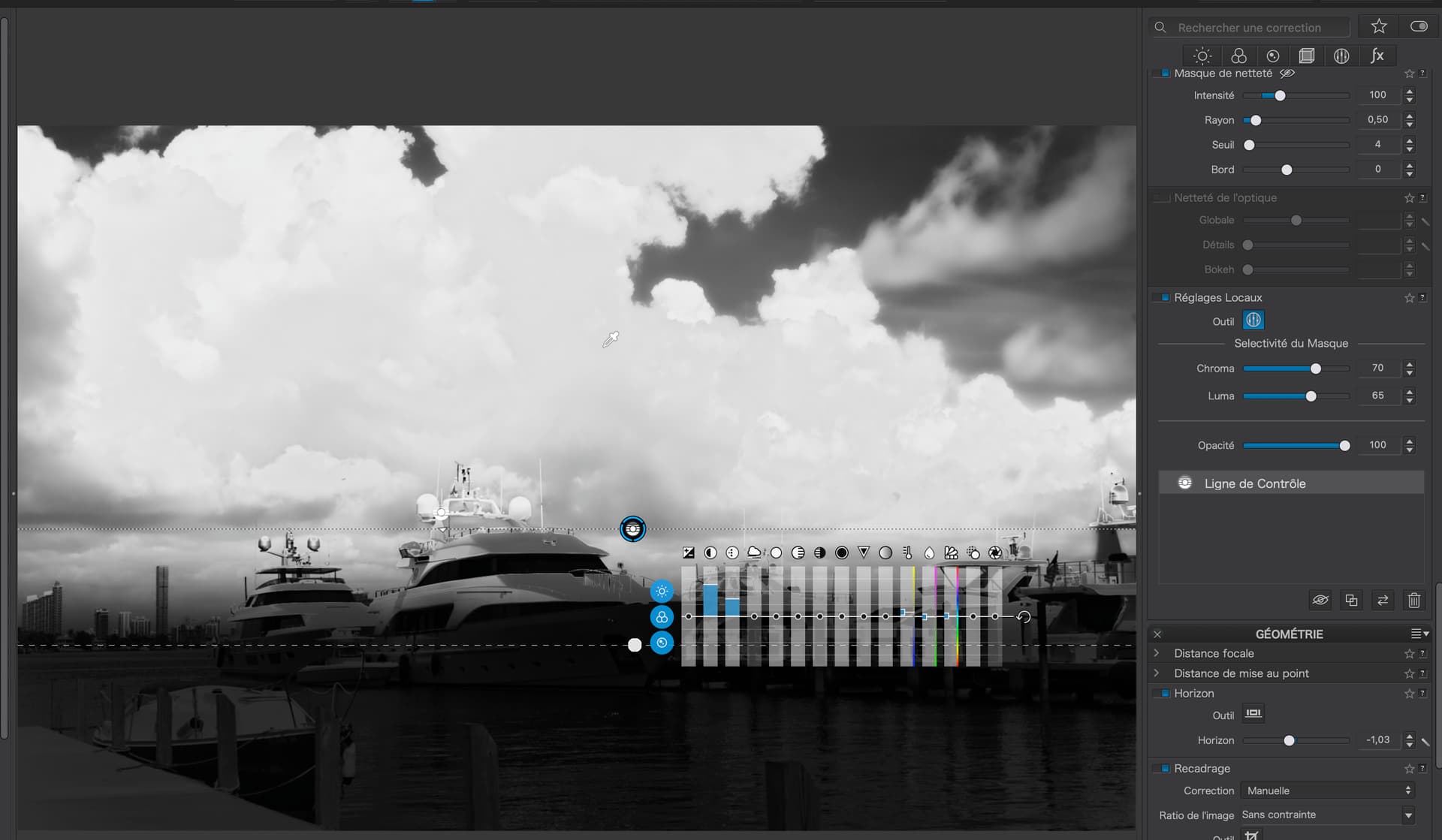
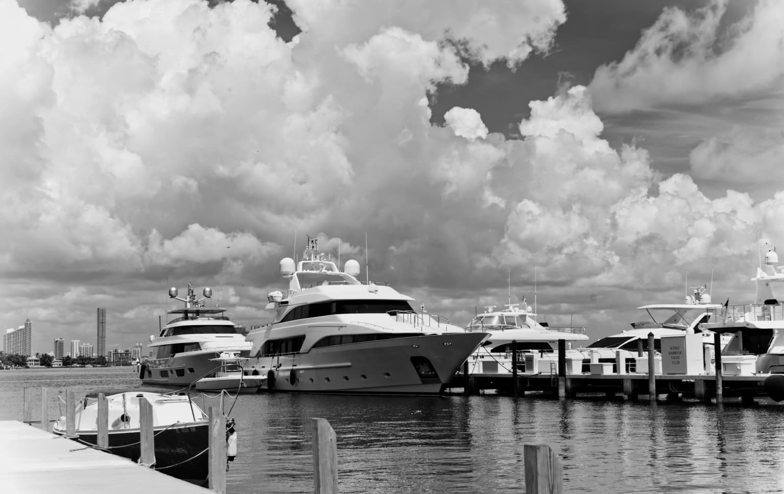
As for VC2, I’m really not at all sure what you wanted to achieve…

You placed the pipette on the blue sky but then you reduced the selectivity to include almost everything in the image above the gradient, only to spend ages trying to negate (unsuccessfully) the boats - so you ended up with, essentially, a simple gradient filter.

Then you proceeded to reduce the brightness over everything above the boats, along with increasing the contrast on the shadow tones you have just created. This wasn’t helped by your creation of a tone-flattening curve…

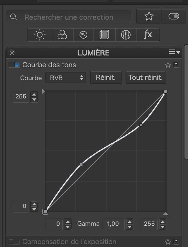
… which further served to only increase contrast in the deeper shadows, but not in the mid-tomes where the majority of cloud texture is to be found.

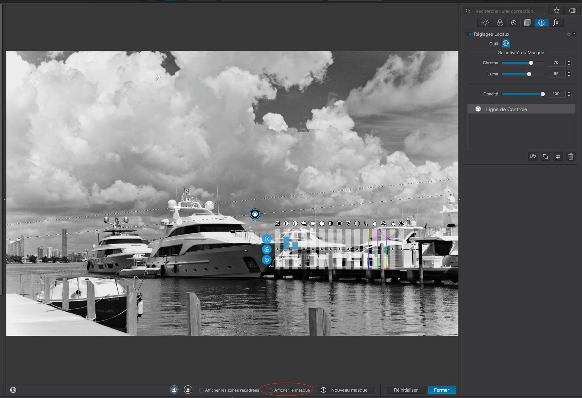
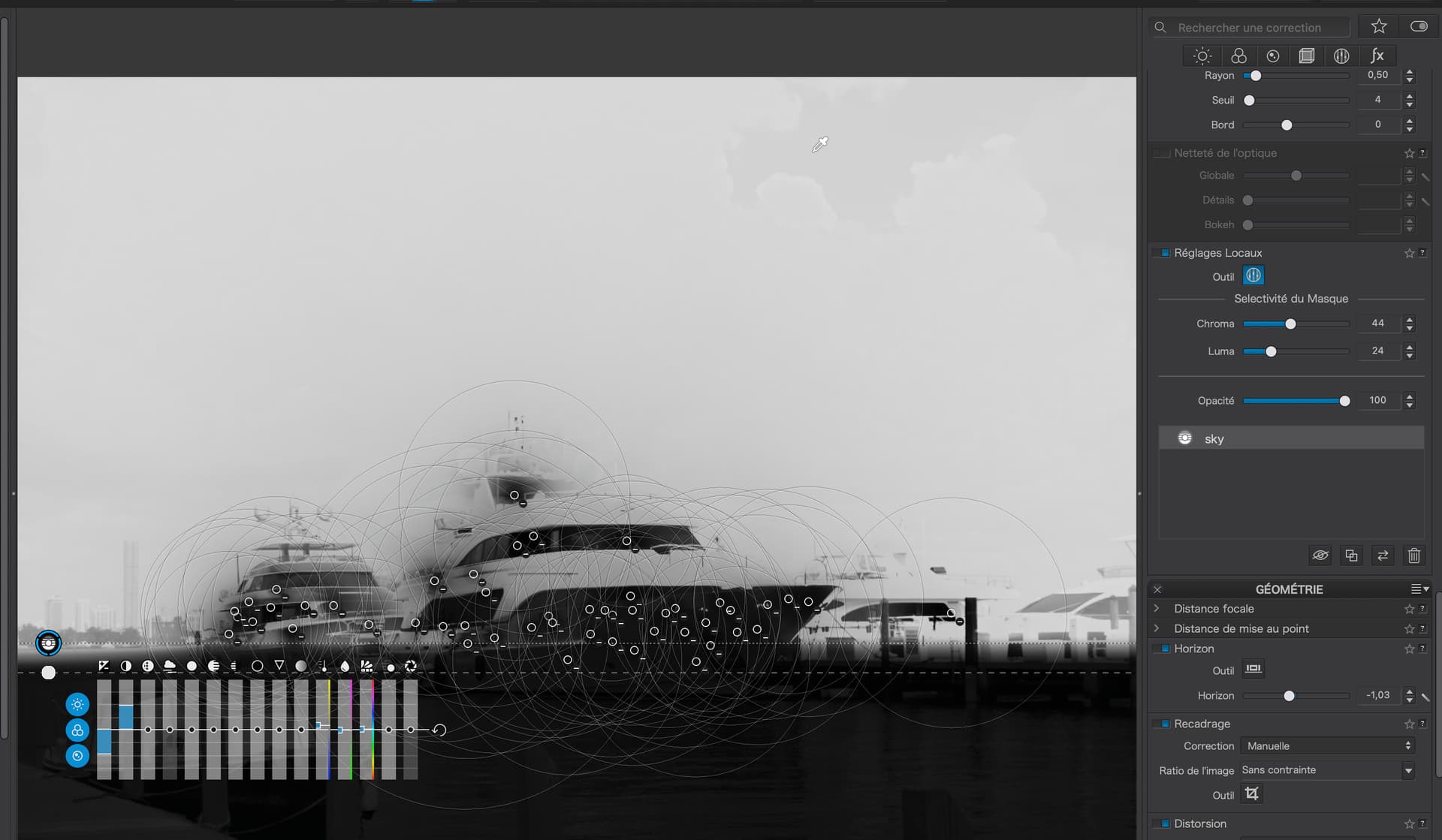
VC3, with its additional Control Points, only served to flatten the contrast in the clouds even further.


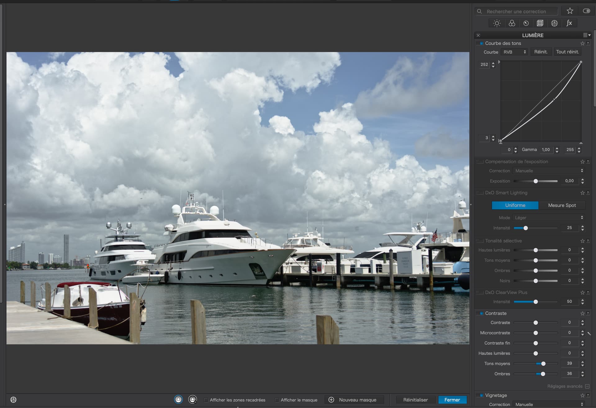
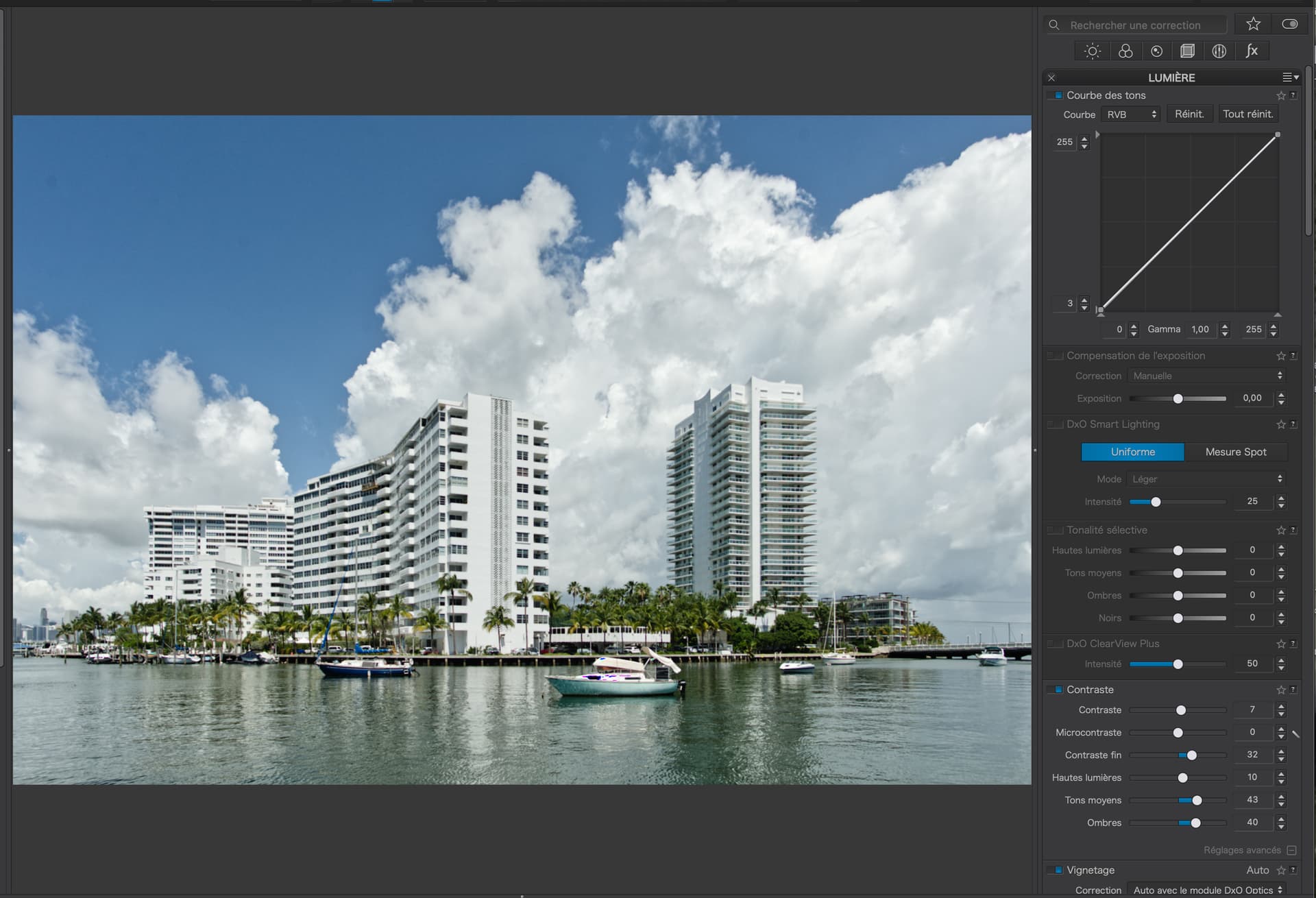
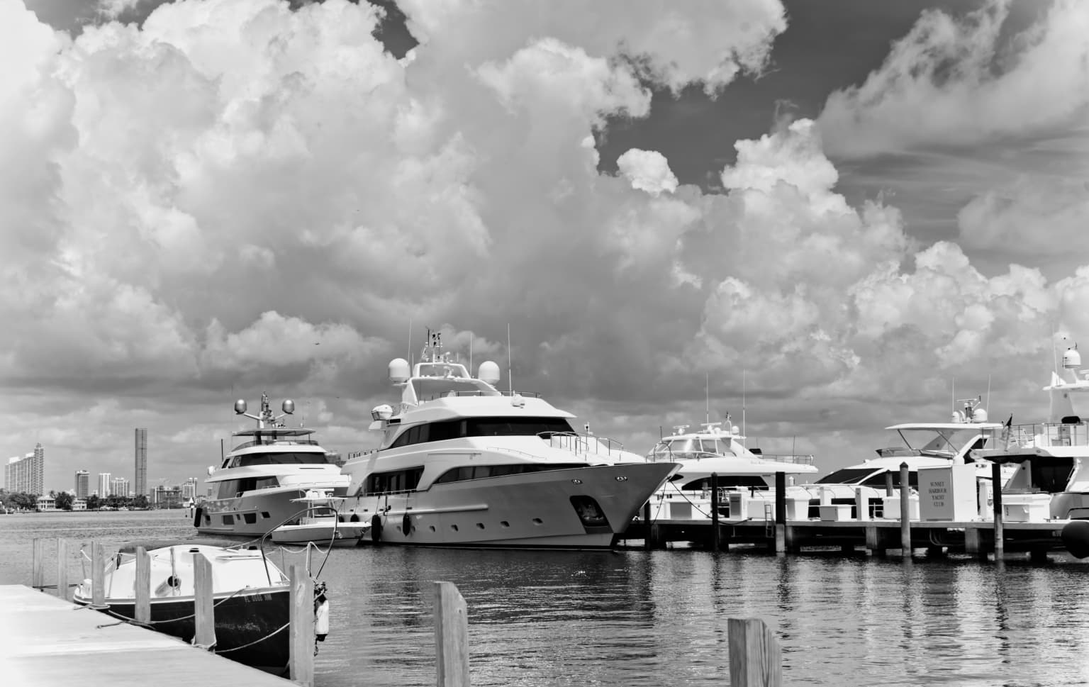
Try my DOP, with two alternative versions - the first using the double Control Line, the second using a Grad Filter on the foreground rather than the sky…

D3M_0126 | 2023-06-25.nef.dop (114,0 Ko)

2 Likes

Thank you for the detailed explanation. I will do as you suggest, but only after I start with a “clean copy” of the image, and repeat what you did.

Your end results (both/either of them) are what I wanted to accomplish.

My thoughts were to delete the mess I had created, and start all over again. Then I decided to just make a new VC, and reset it to the beginning, and start all over again.

I can now see why your original pipettes were on “the clouds”, and that by using the two control lines, more of “the clouds” were selected.

I’m glad I took and posted this photo, as it led to your wonderful explanation. (For you, it is probably all just “routine”, but for me, it is “wonderful” with your explanation of WHY you did it this way.)

Joanna, I replaced my .dop file with yours.

  • Then, using the latest image you worked on, I made another VC, and clicked RESET for what is now VC7.
  • So, I’m back to the original image I took, in color, with no editing.
  • I straightened the image, as it wasn’t level, and cropped out the “extra areas” lost during the image straightening correction.
  • (No cropping, no editing, nothing else.)
  • Then I re-created your first control line, and put the pipette on the whitest cloud I could find, followed by decreasing the exposure and increasing the contrast.
  • Finally, I re-created another control line, as you did, capturing the area at the left that was missed by the first control line, and I put the pipette on the second whitest part of the image I could find, followed by a minimal change to exposure, but adding contrast.

I’m going to stop editing here.

Obviously, my first mistake was placing the pipette in the wrong spot.
Next mistake, I never thought to do another control line to correct those areas missed with the first one.

I might continue and make the clouds nicer, as you did, but it’s obvious that I totally screwed up any chance of doing this correctly, when I put my pipette on the blue sky, not the clouds.

Thank you a million times over. I think I fully understand this now, but that’s what I thought before. I don’t think I’ll forget this time.

The image below is NOT a finished, fully edited picture; it is ONLY the result of replicating your control line corrections properly.

D3M_0126 | 2023-06-25.nef.dop (144.4 KB)

At times I think I’m as hopeless as @wolfgang and others think I am.
It’s like putting sugar on my steak, instead of salt. Yuck!

Hopefully this has been helpful to others in this forum.
Control lines are more complicated than most PhotoLab adjustments.

1 Like

Is there any way to show all my control line corrections on my screen in one image?
As in a combination of the two screenshots below?
(Looking at these two screen captures, did I really need the second one, at an angle?)


Another thought to consider. My brother, who is four years younger than I/me, has developed MCI (Mild Cognitive Impairment), which is the first step on the way to “dementia”. He is losing his memory, along with his reasoning ability. Other than the fact that I’ve had a lousy memory for my whole life, I sometimes wonder about my very slow learning curve. Learning “control lines” is just the latest example. It’s like my brain is wired differently - I don’t need to remember WHAT to do, I need to also remember the WHY.

My way to deal with this is to take lots of photos, and keep editing them until I finally get to where people here say I did it correctly. I can memorize PhotoJoseph’s videos, but it’s more difficult for me to remember WHY he did things the way he did. Personal experience is the best way, for me.

I wish more people were posting their own editing attempts here, rather than copying textbooks full of irrelevant (to me) information. I used to think of control lines as just a fancy toy. Now I see them as essential, for when other editing tools don’t work as well, or at all.

The two screenshots you have shared tell me that you still haven’t quite got the idea of Control Lines.

You seem to be looking for bright bits of cloud on the image but without showing the masks or using the selectivity sliders.

First, you have created two independent Control Lines instead of adding the second to the first.

To start with, you need to select somewhere on the clouds…

… and activate the masks.

Now, you can see that all you have is a grad filter, which will not only affect the clouds, but almost everything that is above the line. This is because you have left the selectivity sliders at their default 50 / 50 levels.

In order to only affect the clouds, you need to increase the selectivity until only the clouds are masked (appear white)…

I used 70 / 68 but you need to experiment for yourself.

Because of the variety of tones in the clouds, you can see that not all of them are selected. So we need to add a second line to the first, not as a separate line…

Adding the second line and pipette, you can now see that more of the clouds are now selected. I placed the second pipette on the darkest bit of cloud - this than adds in those tones to the predominantly brighter tones from the first line.

(a little hint - sometimes you need to move one of the selectivity sliders and return it to where it was in order to prompt the mask to “catch up”)

Now, you can see that it is now most of the clouds that are masked.

Only now, should you deactivate the masks and make any necessary adjustments without the masks visible.

N.B. you should never attempt to create Control Lines or Points without activating the masks and you should never make adjustments with the masks still visible.


And here is a colour version…

1 Like

OK, Among other things, I wasn’t aware that I could create an additional control line on the same screen where I had created the first. I know that now.

I didn’t use the other controls because I wanted to make sure I was right up to that point in time and I now know I was not. I will delete one of the two independent control lines, and add that to the original.

Should I adjust the selectivity sliders one at a time, as I am creating the two control lines, or create them both, and then work on the selectivity sliders?

If I don’t hear from you first, I will do things in the order you described.

N.B. 1 - you should never attempt to create Control Lines or Points without activating the masks: This, I knew.

N.B. 2 - you should never make adjustments with the masks still visible: This, I did not know.

I will do these changes only, and nothing more, until I get this part right.
To Be Continued…

Could we keep politic out of this forum ?
This is not the place for it. Even if photography is implied in a lot of it. And even if this is an interesting subject.
Here is a DxO forum, a demosaicer and image processing software. This is not the good place to talk about it.

I would add (and this needs absolutly no answer) : Isn’t doing this in this place propaganda ?

So please, don’t hijack this forum.

6 Likes

Fair enough.

The answer is no, absolutely it is not. But I agree, this probably is not the a good place for it.

1 Like

Following your written instructions I did everything you did, in the order in which you did it. Eventually it got “close” to what you did. I’m going to stop here, and ask you to see if was I got is acceptable. The clouds did get all the detail I thought I wanted, but I need to tone it down - once I find out if I’m going in the right direction.

D3M_0126 | 2023-06-25.nef.dop (144.8 KB)

If what I’ve got here is correct, I think my next step is to reduce the contrast.
This is starting to become more enjoyable, closing in on a good result.

…anybody else here want to try your hand at this?

Finished (I think).
(Unless Joanna needs to change it more…)

Several hours later - I like the last image, but it doesn’t look “real”. I need to tone down the clouds a lot more.

I took a new image this morning with a 20mm lens of three buildings across the bay from me, with this huge cloud behind them. I over-cooked that image too, and kept turning down the micro-contrast until the contrast effect was minimal. One control line. I suspect this is the maximum effect I should create using the fine contrast tool on the local adjustment. Maybe I’m getting too sensitive to this - I don’t think there’s much need for the control line here, and it’s getting too difficult to decide when the setting is best. (Having said that, what I think is “best” might just get a laugh from Joanna, but I think this is the best edit I have done so far.)

D3M_0139 | 2023-06-26.nef (24.3 MB)
D3M_0139 | 2023-06-26.nef.dop (15.0 KB)

The tools are becoming easier to manipulate.
The most difficult decision is “how much” to use them.

With only one control line, this image was easier to work on. Simpler is good.
(IMHO)

Use them as much as you want to use them, until you get an image you are happy with.

Thank you - at some point, that will become good advice.
For now, I will replace “you” with “the forum”, since other people (especially Joanna) see things better than I do.

It’s like anything in life, there is a learning curve.
It’s also true that everyone has opinions, and the are not identical.
Maybe I’m now in the 4th grade, hoping to eventually “graduate”.
Control Lines are the most difficult part of PhotoLab - at least for me.

I haven’t worked on it yet but yesterday I captured an image of just “clouds”. My plan was to practice on this image, with nothing else in the image to be concerned about.
D3M_0137 | 2023-06-26.nef (23.8 MB)
The D3 metered on the clouds, meaning the exposure is for “neutral gray” clouds.

This reminds me of my photography classes a lifetime ago, where I would come out of the darkroom with a “perfect” print, only to have it torn to pieces when I got to class. :frowning:

There is absolutely no need for a Control Line here. In fact, there isn’t much need for anything.

Here are the changes I made (no local adjustments)…

Don’t forget there are times when you just get everything just so because the lighting and your exposure “just works”.


But, if we look at your LA mask…

… we can see that you placed the pipette on a brighter part of the clouds, which meant that only those parts of the image that had that luminosity were affected by any adjustments.

Look carefully. Only those bits that appear white make up the mask. See how little of the mask on the cloud is truly white - these are the only bits that will be affected. Anything less than white will only be affected partially, including the majority of the clouds where the mask appears dark grey.

Don’t forget, what you are seeing in the mask view is not the image itself - it is the mask, rendered as tones of B&W to indicate what will be affected when you hide the mask and make adjustments.

If I take your mask and, instead of working on detail in the clouds, I change the colour temperature…

Now, you can see the parts of the cloud that were affected a lot easier. You can also see that a lot of the buildings were included in the mask, which is not what you wanted.


I exported and ran both your and my versions through Kaleidoscope comparison tool…

If any differences are obvious, then they appear as dark and, as you can see, the only thing that is really obvious is your signature - all the rest are minor pixel differences - certainly not enough to be noticeable - certainly not enough to warrant using a Control Line just for the clouds.

Ok, now I understand better. I did notice that as I moved the sliders around, but didn’t know what to do. Is this telling me that a control line is not appropriate for the image, or is it telling me that I should have placed the pipette in a different location?

The photo was taken (carefully) because I wanted to experiment with the control line. Since that was the goal, I went ahead and did it. One more thing to learn, when a control line is (or is NOT) appropriate.

OK, I now realize that ONLY the white areas will get the full benefit of the control line. That’s obvious, now, but only because you pointed it out. :frowning:

Control Lines work best where there is a clear difference between the area you want to treat and its surroundings.

Take this image of mine, where I want to reveal the detail in the sky, but there is a line of trees in the way…

So, I add a Control Line with the graduated part just touching the sky, because cloud detail gets less with distance…

Fortunately, this time, the ideal selectivities were 50 / 50, but that is more by chance than design. If I increased the selectivity, the mask over the sky gets blotchy and I would not get the nice even white, which tells me that the whole sky was selected. If I decreased the selectivity, I start to get grey masking over the trees, which will include them when I increase the detail for the sky - not what I wanted. Note that the sky originally has very little contrast, so helping with being able to select all and only.

Finally, I hide the mask and adjust appropriately…

This is exaggerated for use as a demonstration, but you get the gist. See the detail in the clouds between the trees.

Translation for Mike > white buildings in front of a white sky is not a good test image. :-/

While I think it is clear as can be, I will find a similar image to capture, to try this with.

What is nice about your example, is that the final image looks “real”, not “fake”.
Too late to do this today, and too hot.

I’m almost afraid to ask - what is this, what does it do?
Kaleidoscope file comparison tool gets major update to version 4

I will remember this.

Is it best to do the control-line edit at the start of editing an image, or after everything else has been done?

It’s a forensic tool for investigating differences between file and folder contents, as well as images.

The simple answer is - yes. In other words, when you feel the need.