Off-Topic - advice, experiences and examples, for images that will be processed in PhotoLab

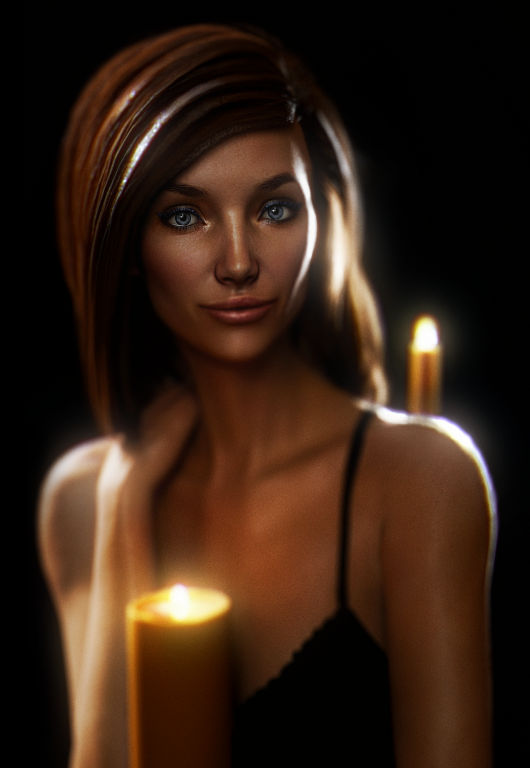
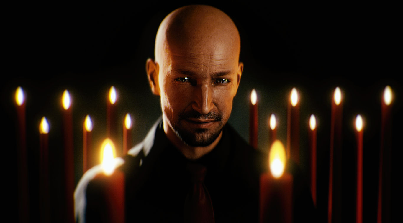
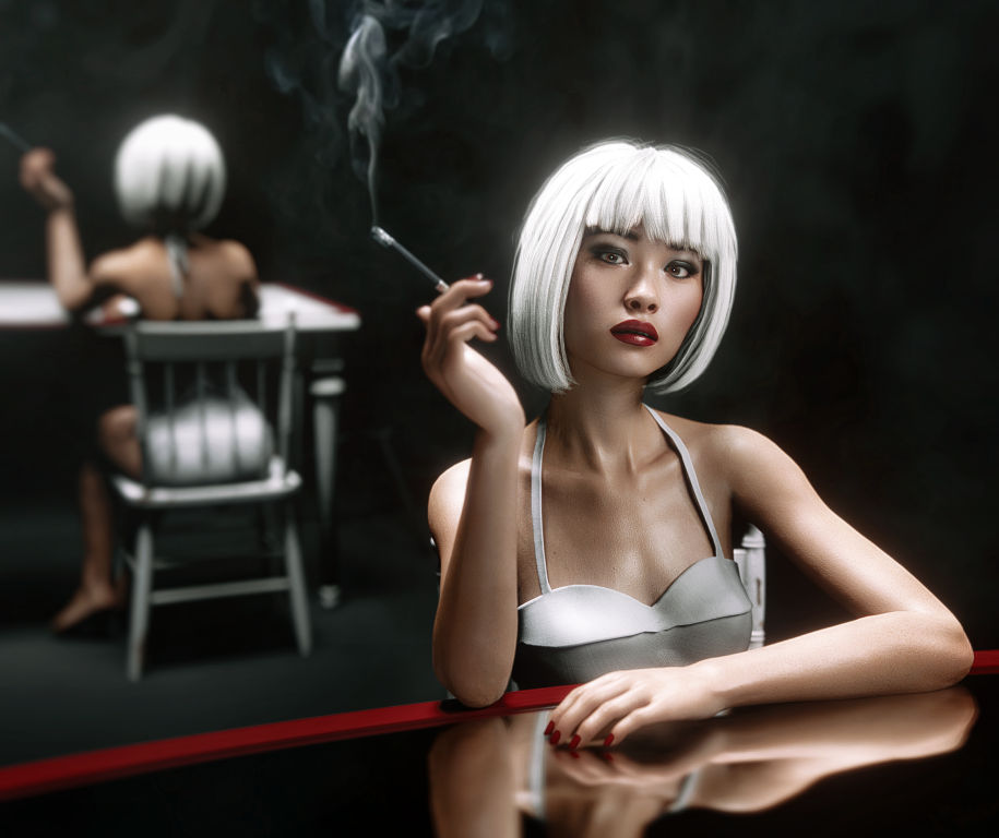
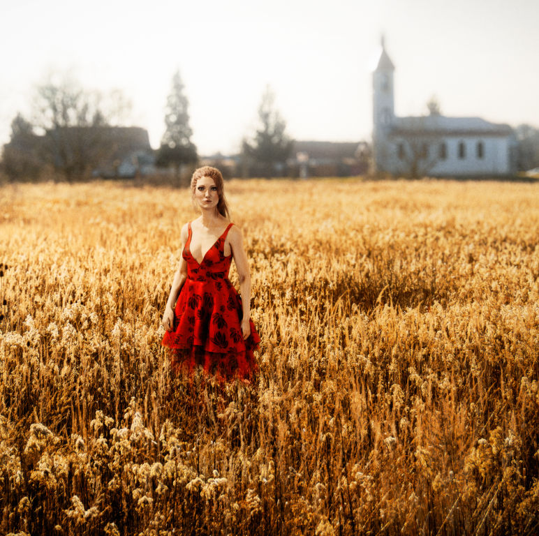
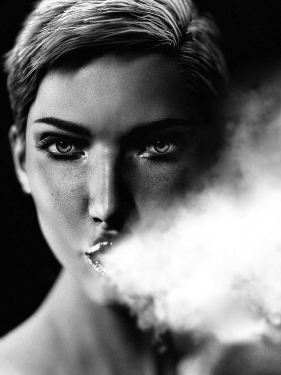
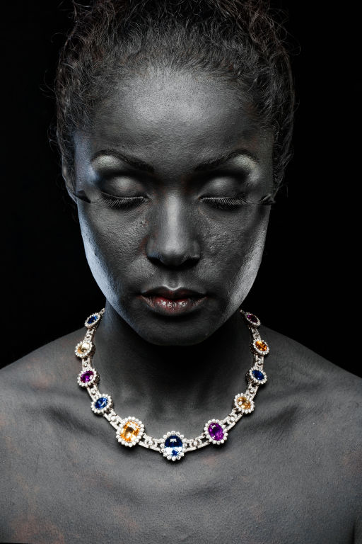
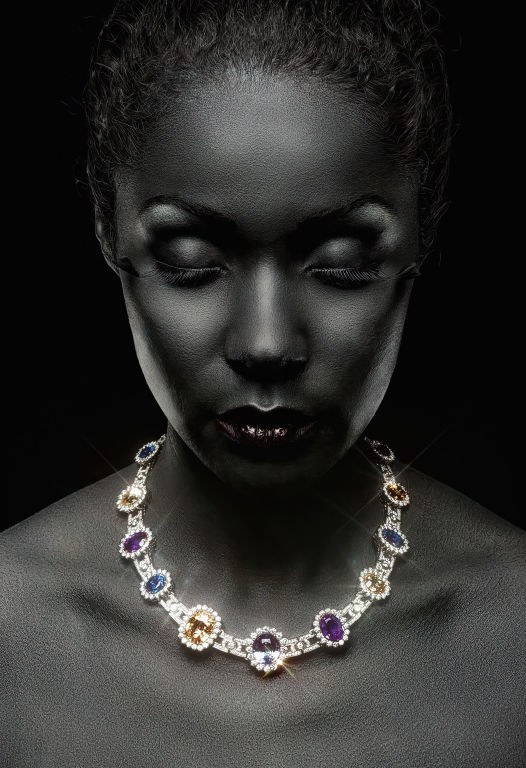
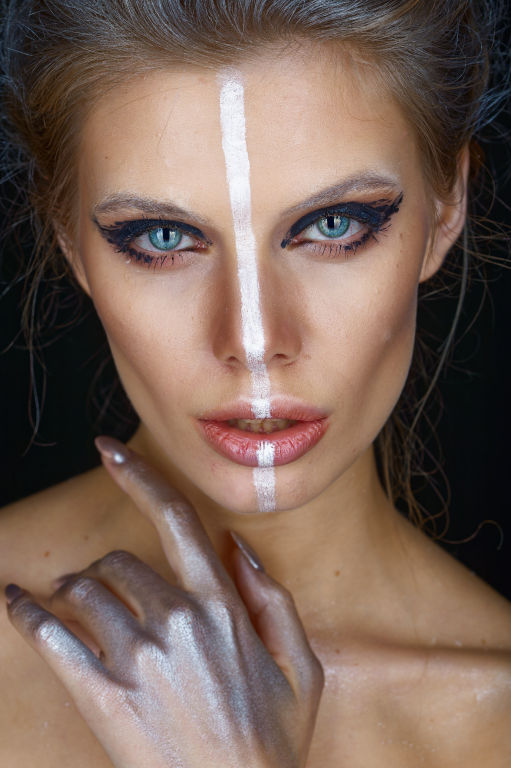
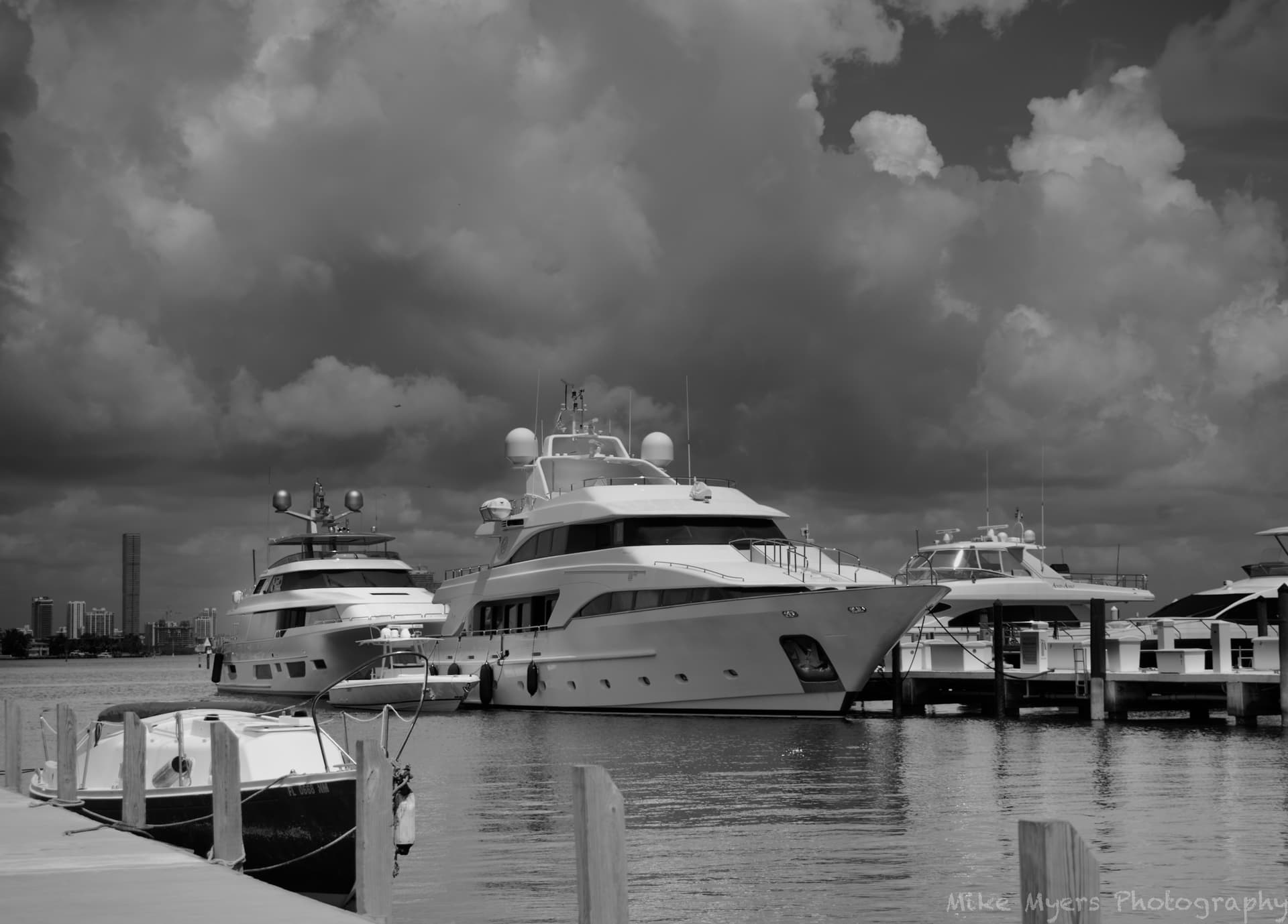
If you are looking for documentation than it does not matter as long as its faithful and functional document of the thing. If you are looking for artistic expression or creative way to tell a story in a visual way, than other things should be considered.

I know you claim not to be interested in artistic expression, which if fine. But I see opportunity to share some quotes on the topic of that, so I hope you don’t mind.

About “getting” art. Here are some food for thought.

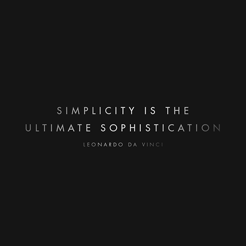
If you want to make something simple, that is easy―remove elements.
If you want to make something complex, that is easy―add elements.
The art of elegance lies in making something that is in fact incredibly complex
…appear to be incredibly simple. And that is is not easy. In fact that is incredibly hard to achieve.

We all know about the expression; “form should always follow function.” That practicality should be before artistic expression. Well, elegance is that thing that makes a successful marriage of the two. Elegance is all about function that is complex to achieve and wrapping up that complexity in seemingly simple form.

“Beauty is the purgation of superfluities.”

  • Michelangelo (1475-1564)

“Much of the beauty that arises in art comes from the struggle an artist wages with his limited medium.”
― Henri Matisse (1869–1954), French artist

“The great artist keeps an eye on nature and steals her tools.”

  • Thomas Eakins

“Simplicity is the keynote of all true elegance.”
― Coco Chanel

“Simplicity is about subtracting the obvious and adding the meaningful.”
― John Maeda, The Laws of Simplicity: Design, Technology, Business, Life

“Any intelligent fool can make things bigger, more complex, and more violent. It takes a touch of genius — and a lot of courage to move in the opposite direction.” ― Ernst F. Schumacher

10917836_640925409366909_141526838326448231_n

Picasso’s bulls: A lesson in reduction.

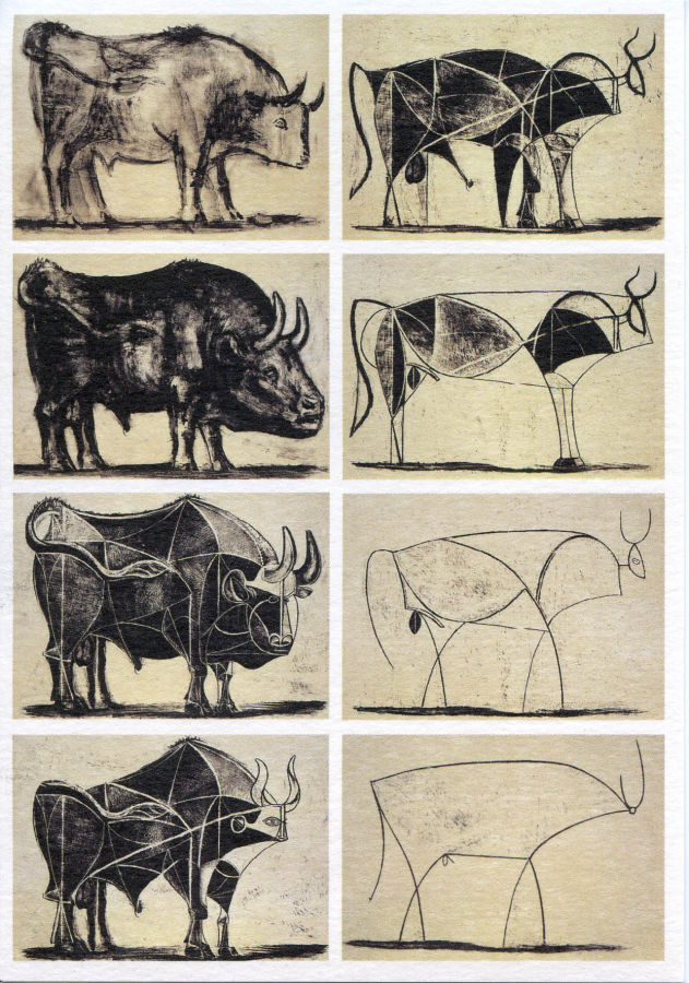
"In the final print of the series, Picasso reduces the bull to a simple outline which is so carefully considered through the progressive development of each image, that it captures the absolute essence of the creature in as concise an image as possible.

Pablo Picasso created ‘Bull’ around the Christmas of 1945. ‘Bull’ is a suite of eleven lithographs that have become a master class in how to develop an artwork from the academic to the abstract. In this series of images, all pulled from a single stone, Picasso visually dissects the image of a bull to discover its essential presence through a progressive analysis of its form. Each plate is a successive stage in an investigation to find the absolute ‘spirit’ of the beast.

To start the series, Picasso creates a lively and realistic brush drawing of the bull in lithographic ink. It is a fresh and spontaneous image that lays the foundations for the developments to come. Picasso used the bull as a metaphor throughout his artwork but he refused to be pinned down as to its meaning. Depending on its context, it has been interpreted in various ways: as a representation of the Spanish people; as a comment on fascism and brutality; as a symbol of virility; or as a reflection of Picasso’s self image."

“Achieved perfection not when there is nothing left to add, but when there is nothing left to take away.” — Antoine de Saint-Exupery (1900 – 1944) French writer, poet, aristocrat, journalist, and pioneering aviator.

“The ability to simplify means to eliminate the unnecessary so that the necessary may speak.” - Hans Hofmann

“Everything should be made as simple as possible, but not simpler.” - Albert Einstein

“All that is not useful in a picture is detrimental. A work of art must be harmonious in its entirety; for superfluous details would, in the mind of the beholder, encroach upon the essential elements.” ― Henri Matisse (1869–1954), French artist

“Like all magnificent things, it should be very simple.”

Natalie Babbitt, Tuck Everlasting

“The ideas need not be complex. Most ideas that are successful are ludicrously simple. Successful ideas generally have the appearance of simplicity because they seem inevitable.” ―Sol LeWitt, American Artist

1 Like

If I were looking for documentation, I would create a very different image. What I am usually looking for is an image that represents what I am seeing, assembled in a way that I enjoy. …and much of the time, I fail to accomplish that. Eventually I usually manage to get what I want, even if it takes several attempts. Or, I just move around using my eyes as a tool, until I find a way to capture what I want to share with others.

About artistic expression, of course I don’t mind. We all have ways to capture and share images, and some of us are better at this than others. (I don’t always agree with Joanna, but most of the time, yes. And regardless of whether or not I agree, I am always learning, which is why I’m in this forum to begin with.)

I disagree. I prefer photos that not only show something, but tell me what it is, and how it works, with as much detail as possible. As an almost-engineer, I want as much of the details as possible to explain how things work. …but as art, that is very different. Simplicity is fine, when that is desired, but I prefer as much detail as necessary to properly understand. …but that’s me, and maybe doesn’t apply to most people.

Picasso’s bulls - reminds me of “stick figures” of people. They might illustrate “the essence”, but (to me) they are no substitute for the real photo. A real photo of a bull likely shows the massiveness, the power, and captures what a bull is, and is capable of - far more than a line drawing. I love Joanna’s photos for all the detailed information they convey, not simplicity. I love that she captures things so well, it’s as if I was there in person looking at them.

Anyway, I certainly won’t argue with what you wrote, but that’s me. I want to capture photos of things to share with others, and the more my photos show, the better, as I see it.

Will you start posting some of your photos here? Posts that go on forever I mostly ignore. Since this is a photography forum, I would prefer to see people’s photographs, preferably along with an expression of what they were trying to show.

Images like these show/tell me far more than dozens of pages copied from elsewhere. I understand these are screen-shots from videos, not photographs. That makes it more difficult to edit them, as an edited photo was never the desired end result. Lovely scenes, that I think would look much more impressive if captured with a camera, and then processed in PhotoLab to bring out the beauty.

Well I suppose an engineer will try to engineer art, which makes him better to simply be an engineer. Stick to his strengths. I suppose.

Perhaps. To me cinematography is as interesting as photography or painting. It is based on same basic principles, so I don’t always focus on medium, per se.

For example. There is a program called set.a.light 3D.

Elixxier’s set.a.light 3D is a virtual lighting software program that allows photographers and filmmakers to create studio layouts with a model. With over 50 different light sources to choose from, users can adjust light positions, change light shapers, add color gels, and more, just like they would on set. The software allows users to preview the lighting effects before the model arrives and create an infinite variety of scenes, rooms, or studio sets according to their ideas. The latest version, set.a.light 3D V2.5.8, offers more realistic models and free movement of all bodyparts, making it possible to visualize photos before entering the actual studio.

its a great program to practice studio lighting and posing etc. I use it to practice creativity. But principles are the same weather one is in virtual 3D world, real world, video or photo or paintings. So its just good practice.

Basically, I like to think of it as; compositing + lighting + gesture (if there are people and or animals in the scene)

A great photo usually has all three components well put together. A mediocre one has just some of those components etc.This program is good for practicing those concepts, so when you take a camera and go for a shoot you can already have proper photographic frame of mind.

If you shoot landscapes etc, you obviously don’t have a gesture, but the same concests apply

Here are some stuff I’ve been experimenting with. To be fair I retouch them later in Photoshop, since set.a.light 3D program is limiting. I also soemtimes combine real photographs with the 3D composites since I am limited what the program offers. Here are some samples. Great for practice.

And here are some images processed with DXO and finished in Photoshop.

1 Like

Both are interesting, and fascinating, but why I’m in this forum at all was mostly to learn how to use the software PhotoLab to improve over what I was capable of. In doing so, I’ve also learned a lot more about photography (…and how to make the best use of PhotoLab - my first attempts were awful).

To me, the tools are far less interesting than how they are used, but that’s just “me”. The tools don’t matter as the end result.

I am sure that Joanna and many others would find out ways to get a great result regardless of what camera they are using. Ken Rockwell convinced me of this:

Your Camera Doesn't Matter

As to what Ken wrote, Joanna’s photos are mostly created to look best in a huge print hanging on a wall. She also has access to many cameras, including a 4x5 view camera. My opinion is that a Nikon D40 will create a lovely photo, but only when making small prints. Better cameras have more resolution, and more dynamic range, and usually are used with better lenses. My 2007 Nikon D3 is way behind what a Nikon D850 or my D780 can do, but I’m happy with it. Heck, at normal size to be viewed on a computer screen, my old Nikon D70 would be (and was) fine.

The key word here is “my”. Joanna, and Wolfgang, and some others in this forum would create a better image with a Nikon D1 than what I could do with the future D999. It’s the Indian not the arrow.

(Which is fine - I joined this forum when the software was PhotoLab3, then 4, then 5, and now 6. The changes in my own photography are not due to the newest technology - they are due to what I learned about photography in these discussions.)

Postings like the above have been invaluable to me, not only knowing what to do, but how to use it properly. I hope Joanna makes a collection of these and puts them all into a collection like what “PhotoJoseph” does.

1 Like

When it comes to emotionally and intellectually compelling content this is true. For sure. Some types of photographs cannot be captured / recorded without appropriate gear, but this does not mean they are more emotionally impactful, its just a different subject matter.

There is however a certain point where technical execution and or subtle nuances of the reproduced image, weather in digital or print / analog form… becomes important extra layer of expression. The way certain colors are rendered, the details captured etc. It too can become a form of expression as well.

Sometimes also there is an important set of factors like reality, budget etc You don’t want to go to ends of the earth to capture some rare bird and have your camera die on you in critical moment, or because of technical problems misses focus, because its backfocued or something. Or you are shooting in heavy snow or rain and you don’t want your camera go limp during shoot or travel. So there is that aspect as well, where you need certain durability and reliability from the gear to be able to capture what you need. Or what if you SD card goes bad and you just spend $10K on a trip to take the picture is Gobi desert or camels eating snow and you get on a plane back home… ups, the card cannot be read anymore. Facepalm moment.

Of you go and shoot war conflict zone and your pictures are confiscated before you can publish them. Or you shoot wedding, once in a life time event, and your camera stops working. Obviously you need to invest in redundancy and backup solutions for those types of shoots ,weather they are private or professional. So gear does matter in that context.

But its two separate elements that combined to make great images.

It reminds me of a great commercial for Arri cameras that emphasizes the importance of choosing the gear before you start making a film, because you need the reliable, capable gear. With photography, there is less complex shooting involved, sure, but basic argument about proper gear still applies. Again this is separate from the actual artistic expression but it is sometimes mandatory to capture the kind of images you want to capture.

No its not about the gear. And yes sometimes its about the gear as well.

The Best Cameras for the Best Images. Great presentation by the way.

Everything you mentioned is a concern. From experiences like these, I’ve learned to always have a backup camera with me. I haven’t needed to do it yet, but my Nikons accept two memory cards, and I can have the camera write to both cards. Water damage - I’m too afraid of allowing my camera to get wet, so I don’t shoot in those conditions. Memory card failure - I only buy Lexar cards, the better ones, and only from a reliable source. I also have software that recovers all the useable image from a card that failed - always for friends or family, and it always brought back the important (most recent) images. Nothing is fool-proof - the plane I take to get there could crash. Nothing is “perfect”, but there are lots of things we can do to minimize the chance of something going wrong - with redundancy being at the top of the list.

1 Like

I wonder if there is a better solution to this. I went for a walk this morning, and saw this “boating picture” at a distance. I walked around including and excluding things, but couldn’t get what I really wanted. I only captured two images, one to get a “feel” for what I was doing, and one I wanted “perfect”.

Joanna will be pleased even if it’s from my D3 - I set the controls to “Mode A (Joanna)” mode, meaning nothing was done by the camera, only by me. As I was looking at the scene, there really wasn’t much color, so I expected to process it for B&W. The menacing sky, storms approaching Miami from the west, is probably the highlight of the image (along with that huge boat/ship in the middle). I’m wondering if what I did is acceptable, or are there things I could have done differently in PL to emphasize the clouds more, without becoming too un-realistic. I used a red filter, which brought out the sky.

I should add that in color, I think the photo is prettier, but it’s a nothing shot I would discard. B&W along with PhotoLab editing makes the image more… interesting.

D3M_0126 | 2023-06-25.nef (24.2 MB)
D3M_0126 | 2023-06-25.nef.dop (14.9 KB)

Interesting title.
For me, it’s almost always: how to do the best, with what I’ve got.

Also, the “best images” don’t come from the “best cameras”.
They come from the “best photographers”.

…as in, it’s the Indian, not the arrow.

They are not mutually exclusive, but rather they are complimentary, are they not?

1 Like

So, what exactly is the subject?

This is not related to DXO PhotoLab per se, or directly to photography, but I was experimenting so I’ll share my findings here.

I used ChatGPT to give me prompts for StableDifussion image generator. This is what I go. after asking to give me prompts for old general in uniform.

"photograph close up portrait 62-year-old tough decorated general, CLEAN SHAVEN, serious, stoic cinematic 4k epic detailed 4k epic detailed photograph shot on kodak detailed bokeh cinematic hbo dark moody "

Honeyview_44a275ba20fe4f1aae1482b186719dfdb4ea9387

I got this, heavily compressed small file. After that I used GiglaPixel AI from Topaz to upscale it 2x.

Than I used Photoshop Generative Fill to extend the image and few other retouching tricks to enhance it a bit. This is the end result.

The point here is not to replace photography or anything like that, but rather to see how far we are getting with this AI business, also I find this pretty interesting way to get creative ideas for lighting of portraits, for example. Also if you imagine, this could have been easily the next portrait shoot you do with real camera of someone , does not have to be old man, Its fairly simple lighting. If you don’t have a fast lens for shallow depth of field you can not use it or you can fake it later in post. Either way, interesting blend of post production and production. Also you could easily process the photo you take in DXO PhotoLab, as I would if I actually shot this.

Anyway, I was just curious so I did a quick experiment, sharing it here. Since this is “off topic” and we are covering all kind of lenses. Obviously all “gear” in this case was software related, not counting PC workstation, but the primary theme is creatively. However one makes a photo is less important, compared to what we get in the end.

Obviously this is not high resolution image and it could not compare with actual photography of a full frame or medium format sensor. But for creative inspiration, this is where we are.

I don’t think this is replacement for taking a photo of an actual real person, obviously. And this image generation with AI is no doubt based on actual photographs of real people that was err… appropriated into stable diffusion database. But for better or worse, its the era where we have this kind of technology, so at least knowing what is out there, what is worth trying and what is not, and where industry might be heading and culture as well, is important.

Remind me a bit like when analog photography was in competition with digital one, and magazines etc were competing with social media. I’m not sure all the changes were for the better, and some were definately for the worse, but they were changes nonetheless. This AI thingy seems to be the next phase.

The subject was supposed to be the boat, but I think that awesome sky took over.
Maybe we should skip this, until I have a simpler photo with an obvious “subject”…

When I shot it in color, the boat was the intended subject.

Joanna, this cropped, but un-edited photo is what I originally started out to take, but it’s not interesting.

Between taking it, and getting to my computer, I changed my mind.
So, maybe it’s not worth doing anything with.

Even if the image is useless, how could I have improved the clouds?

I suppose the harder the example the greater the opportunity to learn something by overcoming the challenge.

Here are some useful notes:

A Strong Focal Point.

Before you compose your picture it’s a good idea to ask yourself why you’re doing it.

Normally, the subject is the impetus for a image. Start by asking yourself this simple question: What is my subject? It may be majestic snowcapped mountains dominating the landscape, a hummingbird hovering at a purple flower, or your child blowing out the candles at a birthday celebration. The subject is the central figure around which a artist’s story revolves. Its striking qualities attract our attention and draw us in for a closer look. But while it may be the subject that first attracts people to stop and look at an image, it is the artistry of composition that holds their attention.

I find a single focus in the scene and then play everything off that one thing. (Kenn Backhaus)

Composing an aesthetically pleasing scene around your subject requires a quick but studied assessment of several factors: subject and surroundings, light direction and shadows, viewpoint and perspective. Every situation presents a unique set of variables, and it’s up to the artist to make sense of it all by combining the elements as artfully as possible so that the resulting photograph communicates a narrative or informs the viewer about the subject.

The importance of a subject’s strong presence in any image cannot be overstated. Objects offering interesting textures, colors, shapes, and lines often make the best subjects. The more interesting your subject, the more obviously it becomes the focal point of your composition, so play up those interesting qualities. Boldly featuring the subject in a composition leaves no doubt about the story being told.

Compositional elements may include colors, patterns, textures, leading lines, highlights and shadows, main and subordinate subjects, and even blank or neutral space. These are the building blocks of visual design. The way in which they are arranged within the composition should work together to deliver the viewer’s eye to the subject, the composition’s visual payoff.

In basic terms, composing an image is an editing process—deciding which elements to include and which ones to leave out. Look through the eyes of your audience and their point of view. This is the decisive moment. You must account for all of the physical components laid out before you and make critical decisions about them based on the story you’re attempting to tell about your subject. The final image’s success or failure depends on the considered choices you make.

  1. Firstly Start by asking yourself this simple question: What is my subject?
  2. Secondly ask yourself what are my Compositional elements?
  3. Thirdly ask yourself how can I use the rules of composition for a more pleasing image and how can use those rules to convey a message or tell a story?

“Composition, the aim of which is expression, alters itself according to the surface to be covered. If I take a sheet of paper of given dimensions, I will jot down a drawing which will have a necessary relation to its format.” ― Henri Matisse (1869–1954), French artist

"Composition is the art of arranging in a decorative manner the various elements which the painter uses to express his sentiments. In a picture every separate part will be visible and… everything which has no utility in the picture is for that reason harmful. A work should contain its total meaning within itself and should impress it on the spectator before he even knows the subject…

…the whole arrangement of my picture is expressive. The place occupied by the figures or objects, the empty spaces around them, the proportions, everything plays a part. Fit the parts together, one into the other, and build your figure like a carpenter builds a house. Everything must be constructed, composed of parts that make a whole." ― Henri Matisse (1869–1954), French artist" ― Henri Matisse (1869–1954), French artist

“A painting that is well composed is half finished.”
― Pierre Bonnard (1867–1947)

“Good composition is like a suspension bridge, each line adds strength and takes none away. Thus a work of art is finished from the beginning, as Whistler has said. If there are only ten lines, then they are the ten lines which comprehend the most. Composition is the freedom of a thing to be its greatest best by being in its right place in the organization. It is a just sense of the relation of things.” ― Robert Henri, The Art Spirit

Composting is basically, its the art of arranging those compositional elements within your frame into a visually pleasing image. It’s up to the artist to determine what the subject is and to arrange the elements within the frame according to the universal “rules” of composition and therefore convey his message to the audience in a compelling way.

Good composition is the artist’s way of directing the viewer’s vision in a planned, de-randomized fashion.

When a photograph or painting is well composed, viewers first see the elements that the artist wants them to see most prominently and remember longest. Next, they notice the elements of secondary importance, and finally the elements of subordinate interest. With good composition, the artist leads viewers through the photograph in a controlled manner. There is nothing haphazard about seeing a photograph or a painting. Composition is the artist’s way of bringing order into a non-ordered world.

“To compose an image is to subtract, to do houscclcaning, to eliminate unnecessary or prejudicial elements as much as possible, to limit the number of significrs to a strict minimum. It is necessary to impoverish the image to make it more immediately readable.” ― Philippe Rousselot, AFC, ASC … (born 4 September 1945) is a French cinematographer and film director

Milk Bottles - Stevan Dohanos. 1944

Here is an example of well composed image. Its not hard to notice what is the subject and why, and its also easy to notice how the eye notice exactly what the artists wanted and than notice where the eyes travel next and you will notice its prefect mastery of the composition, because you eyes should notice things he wants you to notice and travel next to the part of the image he intended. That is mastery of using compositional elements in the correct order, placement, and anticipating how your eyes will travel across the frame and what you will feel in doing so.

And here is yet another example. Notice what you notice first, second, third and why.

Masahiro Nogaki· Giorgio de Chirico - Climb to the Monastery 1908 oil on canvas キリコ「僧院への登り道」 油彩、カンヴァス private collection

1 Like

Simple - as usual, I was walking to and from the local grocery store in 95 degree temperatures, looking for interesting things to photograph and edit in PhotoLab, to improve my editing ability.

(Just reading doesn’t work for me - to learn, I need to “do”, and this was a perfect opportunity, and I got stuck on the best way to use “Local Adjustments”. I tried control lines, and the graduated filter. Neither seemed to do what I was after, but I got closer, I think.)

(I think that’s the main purpose of this forum?)

1 Like

There must be an easier way than this, but it’s an improvement…
I expect I will lighten what represents blue sky at the top right so it’s not so dark.

D3M_0126 | 2023-06-25.nef.dop (52.9 KB)

I think it’s time to take a new photo, and start at the beginning…

This is sort of what I wanted to do, but with too many mistakes, and I need to lighten the clouds more.
Stopping here, at least until tomorrow.

At least the sky is more realistic:

D3M_0126 | 2023-06-25.nef.dop (81.4 KB)

Feel free to edit this image, and see how well you can do with it…