If you talk about the small curve adjustment (I’m having trouble following you), this is maybe not you, but the tools which does not let you do EASILY and SMOOTHLY such little adjustments and see realtime what’s happening.
Other softwares I use with curve adjustments are really EASY to use.
Of course, you have to know what you want to acheive.
Not so.If you do not meter correctly, you will end up with blown highlights, which can never be recovered.
If you want the brightest part of the image to be less than pure white, you can “place” the exposure so that, that part of the image is measured at more than 0EV (which would give 18% grey) but less than the limiting EV of the sensor (which would result in a blown highlight).
Agreed that the image is slightly under-exposed but, given the amount of shadow detail that can be recovered and that the resulting noise can easily be dealt with by DeepPRIME, it is far preferable to under-expose than to over-expose.
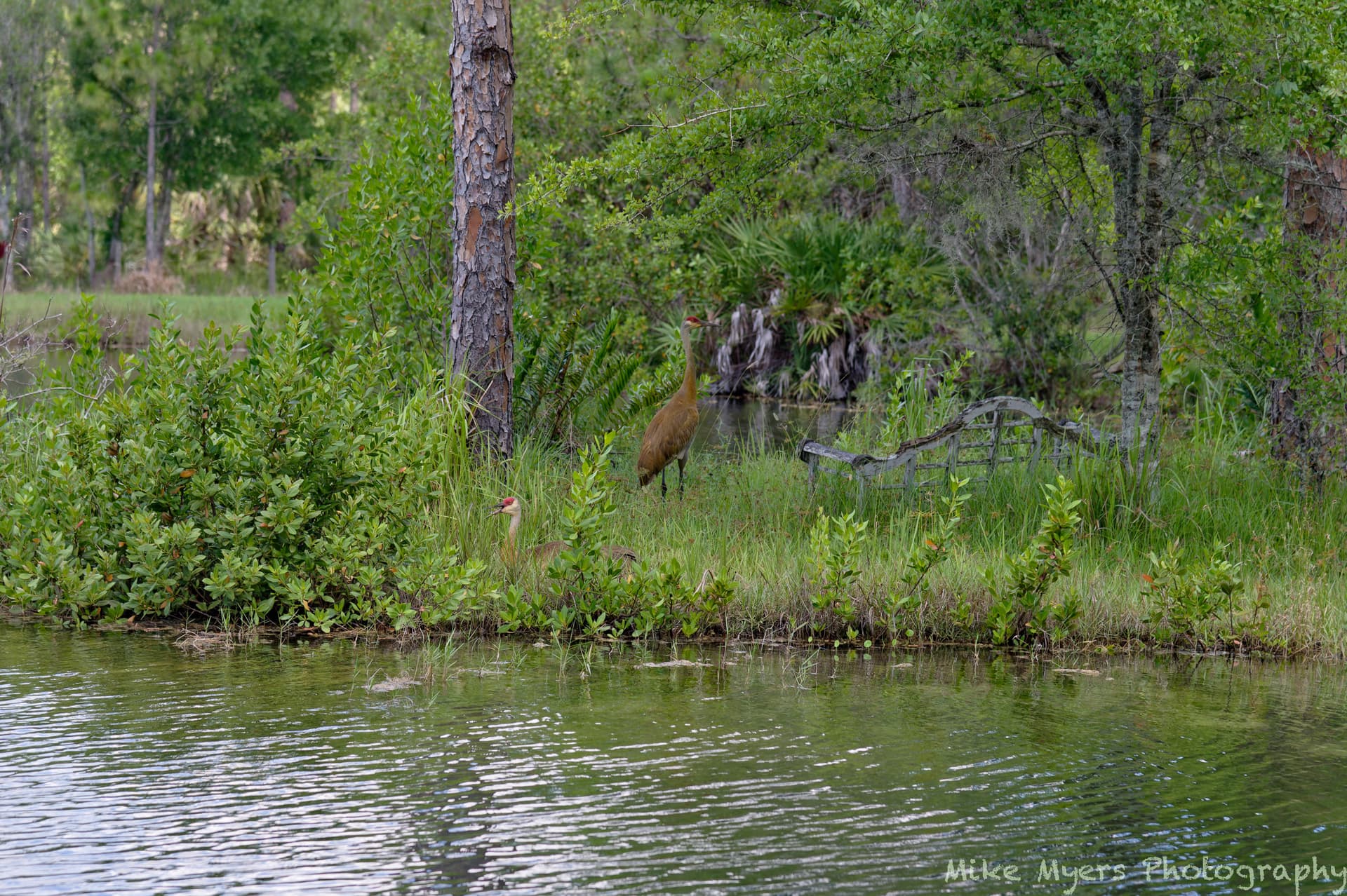
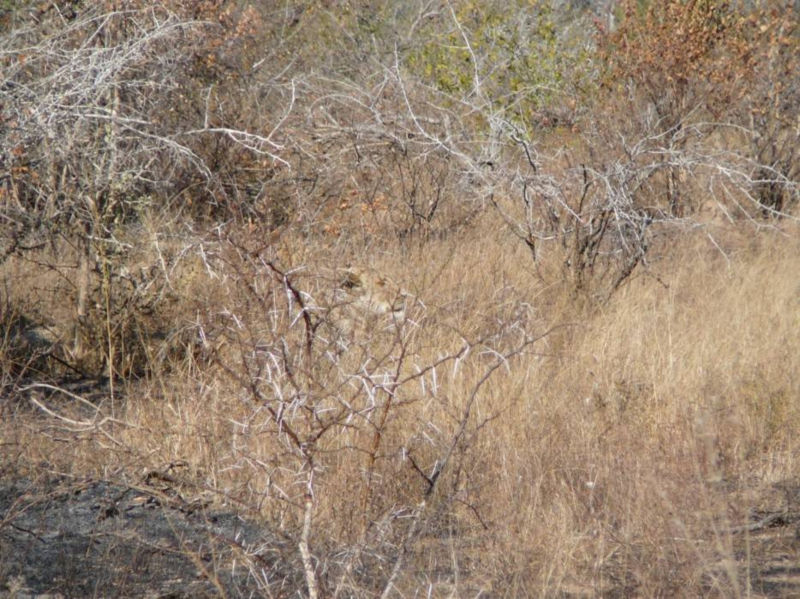
I went back to my original plan for the image, which was to show the peninsula and the birds. That the birds don’t stand out is deliberate - they try their best to blend in. I used similar tools as before, this time using the negative control points. There is enough included so anyone who is familiar with my brother’s property will recognize where I took this, and that is the reason for the 120mm focal length. I also lightened up the “green” just a little.
Next time, I hope to think ahead and also zoom in as much as I can to show the birds.
…and in retrospect, the photo of just the two cranes is a better photograph. Next time I’ll have a longer lens.
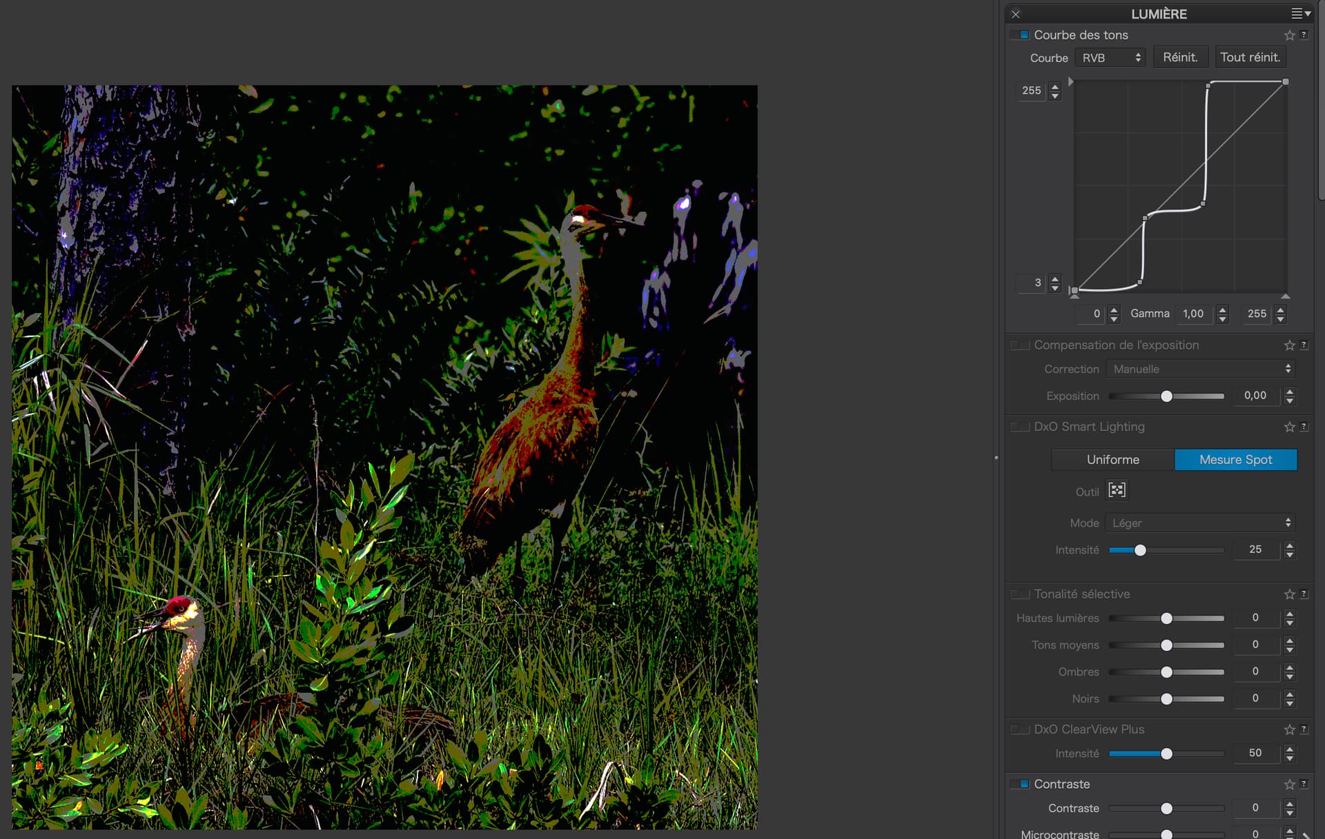
The Tone Curve alters both the exposure and the contrast at the same time. The trick is to get to the stage where you alter the contrast with the curve to suit the image content.
Three examples of the same shape curve, which increases contrast at about the 60 level by roughly the same amount, but which starts and ends at different luminosity levels…
See how the first one raises the exposure only for the brighter parts - the second lowers the shadow levels and raises the highlight levels - the third one only lowers the shadow levels. But the sharp contrast remains at the same point horizontally in the graph.
Unfortunately, by lots of experience and experimentation, like I have just shown you in exaggerated form.
Summary - the more vertical the line, the greater contrast for that level of luminosity at that point on the horizontal scale.
Here’s a two step (exaggerated) curve that imposes a very high contrast at two points in the curve…
These screenshots are not meant to be a lesson in how to get a great result, just to show that vertical sections are high contrast and horizontal sections are low contrast.
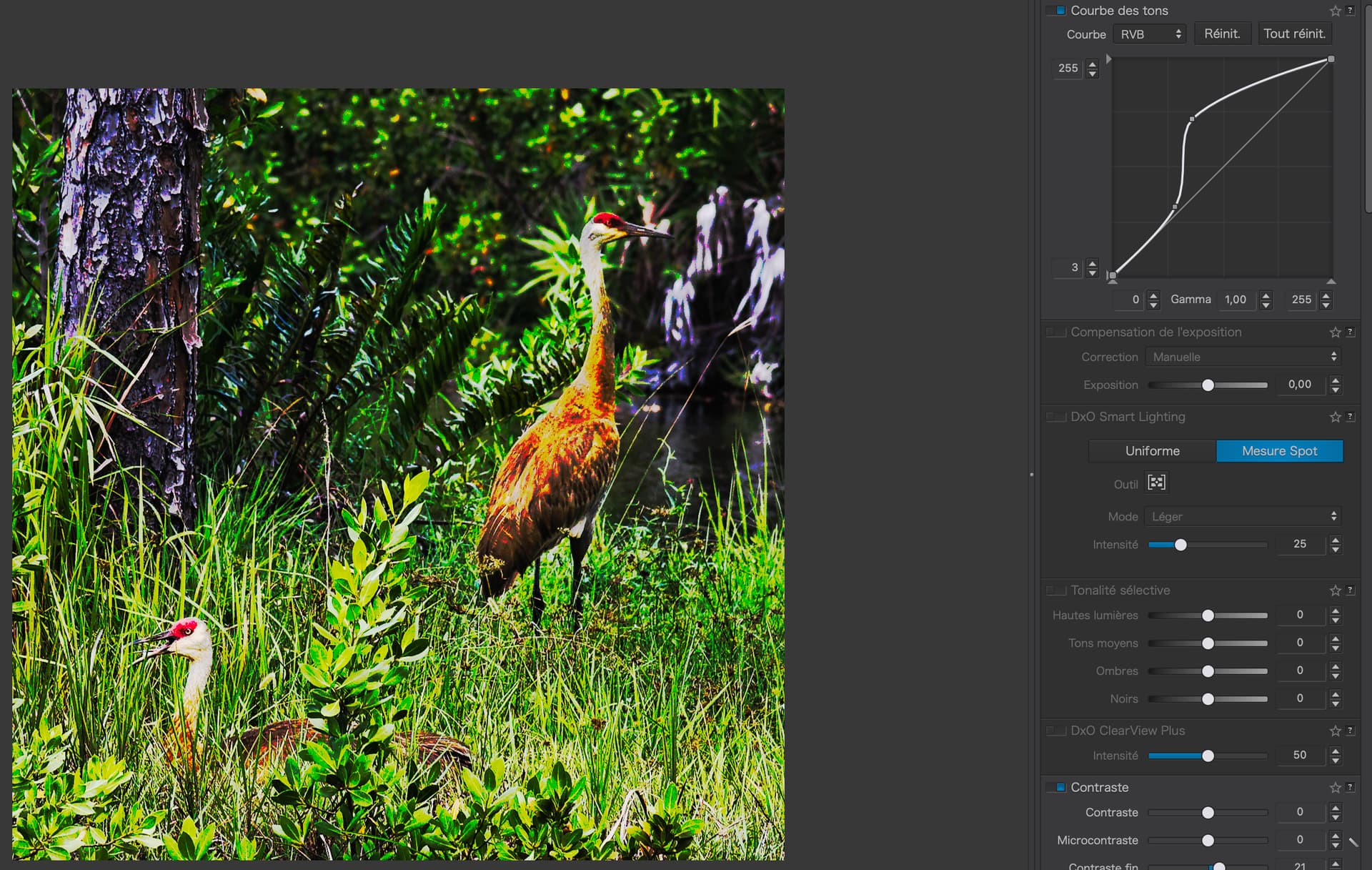
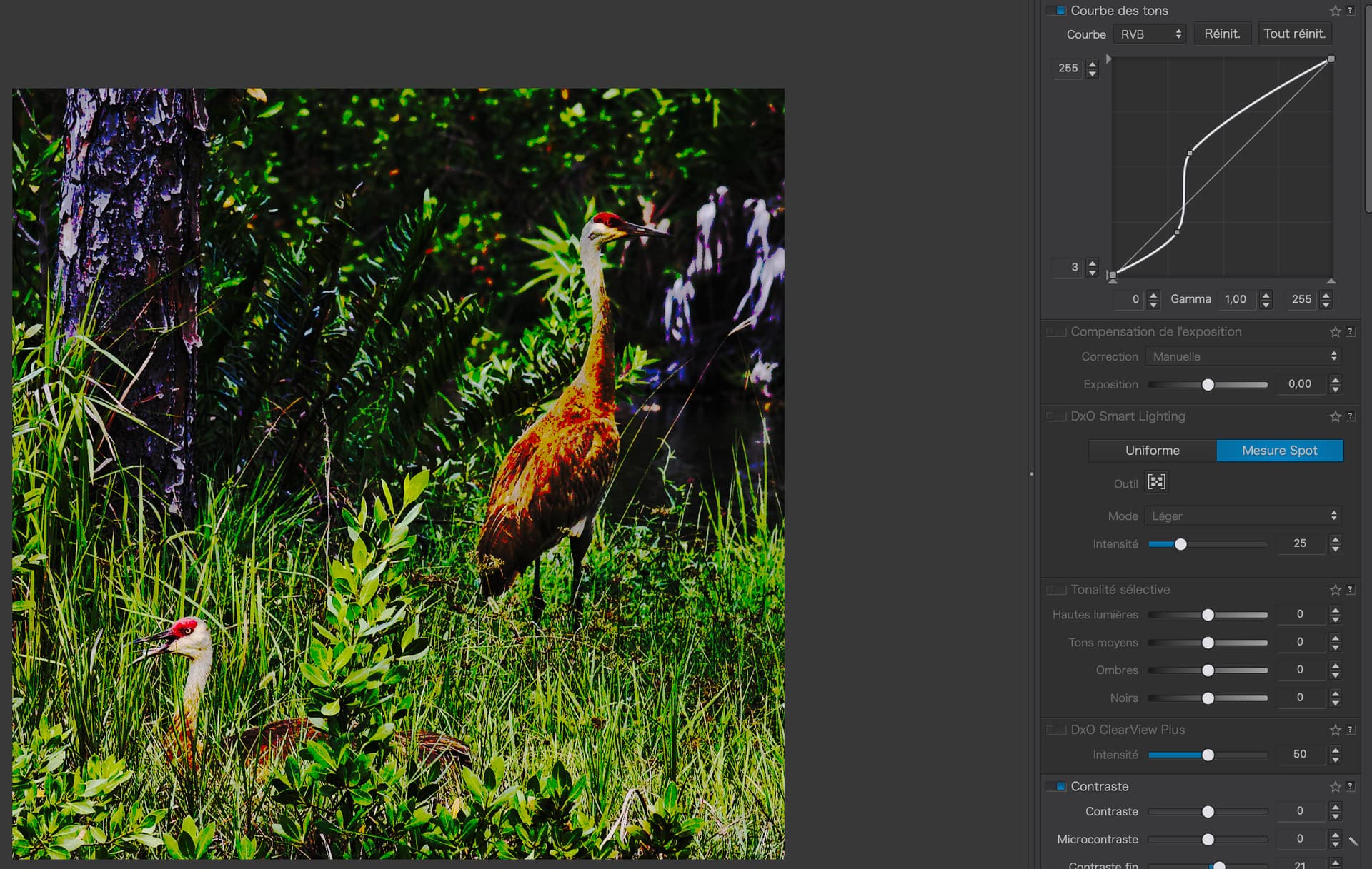
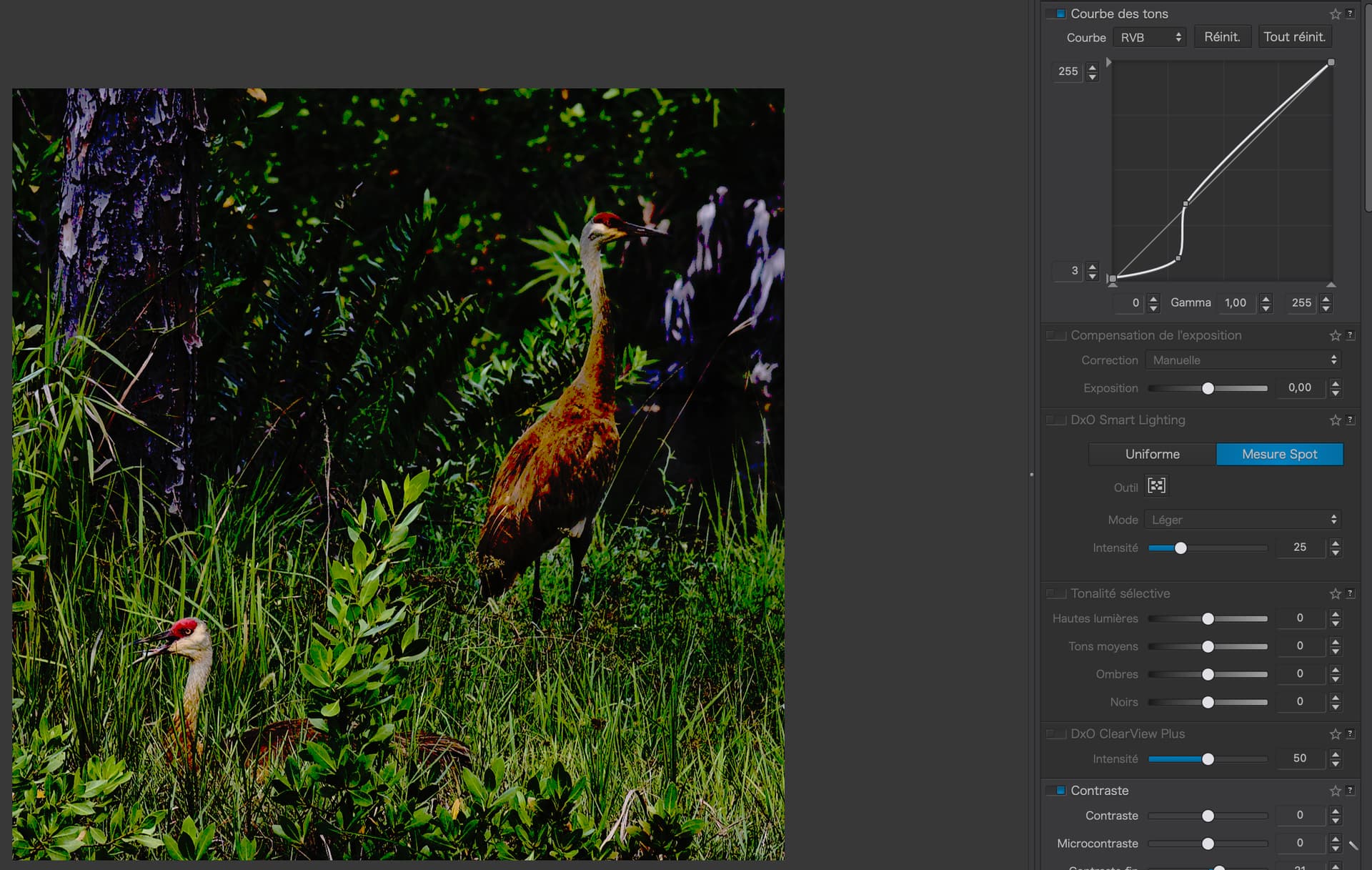
Sometimes contrast only needs to change slightly to bring out differences in tonality. My curve starts at 3 because the under-exposure indicator was showing blocked shadows.
Which produces a non-photo. Only you know what is what and where.
Anyone else couldn’t give two hoots about the location. The most interesting subject is rarely the whole picture and, in this case, it is definitely the cranes.
For the first time ever, I now (think I) understand how this works, and why.
But, other than by having the vast experience you have, how would someone know “where” on the tone curve to do this?
It would be helpful to me to have an image at the left, and an enlarged view of the tone curve at the right, and a way to visualize where on the curve relates to where on the image. I guess for now, it has to be “trial and error”.
I think I’m trying to find a way to “click” on the tone curve, and have something light up in bright yellow on the image, to indicate where the changes are being made in the image, based on the changes on the tone curve.
For now though, I guess it’s “experiment” and test.
Time for me to do some testing, with unimportant images, to get the hang of how to use this.
It’s not obvious, but it does make sense - and makes more sense now than before.
But your recommendation to back off from +2Ev to +1Ev was not because you were concerned about avoiding blowing the highlights (in fact, he was already at least 1Ev below that possibility). Rather, your reasoning for reducing exposure by an additional stop was because you don’t think the clouds should appear “pure white” in the processed image. That’s what’s confused about your advice. When optimizing the raw capture for SNR purposes, the only thing you worry about is maximizing image exposure without blowing the critical highlights. That determination has nothing to do with how light those critical highlights should eventually appear in the final image produced by raw conversion/editing. As long as the raw data you’ve captured hasn’t been clipped, you always thereafter have the ability to output those highlights to whatever lightness level is desired - pure white with no tonal detail, light with visible tonal detail, strongly contrasting tonal detail or pure black. In short, worry about SNR at capture time. Worry about output image lightness at processing/editing time.
But again, if you do that, you’re not optimizing for SNR. In fact, you may very well be producing an exposure with a lower SNR than just matrix metering or metering on the primary subject. The point here is that how you meter to optimize for raw is usually different from how you meter to optimize for JPEG. For the former, you don’t at all worry about output image lightness; you worry about maximizing SNR so that you have the cleanest, best raw data to start your manual raw processing from. For the latter, you worry about output image lightness. Most times, these two different exposure (and associated metering) strategies will result in different exposures.
Except mikemyers was nowhere close to overexposing the shot (as confirmed by Rawdigger). Because of the high DR nature of the scene and the decision to (sort of) meter on the cloud highlights resulted in the shadowed areas of the image being severely underexposed (25% of the R channel and 23% of the blue channel per Rawdigger). An additional reduction in exposure just to avoid having to make tonal adjustments in conversion/post-processing would have resulted in even more severe underexposure of the shadows.
And while DeepPrime is a really nice tool for reducing visible noise, it can never be as good as not needing to use a noise reduction tool in the first place. It does reasonably well at creating plausible shadowed detail, but it can never recover the real detail that would have been there in a better exposed version of the shot. It is not wise to use it as a crutch when a crutch isn’t necessary in the first place.
I’ve noticed a number of mikemyers’ shots are less than optimally exposed for raw capture (with optimal SNR as the objective). The latest example is the shot of the two cranes. It’s a perfect example of the problem of fixating on not blowing highlights and exposing too conservatively for a raw capture. He was a full stop (per Rawdigger) underexposed even for the highlights in the water. Meanwhile, the birds’ bodies are noisy and lacks feather detail due in part to the fact that saving unimportant water ripple detail was prioritized over what I believe he was probably far more interested in at capture time - the birds themselves.
The AI noise tools are notoriously problematic when it comes to dealing with bird feathers and other fine detail. Even DeepPrime does a mediocre job of generating plausible replacement feather detail for what was wiped out by the image noise. Since bird shots like this tend to get cropped significantly due to inadequate reach of the lens being used, the problem of not optimizing the raw exposure (when it was otherwise feasible within the camera/lens Av and Tv parameters and scenic conditions) is avoidable by simply pursuing an optimal/ETTR type exposure strategy instead of some kind of hybrid (sort-of raw SNR/sort of JPEG lightness) strategy you seem to be advocating for.
For those of you who clean sensors, here’s a question I think I already know the answer to. After 8 attempts, I am still left with 7 dust specs. I’m trying to decide if I:
leave well enough alone, and accept that there are 7 spots needing attention in processing, or
take the D3 to my shop, where they charge $60 (meaning $10 per dust spec).
The most logical answer is to leave things alone, and use it for a while.
For anything “serious” I can use my D780.
Not sure how to think about that.
I often set the aperture by how much depth of field I want,
I often set the shutter speed by how high it needs to be, for movement by either myself or the subject,
…and the ISO is set to get me a good exposure.
For most of the photos I take, DeepPRIME allows me to pretty much ignore the ISO, even though a lower ISO might be preferable - but everything in life is a compromise.
So, I’m standing in downtown Manhattan at night, ready to take a shot of the buildings and lights and so on, a night-time view like lots of people take, and what do I do? The Leica experts showed how ISO 20,000 and 50,000 can capture beautiful images hand held. What would you do? I don’t have an answer for that, other than newer technology which allows these astronomical ISO speeds to work so well. (Joanna says I can do this with my D780, and Leica suggests their new M11.) Whatever I do, I’ve got the triangle of exposure settings, and if I use f/2 or perhaps f/1.4, and maybe 1/100th to avoid camera shake, I’m locked in to using a very high ISO (and I’m thankful that I’ve got DeepPRIME).
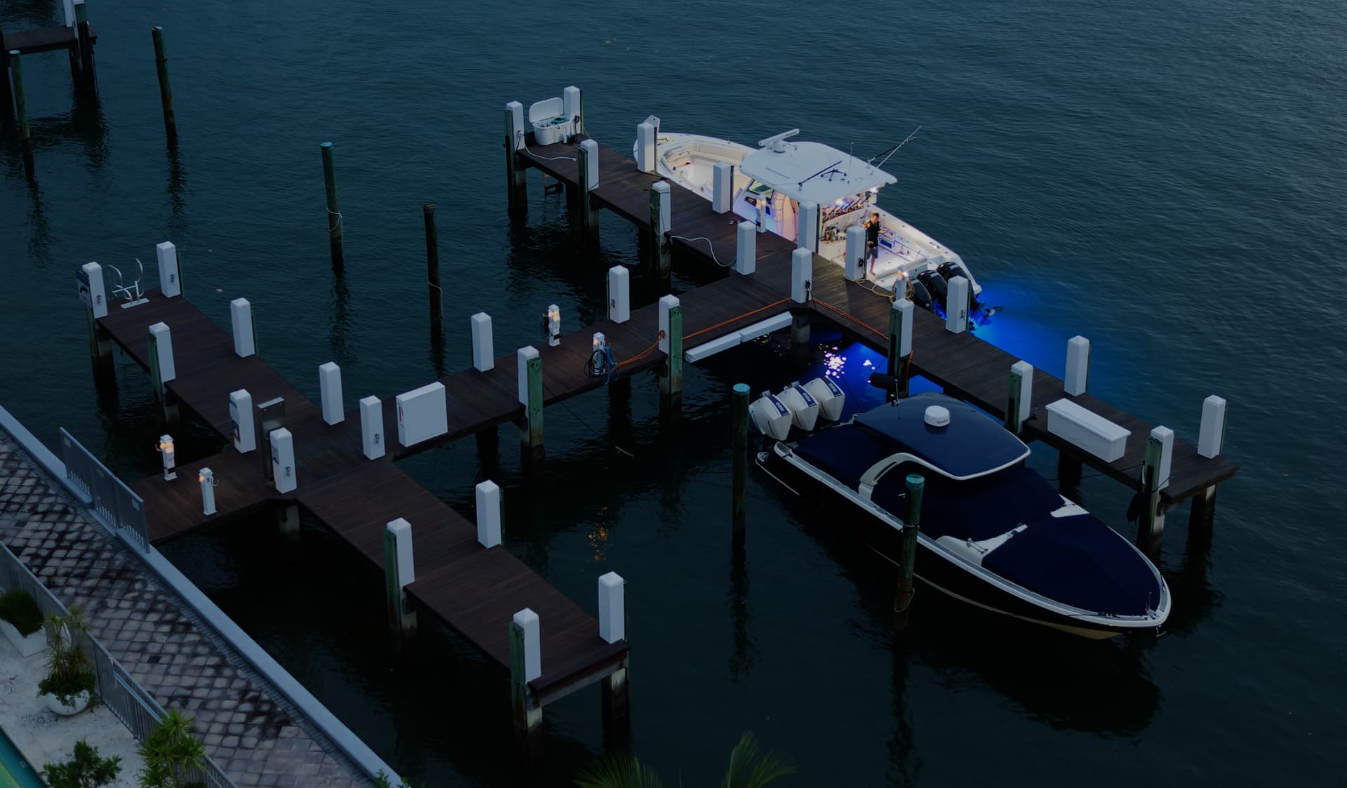
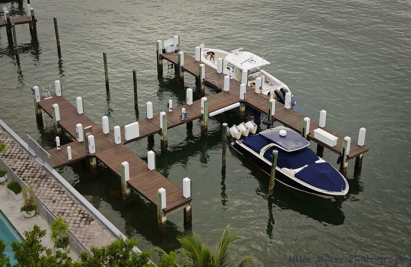
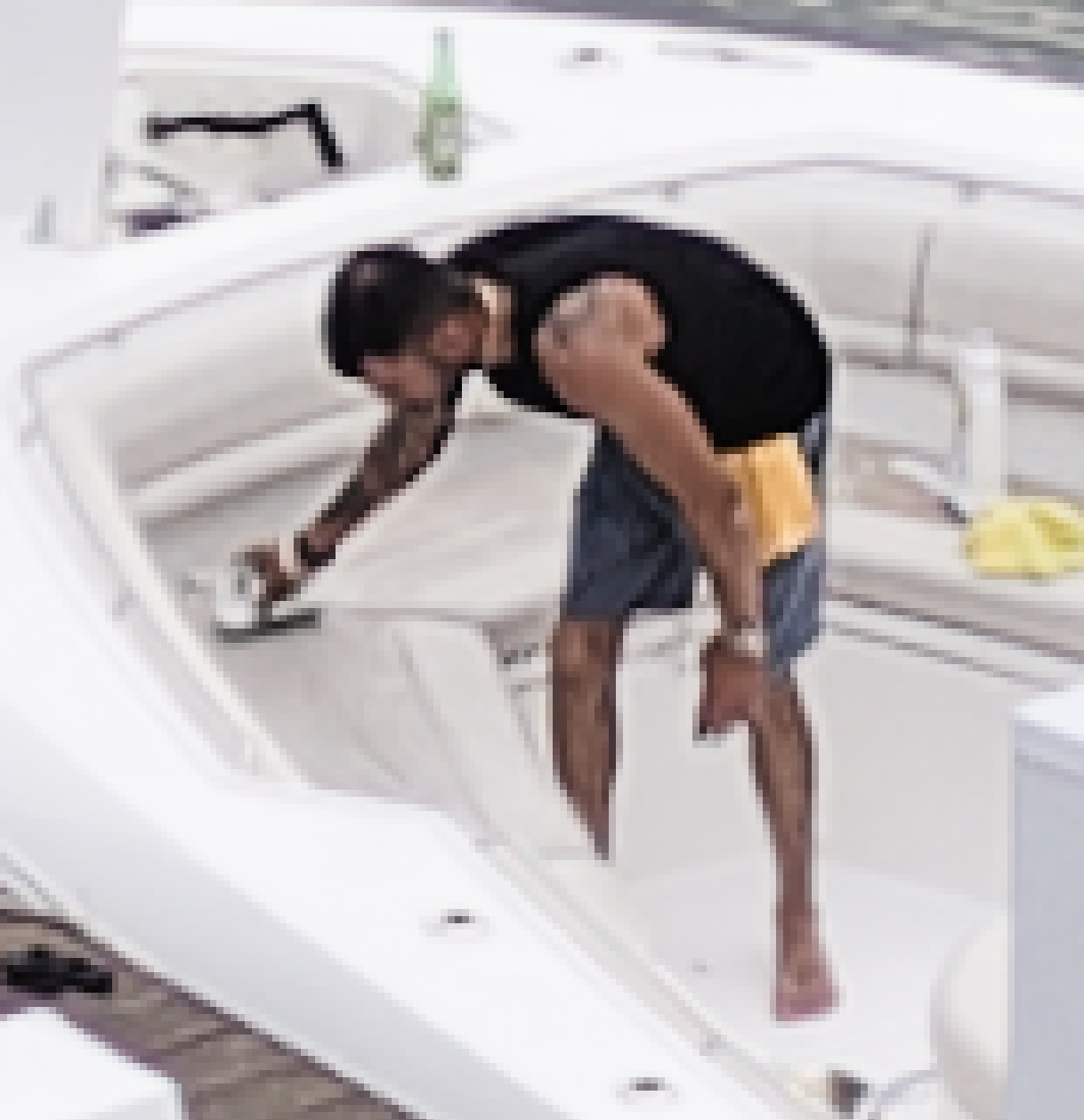
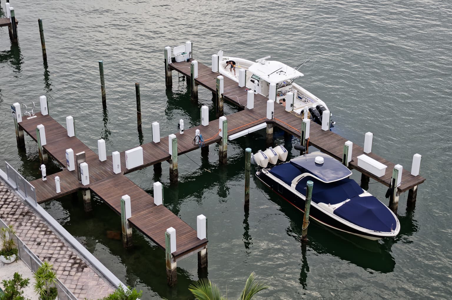
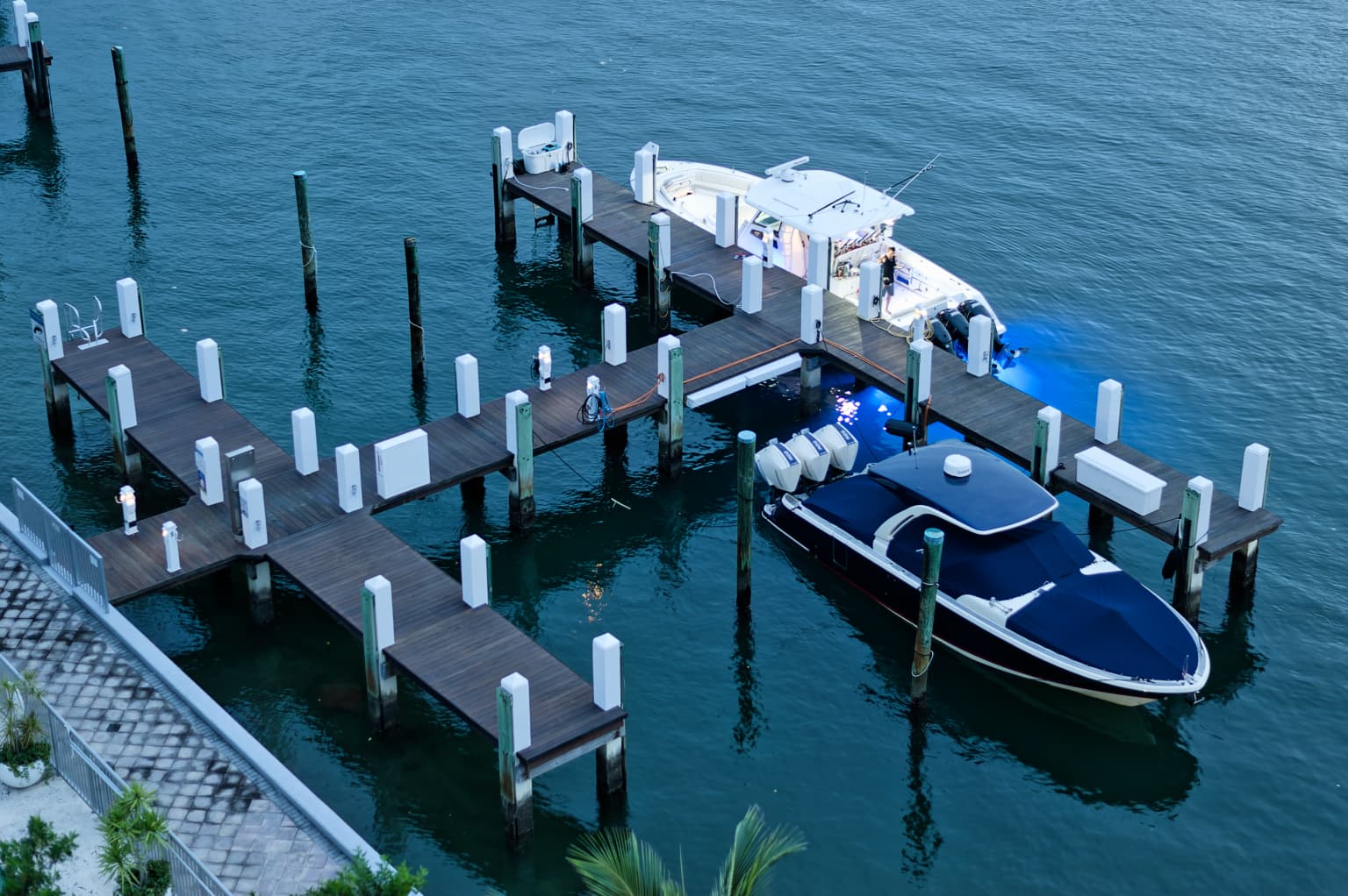
I noticed a fellow working on a boat just outside my building. I liked the composition, and took a few photos just as the sun was about to set, and again when it was close to night. The two photos below are literally the first image I captured, and the last. I liked the blue lights on/in the water. I set the D3 to ISO 200 where the dynamic range is best, kept the aperture near wide open, and let the shutter do what it wanted. There is a large bar graph on the right side of the D3 viewfinder, and I kept adjusting the exposure until the camera said it was good.
I like the results. I like the composition, and I like that it has a real person (same person) in both shots. I think the early shot is better, but I wanted to try the almost-night shot too.
My way of thinking is that the first step is learning how to use this new (for me) tool. I’d like to find a poor image, and experiment with the tone curve to see/learn how to do what you do. My first step is to find a suitable image for testing this. Once I’ve got a handle on how to use the tool, I’ll put that to work for real. …but maybe I’ll try to use an image I do really like, but it needs to have a problem for me to practice using this tool. IMHO.
You and Joanna are probably right, but long ago, in r/c car racing, I found I learned things the best in practice. When it was a real race, I used what I learned while practicing.
I know/think that I need to modify the tone curve to separate two parts of an image that seem to blend together, as Joanna separated the bird from the greenery. I’ll start with how to locate the part of the tone curve where the modification is needed. Until I can do that, I’m dead in the water. I also want all of you to see what I did, and why, and if I made a mistake, point it out. I can’t just blindly copy what Joanna did, as I need to understand it better. Somewhere along the tone curve this correction will have the proper effect. Any place else on the tone curve would be ineffective. Right?
Why, oh why do you want to go back to using a crappy old 12Mpx D3, with a filthy sensor, when you’ve got a perfectly working, modern, 24Mpx D780?
Nonetheless, the exposure was as near perfect as possible - but, with matrix mode metering, it was a case of letting the camera do all the hard work. And you left the white balance in auto.
You stated that you don’t like automatisms but, in reverting to this old camera, you forgot to take control of it like you have with your D780.
Why didn’t you use your zoom to get the tighter framing you ended up with?
Why did you open up to such wide apertures, thus losing depth of field? Although with such few pixels, the only thing that is likely to be sharp are the pixel edges…
Some personal thoughts. Take it as constructive criticism or suggestions only if you so choose. its more about me being inspired by your photo to share some ideas.
There was a wildlife photographer who was shooting animals in well composed manner, but so were other photographers as well. So to try something new, he used similar idea or shooting animals as they are camouflaged. Camouflaged, so well that in fact finding them was the challenge. He published a photo book where every page has a camouflaged animal and the game audience is playing than, find the animal.
I like the overall theme of these projects. When ti comes to camouflaged animals, I think its important they are hard to find. So if you shoot camouflaged animals as a project, perhaps… I think its best to go full in and shoot “invisible” animals. They should not be easy to spot, in fact almost impossible to spot, because the more effort the audience put into it, the greater the sense of reward of finding the animals… eventually.
Its a creative project that has potential to develop into more. But probably best to do is to go all in.
Creative project of camouflaged animals is a great idea, but one should go full in for best effect.
Anyway, juts my 2 cents.
Actually, now seeing Joanna’s crop, that is another example of an improved image with better crop (composition) Same image, better results. Crop in camera if you can or if the lens and or foot placement does not allow it, try crop in post.
Joanna is demonstrating curves adjustments, but I see better composition of the original image because of crop.