Here’s a little exercise. Start with this greyscale…
Greyscale_DxO.tif.zip (1,1 Mo)
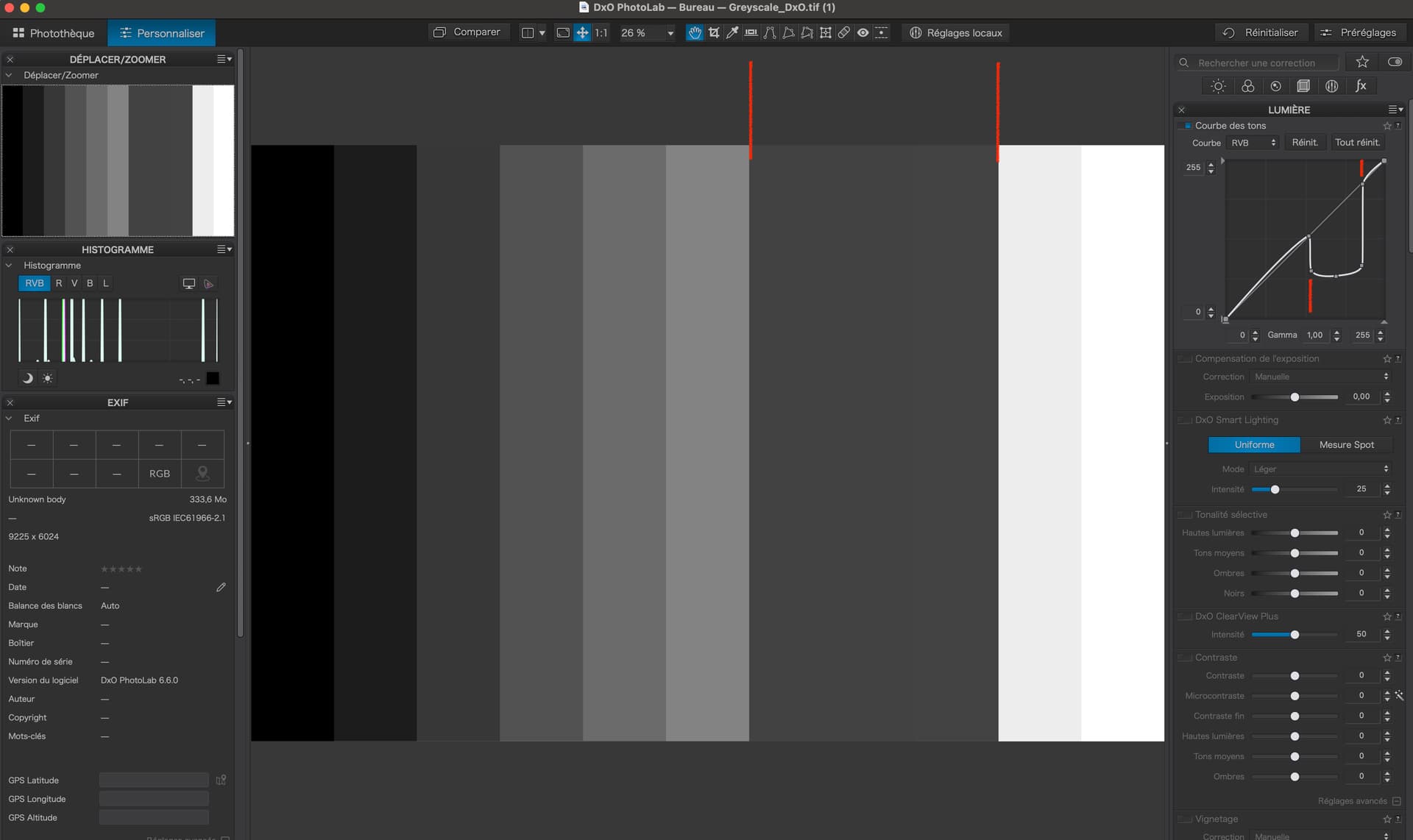
In PL, you will see…
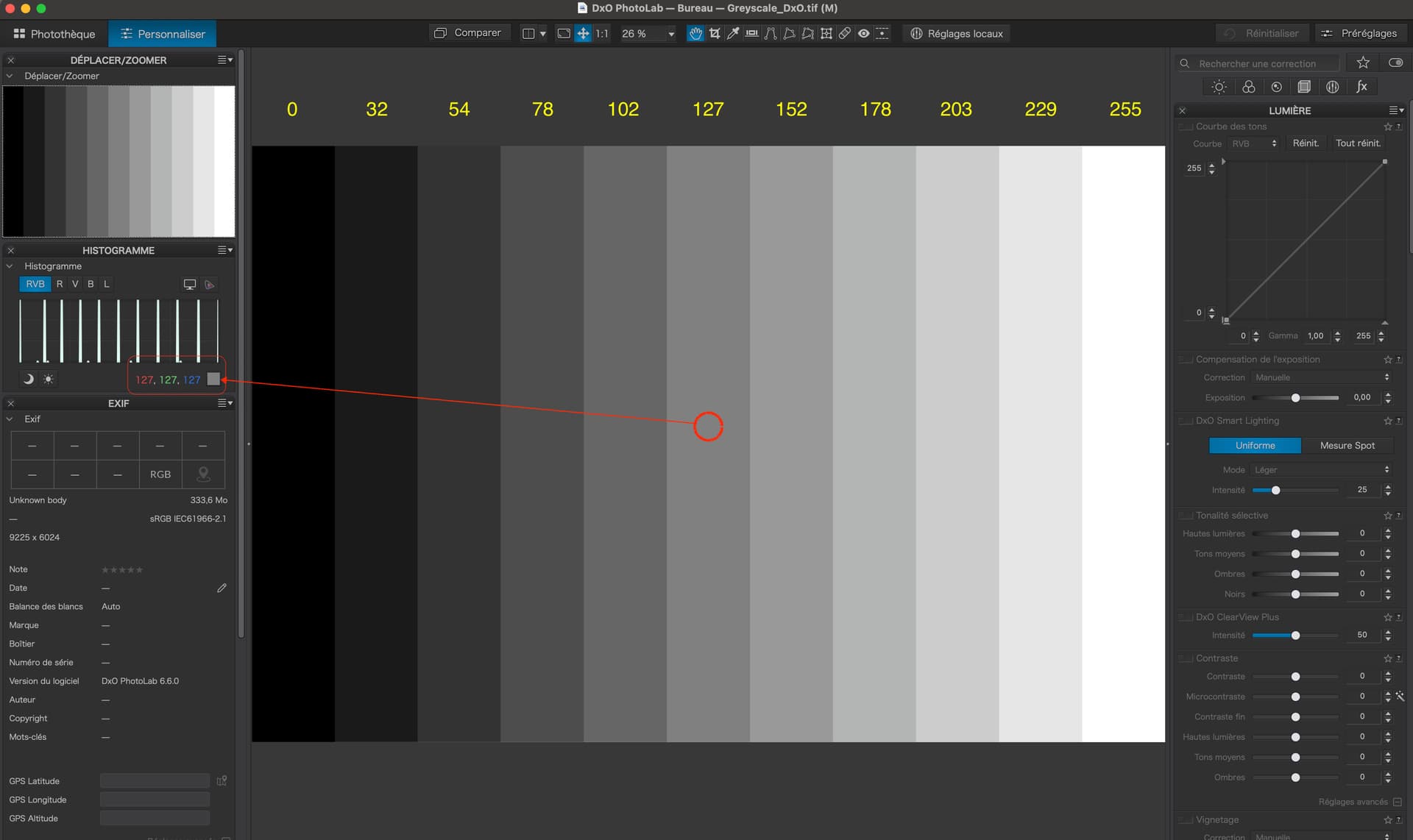
Moving the mouse over the image, the tonality under the cursor will be displayed under the histogram. The centre strip here shows up as 127|127|127.
Now, adjust the curve like this…
The left side of the “dip” is just to the right of the centre of the graph…
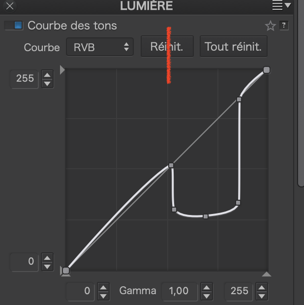
… so that means it is roughly at around 130 out of the available 255.
If you hover the mouse over the wide band you have created, you will see that the numbers under the histogram read around 68.
So, what we have done here is to create an extreme change of level (contrast) that affects all tones from around 130 to 237. The curve is vertical, which means a very high contrast between the tones before the dip and those in the dip. Likewise, there is another high contrast change to the right of the dip.
If we change the curve to something resembling a step…
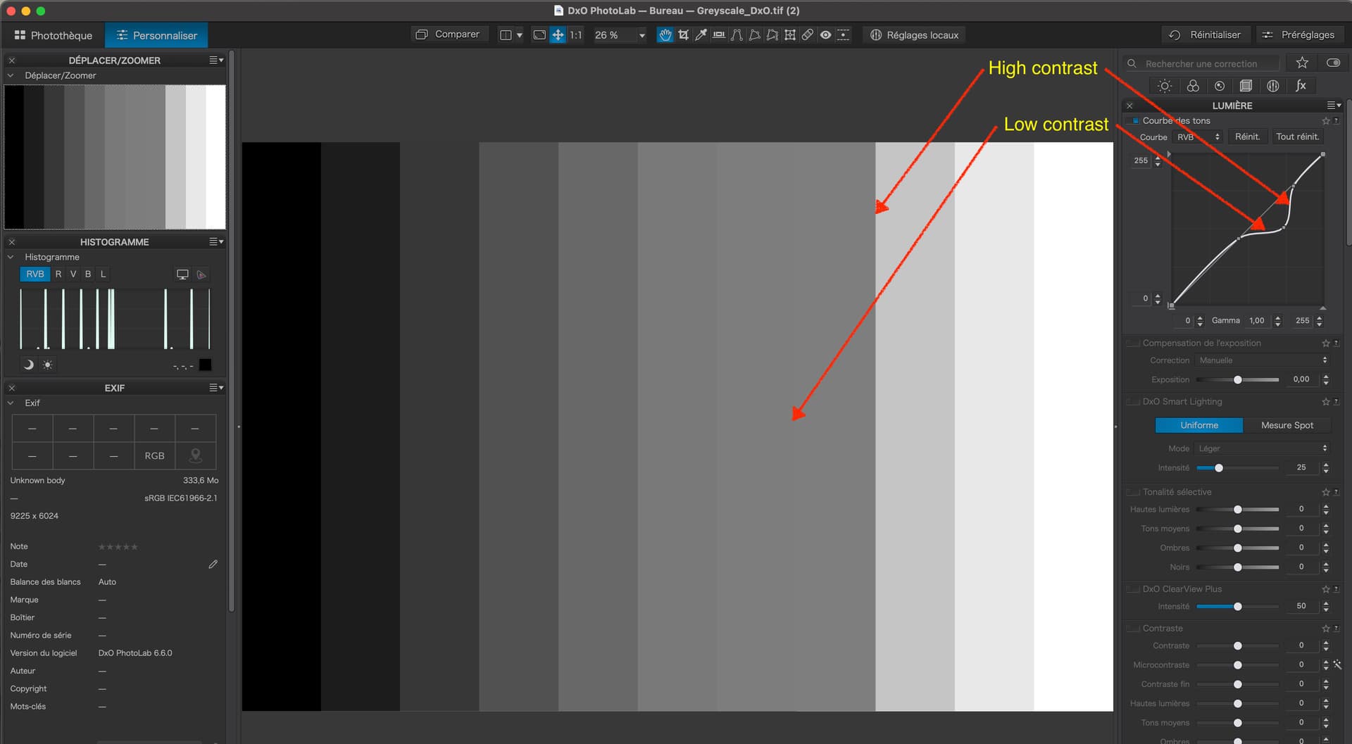
… then you can see that the more vertical section corresponds to a sharp change in level (high contrast) and the more horizontal section corresponds to a very slight change in level (low contrast).
Of course, in a real image, you are unlikely to see these exaggerated changes but I thought it might help to demonstrate the effects such changes to a curve have on contrast at a given level.