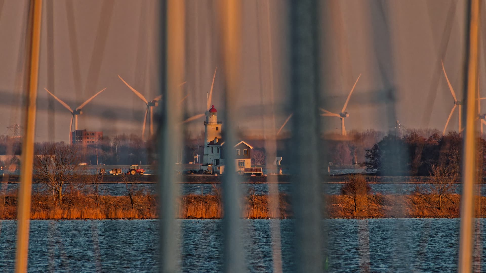
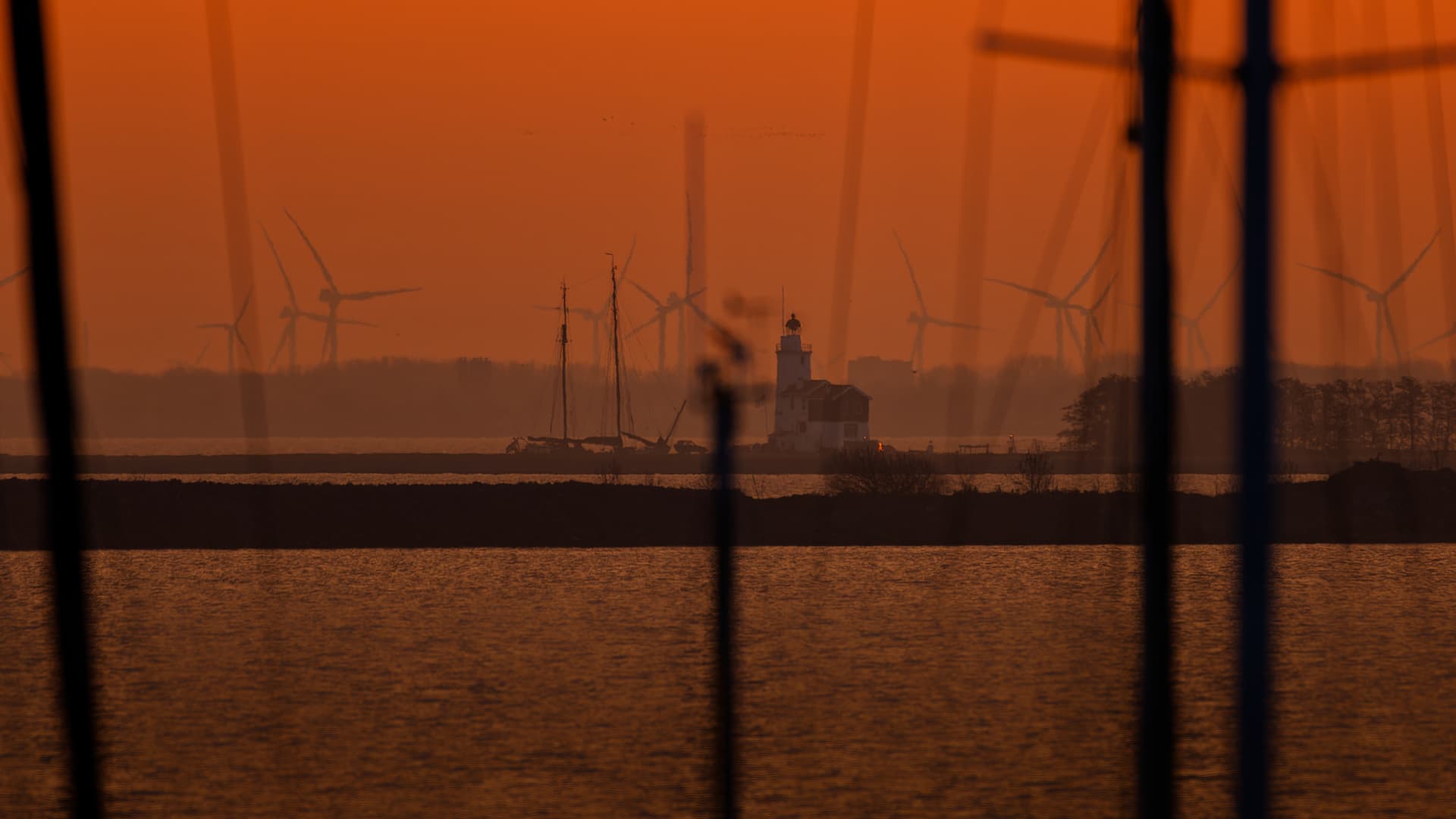
The lighthouse of Marken, Netherlands, taken from a distance of 6 kilometers. The vertical lines are ship’s masts.
1 Like
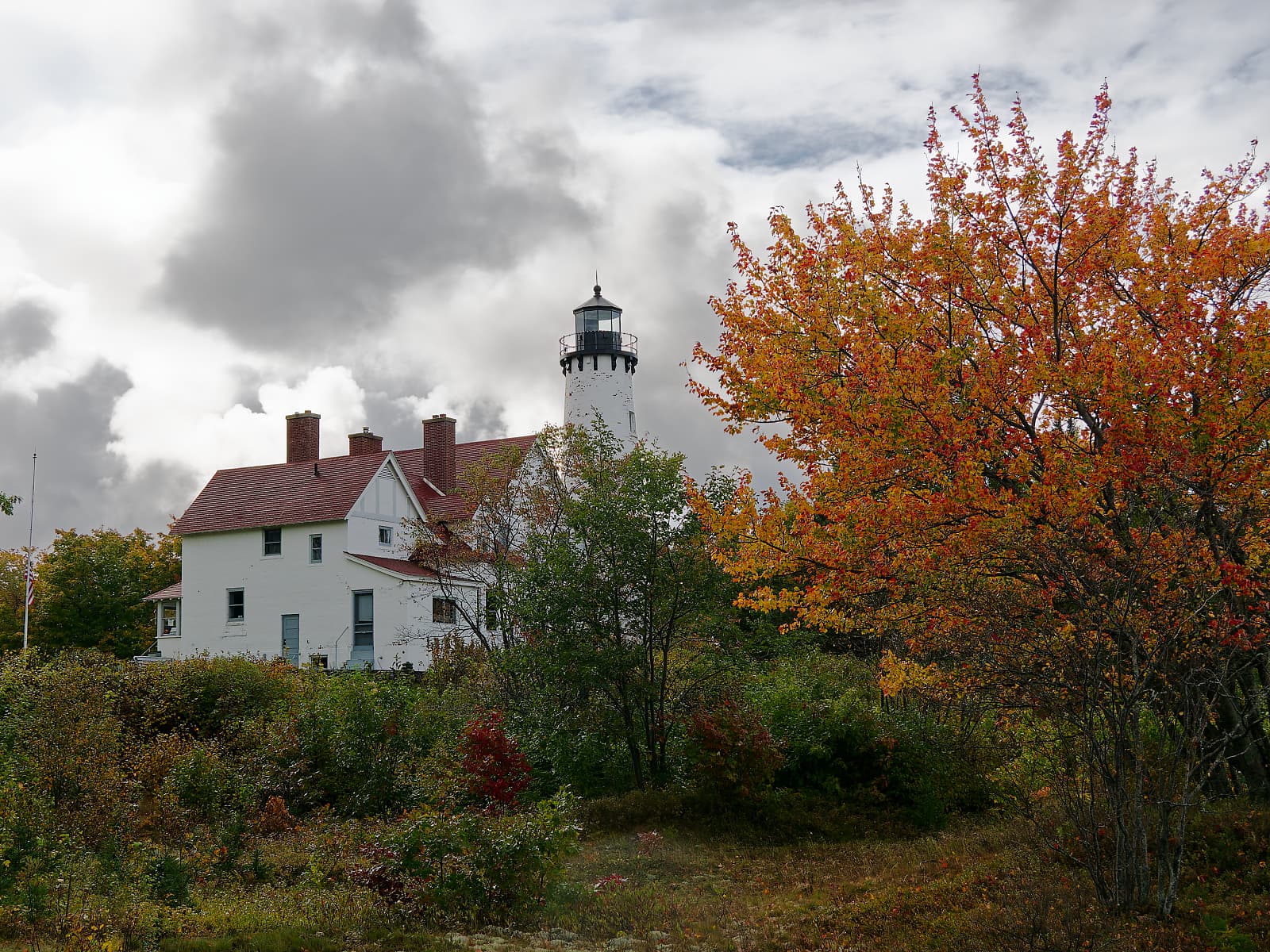
Point Iroquois Lighthouse, Lake Superior. Brimley, Michigan.
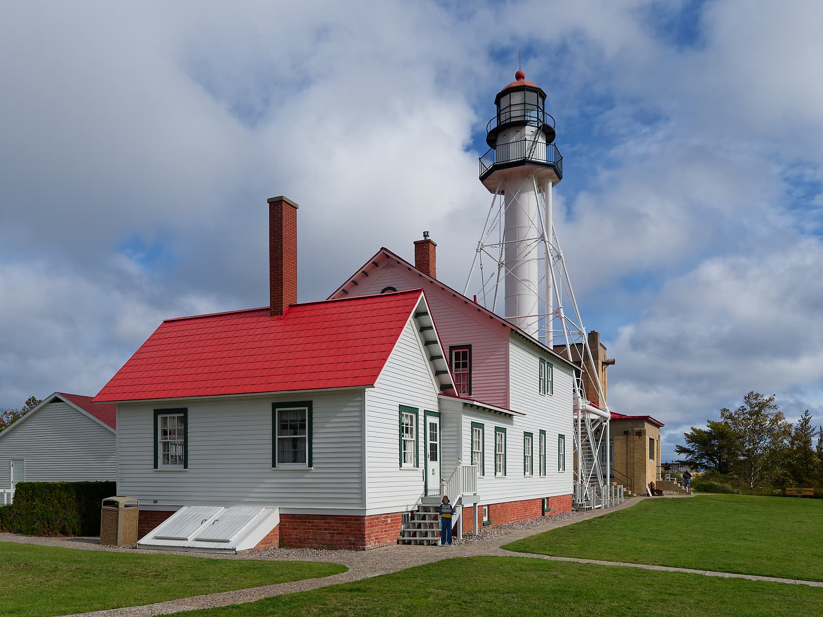
Whitefish Point Lighthouse, Lake Superior. Paradise, Michigan
7 Likes
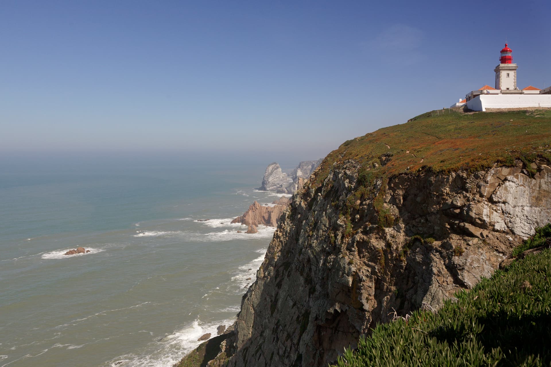

The ancient Greek thought it was the end of the world.
George
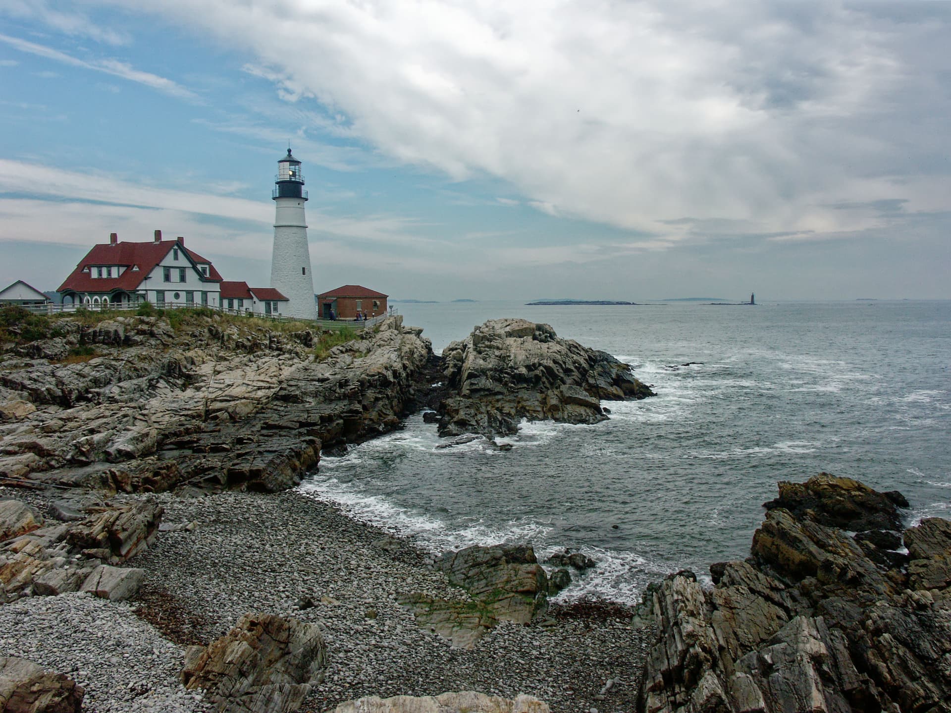
Thanks, Benoit! One of my favourite places! Did you go down the steps to the cove?
Looking around at different angles. Nice and interesting idea, although impossible to make it “clean enough” in this case. Inspiring to reproduce in other situations.
I like the harmony of composition, even though some may think it’s “excentric” ![]()
Thanks Mike,
We walked along the path but not so long. Beautiful location that we visited long ago (16 years ago).
Thanks Wlodek,
Well, the aim was to show that the lighthouse can protect sailors from a very dangerous coast
Actually I liked it more for abstract reasons. It just captured my attention and only afterwards I realized it breaks some “rules”, for good purpose that is ![]()
One thing was overall image geometry. The other thing was a contrast between sharp and blurry – after all most of photography is about all kinds of “contrasts”. Colors did a nice complement too.
Just my very subjective 5 cents, coming from no “expert”.
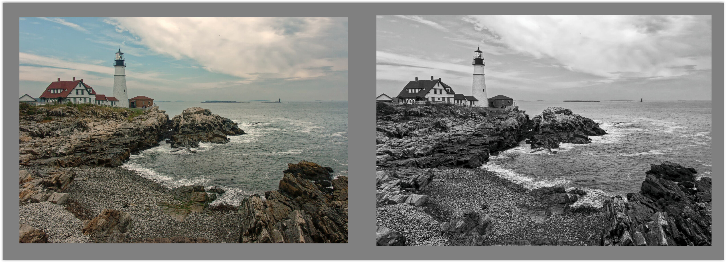
The scene is quite peaceful, so there’s too much microcontrast for me, seen especially on the lower left side.
I would also crop the photo from below to get rid of the distracting yellowish rock in the middle bottom, but maybe let it stay as a “counterpoint” (?).
The photo is a bit too cold for me, perhaps with a slight greenish cast, so maybe some WB tuning would make it “better”.
Maybe the whites of the lighthouse and nearby building are too dark, or the picture is a bit too flat in general (?).
These are minor things for me, as otherwise I like the composition, with its “classic touch” and interesting clouds.
I would like to hear opinions on my opinion ![]()
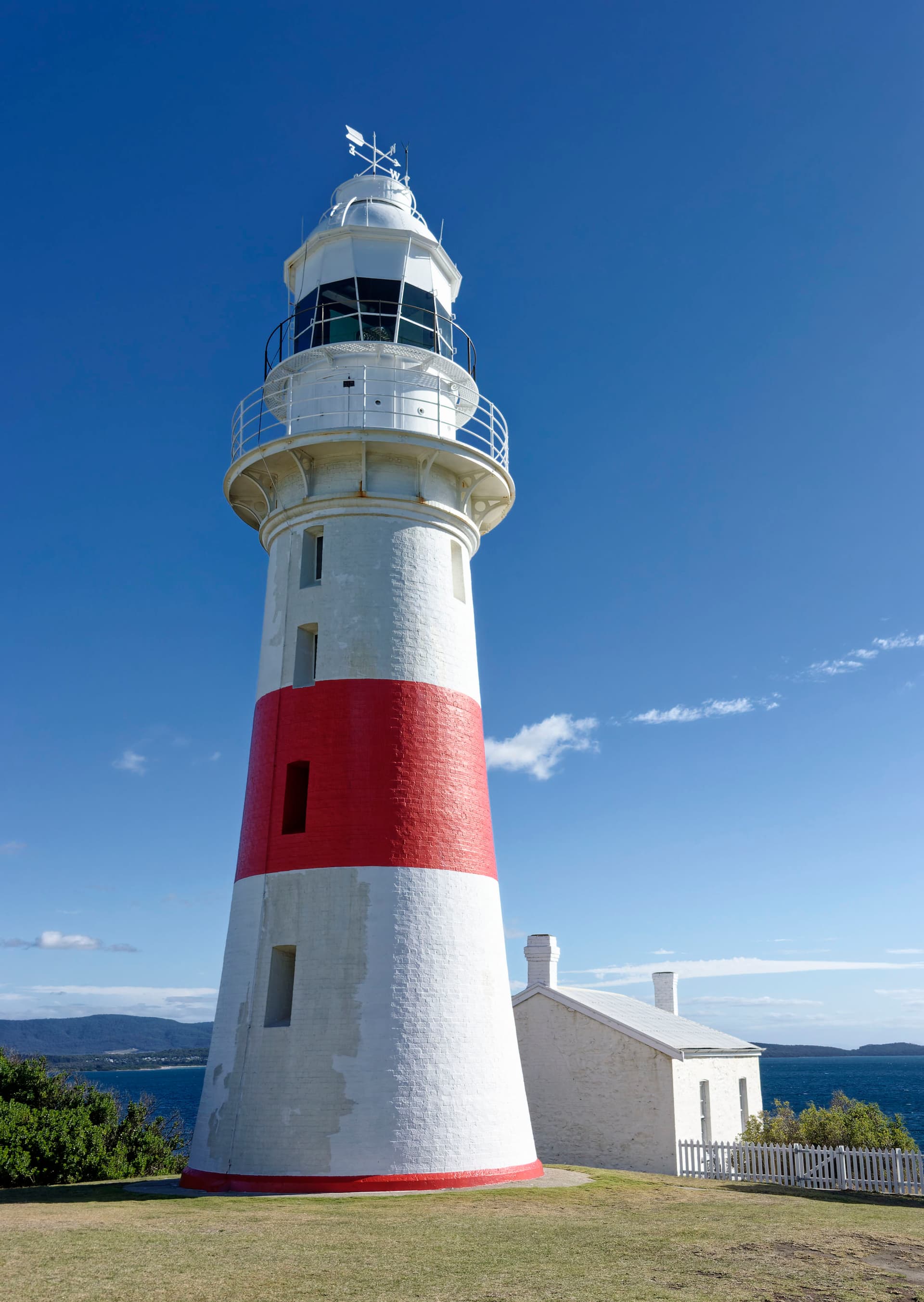
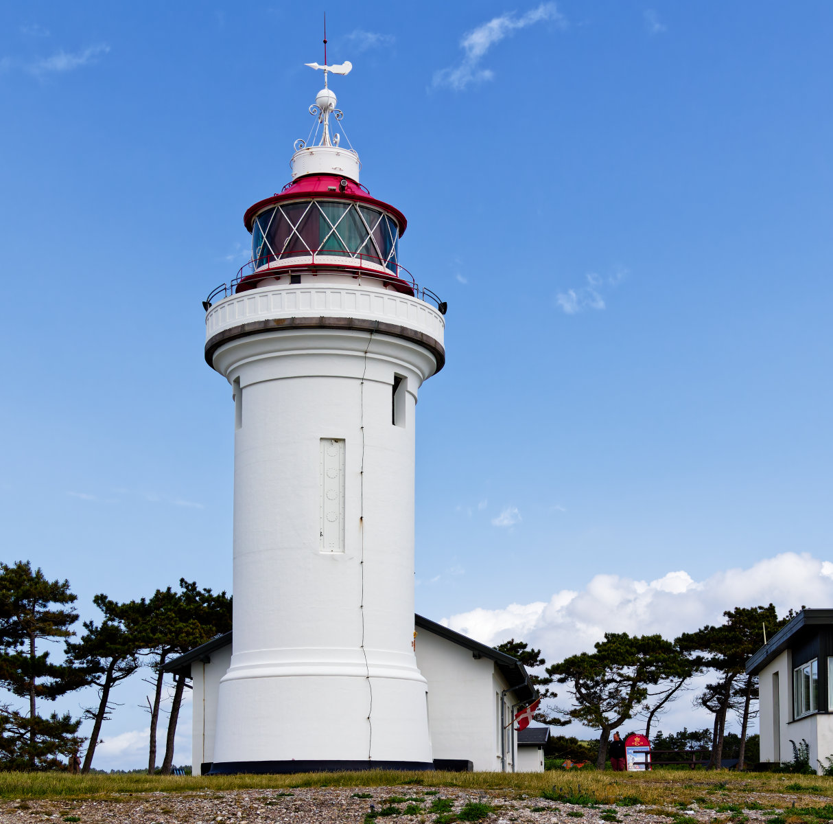
Sletterhage Fyr is a Danish lighthouse located at the southernmost point of the Helgenæs peninsula in Djursland.
2 Likes
Well, I adjusted the color a bit, darkened the “distracting yellowish rock in the middle bottom” and cropped part of the sky to highlight the blue triangle / whitish leading line in the sky which indicates another lighthouse (?) in the background, creating depth.
I kept the foreground to preserve the rocks in the corners and tried a B&W version.
2 Likes
@Wlodek @Wolfgang Thank you for your comments and critiques. For background, this image was taken in 2005 as a JPG with an 8 MP Konica Minolta A2 (DxO can’t handle A2 raw files). I agree about the rock in the foreground and the color adjustment. And yes, that’s another lighthouse in the background (the Ram Island Ledge Light Station in Portland, Maine).
1 Like