Issue with color management PL7

Take care with browser too. Some are color managed, some not. FF by example is color managed but you’ve to turn it on. If they didn’t change it.

George

Hi Klaus,
should you like to delve further …
[ my post (part of a reply) got stuck there, but concerns Windows ]


Not every program / viewer can fully handle color management.
If everything is properly set up the preview then shows the right color,
.
but not necessarily the so-called thumbnails.


Wolfgang

Hi Wolfgang,
I’d be glad to continue discussion and experience exchange regarding color management. It sure is not my strongest skill in photography so anything will improve.

//Klaus

Yes, feel free to ask questions … as long I can help. :slight_smile:

It’s an old one but still ok Jeffrey Friedl's Blog » Digital-Image Color Spaces, Page 1: Introduction
On page 2 you can test if your browser is color managed.

George

1 Like

Good to hear you’ve solved your problem/issue, Klaus.

I really strongly recommend that you take this approach …

Perfect example of an unfinished color management workflow, and that DxO should publish video tutorials to fully utilize the softproofing feature.

You should have choice of rendering intent when export and that you export in a small colorspace like sRGB. and Softproofing requires that you know what you are doing, but most importantly that the software knows it!

If you softproof it is either because you want to save to a smallcolorspace (equivalent to “convert to profile” in Photoshop. A mandatory step is you want true color fidelity. Even if I recognise a perceptual rendering intent when, by default, DPL export in sRGB from a raw file, I would like to have the choice of “relative” during export, and to have a clearer process.

The most important case of softproofing is for printing. Printing with HDR inks offer a bigger gamut than AdobeRGB, let’s take advantage of that. Then you softproof against a simulation of Ink/paper (contained in an ICC profile) to have a print that is as faithful as possible to the image you see on your calibrated wide gamut-ready monitor.

One of the best ressource is Luminous-Landscape old but still unequalled today set of videos from Digital to Print, with the late Michael Reichmann and Iconic Jeff Schewe. I have fond memory of this era of early digital photography. Camera to Print & Screen (C2PS) - Luminous Landscape
LuLa lost itself along the way after the passing of Michael and the shitty transmission to his son, but still have very good articles and an unrivalled legacy of articles if you truly want to improve (The videos are reasons enough to try for a year at least).

1 Like

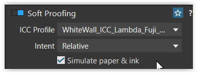
As shown and discussed in detail there is still a bug in the GUI.

The rendering intents perceptual & relative only work with printing
and one can also choose to simulate paper & ink.
grafik


For to export e.g. to sRGB, one can simulate the color space conversion,
adjust the Preserve color details slider, judge on screen
grafik
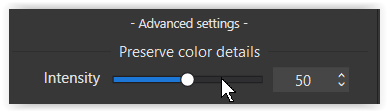
and use the export option Same as Soft Proofing.
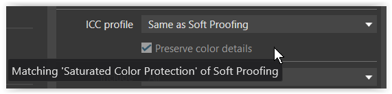
grafik


note

With Soft Proof it is recommended to use a virtual copy when adjusting color etc.,
trying the (expected) output to match the master file as good as possible.
.
In the second case (using the PCD slider) that’s not necessary,
no obstacle for standard exports / conversions.

2 Likes

Maybe it’s time to add ‘true’ HDR to the color management discussion/issue. Adobe is adding workflows to produce images that can be viewed on newer HDR TVs, phones/tablets and computer monitors (and on SDR displays). It’s still early days for this, but it seems useful to be forward-thinking as more HDR displays become available. Here’s a reasonable concise discussion of the issue: Lightroom’s HDR Display Features Explained

When can we expect DxO to add this option to PL7 (or PL8)? (I think DxO may have already done much of the interior plumbing for this.)

HDR is a matter of contrast and only works on displays, but could be a possibility for online content. – As far as I can see, high contrast is “helpful” with glossy screens and reflective room light, quite common in TV setups.


Not to shoot it down, but my personal goal is printing.

Printing papers being reflective media cannot reproduce such high contrast. To preview the expected print output on the screen without guessing, I’ve reduced the brightness of my screen to 80 cd/m² and limited the contrast to 500:1, while working in a more or less controlled environment. It’s also less stressful on my eyes. :slight_smile:

1 Like

Given that after all these years standard colour management issues still abound, worrying about HDR at this stage is perhaps not a priority.

Yes, HDR is really just applicable to (some) displays, and isn’t of current interest to some of us. Of course that’s similar to the fact that some folks print only in B&W and so have no interest in color management. I expect HDR will be of interest to a growing number of professional and amateur photographers, so is something that should be of interest to DxO in their quest for market share.

In DXO’s quest for market share how would you rate the priority of catering for a currently virtually non existent market compared to:
i) Adding pano & HDR capability
ii) Mask feathering/refining
iii ) An auto brush that actually showed the selection it is making
iv) Able to add a filled mask to avoid the kludge of pushing a Control Line passed the image boundary
v) Curves available as a local adjustment
vi) AI masking similar to ON1 and Capture One
vii ) Improved curves tool with histogram, on image adjustment and resizeable UI
viii) Mobile phone support
ix) User assigned keyboard shortcuts
x) Style/adjustment brushes similar to Capture One
etc.

2 Likes

I think DxO desperately need to fix all the major issues including most of these before moving on to the next version. I suspect a lot of people have not upgraded to 7 which is why DxO are desperately advertising and offering a chance to win a camera!

2 Likes

Thank you for these links. Love Reichmann since almost 20 years. Miss him since he is long gone.

Thank you Wolfgang, the procedure is not what I would have liked but it can help do softproof and make decent prints. Makes me want all the more an updated Printing module (much needed).

Yes these are good settings, and you know what? A true printing station with softproof configuration has a calibration for a contrast of 220:1 (max 300:1). So the true softproof is to interpret the picture you took in values, density, nuance, and contrast, in a very very narrow space comparing to the extremely wide DR capable cameras. But paper is paper and you do not archive a laptop or a Samsung TheFrame.

May be true. I upgraded to DPL7 because I support the work of DxO (and had a few friends working there as dev and signal processing engineers), but I admit I didn’t find the upgrade very compelling. And the local adjustments dedicated panel changed my habits a bit.

Me too, Michael had this unique blend of humility, curiosity, and keen ability of gathering the very best of the Photography trade around him. Something Kevin Raber had done for a few years with success. Now is son took over and kicked Kevin out of the business, and LuLa became something strange, lost its soul. A mixture of good articles from Dan Wells, bizarre articles from Michael’s son, with an out of pace edition…The East Village article/video has been on the front of the site for more than a year…

After experimenting it seems that the issue lies in software outside DxO. After what I learned from you, my friends, I managed to produce images that come out the same way I see them in PL - but only in some software:

The experience is now as follows:

  • “WIN PHOTOS” give now same color as seen in PhotoLab = ok
  • PowerPoint gives good color when the image is inserted one by one to each slide
  • PowerPoint gives washed-out images when inserted by making a “Photo Album” with one or several images.
    The image files are the same in each case and “picked up” from the same folder for testing.

I do not know why, but it seems there is a color dis-management issue only related to some software and not to all.