Judging Your smugmug gallery one could say so!
In fact, some modesty would suit you better.
You might be wrong – and who cares anyway? I don’t need to understand RC cars to judge for myself wether a picture catch my eye or not. But ok, no point in arguing with a fan of Ken Rockwell…
1 Like
I didn’t address the photo because I didn’t quite know what to say at first and didn’t want to come off as overly critical, but I agree with @JoJu - I don’t believe that it works compositionally. There’s a lot of wasted space in the frame on top, and a weird pole besides - I would’ve reframed the shot looking down at the track, somewhere between standing and your position, to better fill the frame with the curve. As shot, the bottom third of the frame feels squished while the upper third is completely wasted space.
I like the idea you had of layering the car in the foreground with the drivers in the background, but they’re too far away, too small, and too dark to really be an effective secondary subject. There are distracting structures on either side of the bleachers which could’ve been excluded by zooming in a bit more or repositioning yourself.
You could take an image like this and process it through PL5 and perhaps make it a little nicer to look at, but in my opinion the composition makes it a non-starter and not worth the extra effort.
That’s fair. I guess I didn’t know how to direct your attention to specific photos since they’re not numbered or anything, and I didn’t want to deal with resizing them for a forum and posting them here, but I’ll figure it out here in a bit.
Ok, here’s a few of mine. I don’t know if they represent my “favorites” per se, but I tried to choose some that were different enough from each other to provide some variety.
This first one was taken over a place called Tenmile Creek in Oregon with a drone:
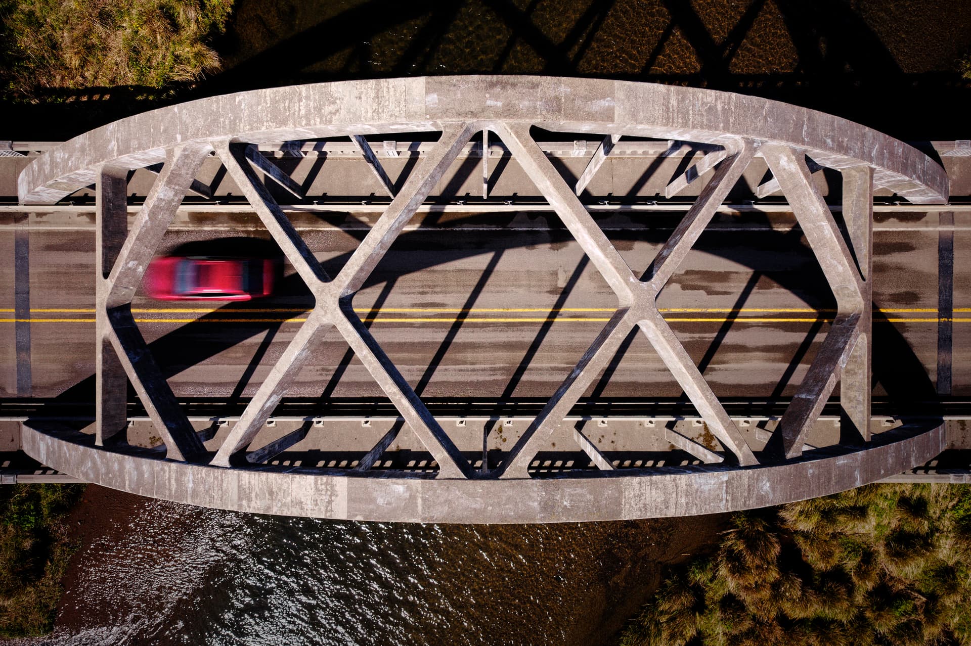
The subject is very clear. The bridge fills the frame, but there is enough water on either side to give a little bit of context. I like the little patches of grass on opposite corners to add some different texture and color, in particular because the green is complementary to the red of the car. The lighting was lovely that day and I like the shadows cast over the roadway and the overall warmth of the image. The red car in motion crates a sense of dynamism.
I did wonder afterward how it would’ve looked reframed to include the bridge’s shadow cast onto the creek, but I think that would’ve very much changed the feel of the photo and it would’ve lost some immediacy and impact imparted by the tight framing.
Another one, taken of a parked, scrambler-style motorcycle:
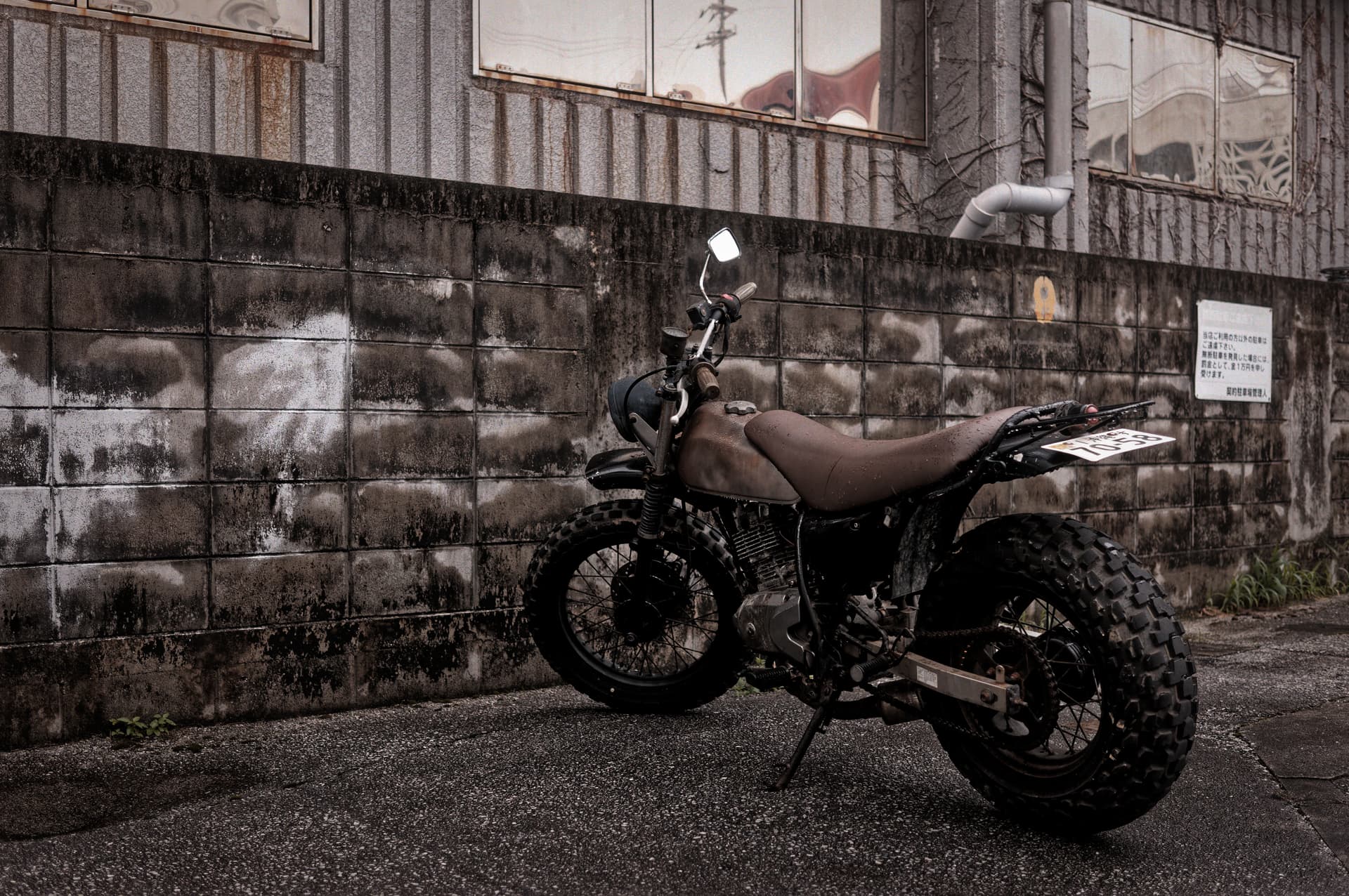
To me, an interesting subject, I like the sort of post-apocalyptic vibe of this bike. I’ve framed it to remove all clutter and distractions, and also allowed me to tie everything together with a pseudo-monochromatic color palette. I love the many different textures, shapes, and lines provided by the asphalt, wall, and glass, especially after a fresh rain. I like the specular highlight in the rearview mirror, which I think gives a little pop in a somewhat dark scene. I like that if you look closely you can make out enough of the writing on the license plate and sign to allow you to place the image in Japan.
Here’s one taken at a beach in San Diego, just after sunrise, from my hotel room balcony:
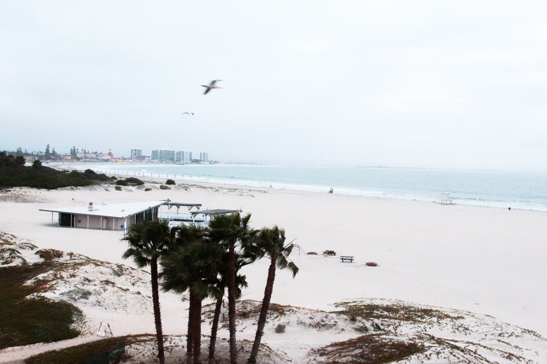
My vantage point (on the 3rd or 4th floor) provided a more interesting view than ground-level, although it also limited my options somewhat because of the narrowness of the balcony. Anyway, I was trying to capture the sort of surreal and serene vibe and intentionally overexposed to get get the sand, sea, and sky to sort of run together and blow out at the edges. I love the emptiness of the beach, miles away from the city skyline lost in the encroaching marine layer in the far background. I like the soft color palette, contrasted with the dark palm trees in the foreground. The wind in the palms and especially the seagull blurred in flight add some dynamism to an otherwise tranquil scene.
Ok, last one. This is a shot from the recent Pikachu Parade here on Okinawa:
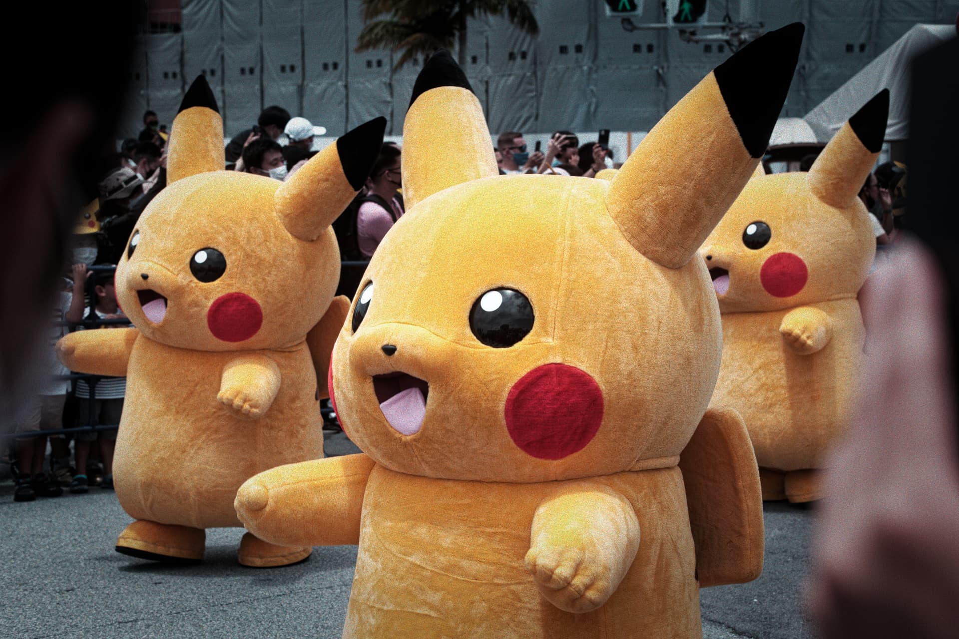
This is obviously just kind of a quirky subject. I wanted to convey the absurdity of this sort of endless procession of ridiculous, enormous Pikachu. I used a film simulation (Adox Color Implosion) to push the colors in sort of an exaggerated way, although I did tone done the effect by turning down the Vibrancy and Saturation a little. A wide-angle lens would have captured more Pikachu, but also way too many spectators, and the impact would have been lost. The way this shot is captured, I like that the frame is filled with the Pikachu, but you also get a glimpse of the crowd for context. I used spectators on either side of me to provide some framing, and also give the viewer a sense of being in the crowd themselves. I like that there is no dead space in front of or behind the Pikachu, which creates the possibility of endless Pikachu in either direction, which I think heightens the absurdity. I like that the gray asphalt and construction barrier provide a neutral backdrop for the brightly-colored Pikachu to pop even more. It almost looks like I masked the Pikachu and desaturated everything else, but I didn’t - it just worked out that way.
Anyway, that’s probably enough to give you an idea. I’m not claiming award-winning work here, but I think these are fairly good compositions and I’ve tried to explain why. I hope I’ve conveyed that these images are the result of very deliberate choices made by me, both during the time of capture and post-processing.
2 Likes
I especially like like the bridge with the moving car! I assume it was it taken by a drone.
Mark
Everything you wrote is true and it would certainly be a more effective photo, but for the audience it was intended for, showing more of the Toledo track, so readers would recognize things, was a priority. I also took similar photos, with more cars in the scene, cropped tighter. All of my editors but for one preferred it that way. The other editor wanted me to send “my best 25 photos”, leaving it up to me.
Also, leaving extra room around the subject allowed the layout editors to crop my photos to fit into the article as they wished.
My number one goal was to “capture the action”, not to create beautiful photos.
Why not both? You create arbitrary limitations for yourself.
1 Like
Thanks! Yes, taken with a DJI Air 2S.
I would prefer to say what I think, and for everyone else to do the same.
The Smugmug gallery is me. I love some of the photos, and I dislike some of the photos. All the photos could be purchased, and strangely none of my favorites was purchased - people had their own reasons for what they liked, or not. Some things there are just “history”, places I’ve been to, things I’ve done, and events I’ve been asked to cover. Out of any group of say, 100 photos, there is likely to be perhaps two or three that I really liked.
You are one of the people here that I listen to the “strongest”, to understand what you mean, and I learn from that. I’ll probably still be learning until the day I die. A lot of stuff here (and elsewhere) goes in one eye, and out the other. Oh well.
Modesty - I will try to be more modest starting now. Sorry if I’ve offended anyone. I like to write what I think, but maybe that’s a bad idea. But please, if you, or anyone, wants to criticize something lousy that I’ve posted, please do NOT hold back. I’d like to know what people think, good or bad.
“capture the action”, and “create beautiful photos”. You ask why not both. The simple answer is “time”. These 1/8 scale cars, for example, can go over 70 mph real speed, and the amount of time I have is a split second, to not be too early, or too late. Everything is set, ahead of time, and as the car goes by I try to catch it at a pre-selected spot, having already positioned the camera to include important parts of the race track. Back then, I usually had to pre-focus too. Out of 50 similar photos, I then needed to pick one to submit, but it also needed to include one of the cars driven by one of the “famous” racers, preferably the car that ended up winning, so I had to capture photos like this of all the cars, as I wouldn’t know who was going to win. Ideally, I would capture the car in first place, with the car in second place also in the photo. My attempt at a “beautiful photo” mostly meant setting up the camera ahead of time, resting on a board so it was stable, with the lens focused where I hoped the action would be, and with a high enough shutter speed, but those photos didn’t show “action”. The better photos were when I could “pan” with the car as it went through the turn, snapping the photo at the place I had already selected - so the wheels and background would be blurred.
Anyway, I’m “guilty as charged” - I had no interest in creating a beautiful photo, only in capturing the racing action. Cropping would come later, leaving room for the magazine to crop more.
Another path would/could have been to capture 25 beautiful photos of the event. That’s the last time I would be asked to cover a race. The magazine didn’t want “beautiful photos”, they wanted “racing action” that would excite the readers.
Oh yeah, the camera equipment mattered too. I went to Italy with my brand new Nikon D70, leaving my own D2x at home as it was so big and heavy. The D70 took about eight photos and died. All of Italy was on vacation, so there was no way to get my camera fixed, or buy a replacement. Someone at the race loaned me their D50, the slowest, least expensive DSLR Nikon made, and I covered the whole race with it. I had to photograph cars when they were three feet before where I wanted them in the photo, due to the shutter lag. I was astonished that none of the editors, at both of the magazines I was shooting for, had any complaints. This left me wondering why I was spending $4,000 a year or so for the top level Nikon, when I could accomplish the same job with the least expensive DSLR Nikon made. I learned a lot from that, or at least thought I did…
Me too - and the reflection in the water!
@mikemyers, here’s the thing: it’s hard! But that doesn’t mean that it’s impossible, or that you should accept simple fulfillment of an assignment at the expense of a visually pleasing composition. What strikes me is that you’re not saying that you tried to do both things and failed, but that you decided that you couldn’t possibly do both of them at once and so opted for a utilitarian image that technically “captured the action.” It’s a theme you’ve gone back to several times, and all I can say is that the hard things will never get any easier if you go out of your way to avoid doing them.
I’m not suggesting you should have turned in abstract art! But there is room for some creative expression in photojournalism, even in sports photography. And I seriously doubt that your editors would’ve turned down a well-composed image, so long as it also told the story effectively.
And here I thought the camera did not matter!
2 Likes
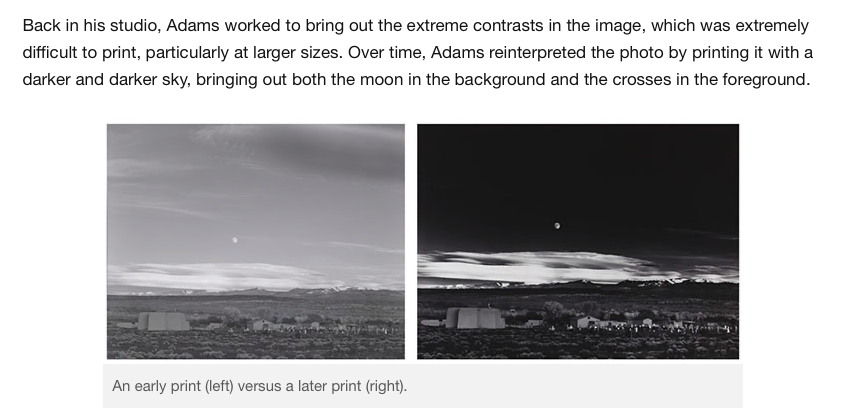
Here’s an interesting question. If you had never heard of Ansel Adams and his almost god-like reputation, and you had his Moonrise, Hernandez and Helen’s Moonrise over Tréduder side by side, would you still tend towards Ansel’s image? Or is there an element of “it’s by Ansel and he’s famous so it must be better”? ![]()
Also, there’s the question if Adams’ first prints of the same negative, before he decided to go for a darker sky, would have been able to compete with the version “we all know”… ![]() So, without the specification of the year, Adams’ first result was judeged by himself as weaker. Meaning, a statement like
So, without the specification of the year, Adams’ first result was judeged by himself as weaker. Meaning, a statement like
can show if someone know a “master” well.
Masters were not born as masters, they grew and developed. And even Adams was able to produce some, hmmm, less genial shots.
And how did you do that?
George
Well, I know it’s not the latter, as Ansel took a lot of images that personally, I don’t like. So I know I don’t feel “it’s by Ansel and he’s famous so it must be better”. He created some images that I think were spectacular, and some images that didn’t impress me, and some images that don’t look (to me) like he even took them.
Regarding his Moonrise photo, I’ve seen a straight print from the negative, and it looked very dull and uninteresting to me. He recognized what he captured, saw the beauty hidden in that image, and brought out “the best”. Over the years his style changed, so now we’ve got several of versions to compare. Personally, I prefer some of his earlier prints rather than his later print, and his earliest print looks nothing like what he did later on - here’s something I copied from petapixel:
https://petapixel.com/2018/11/07/the-story-behind-ansel-adams-iconic-moonrise-hernandez/
Something else I wonder about - without Ansel’s expertise in the darkroom, would I ever have heard of him? He used his darkroom like we now use PhotoLab, and obviously with either tool we can create beautiful images from a negative that didn’t look so impressive (to us) to start with.
Well, with my multi-thousand-dollar Nikon D2x it was effortless to capture the racing images I wanted, I still managed to capture everything I needed with my borrowed “toy” D50. For the quality of the images, I knew enough to force the D50 to do what I wanted, which was effortless on the D2x.
So, “did the camera matter”? In terms of convenience, yes. In terms of final results, no. I guess I’m spoiled by all the features we’ve now got access to, but back in time, I was capturing racing photos with my rangefinder Nikon SP, and an old, manual everything 135mm lens I bought used.
Correct. In fact, I captured “extra” space around the image so I could correct faults later in the computer, as I couldn’t always keep the camera perfectly level. And, I took enough images that I could sort through and select the best ones before submitting 25 or so images out of maybe a thousand or so images I captured. As you put it, “fulfillment of an assignment” was my top priority, and the reason I was there in the first place. There were other images, that I had all the time in the world to create as best I could, but what the magazine wanted was “racing action images”, photos of the winners, and detailed close-up photos of the cars, usually taken after the race.
Not sure how to respond - those really dark images he created later on don’t look as good to me as the ones he created a little earlier. In between that first and last image I just copied, are images I liked the most. I don’t think of all the earlier prints as “weaker”, just different.
It’s like what I’ve learned from @Joanna, @Wolfgang, Peter, and many others - how we can use PhotoLab to bring out what we feel is the best in our images. As I quickly learned here in this forum, the tools available in PhotoLab can be over-used, creating garbage. At first, I thought “ClearView” was the perfect tool to make any image more impressive. Wow, was I ever wrong. I’m wrong about a lot of things, as I quickly found out from reactions to my “edited photos”.
After years of fighting the concept, I now accept that the camera is just a tool, no more, no less. Used properly, my images looked good. Used incorrectly, my images looked like garbage. And finally, as in cooking a steak, some people prefer rare, and others prefer well-done. There is no one-size-fits-all.
Just what is the point of taking a photo that is not aesthetically pleasing? You’ve said that you’re unable to think about exposure settings in real time because your priorities are “composition and time,” and now you say you’ll sacrifice composition to “capture action.” Do you hear how ridiculous all of this sounds? There’s nothing left except crossing your fingers and trying to fix your mistakes in PhotoLab.
I’ve said everything I need to say. You’ve gotten loads of good advice in this thread and others from many people, but ultimately it’s up to you to receive it or not.
1 Like
Helen’s SOOC file is hardly inspirational either…
I cannot say the camera is not important because, without the 14.6 stops of range that the D810 gives, it would have been hard to realise this image digitally. Using Fuji Acros 100 film in the Ebony would have coped with the usual over-exposure and under-development dance, but it wasn’t at hand when the picture needed taking.
The processing of the RAW file took the two of us, working together, a couple of weeks to settle on the rendering I showed above, with us having to print at least 6 other versions because judging things on screen (even if it is calibrated) is not the same as holding the print in the light it will be viewed under.
Our local town hall has asked our club photo to produce about 30 pictures for an external “exhibition” of publicity photos. This has been especially hard because our town is not particularly aesthetically attractive and we were asked to avoid being artistic and only shoot things whose locations were recognisable. Sheesshhh!!!
So, the mayor’s assistant smartphone was broken and he had the brilliant idea “hey, there are these dudes with professional looking cameras walking through the landscape or having a wine in the brasserie - why not give their lives a bit of importance?”
Sometimes I visualize discussions and try to find an everyday situation to describe. Here it’s a fly trying to get back to fresh air but keeps on bumping on window glasses, not able to see the glass. But keeps on trying. Well, analogies always fall a bit short…
1 Like
Yep, that’s what I said, and that’s what I meant. When I get time, I’ll take a photo of some magazine pages, to show how the images were used. Maybe then you will understand.