How to create photos like "the masters", and is PhotoLab a useful tool?

Completely true. When I first came here it was because I was lost in PhotoLab. I didn’t want to use Adobe any more, and PhotoLab seemed much more powerful than DarkTable or RawTherapee.

Much of the “chatting” is how I slowly and gradually learned what (not) to do with PhotoLab. Seeing how others, far more experienced, did things was extremely helpful, after which I tried to do the same things.

Oh well, enough typing - I keep saying I’ll get back to editing my Colorado photos, but I need to get with the program, pun intended. :slight_smile:

If you’re too busy “thinking about other things” to think about exposure settings, I would suggest that you are perhaps thinking about the wrong things. :slight_smile:

Seriously, though, it can seem overwhelming staying on top of camera settings while out shooting, but the only way to get better at it is by doing it more. If you rely on the crutch of Program mode, you have no incentive to ever get better at shooting without it.

It’s true, you don’t need to use film simulations. Probably most people do not. It is simply a stylistic option that is available. But I found two things telling about your attitude: (1) Given your age, it would seem that the majority of your photographic experience would be in the film era, so how could your knowledge of various film stocks possibly be so limited? and (2) Your unwillingness to even consider learning about them is indicative of a general lack of intellectual curiosity that I think is holding you back, and limiting your potential to express yourself fully in an artistic medium. To be clear, your choice to use film simulations or not is not really the issue, as either one is a valid choice, but it put on display your sometimes rigid thinking.

Incidentally, the ultimate output of the image (print versus web) has nothing to do with whether or not to use a film simulation. They’re there only if you want to emulate a certain look, as different emulsions handle color and contrast differently, have different grain patterns, etc. Some people are into that and others aren’t - it’s simply personal preference.

Okay, I’ll bite. Which magazines? How is it that you’ve worked professionally for magazines for “too many years,” presumably in the midst of the film era, and yet don’t get the difference between various film stocks? A comprehensive understanding of film would’ve been a job requirement, no? As would an ability to think about exposure settings , focus, framing, and other things on the fly, all while making adjustments to each. It simply does not make sense for you to have been a professional photographer and yet be so befuddled and vexed by the operation of your camera.

I would guess that you spent your professional life differently, probably as an ophthalmologist, given your apparent well-off lifestyle and annual volunteer trips to an eye hospital overseas. Photography is probably one of many hobbies you’ve dabbled in (I think you’ve said as much yourself). Not that there is anything wrong with any of this, most photographers are hobbyists, myself included. I just don’t understand why you continue to tout professional credentials that are at odds with the questions that you ask and the output that you generate.

To be sure. :wink:

Considering that we’re having this discussion an a DxO forum, I thought it would’ve been obvious, but they’re all RAW images that have been processed with PhotoLab.

Again, rigid thinking, holding you back.

I’ve already provided you a link to 68 of my most recent photos. :slight_smile: And I’m adding more every day, at least one, sometimes two. I use Flickr for storage of the full resolution jpegs, but find that Instagram is better for sharing. I’ve had a SmugMug account in the past but currently don’t see a need for a third web gallery.

1 Like

For you, they might well be the wrong things. To me, COMPOSITION and TIMING were the most important things to get right. Everything else can often be adjusted later.

My film experience? Mostly Plus-X, Panatomic X, Try-X, Kodachrome, Ektachrome, Ektachrome IR, and every so often whatever I could find.

Magazines: Radio Control Car Action, Xtreme, RC Car, Race Car, and a few more that I don’t remember. After a number of years doing race reports with photos, they sent me all over the world to cover world championship races - Jakarta, Brazil, Japan, Italy, all over the USA… At first I sucked, but then I learned how to take photos of these radio control cars so they “looked” like the real thing. Everyone else photographed the cars while they were standing, while I shot them from the perspective of a tiny person standing by the track:

As far as I know, I’m the only person to take a photo of the race cars, along with the drivers in one photo…

A better view:
Great Lakes Challenge Race, Toledo, Ohio

Absolutely not - like I said, composition and timing. And I don’t remember being befuddled and vexed by anything. To me, the camera was (and still is) a tool. Oh, and after the races, various manufacturers paid me for the use of the photos in advertising.

Maybe you should re-consider what makes a photograph “good”. Adequate exposure and sharpness and color are expected. Composition and Timing. Look at the photos @Joanna posts here - they go far beyond being “just a photo”. Many people though don’t “get it”. To them, they are literally “just a photo”.

We were talking about “the masters”, in this thread. What brush someone used, or what paint, or what film, and often what camera or lens is irrelevant. It’s the artist inside them that created the beauty, not the tools. If you don’t accept this, read this article:

The Camera Does Not Matter

All that “stuff” is/are tools, and there are lots of choices for tools.

Of all the photos you took and posted in that Instagram link you posted, which photo or photos are you most proud of?

I’m not sure who you’re talking to - in my first post to you, I said that composition was “obviously crucial.” Anyway, you create a false dichotomy - all of these things are important (composition, exposure, etc.).

When did I imply that the camera mattered, or was anything other than a tool? Maybe you really are talking to someone else. :slight_smile:

As an aside, I try to avoid reading anything written by Ken Rockwell.

I don’t know, I’m generally happy enough with all of them (or else I wouldn’t have posted them), but there are of course things I can pick apart about probably each one. In any case, I stand by my assertion that they (for the most part) demonstrate clean and uncluttered composition, even if they don’t resonate with everyone tonally or thematically.

1 Like

Yes. You might be the only person. But looking at the picture, you never questioned why nobody else tried to deliver a picture with a weird sized car and some dark men in the shadow behind?

Well said, thank you @MJB

2 Likes

Well, I disagree with one thing he says…

Why is it that with over 60 years of improvements in cameras, lens sharpness and film grain, resolution and dynamic range that no one has been able to equal what Ansel Adams did back in the 1940s?

He obviously hasn’t seen this shot by Helen…

Moonrise over Tréduder

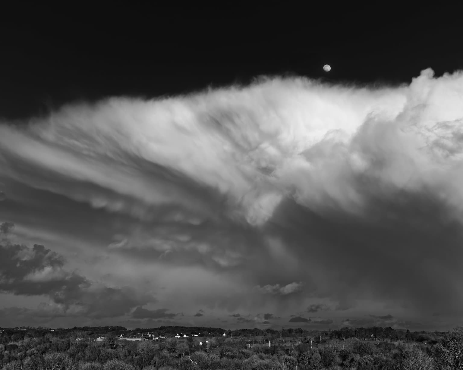
All work from the Nikon D850 RAW to the finished result using PL5 and printed to 24" x 16" on our Canon Pro 1000 printer, it looks stunning on the wall.

Ha! I’m pretty sure that the people reading that magazine, and being interested in radio control race cars, had no doubts, and the people at the magazine loved it! Most likely you know nothing about 1/8 scale on-road r/c car racing, and chances are, almost nobody in this forum knows about it. Many people doing what I did just took snapshots of toy cars. But the quality of r/c race car photography has continued to improve over the years, and I would have given anything back then for a Nikon Z9. Oh well, it’s all history now. Even if I wanted to race again, my reflexes are way too slow, not that they were anywhere near the level of the better drivers back when I was involved.

Many people feel that way. It’s their loss. Not to mention if I want information on some obscure used lens I’m thinking about buying, nine times out of ten Ken has done a review. He usually writes what he really thinks, and not what advertisers would like to read. He has tech articles on most things the “average” photographer might want to read. I like his photos, I like his articles, and I enjoy his writing style. And I like that he used a writing style that is easy to understand, for average photographers.

I was asking you, the photographer, to select some of your favorites. I get lost and bored going through endless galleries of photos. I was hoping you would select a few, that you especially like.

I suspect that if Ken got to see your photos, and Helen’s photos, he would be VERY impressed, and maybe change what he wrote to:
" Why is it that with over 60 years of improvements in cameras, lens sharpness and film grain, resolution and dynamic range that hardly anyone has been able to equal what [Ansel Adams] did back in the 1940s?" …but Ken was trying to make a point, and exaggerated.

I should add that as much as I enjoy Helen’s photo, I prefer what Ansel created.

Judging Your smugmug gallery one could say so!
In fact, some modesty would suit you better.

You might be wrong – and who cares anyway? I don’t need to understand RC cars to judge for myself wether a picture catch my eye or not. But ok, no point in arguing with a fan of Ken Rockwell…

1 Like

I didn’t address the photo because I didn’t quite know what to say at first and didn’t want to come off as overly critical, but I agree with @JoJu - I don’t believe that it works compositionally. There’s a lot of wasted space in the frame on top, and a weird pole besides - I would’ve reframed the shot looking down at the track, somewhere between standing and your position, to better fill the frame with the curve. As shot, the bottom third of the frame feels squished while the upper third is completely wasted space.

I like the idea you had of layering the car in the foreground with the drivers in the background, but they’re too far away, too small, and too dark to really be an effective secondary subject. There are distracting structures on either side of the bleachers which could’ve been excluded by zooming in a bit more or repositioning yourself.

You could take an image like this and process it through PL5 and perhaps make it a little nicer to look at, but in my opinion the composition makes it a non-starter and not worth the extra effort.

That’s fair. I guess I didn’t know how to direct your attention to specific photos since they’re not numbered or anything, and I didn’t want to deal with resizing them for a forum and posting them here, but I’ll figure it out here in a bit.

Ok, here’s a few of mine. I don’t know if they represent my “favorites” per se, but I tried to choose some that were different enough from each other to provide some variety.

This first one was taken over a place called Tenmile Creek in Oregon with a drone:

The subject is very clear. The bridge fills the frame, but there is enough water on either side to give a little bit of context. I like the little patches of grass on opposite corners to add some different texture and color, in particular because the green is complementary to the red of the car. The lighting was lovely that day and I like the shadows cast over the roadway and the overall warmth of the image. The red car in motion crates a sense of dynamism.

I did wonder afterward how it would’ve looked reframed to include the bridge’s shadow cast onto the creek, but I think that would’ve very much changed the feel of the photo and it would’ve lost some immediacy and impact imparted by the tight framing.

Another one, taken of a parked, scrambler-style motorcycle:

To me, an interesting subject, I like the sort of post-apocalyptic vibe of this bike. I’ve framed it to remove all clutter and distractions, and also allowed me to tie everything together with a pseudo-monochromatic color palette. I love the many different textures, shapes, and lines provided by the asphalt, wall, and glass, especially after a fresh rain. I like the specular highlight in the rearview mirror, which I think gives a little pop in a somewhat dark scene. I like that if you look closely you can make out enough of the writing on the license plate and sign to allow you to place the image in Japan.

Here’s one taken at a beach in San Diego, just after sunrise, from my hotel room balcony:

My vantage point (on the 3rd or 4th floor) provided a more interesting view than ground-level, although it also limited my options somewhat because of the narrowness of the balcony. Anyway, I was trying to capture the sort of surreal and serene vibe and intentionally overexposed to get get the sand, sea, and sky to sort of run together and blow out at the edges. I love the emptiness of the beach, miles away from the city skyline lost in the encroaching marine layer in the far background. I like the soft color palette, contrasted with the dark palm trees in the foreground. The wind in the palms and especially the seagull blurred in flight add some dynamism to an otherwise tranquil scene.

Ok, last one. This is a shot from the recent Pikachu Parade here on Okinawa:

This is obviously just kind of a quirky subject. I wanted to convey the absurdity of this sort of endless procession of ridiculous, enormous Pikachu. I used a film simulation (Adox Color Implosion) to push the colors in sort of an exaggerated way, although I did tone done the effect by turning down the Vibrancy and Saturation a little. A wide-angle lens would have captured more Pikachu, but also way too many spectators, and the impact would have been lost. The way this shot is captured, I like that the frame is filled with the Pikachu, but you also get a glimpse of the crowd for context. I used spectators on either side of me to provide some framing, and also give the viewer a sense of being in the crowd themselves. I like that there is no dead space in front of or behind the Pikachu, which creates the possibility of endless Pikachu in either direction, which I think heightens the absurdity. I like that the gray asphalt and construction barrier provide a neutral backdrop for the brightly-colored Pikachu to pop even more. It almost looks like I masked the Pikachu and desaturated everything else, but I didn’t - it just worked out that way.

Anyway, that’s probably enough to give you an idea. I’m not claiming award-winning work here, but I think these are fairly good compositions and I’ve tried to explain why. I hope I’ve conveyed that these images are the result of very deliberate choices made by me, both during the time of capture and post-processing.

2 Likes

I especially like like the bridge with the moving car! I assume it was it taken by a drone.

Mark

Everything you wrote is true and it would certainly be a more effective photo, but for the audience it was intended for, showing more of the Toledo track, so readers would recognize things, was a priority. I also took similar photos, with more cars in the scene, cropped tighter. All of my editors but for one preferred it that way. The other editor wanted me to send “my best 25 photos”, leaving it up to me.

Also, leaving extra room around the subject allowed the layout editors to crop my photos to fit into the article as they wished.

My number one goal was to “capture the action”, not to create beautiful photos.

Why not both? You create arbitrary limitations for yourself.

1 Like

Thanks! Yes, taken with a DJI Air 2S.

I would prefer to say what I think, and for everyone else to do the same.

The Smugmug gallery is me. I love some of the photos, and I dislike some of the photos. All the photos could be purchased, and strangely none of my favorites was purchased - people had their own reasons for what they liked, or not. Some things there are just “history”, places I’ve been to, things I’ve done, and events I’ve been asked to cover. Out of any group of say, 100 photos, there is likely to be perhaps two or three that I really liked.

You are one of the people here that I listen to the “strongest”, to understand what you mean, and I learn from that. I’ll probably still be learning until the day I die. A lot of stuff here (and elsewhere) goes in one eye, and out the other. Oh well.

Modesty - I will try to be more modest starting now. Sorry if I’ve offended anyone. I like to write what I think, but maybe that’s a bad idea. But please, if you, or anyone, wants to criticize something lousy that I’ve posted, please do NOT hold back. I’d like to know what people think, good or bad.

“capture the action”, and “create beautiful photos”. You ask why not both. The simple answer is “time”. These 1/8 scale cars, for example, can go over 70 mph real speed, and the amount of time I have is a split second, to not be too early, or too late. Everything is set, ahead of time, and as the car goes by I try to catch it at a pre-selected spot, having already positioned the camera to include important parts of the race track. Back then, I usually had to pre-focus too. Out of 50 similar photos, I then needed to pick one to submit, but it also needed to include one of the cars driven by one of the “famous” racers, preferably the car that ended up winning, so I had to capture photos like this of all the cars, as I wouldn’t know who was going to win. Ideally, I would capture the car in first place, with the car in second place also in the photo. My attempt at a “beautiful photo” mostly meant setting up the camera ahead of time, resting on a board so it was stable, with the lens focused where I hoped the action would be, and with a high enough shutter speed, but those photos didn’t show “action”. The better photos were when I could “pan” with the car as it went through the turn, snapping the photo at the place I had already selected - so the wheels and background would be blurred.

Anyway, I’m “guilty as charged” - I had no interest in creating a beautiful photo, only in capturing the racing action. Cropping would come later, leaving room for the magazine to crop more.

Another path would/could have been to capture 25 beautiful photos of the event. That’s the last time I would be asked to cover a race. The magazine didn’t want “beautiful photos”, they wanted “racing action” that would excite the readers.

Oh yeah, the camera equipment mattered too. I went to Italy with my brand new Nikon D70, leaving my own D2x at home as it was so big and heavy. The D70 took about eight photos and died. All of Italy was on vacation, so there was no way to get my camera fixed, or buy a replacement. Someone at the race loaned me their D50, the slowest, least expensive DSLR Nikon made, and I covered the whole race with it. I had to photograph cars when they were three feet before where I wanted them in the photo, due to the shutter lag. I was astonished that none of the editors, at both of the magazines I was shooting for, had any complaints. This left me wondering why I was spending $4,000 a year or so for the top level Nikon, when I could accomplish the same job with the least expensive DSLR Nikon made. I learned a lot from that, or at least thought I did…

Me too - and the reflection in the water!

@mikemyers, here’s the thing: it’s hard! But that doesn’t mean that it’s impossible, or that you should accept simple fulfillment of an assignment at the expense of a visually pleasing composition. What strikes me is that you’re not saying that you tried to do both things and failed, but that you decided that you couldn’t possibly do both of them at once and so opted for a utilitarian image that technically “captured the action.” It’s a theme you’ve gone back to several times, and all I can say is that the hard things will never get any easier if you go out of your way to avoid doing them.

I’m not suggesting you should have turned in abstract art! But there is room for some creative expression in photojournalism, even in sports photography. And I seriously doubt that your editors would’ve turned down a well-composed image, so long as it also told the story effectively.

And here I thought the camera did not matter!

2 Likes

Here’s an interesting question. If you had never heard of Ansel Adams and his almost god-like reputation, and you had his Moonrise, Hernandez and Helen’s Moonrise over Tréduder side by side, would you still tend towards Ansel’s image? Or is there an element of “it’s by Ansel and he’s famous so it must be better”? :stuck_out_tongue: