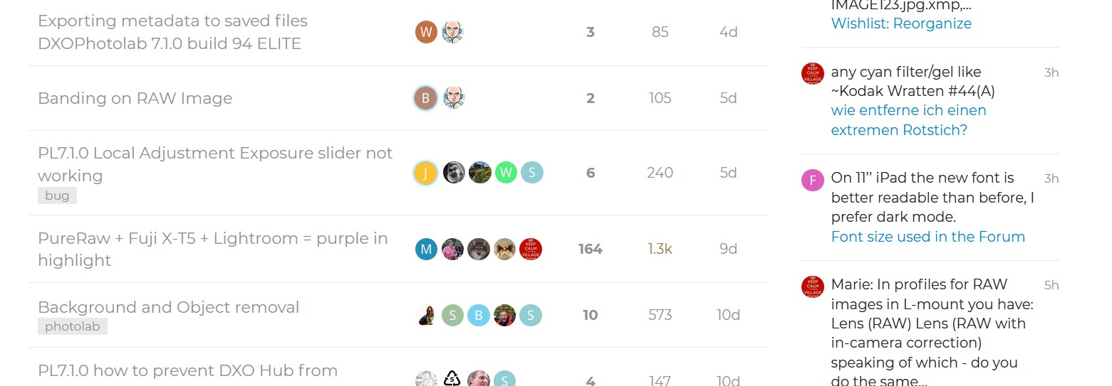
On 11’’ iPad the new font is better readable than before, I prefer dark mode.
As an example of the problems created I looked at two forums here and dpreview.
I took screen copy of both on my phone and some on the PC. In both light and dark the DxO forum is poor, on my phone nearly unusable for me and not good for my wife who has good eyesight. This is on a 22Ultra that has a good and large phone screen. Its improved on the PC screen but not everyone has, can afford or even has room for bid screen but the DxO forum wasn’t anywhere as clear as the dpreview one just improved on the appallingly poor phone screen (using the DxO Forum app).


Black theme fits, light theme is not easy to read (glasses wearer). Size of the fonts is relaxing if you work many hours on high-resolution photos ![]()
Looks to me like a “fix” to something that wasn’t broken in the first place …
I’m not happy about this change either … I played around with font-size (on Chrome), but found the actual problem is with text colour (now grey, and harder to see/read)
- Does anyone have any suggestions for how to fix the “fix” !?
3 Likes
In my view they have created the worst fourm dusplay I have atempted to use ever. When I was working we were creating an authority web sute and all the readablity/usablity guidelines have been busted with this new mess for meny of us.
Hi,
About the size of the text, just go in your profile settings and set the size you want from very small to very big.
Until now I didn’t find the setting to change the theme (on mobile). Will have a look later on Mac.
But I do not feel like complaining that much, it is still readable (I also wear glasses).
Cant find anyway on my aneroid, its the light text ang odd colours that make it so poor there in either version. And I do have visual problems I know but so do many others.
1 Like
Changing the size of the text is not the answer … that just makes the now hard-to-see/read text consume more screen real-estate …
- The actual problem is that text is not dark enough to see/read easily … and I can’t find any way to address this regression.
2 Likes
I dont like to say it but compare this mess to the Affinity fourms and you can see who takes there users seriously
We shouldn’t have to be complaining even a little no one else managed to create these forum user problems that have been created here. As John-M said it worked before why mess it up? It’s a well-known problem light text and there were complaints on the forum about DxO doing this in there programs and web site so they must have known (if they fallow what said here) that it was a problem for some.
1 Like
I recommend the complainers a brief visit of the Capture One forum and you will start running back to this one ![]() to me, this forum is one of the best in terms of readability and search functions. I was very pleasantly surprised when I saw the change in layout. Admittedly I read it on a big screen, not a tiny smartphone or tablet monitor. But even there, the readability now is an improvement over before.
to me, this forum is one of the best in terms of readability and search functions. I was very pleasantly surprised when I saw the change in layout. Admittedly I read it on a big screen, not a tiny smartphone or tablet monitor. But even there, the readability now is an improvement over before.
Congratulations to the team, I find the changes a massive improvement, well done!
I agree on “dark mode is a pain to read” - but only in daylight, in a dark room or at night it’s better than a super bright screen. And the button for it is well placed, the reaction happens immediately without refreshing, without being thrown out of a thread. Really well done job!
It’s not the new layout, dark- or light mode, @BHAYT but the sheer amount of text you love to press into a thread. Did you ever consider to write less than a full monitor’s height? ![]()
![]()
1 Like
If you are using one of the following:
Chrome, Edge, Firefox or Safari
Then install the Dark Reader Extension (https://darkreader.org/) if you are bothered about the font used on a site.
Two clicks and you can have the old sans-serif back.
If you understand CSS, then you can easily use any font installed on your computer. If you also use the Font Finder Add-on (Chrome, Firefox, other I don’t know), then you can easily see how the fonts are styled.
Then you can also post screenshots of how it could look as a suggestion for DxO.
Thanks that has helped somewhat. Really shouldnt have to use an addon to make a fourm unable! But cant get it to work on phone.
Taken it off it caused a lot of problems on other sites, pity no way I could find to just have it run on one site.
Well dear fellow, it will never be possible to please everybody at the same time.
That is why we always need some options, but most times people reply on this forum « no, no, I prefer they invest their time doing this or that ».
So, no options, I will adapt myself.
I am sure DxO teams is doing it’s best. Thank you for trying to bring some new breath in this place.
@JoJu The point wasn’t how good or bad the forum was in content or looks compared with any other forum but rather how the “light mode” had deteriorated compared with its previous incarnation.
This was obviously only true for me and some others who have commented here but everyone else either likes the new look or accepts that changing DxO’s direction is difficult and accepts the inevitable or perhaps they have all switched to “dark mode”.
I agree that the “dark mode” is useful and that the way of toggling between each is also good, shame about the new font in “light mode”.
@anon78744791 Thank you for the information about “Dark Reader Extension”, I am still using it but need to be careful since I now have 3 ways that “dark mode” cab be invoked which makes returning to “light mode” interesting!
I agree but in the absence of any ability to change the font and the depth of colour it was the only way to gain a little more clarity. The above snapshot was from the forum running with the “Dark Reader” and is much better for me.
This might help restrict the extensions scope
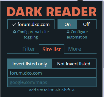
This restored forum text to what I was used to or at least what I feel comfortable with and the old (actually new) font is just an Alt + Shift + A away

Thanks will give it another go on the PC but can find no way of using it with the DxO app.
@John7 Sorry you have me confused, the extension is for web pages not applications what did you want to change in the DxO app (sorry wrong question I have a long list of changes I would like)?
I must admit that I don’t use the forum on anything except my computers.
Just tried it on my Android tablet and the new “light mode” font is tolerable and the new “dark mode” is good and for just catching up it it is fine.
Please rest assured @BHAYT I didn’t want to attack your position, I just made a bit fun out of your “never short of words” post. ![]() Also, it’s a bit early to conclude “everybody else appears to be happy”. I find the new layout an improvement, sort of modernisation – but I also found the “old” layout (and the functions of the forum) far superior than the dark hell of C1’s forum mess.
Also, it’s a bit early to conclude “everybody else appears to be happy”. I find the new layout an improvement, sort of modernisation – but I also found the “old” layout (and the functions of the forum) far superior than the dark hell of C1’s forum mess.