The font size in the Forum has changed !
-
much bigger = lesser overview
-
grey = harder to read
completely unnessessary
the Forum is about readability and exchange, NOT about “design”
checked with Firefox and MS Edge.
The font size in the Forum has changed !
much bigger = lesser overview
grey = harder to read
completely unnessessary
the Forum is about readability and exchange, NOT about “design”
checked with Firefox and MS Edge.
I think it is more readable in dark mode, set in preferences->Interface. There’s a size control there too. Light and dark also has as sun or moon symbol at top right in normal usage, next to the search or user icon.
and I hate that dark mode – the same thing with the online help(s)
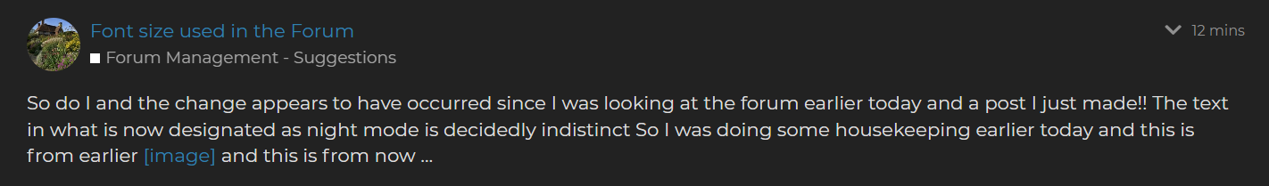
So do I and the change appears to have occurred since I was looking at the forum earlier today and a post I just made!!
The text in what is now designated as night mode is decidedly indistinct
So I was doing some housekeeping earlier today and this is from earlier
and this is from now
and I know which is better day or night and it is what was there before!
This new “look” is utter washed out rubbish and has the width been reduced as well?
@Aearenda thank for that piece of information, changing to large yields this
Which is slightly more readable for those that don’t like white on black when writing in particular!
Black on white is certainly more legible now that they have fiddled with black on white
PS: I got my references to day and night mode mixed up!!
Someone obviously decided to make the forum look more like the site and are now using the same font.
If using Chrome, Edge, Firefox or Safari, the Dark Reader extension is an option. It is not just for turning a dark mode on or off but also has brightness, contrast, sepia and greyscale sliders. So you can also do some editing* ![]()
Under the more tab there’s an option to select fonts. It can be easily set to be on or off for any given site.
*to avoid misunderstanding, it of course only changes css and not the overall colour of the window and everything in it.
I’m reading this in dark mode on Android Firefox and love the changes. Some forum functions such as muting topics work better now, too. Thanks, DxO! I was ready to leave this forum and am more interested in staying knowing that it isn’t being neglected.
Maybe not neglected but I wouldn’t say cared for either. This new style is poor.
@Egregius I could do that anyway with Opera GX
unfortunately it comes with the unnecessary changes to the “old” mode which don’t improve legibility one bit!
The “dark mode” has its place for reading and I could return to the smaller font for that but as for writing I don’t like it at all!
@Egregius Because they changed a few things with the forum format does that really signal anything new or rather meaningfully new with respect to DxO and the forum! (I just typed that in dark mode and it just feels so wrong!
So back to the old mode!
@stuck I agree.
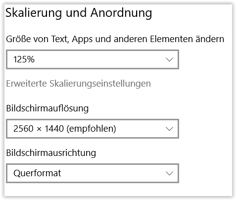
Hmm, I see what they’ve done now that I’m viewing the forum on my laptop, they have optimised the view for at least 2K res, as well as dark mode.
My laptop has a 2K (i.e. 2560 x 1440 pixels) panel. and on this device the font size is sensible.
On my desktop PC although my monitor is good, it is a Adobe RGB capable panel, it’s resolution is only 1920 x 1200 pixels and on that device, the forum is just plain ugly now.
Eizo CG2730 here
(calibrated to sRGB, ARGB, Native all w/ 5900 + 6500K + 80cd/m²)
satisfying resolution/representation since 5 years
I’m finding it very poor, yes give an option to make it unreadable if that’s what you what but let us with devices and and eyes that can’t deal with thew change a way o]f going back to a usable format!
Who knows right now, but something is better than nothing. I’m grateful for small favors and am trying to find hope amid the enormous letdowns of late.
Reading this on my desktop now, Firefox, dark mode, 1440p. Looks really good to me. I’m not saying that to dismiss the complaints here - I just want to provide another point of view.
For those with many visual imperments light text is a disaster as for many is the current use of white text on dark background. It effects vary according to many facters, level of lighting, size of imige as well as quality of the screen
Many more problems than black text on white. The current fourm gray on blsck using light sized text is very difficult for ma the worst of all worlds and for many other’s as well
I’d love to buy an Eizo monitor but my pockets are deep enough. Or perhaps my pockets are deep enough and it’s my arms that aren’t long enough ![]()
@Egregius and you are most certainly welcome to your opinion and hoping for better things to come (“a glass half full rather than a glass half empty”) I can certainly understand.
But although I may well use “dark mode” for reading I feel it adds to much gravitas to a post i.e.
or
The larger font makes it look as if it must be correct, as if its come out of an official document! For reasons I cannot fully explain I find that it discourages me from challenging what has been written, definitely the wrong thing for a forum!!
But like this, even with the larger font I don’t feel intimidated but actually don’t feel that the new font adds enough gravitas!
So @Egregius I may well be “weird” but the current font makes me less willing to engage with the posts for one reason and the dark mode “intimidates” me!
While I am sure that I will get used to it, that is how I feel at the moment, so rather than be “buoyed up” by this change as you obviously are, I am lamenting the change even on my old Dell 25" 2560 x 1440 monitor, and my two very old 24" 1920 x 1200 HP monitors.
The 25" is due for an upgrade, almost certainly to another 2560 x 1440 monitor (25" or 27") so if you have any candidates I should look at for my “Christmas present” then suggest away, i.e. I will need to fit the 25" + new (25" or 27") + 24" HP on my desk!
Get a wider desk this year, monitors will be better next year ![]()
You mean that I have also got to budget for a new, wider desk, which will require a new, bigger room which will require …
My current budget is about £250 to £300 and I am prepared to stay with 2K rather than make the jump to 4K and it will be considered as my “Christmas present”.
Your wonderful observation tickles my long-time interest in how/why we perceive things as we do. It happens that I’ve been moving away from smaller fonts lately, so am probably biased by that. Your experience, as you’ve described it, reminds me of the uncanny valley: feeling disturbed by a presentation that’s very close to an ideal but not quite there. The valley (a strong shift toward a negative reaction) is thought to represent raised expectations frustrated by now-glaring shortcomings.
@Egregius Sadly one reason for the larger font as we get older is that our eyesight changes. I have been short sighted since early teens but my short sightedness is becoming weaker so things I used to be able to do without glasses are now becoming harder to do, e.g. soldering.
I now need to use reading glasses for very close work.
My monitor is about arms length away and the larger version of this new font is easier to see that the “normal” version, and I work at the computer without glasses.
Now I wonder what springs to mind when I consider the above statement!
But I do feel a bit like that with the new font in “light mode”, although I am beginning to adjust, I think.
With the dark mode I feel I am being “sold” something which should not be “challenged”, it is cast in “concrete” and it has been cast correctly.
I am being “conned” by the appearance of the post but don’t feel I can challenge the con (but I doubt that will stop me and it is but a toggle of a switch to revert to the rather underwhelming font in light mode)!
If that is all I have to worry about then …
I experience the font as a bit too thin as well on my 27” Eizo in 2560x1440.
But the find it quite nice in Safari on my iPhone 13 mini. ![]()