In the ‘grain’ context:
Agree. That one looks horrible indeed, shame. Personally, I use only B&W grain and that works nicely in many cases, although I don’t like e.g. ‘Foma Fomapan 200 Creative’ (ok, it’s “creative”). I’ll stay with some Kodak or Ilford B&W grain.
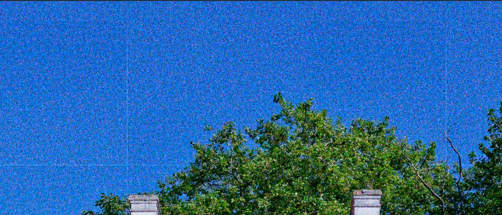
Sample for Lomography Color Negative 400 grain, 70% screenshot, Intensity=200, Size=10 (overdone to make the problem more visible):