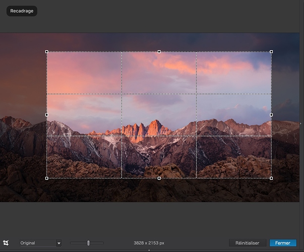
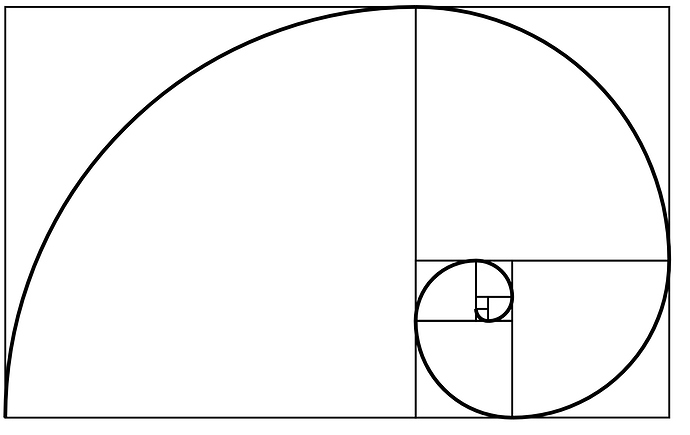
Currently PL2 offers only 3:2 grid for croping. Will be good if will be available other croping overlays like golden ratio, golden spiral, diagonals etc
Hello,
Like netrunner, I would like the cropping tool to evolve. Alhough it is now possible to choose crop ratio, the overlay remains stuck with thirds rule, when I think additional overlays will be very useful (golden ratio, golden spiral, diagonals as already mentioned).
Does someone know anything about this feature ?
I think this is a duplicate request. I’ve certainly seen this request before. If it is a merge would be nice so we don’t all have to cover the same ground all over again.
Short answer: it’s possible to create a single custom aspect ratio. It would be nice if PhotoLab would allow each photographer to save at least three or four common aspect ratios that s/he uses.
Adding a vote for additional crop tool overlays. It seems the simplest way to allow selection of the different overlays would be iteration (e.g. keep pressing a key, like g for grid or o for overlay) when in the grid tool to loop through the overlays available or maybe a number key associated with each overlay. I’m suggesting this to avoid additional menu clutter.
Maybe also save the crop tool overlay in profiles? Then a user of PL2 Pro could always have their favorite grid as a default by saving a profile and loading it as a default in preferences/general.
Gets my vote! The overlay is a great learning aid as well as an expert guide.
+1 for sure, little bit suppraised that PhotoLab doesn’t have this feature
While you’re at it - fix the crop tool so you can adjust the horizon by placing the cursor at the corner of the crop and rotating like, say, every other photo program in the world!
Welcome, @jpturner. Someone else suggested the same in another topic, so there’s interest. But it will need to become a separate request with its own votes.
I’m not so sure that would be a “fix”, jp … The current crop tool is very effective; providing much more than a simple “adjust by eye” approach.
Are you aware (just checking) that, once the Horizon tool is activated, you can ignore the horizon line provided and draw your own line between any 2 points - and the image will be aligned accordingly (?)
You can also draw a vertical line, in the same way - say, up the centre of a not-quite-vertical pole.
Regards, John M
As much as I like the idea of corner “handles” for rotation, I find the current use of the horizon tool and (auto) cropping to be perfectly fine.
As you say, moving the horizon line is far more accurate than trying to manoeuvre the whole rectangle to align it.
And when you combine that with the distortion correction tools from ViewPoint, I really am not convinced of the need for rotation handles at all.
Overall I am somewhat neutral on this topic, but there seems to be another element to this discussion that has not been touched on… sometimes you want to adjust by eye and not accurately…
The crop tool is very effective, and the horizon tool is very flexible and accurate, but crop tool provides immediate interactive visual feedback and the horizon tool does not. If the horizon tool is being used to align vertical and horizontal lines then this is fine, but there is another scenario that I often encounter outside of the “normal use case”, and that is “rotating a photo for aesthetic reasons”.
If I am rotating a photo for aesthetic reasons, as oppose to precise alignment of horizon / verticals, then the interactive aspect that the crop tool provides holds a distinct advantage over the horizon tool In this one use case I do miss having rotation handles in the crop tool.
Yes, that’s a fair point, Alun. In this scenario, I expand the Horizon tool (via the Palette) and Right-Click either side of the slider’s “pointer” - thereby nudging horizontal alignment until I get the look that I like.
John M
PL4 is out and I’m surprised there is no crop grid selection. 
Could you elaborate a little, Rob - - I’m not clear on what you mean (?)
John M
PhotoLab offers no variation in grids yet.
Lightroom lets you choose between these: https://www.pinterest.com/pin/139189444707804214/
Bonjour,
Recadrage selon les points d’or ou les lignes des tiers, pourquoi ne pas avoir le choix?
Cordialement, Martial
Too much choice makes a tool crowded and messy. Have a look at any of the Linux photo applications to find out what happens when developers don’t make choices and simply add every possibility and every option. Non, merci.
Sorry but you can add 100 options for the same tool and in the settings let the user « activate » the ones needed.
In this exemple, let the user choose several of many crop overlays in the settings (checklist). All of the selected ones will be available in the tool settings for the user to choose from.
You want one only one grid ? Fine, deselect all the others.
UI/UX is an art.
We are all different and we all use the same tool in many different ways.
Have a great end of the week 
Nonsense. Go and look at RAWthereapee interface or even Lightroom to see where too many interface options leads. You may want a cluttered hard-to-use tool, Marc. I don’t. There’s lots of photo editors with cluttered difficult interfaces on the market already.

