Creating B&W Photos - good techniques

I wanted to see what this might look like in B&W:

D3M_4067 | 2024-07-12.nef.dop (28.2 KB)

Now that it’s in B&W, I might make some changes tomorrow to make the hydrant stand out more from the background.

Anyone is free to work on this, and see what they can do.

Tomorrow, I will lower the camera, so the top of the hydrant is above the city skyline, instead of blending into it.

Oh, and I don’t believe I’m even writing this, but after seeing the image even this nice in B&W, my color interpretation now looks ready to ignore. There is something really special about B&W, that I wasn’t aware of before. The more B&W I do, the more I want to do.

Oh yes, one more thing, “Volume Deformation” (diagonal). With it on, the fire hydrant seems to leap out off the page. I’m not sure how or why, but in a way, it makes the image feel more “three dimensional”. Am I imagining this? I don’t understand it, but it’s a fascinating tool!

Instead of the perspective lens and camera, shy not use your current Nikon with the fold out “LiveView” screen to lower the camera to the preferred perspective?

1 Like

This is, what is known in the trade as a bad idea™

What you did is not what a tilt/shift lens is meant for and has given you more problems than it solved. You’ve even ended up with a shutter speed of only 1/20 sec, which has meant that the hydrant is not only blurred due to incorrect focus but, also movement blur.

You do realise that tilting the lens changes the plane of focus from parallel to a wedge shape that starts either under or over the camera and proceeds away from the hinge point at an angle to the film plane?

Here is a photo, taken with my Ebony, with the lens board tilted so that the tops were closer than the bottoms. It allowed me to have a much wider DoF at a smaller distance than would normally be possible with the front and back parallel…

This is because the “wedge” of sharp focus is wider at the bottom and the hinge point was around 8ft above the subject.

You will notice, with your shot, that the bottom of the hydrant is more in focus than the top. This is due to the slanting angle of the plane of focus. Never try and use a tilt/shift lens without a tripod with a spirit level head. Even then, with such a small viewfinder, life is going to be incredibly difficult. The only semi-sane method I would use is to tether the camera to a laptop and use the transmitted live view to check your plane of focus.

Don’t forget that tilt/shift is usually the domain of LF cameras with large rear ground glass screens and a magnifying loupe.


And, don’t keep on using ClearView Plus and Micro-contrast. This just increases noise and changes colouration. Stick with the four Fine Contrast sliders instead.

Joanna, I have no experience at all with a TILT shift lens, and certainly don’t (yet) understand your drawing, but maybe you didn’t understand what lens I used, probably because I did’t post a proper photo.

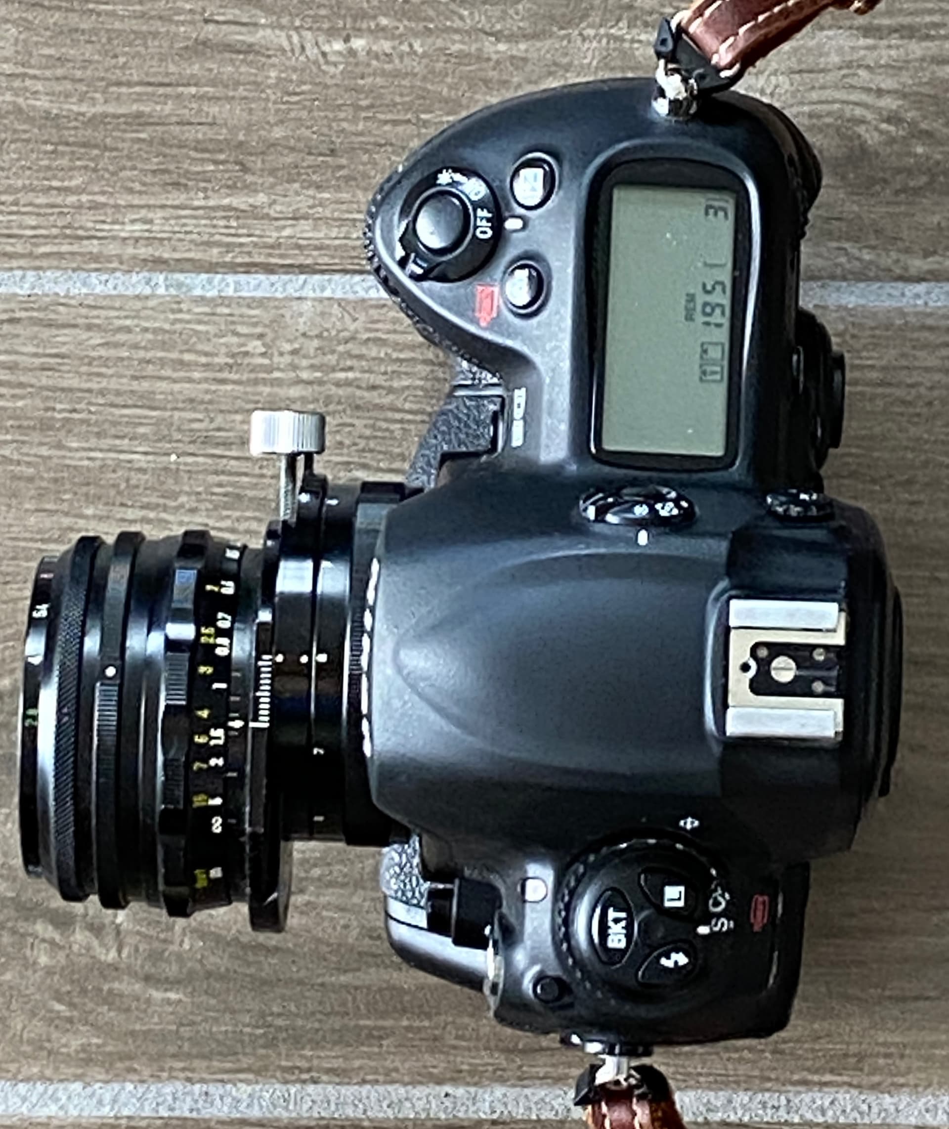
Here is what I used, on my camera, held vertically, shifting the lens DOWN:

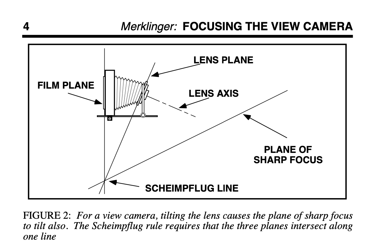
My understanding (which might be wrong) is that this will not cause distortion, vertical lines will remain vertical, and both the “lens plane” ad the “plane of sharp focus” will remain vertical.

The photo I posted does show the lens properly shifted, but there is a very different series of (expensive) lenses that allows both offsetting the lens, and “tilt”. I’ve had this lens since my Nikon F2 days, and while I think I’m sure about how it works, and I’ve used it before (rarely) I only held the camera parallel to the subject, to avoid the problems you illustrate.

I guess I need to re-read the Nikon instructions for the type of lens I have. And I never got a “tilt shift” lens, as I didn’t (don’t) understand drawings like what you posted - yet.

Now that you’ve posted this drawing, I guess I need to read about it, so I don’t just “see”, but rather “understand”. I don’t know why I would even want a “tilt” lens, but maybe it’s because of the ability to shoot from above, but look “down”.

To @smurray - I wasn’t sure the lens would work on my D780, as the lens is so old, but I already knew it works on the D3 which I used. Very old lenses (“non-AI”) can damage a new Nikon body, unless they are converted to AI. I’m 99.9% sure this lens will work with my D780, which will allow me to hold the camera lower and tilt up the viewing screen - but by the time I was thinking about this, it was already too dark. With all the practice shots I took, it was already too dark, which is why my shutter speed was so low. I don’t think my D3 enjoys high ISO settings, and while ISO 800 was fine, I didn’t want to go above that. It was just a test, and to look right, I either need to hold the camera lower - as in use the D780. All this is intuitive now, but was anything buy when I first walked outside last night.

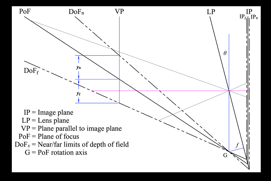
To @Joanna, no I did NOT, and do NOT, yet, realize that " tilting the lens changes the plane of focus from parallel to a wedge shape that starts either under or over the camera and proceeds away from the hinge point at an angle to the film plane?" I never learned this, but later today I will look it up, and try to understand WHY this happens. Everything in your illustration is clear, but I see no obvious reason why the “plane of sharp focus” is angled as show, not higher, or lower. I would have thought that the angle between the “film plane” and the “lens plane” would be equal to the angle between the “lens plane” and the “plane of sharp focus”. That sounds almost intuitive to me, meaning the illustration isn’t accurate - but maybe I’ll enter a new thread about this, as likely nobody (hardly anyone) here cares. If they weren’t so expensive, a viewfinder camera with a digital back would be a fascinating tool to learn with.

You did explain why tilted lenses can be useful:

I’m slowly beginning to understand what you’ve shown. Not sure if anything like this could work on a Nikon body. I’ll do a search later for Nikon lenses that both shift parallel to the film plane, and can tilt.

Only $1,000 or so:
https://www.keh.com/shop/nikon-pc-e-nikkor-24mm-f-3-5d-ed-ultra-wide-angle-lens.html?rrec=true#view-2

Yup, I assumed tilt/shift when yours is only shift.

If you don’t have a tilt lens, don’t bother. But, of you are interested, the line marked “Plane of Sharp Focus” does what it says on the tin. Because the front lens board is tilted forwards, instead of the POSF being parallel to the film plane, it moves to that line, which means that only objects on that line will be in sharp focus.

The reason this is so useful is because it allows everything from under the camera to infinity to be perfectly sharp, without having to stop down like you would with a parallel line.

I was going to try again with the shift-lens, now that it’s the next morning and it’s daylight. Nothing worked the way I wanted it to, using the D780 and bracketing, and trying to use LiveView as I couldn’t get myself low enough for the viewfinder, so as suggested I pulled up the viewing screen. Should have worked, but nothing was cooperating.

So I put away that lens and put on a normal zoom, 24-85. To move the distractions on either side, I moved back, and set the lens to 85. After a few minutes, everything was working well.

I may get a better photo than this with a moon-lit dark sky, but after a bit of (what is the proper term for “photoshopping”?) PhotoLabbing, I got what I was after, and edited it in both color & B&W. If there is a good moon tonight, maybe I can get something better.

Lessons learned, use the flip-up review screen to get the camera lower, use a longer focal length to separate my subjects on either side, and take several shots from slightly different viewpoints, so I can choose later which I want. Also, after a rainstorm, it might be possible to get a nicer photo - sure worked for me. Oh, and beware of birds pretending to be dust specs on my sky. It wasn’t obvious enough, so it got obliterated. :slight_smile: Silly bird…

780_6119 | 2024-07-13.nef (26.4 MB)
780_6119 | 2024-07-13.nef.dop (31.2 KB)

Color image is fine - but I need to raise/lower the camera a little for the B&W image to separate the hydrant from the background.

Your first photos had shadows from the lighting. These seem flatter to me, loosing “character”. What features do you see in the hydrant that give it character, and how can you use the best natural light to make these features mor obvious in the photo?

What DoF do you want with respect to the background buildings and the lines in the bricks?

Time out…

All my good (?) intentions went out the window when this happened.

780_6122 | 2024-07-13.nef (29.8 MB)
780_6122 | 2024-07-13.nef.dop (13.0 KB)

Ain’t nuttin I’ma gonna do, that will top this image.

It ought to be darker, as the sky really was turning dark.
Maybe tomorrow I’ll have second thoughts, who knows.

Features in the hydrant? The rough surface texture, the wear and tear. the nasty chain, the ugly base, and the details that don’t show up without enlarging the image.

  • Lighting - I could try my flash, but I think that would ruin the image. I’ve now tried day, night, dry, wet, but no matter what I do, it’s really just a snapshot of a hydrant - until the now-blurry people came along. I wanted Miami to be blurry, and ditto for the people, which I got.
  • Depth of field - the hydrant sharp, the background very blurry, and the bricks getting less and less sharp the further away they are.
  • I didn’t intend to use the color and texture of the sidewalk, but it makes the hydrant stand out even more.
  • I did NOT want the street light to be in the photo, but it worked anyway.
  • I did want to exclude the bench at the right, but all I could do is minimize it

For me, the “texture” which I can increase or decrease with sharpening, but if I go too far, it looks ugly.
I’d love a beautiful sky, but without “cheating”, I don’t know enough about how to improve it without damaging other things.

The initial goal was B&W. Tomorrow morning I’ll try, but I don’t expect it to surpass the above image. Time for sleep now.

I was too curious to go to sleep.
Here’s a rendering, using a film I never heard of, in B&W:

780_6122 | 2024-07-13.nef.dop (26.7 KB)

Indeed. or not.

I took your image and removed all the extraneous nasties like CVP and Micro-contrast. How many times do you need telling?

Then I added a blue filter at +50 to darken the hydrant and lighten the background, separating things a lot better without losing the context.

Now you have a quite reasonable B&W. Altering your shooting angle will be difficult and could look unnatural.

At last!!! This must be one of the best “art” photographs you have shown here :clap:

Here is my version with minor adjustments…

DOP with my version added…

780_6122 | 2024-07-13.nef.dop (15,4 Ko)

Comments…

  • just a tad over-exposed, so I lowered the highlight exposure, to retrieve the detail in the pavement lights.
  • adjusted the colour temperature to 5600°K, which slightly cools the background.
  • boosted the yellows (both saturation and luminosity) to counter the now bluish background, thus helping with separation.

Actually, including the lights on the side makes for a nice line of lights and I think, for once, cutting the light on the right in half provides a nice “terminator” to the framing. it also provides a context for the reflections on the top of the hydrant.

Nope, definitely not. This has something beautiful in the colour contrasts that is lost in B&W.


I’m not sure about the idiots in the background, not because they are there but because they are trying to take portrait photos of a landscape with their phones - duh! :laughing:

There is so many ways to achieve what you want. Playing with the Tone Curve and a slightly lower exposure, I made this in two minutes:

When working with Tone Curves, dont pull too hard on the controls…

2 Likes

They may be taking selfies with a fire hydrant and Mike figuring as background :innocent:

Aaargghhh!!! Coffee, spit, keyboard :woozy_face: :rofl:

Actually I like, when people like something.
On the other hand, if I see people making group photos against the sun, with no hope of shadow recovery, I may kindly advice them to look for good light and background first, or just let them “learn by pain”.

Slightly confused, but in a good way. I absolutely enjoy the way you included more on both ends - the people and light at the left, and the light at the right. I was thinking that this was adding extraneous things to the image that would confuse viewers, but you made both sides (especially the right) into book-ends. Your sky is certainly more impressive - I need to figure out how you did that, also making it darker, and try it on my own. Agreed about the light at the top right and the reflections on the hydrant - I never even considered that.

I need to remember what (and why) you did these things in the future.

My “failings” are not because I am “old and senile” (although that might be part of it) but I don’t think I’ve ever thought things out so well as what you describe. Most likely "practice, experience, and ability) which you have in abundance.

I wonder if @swmurray was already thinking of something similar to this, when he “prodded” me forwards beyond my past ability" But for that comment, I might have given up.

@mikemyers:

I like where you are going with this photo. :+1:

It’s also nice the see you thinking about composition, framing the shot and the “meaning” you wish to convey with your photo. (All that pre-visualization stuff :slight_smile: )

Random riffing on the landscape article from the other thread…
The serendipity of placing people into the “background” helps to really give the photo some “life” and context of scale (in our mind we know people are taller than the hydrant so the relative sizes in the image help us “see” depth". The choice of DoF and lines in the pavement in balance with the horizon seem to complement this.

@joanna’s use of a blue filter was a great suggestion to bring out the color contrast. Coming from LR/PS (or bad habits) I tend to jump to selections to create contrasting color casts. This is a good tip for me to consider too. Thank you!

Joanna, getting back to your illustration of a “Scheimpflug” line, I don’t understand it.

I suspected the angles between “film plane” and “lens plane” and between “lens plane” and “plane of sharp focus” would be equal?

I looked it up via Google, and got this:

On both your illustration, and the one I just copied, following the line that leads to PoF (point of focus?), the angle between the lines above and below it are nearly equal, not the case with your illustration - leading to "DoFf, and DoFn.

I suspect that what these shows what angles above and below the center line will be sharp (the range of sharp focus?).

I might have garbled things, and gotten my mords wixed up.

Anyway, while you are standing there with your view camera, do you just have the lens pointing to the middle of the subject, realizing above it (further away) and below it (closer are going to start getting sharper? How much do you know for tilting the lens? Or do you just watch the result on your viewing screen?

Shouldn’t the aperture be involved, as f/2 won’t get the results f/32 can achieve? Also, the tilt angle of the lens?

To say I am lost would be an understatement. (But since I don’t have a tilt lens, and don’t have any plans to buy one, none of this is really relevant for me. Just curious.

No real need to answer, unless you can somehow give a simple answer, that someone standing there, wanting to tilt their tilt-lens, might want to do.

With a non tilt lens, I would hold the camera level, and lower the lens until both the top and the bottom of what I’m shooting at will both be in the photo, knowing vertical lines will remain vertical.

Read the image you showed yourself!!!
Plane of Focus.

George

1 Like