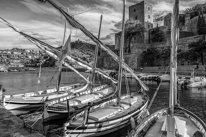
Hi Jeff. If I can be constructively critical - this looks a bit “overcooked”, with halos around the edge of the sky. It looks like you used ClearView Plus?
Can you make the original available? I have been playing with PL8 and, in so doing, have also discovered a technique for avoiding those halos in PL7, which may or may not work with this image but could be worth a try.
If you don’t want to publish it generally, then would you send it via PM?
can’t
Hi Joanna, could you publish the details, please ? I can’t yet decode .DOP or preset files.
??? I was asking Jeff for the original file, without which the DOP is useless
It’s micro contrast in SFX I think. I’ll have another go at it. I too, have a perennial problem with halos, which I usually fix with masking the edges in PS.
Please don’t shoot me, but the original had a LOT of detail that is now lost. I miss that detail, now that I’ve seen it.
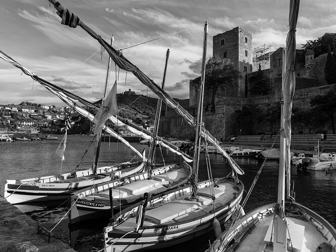
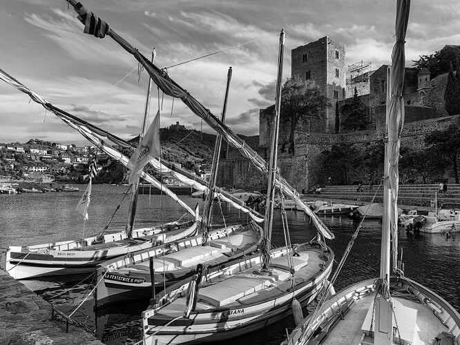
No idea why the two versions are different - maybe you could do an in-between version that keeps the both part of each of them?
If I was going to hang one up in my room, it would be the first one. That is my preference. It shows so much detail.
The big question is which do YOU prefer?
There are lots of things to consider, but the first one you showed has detail every place I look - almost too much, maybe, but for me, that’s my favorite.
Hi Jeff
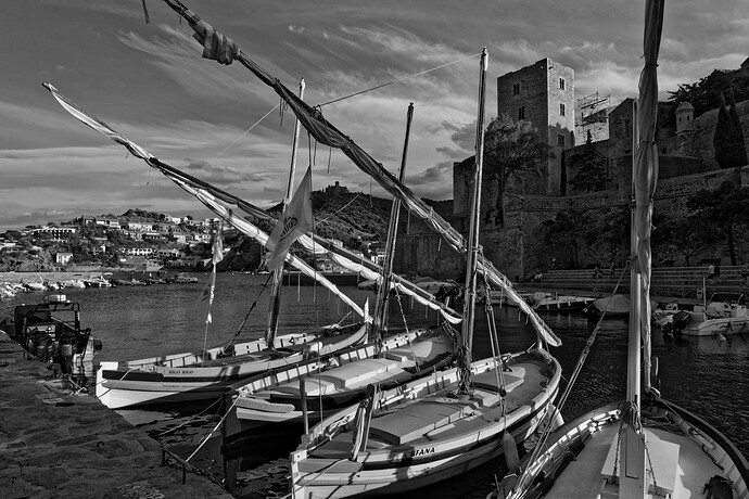
By using the Fuji Acros 100 emulation and a red filter to darken the blue sky, but no local adjustments, I ended up with this (with no halos)…
Here is my DOP from PL7…
_DSC9996.NEF.dop (13,9 Ko)
I tend to prefer “deep” blacks, but with detail, which is what the shadows fine contrast slider gives me - a sort of sunsety/sunrisey sort of feel.
Nice interpretation!
There is something “magical”, almost multi-dimensional, about the very first image posted here, which is lacking from the other editing attempts. I suspect Joanna’s last post is technically the best, but it still loses the “magic” from the first version. That last version is “just another beautiful photo”, but it lacks something from the first version which I feel is very important. The first one almost seems “alive”, rather than “static”. Not sure how to correctly describe this.
I suspect we need to learn again how to look at B&W photos, Mike. You and I are both old enough to remember when they were - for just plain folks - the only kind. And even in those days there were professional quality prints with a great tonal range, and the rest. The latter, of course, in the majority, outside the cinema. Well, OK, we’re not quite old enough that B&W were the majority in the cinema, but …
My colour-oriented eyes are a little threatened by the dark tones in @joanna’s version. But her boats have the hit-you-in-the-eye emphasis that I have to look for in the original.
But, as you say, we can all experience the same photo differently.
Memories, my huge 4x5 Simon Omega D2VXL (I think), dodging, and burning, and twisting the paper easel, and then using the most appropriate paper - now it sounds like “work”, but that was just how it was done back then.
I think I am still more attached to B&W than to color, after all these years.
My thoughts on images taken around sunset, is that the shadows should be a lot darker, but with full detail. The problem we have is, because our eyes adapt to high contrast, our brain constructs an “HDR” memory and we forget how images need to look to represent the impact of the contrast we actually saw.
@jeffholdgate I forgot to say, but I prefer your second version to your first but, for my interpretation, it lacked a tad of impact, hence my effort. Or maybe I just assumed you took it later in the evening.
Oh, and by the way, I must say this is the kind of image I would hang on my wall ![]()
I remember how struck I was, when I worked in Aix-en-Provence a few years ago, with the intensity of the Mediterranean light and the vividness of colours. Something it is hard to explain to someone who has never experienced it. Looking at Paul Cezanne’s paintings, you might think the colours are over-emphasised but, having had to use filters to try and “tame” the light for Velvia 100 film, I realised he wasn’t so far off. Trying to realise that visual impact in B&W needs careful and thoughtful work, sometimes leaving the image to “mature” for a couple of days before coming back to it and maybe reworking it.
Absolutely.


