Today was one of those days when the sky was constantly changing, from full cover to partial, with all sorts of different textures. Here are a few from an outing to Locquémeau this afternoon…
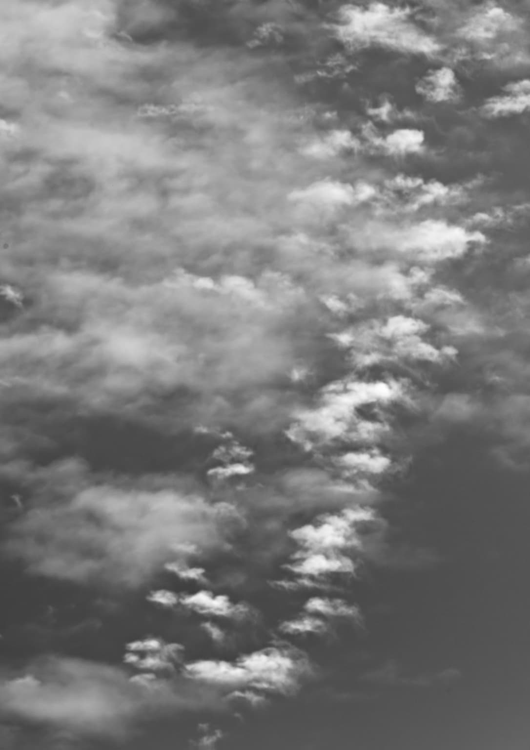
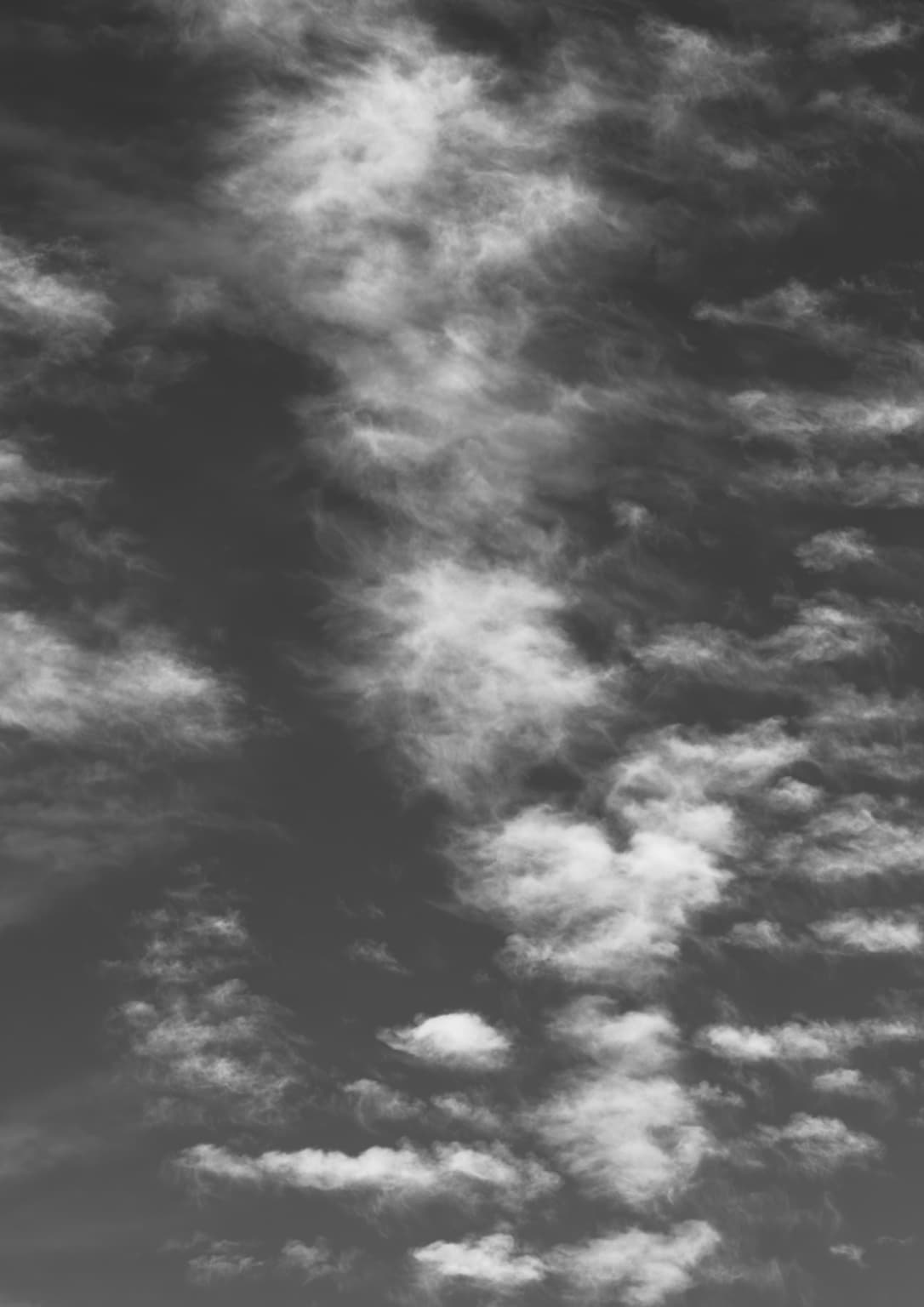
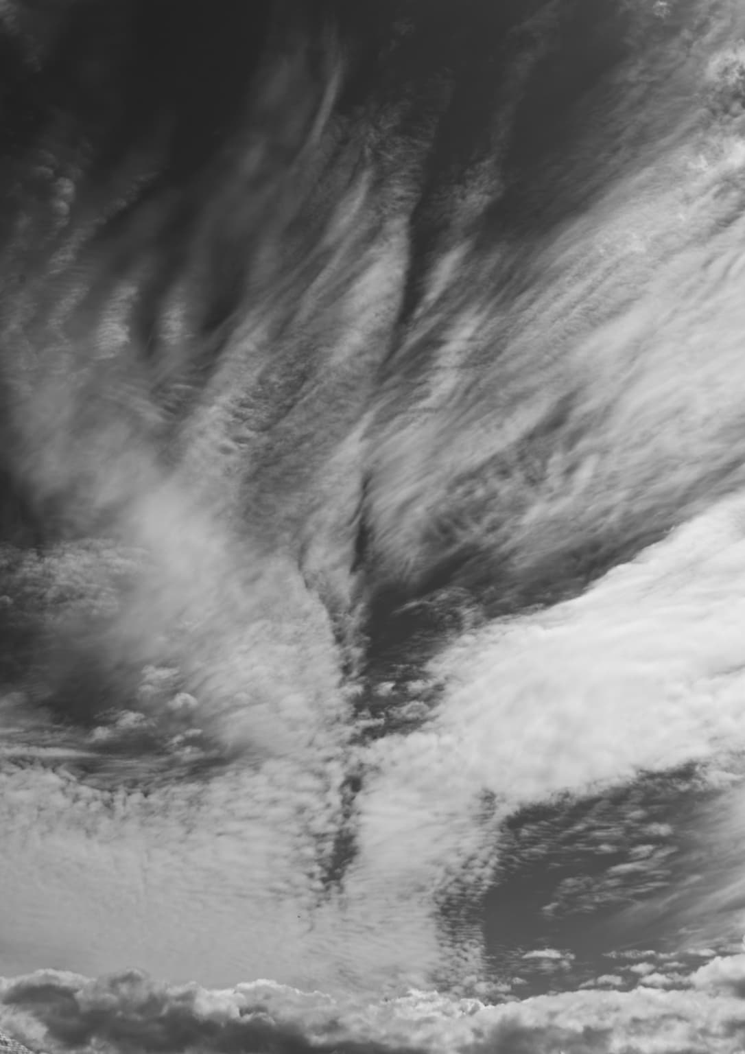
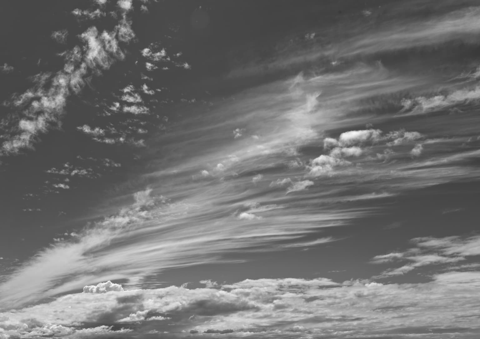
I like them, particularly the last one.
Is this the time of the year?
I have been taking images of wonderful clouds for the last week and some of them converted to B&W.
One of them is printed already, the second one I am working on right now, not quite satisfied yet.
I can not post them here I am afraid, I used my iPhone to capture them and so they are not processed in PhotoLab 
Sure you can! As “chat”! Just explain in the new thread how you captured them.
Joanna, I can’t help it - for the first two photos I feel like I’m in an airplane looking down. Third photo feels like I’m standing in a hurricane! Gack!!! Last photo, beautiful as it is, I feel so disoriented - the clouds at the bottom help me keep my feet on the ground, but the top of the photo makes me feel “dizzy”.
Clouds in Miami never, ever, seem to look so exciting. Here they are just plain boring.
Is Locquémeau near a large body of water?
Google Maps is your friend
I never heard of this place, but there are lots of photos posted on-line from there.
You could wear out your camera shutter in a place like this!
For me, it’s USA, India, and maybe back to Thailand again.
I’m getting too old for long trips.
…but the clouds in this photo are in color. Doesn’t really belong here.
What lens do you usually use to photograph clouds?
Done! Photo deleted.
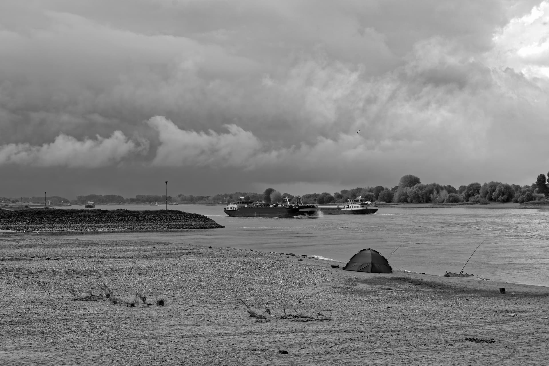

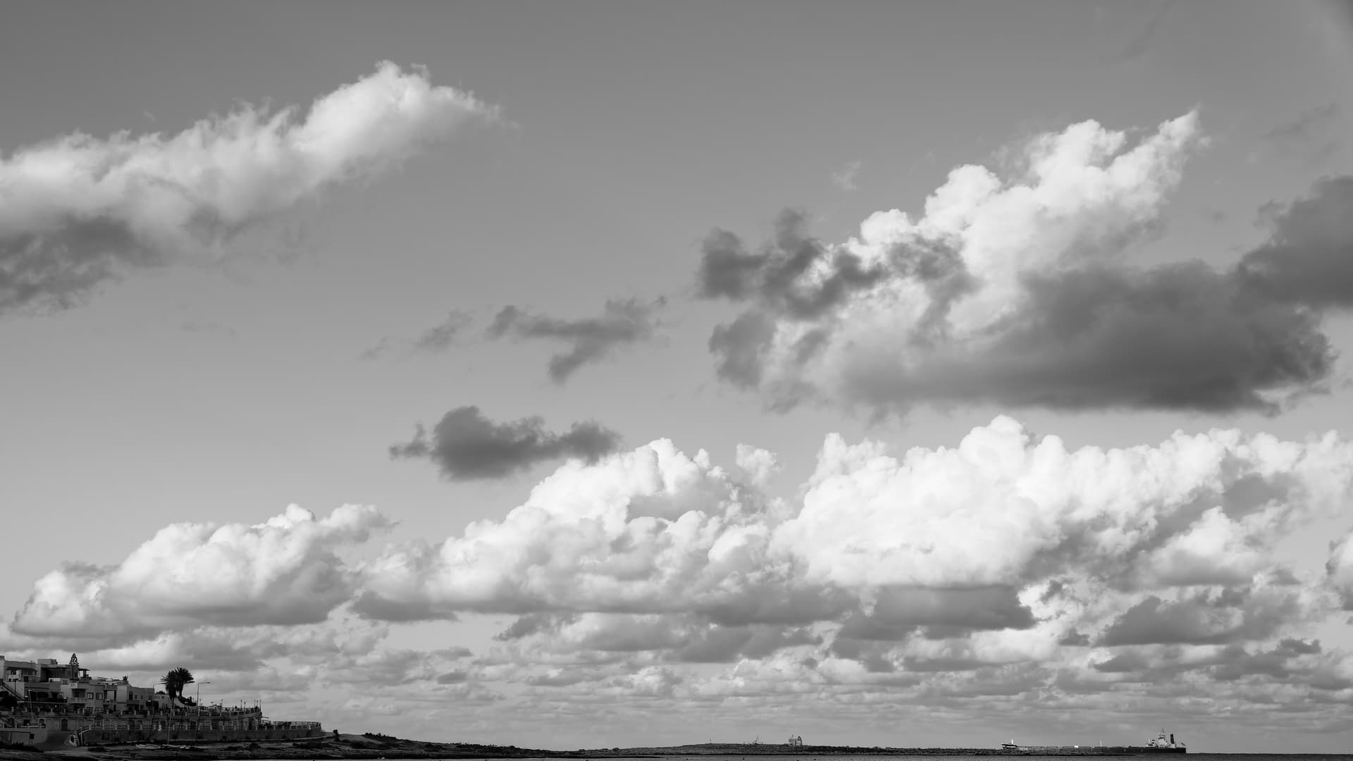
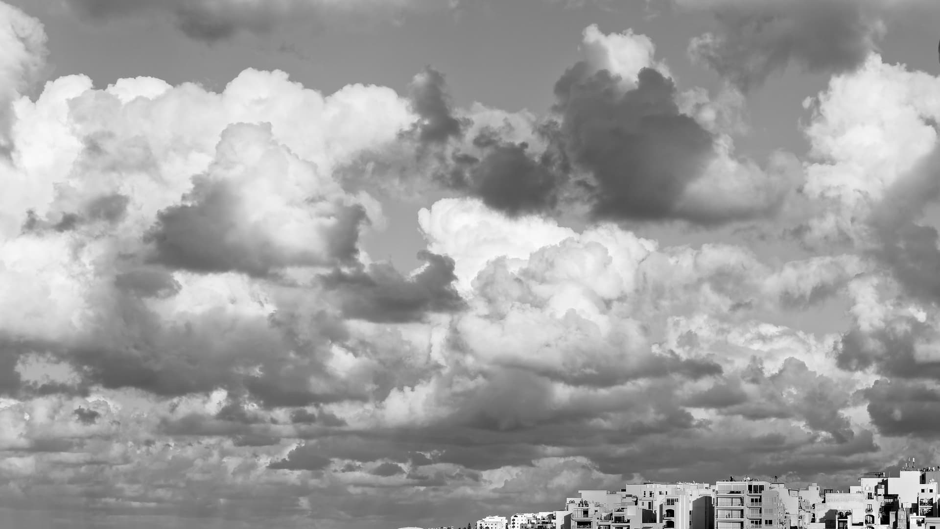
Make use of the channel mixer.
I would recommend either showing a bit more of the foreground, to give a context of scale, or cropping to just the clouds.
And by using Micro-contrast instead of fine contrast, or even a local adjustment with just contrast, you have made some of the edges a bit “harsh”.
Before doing anything else, use a red filter on the sky to provide better contrast of the clouds to the blue.
If you haven’t got FilmPack - quite simply, get it. We use it all the time for B&W work.
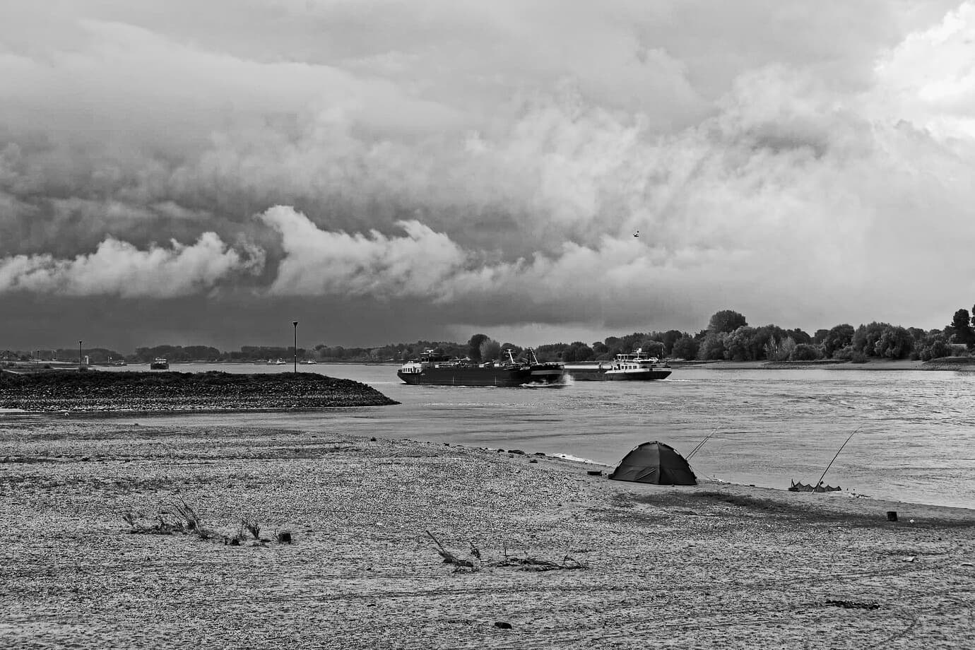
The difference between those three images, and Joanna’s image, to me, are the difference between “over-done” and “natural”.
For me, it’s difficult to draw the line between “too little” and “too much”, but I usually end that internal argument by considering how plausible the images look.
@Joanna, thank you.
I myself find it a little overdone. In the foreground the contrast becomes unnatural i.m.o. It is difficult. A shower was coming and not a heavy weather. In the right uppercorner a little part of the air was blue.
That’s due to the low resolution, preprocessed version you posted. Sorry. It was just an idea. The choice as to any final version has to be yours 
@Joanna, I really appreciate your comment!

@Joanna ,
Preset: optical corrections only
Horizon corrected
Red Filter Density 150
Micro Contrast 16
Crop 16:9 ~2/3 rule
In my opinion: looks not to bad. 
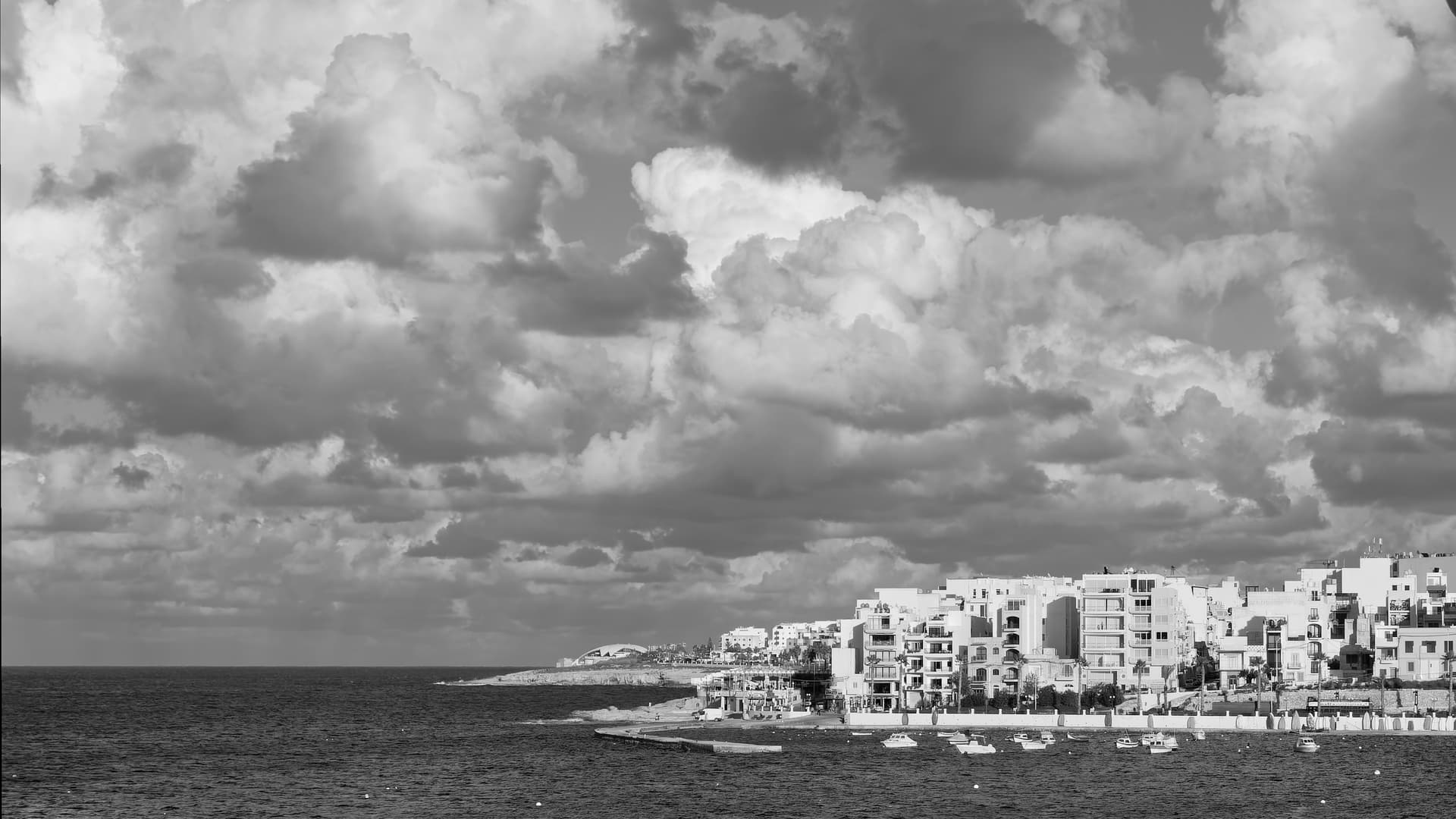
@Wolfgang
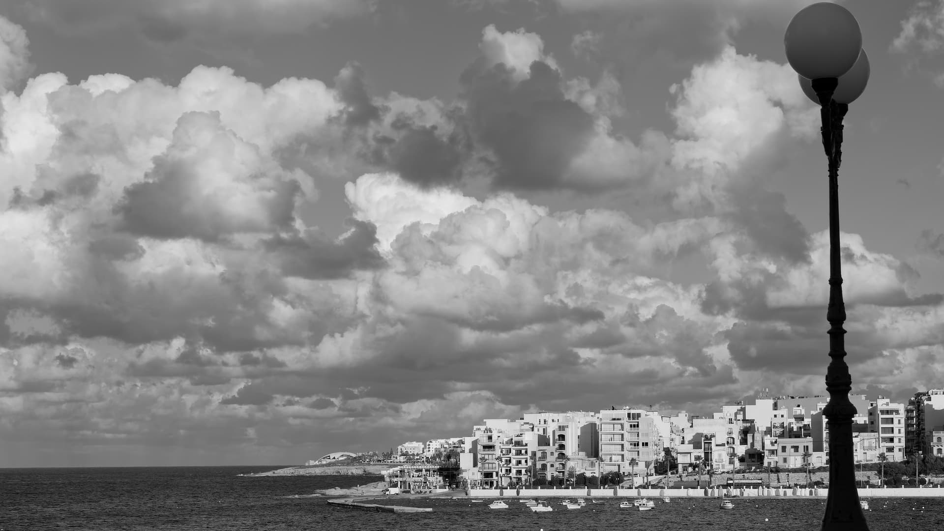
Preset: optical corrections only
Horizon corrected
Channel Mixer: Cyan -50, Blue -50
Micro Contrast 16
Crop 16:9 ~2/3 rule
Channel mixer is a good option to play around with.
Thank you
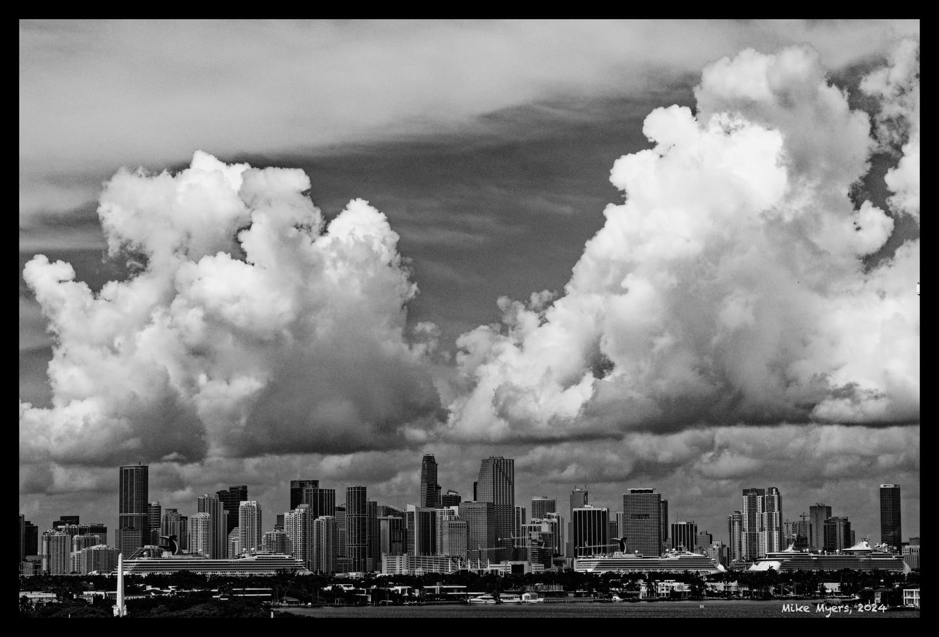
Now, that really is an image of clouds over a city, rather than a city with clouds 