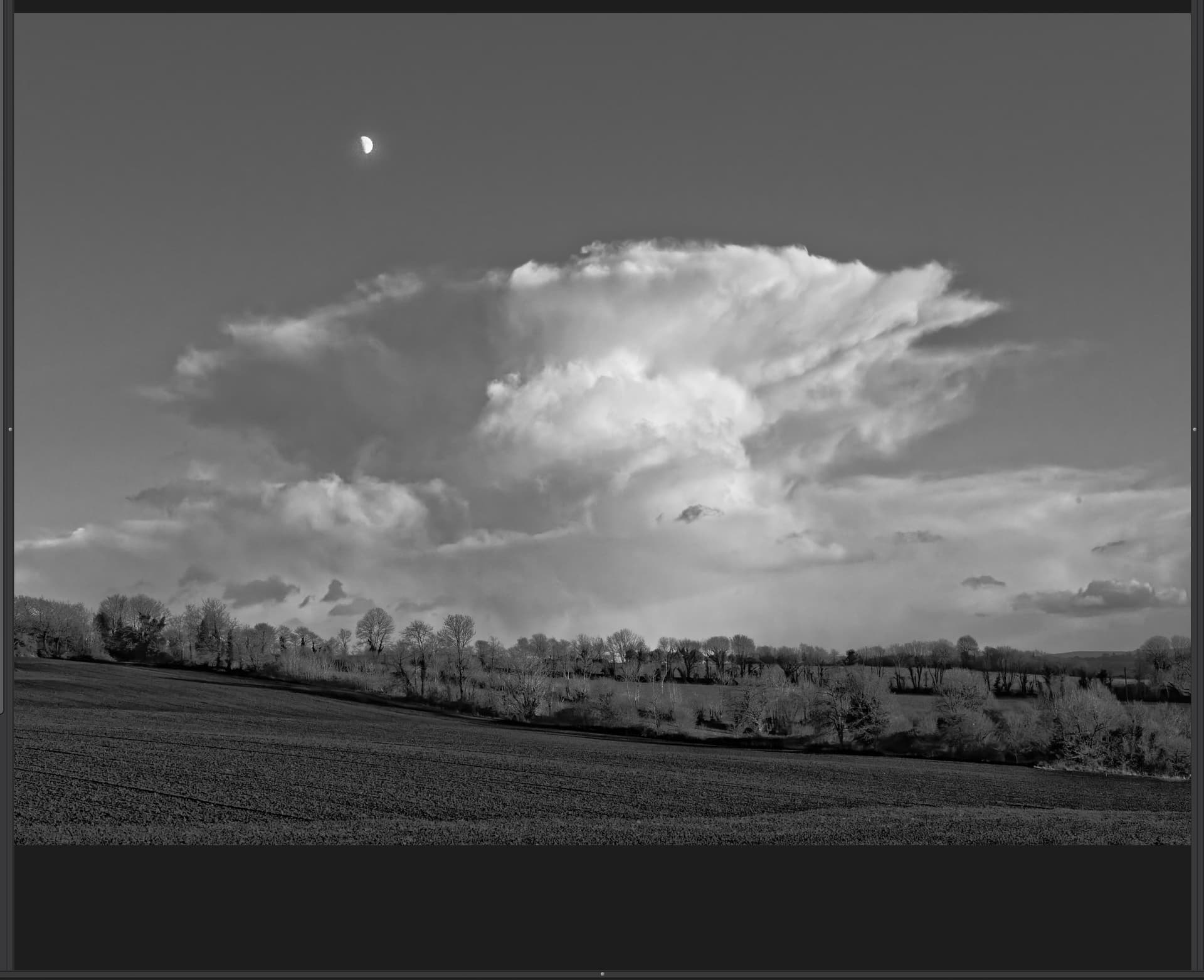
I know these things can be a matter of personal preferences, but I tend to find that the clearview algorithym creates too much grey in clouds.
It can be an interesting effect, but I tend to end up doing a graduated filter on the bottom part of my Landscapes to just apply Clearview to that. I would just like to see what other people think and maybe open a discussion
Absolutely. Clearview can quickly become too aggressive!
That’s OK though, masking is currently in vogue, so it makes sense to not apply it at all (or sparingly) as a global setting and only bringing it in on your subject, or specific areas.
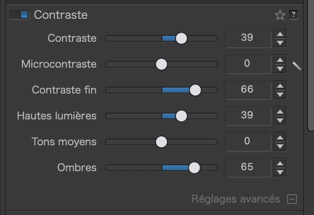
With ClearView Plus, a small adjustment goes a very long way. I find that there usually isn’t a need to apply more than a little bit, even as a local adjustment. It’s meant primarily for bringing out detail in hazy scenes. I’m more bothered by the color shifts it produces in ground features (concrete, sand, sometimes grass, water) than the darkening of clouds. Besides applying it locally, another option is to instead apply a combination of “fine contrast” (an adjustment available with FilmPack) and “contrast” to a scene. It accomplishes much of the same effect without the color shifts.
In my view, the ClearView slider could be recalibrated (perhaps optionally).
I think the highest I have ever taken it was 20. Most of the time I ever use it it’s below 10. It would be more meaningful to me if the full slider deflection was equivalent to the current 20.
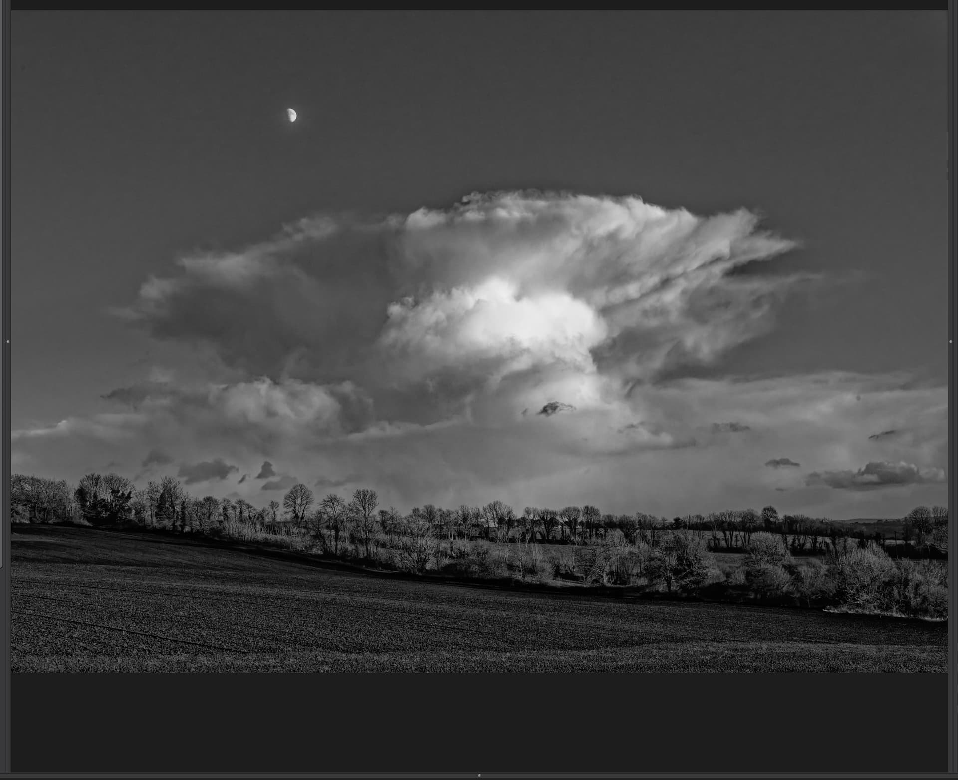
As can be seen in the histogram, ClearView naturally collapses (or rather compresses) the bright areas of the image. By gently increasing the highlights and midtones in Selective Tone, you can get a hyper-realistic rendering … depending on what you want, of course.
Wile clarity mostly adjust saturation for shine of colors ( like finish over paint) is dehaze a tool for adding blacklevel to darken the white glow over a image. Like a dustwhipe.
Clearview plus suppose to be spreading the backdots not equaly over the image but more where its needed and less where it issent.
Problem is artefacts and dropdown of any color aka blacked. Ive lensmodule active which uses microcontrast as lens sharpner.
Ive cleawview preloaded to max 15.
On better? Go on with adjusting.
On worse? Off again and other approache.
Dehaze is also possible with tonecurve module without the sharpening effect microcontrast does.
Clarity of colors is also possible with fine contrast and some saturation fiddling.
Local adjustment us an other aproache.
Using building block to build the house instead of prebwalls so to speak.
I have just one example with Clearview higher than 20 ; this one.
A photo taken from an airplane through the window, at a 45° angle and through three layers of scratched plastic, from a distance of 80 km.
Unshowable without reprocessing.
Otherwise, my use of Clearview does not exceed 10 to 20.
I agree that I would not want to lose the ability to go more than 20% because I have also sucessfully procesed from airplane shots and that needed a more agressive setting.
As I said in my original post I tend to find that these days I use it in combination with the graduated filter so that I can use one setting on the foreground and one on the clouds, but it has been very interesting to read how others use the feature and their opinions as well
There’s no such thing yet, at least on Windows. IIRC, there was a feature request for that. Perhaps you meant negative Microcontrast?
Negative Sharpness is more delicate but may suffice sometimes.
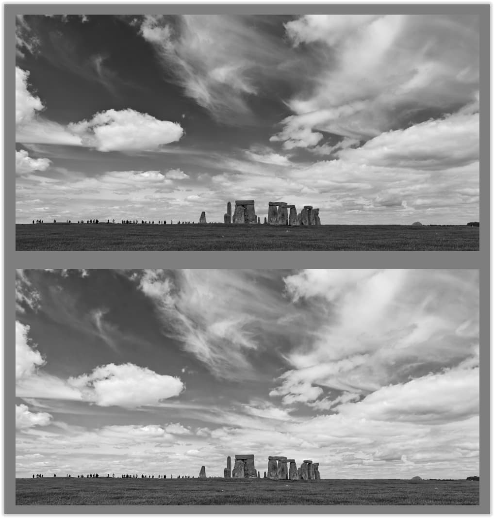
In both cases, I (also) used ClearView for the landscape. However, experiments showed that CV didn’t look good under cloudy skies.
And it wasn’t the grainy look that can occur in insufficiently noise-reduced images, but rather the formation of dark halos around the white clouds.
Furthermore, I dislike clouds that look like they’ve been cut out of cardboard and glued to the sky. Instead I prefer fluffy clouds with a clear, pristine white – not ones that are “crushed” by ClearView.