How do I keep my work within the classic working color space? It is, of course, easy to choose the version for a single picture, but do I really have to do this all over again for every single picture? Any way of applying classic to every picture by default?
Create a preset, then make that preset your default. (Remember there are separate default presets for RAW and bitmap (jpg, etc).
Thank you. I created a preset from a picture with “Classic (Legacy)” on and changed to this for RAW under preferences. I would have expected that every non-edited picture in the folder now would load in Classic color space. However, it still opens in “wide gamut”. Am I missing something?
Default presets are only applied when an image is discovered by PhotoLab the very first time. After that, you can select all files of the selected folder and switch to the classic WCS. This could be done manually or by a partial preset that sets the WCS ONLY.
You could also edit the.dop sidecars and automate the change…
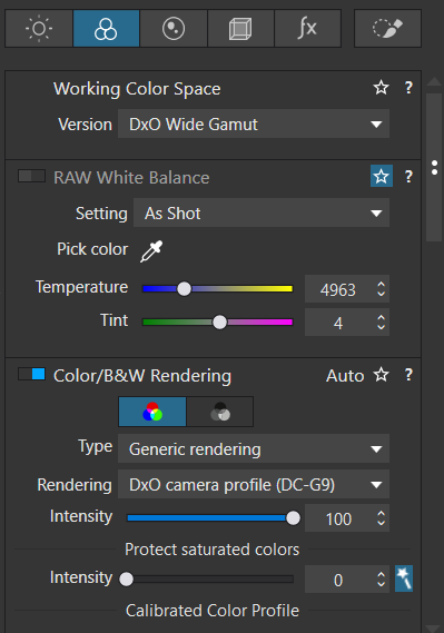
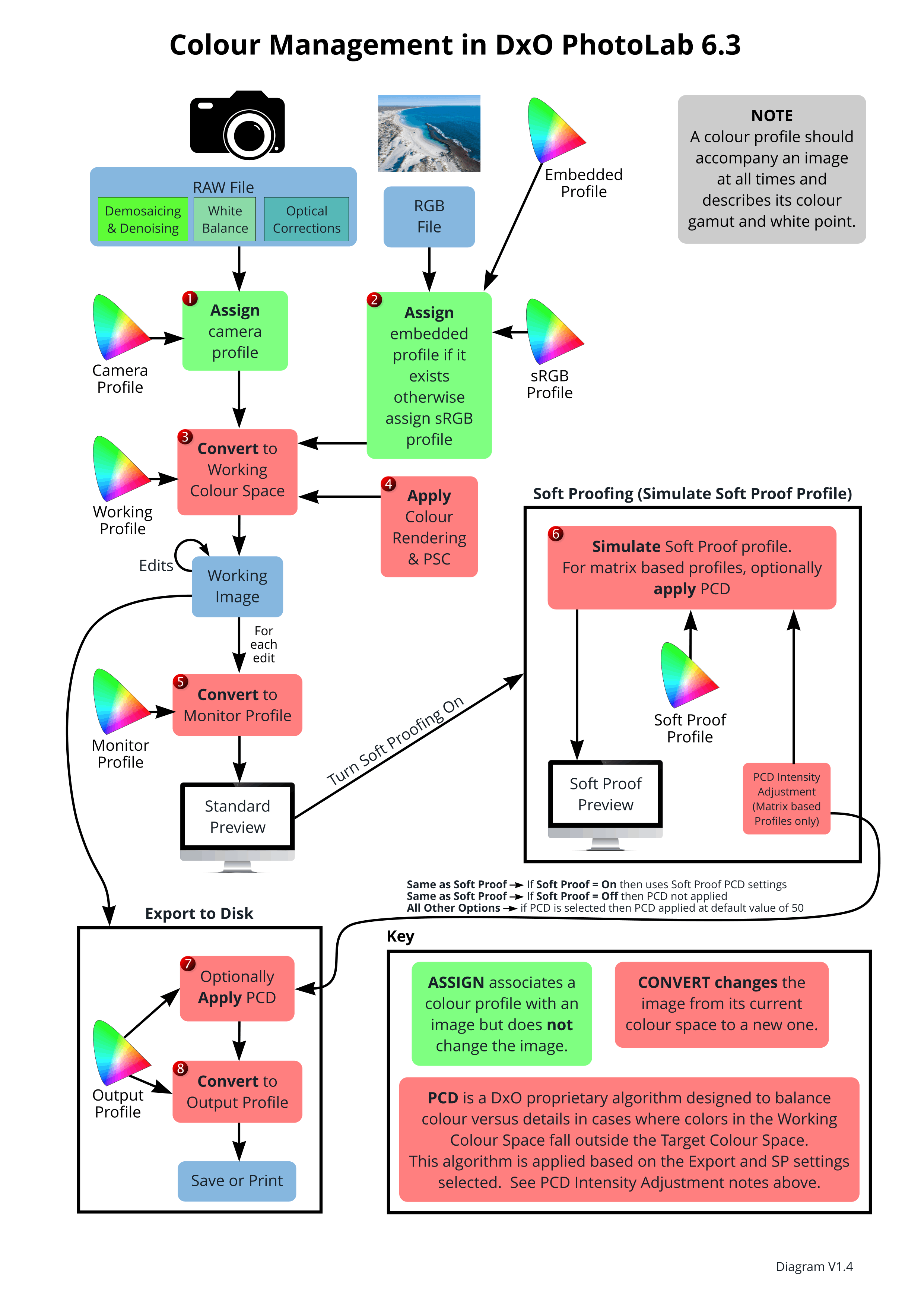
![]()
Caveat: The DxO Wide… WCS enables a few features that are otherwise unusable.
1 Like
@Bhard use a Partial Preset to change to the chosen colour space, i.e.
either
Preset = {
Settings = {
Base = {
ColorPipeline = "Classic",
}
,
Overrides = {
}
,
Version = "17.3",
}
,
Version = "11.0",
}
or
Preset = {
Settings = {
Base = {
ColorPipeline = "WideGamut",
}
,
Overrides = {
}
,
Version = "17.3",
}
,
Version = "11.0",
}
Contained in this zip file
Gamut.zip (709 Bytes)
and part of my Partial Presets library
Unzip and put the two presets somewhere easy to find and then import into your presets Library
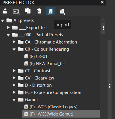
or simply copy them in place into
![]()
replacing my user name with yours etc. and restart DxPL (please note I am a Win 10 user).
Whenever you want to change Gamut select an image, [M]aster and VCs as required, or all the images in a directory and double click on the Gamut Partial Preset and all images should retain their edits but take on the chosen Gamut.
Please note @platypus’s warning because there might be a clash between a change of the Gamut and any features currently being used, i.e. try it on a small number of images first before selecting thousands and changing the Gamut!
Hope this helps.
Switching to Classic gamut will disable supplied LUTs, change available color Generic renderings choices, and disable all B&W Generic renderings; not sure if anything else (PL7.8/Win).
1 Like
@Wlodek Thank you for the details.
Both manual and preset made changes need to be done folder by folder which is not what the OP really wants to do.
Is there an easy way to automate the task?
Thank you. I tried with a new folder of pictures. Loaded as Classic, now.
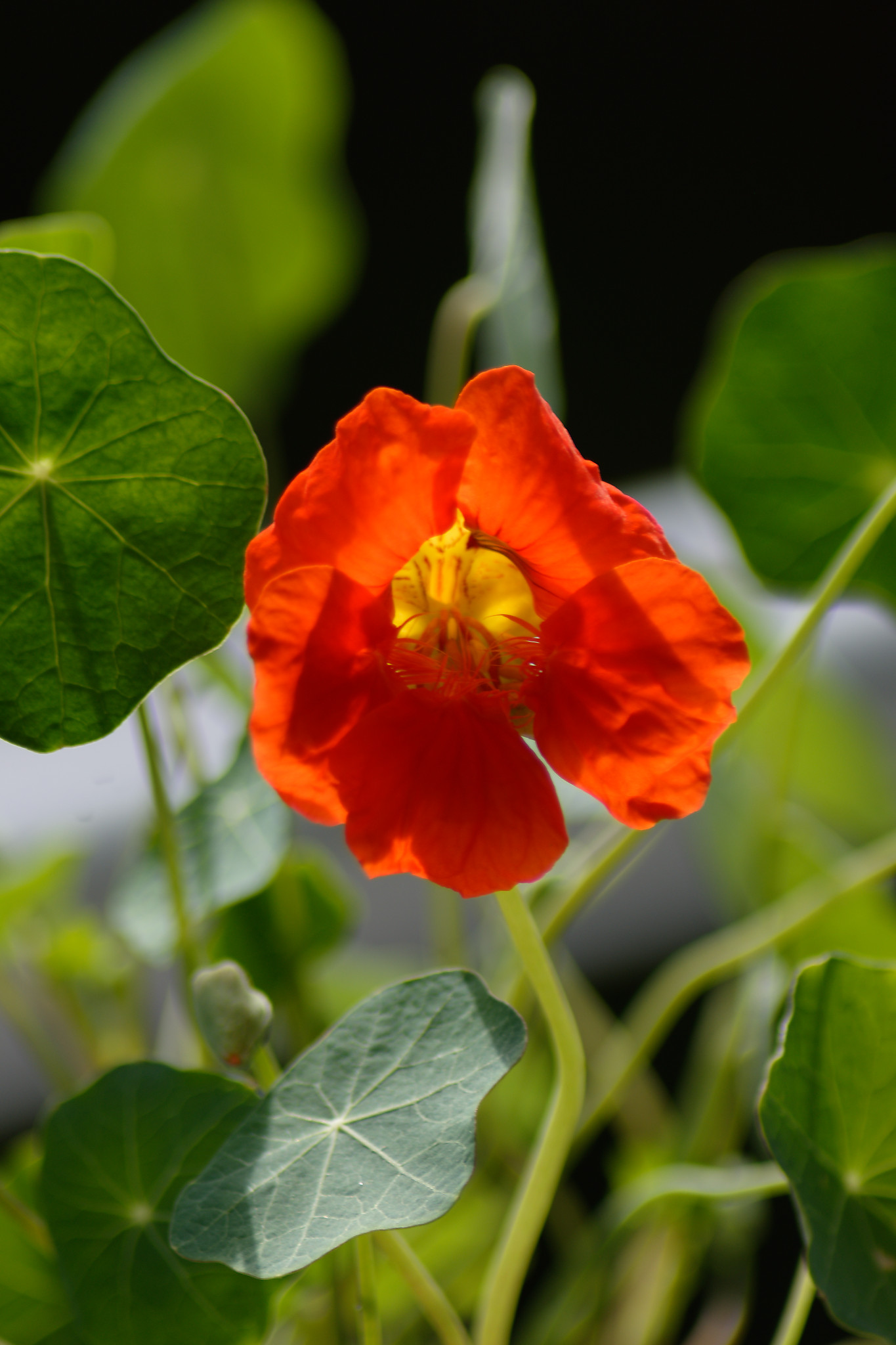
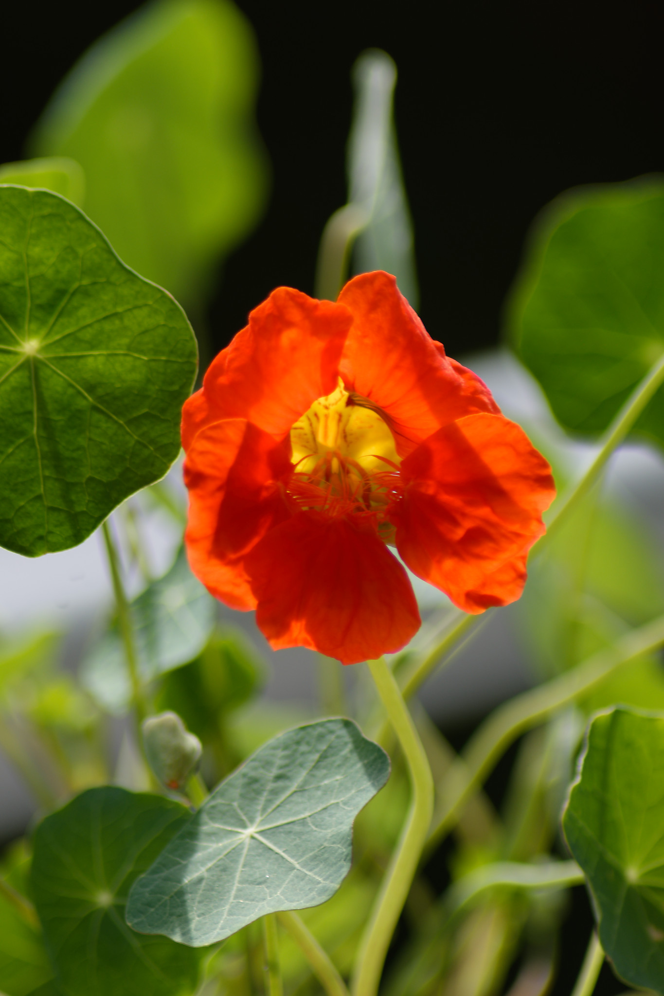
I could add an expanation of why I want to do this. I had an orange flower that looks right with classic on, but intensely red with wide gamut on. Not a good starting point for editing. The reason may be that I am working with a very old monitor (calibrated with SpiderX Pro).
PhotoLab’s colour management somehow struggles with the hues near the red corner of the gamut. The new colour space includes more hues and handles saturated colours differently.
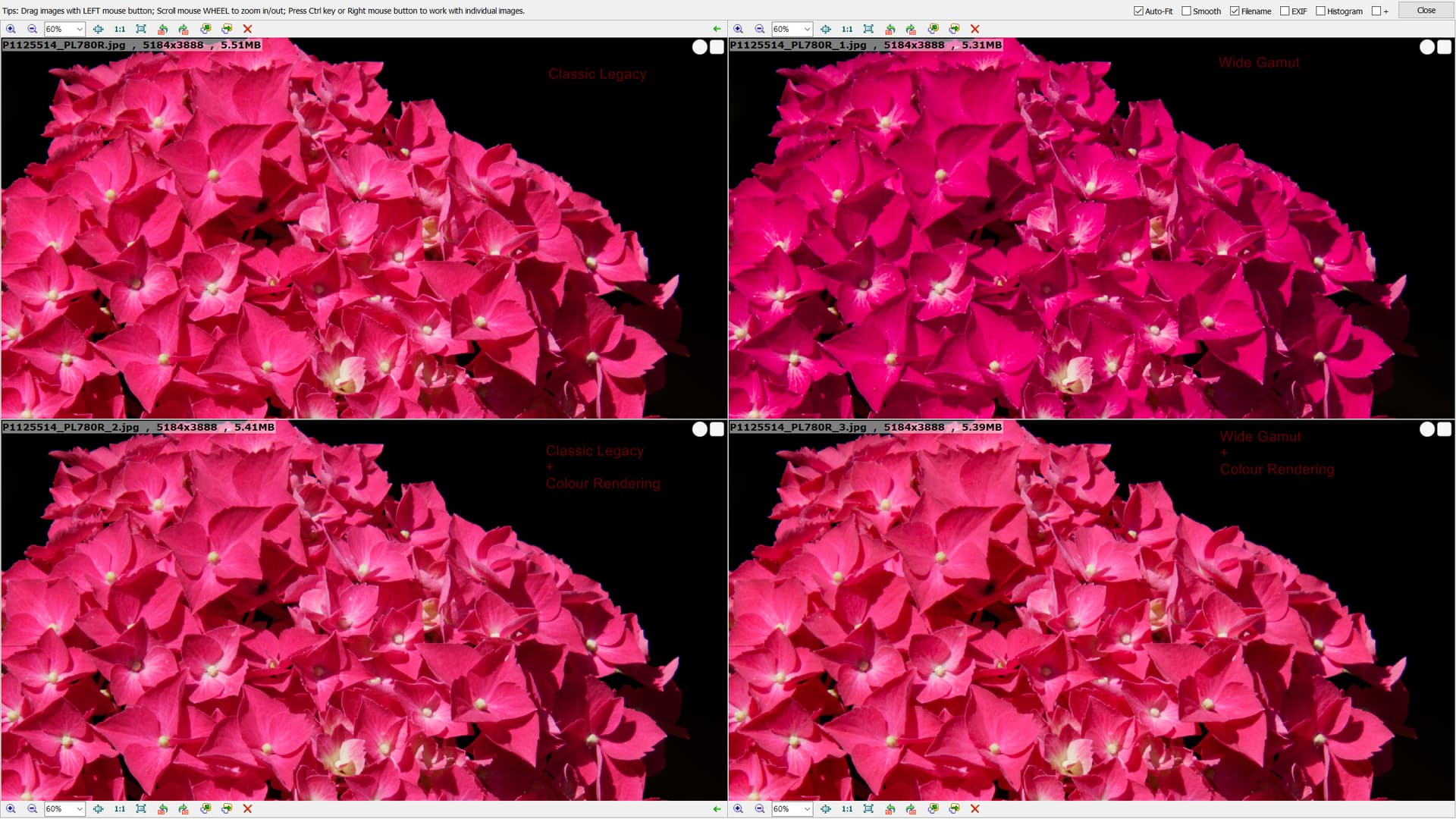
For future use, I recommend that you test the new WCS and the built-in presets as starting points. Hues are quite similar now, although you can spot some differences as shown below:
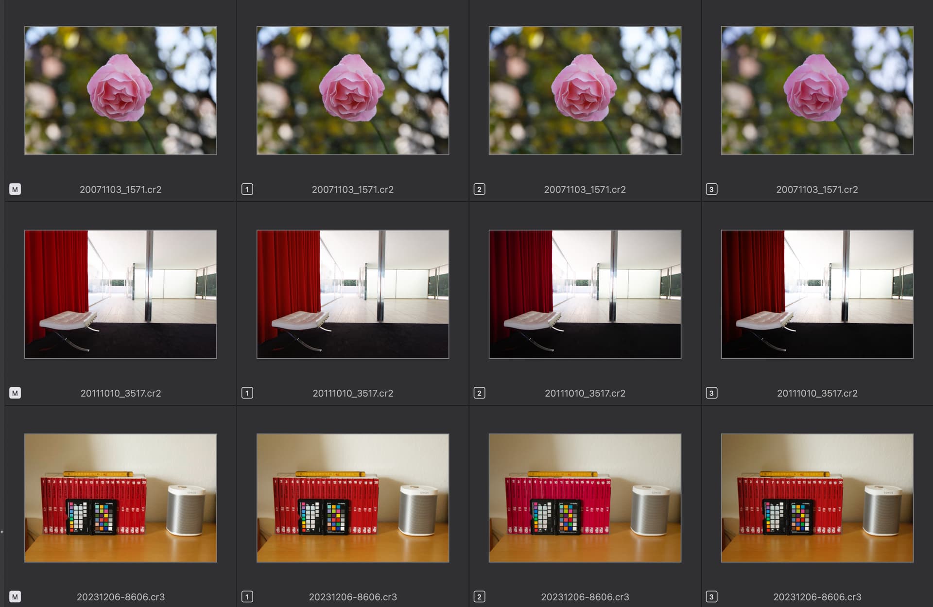
From Left to right:
- Wide WCS + DxO Standard preset
- Classic WCS + DxO Standard preset
- Wide WCS + No Correction preset
- Classic WCS + No Correction preset
Rose: Hues fairly similar, except for the rightmost image
Curtain: Reds brighter due to Smart Lighting
Books: Slight differences; could be compensated by a DCP profile drawn from the color checker reference - if the new WCS is used. Saturation is too high and needs to be lowered to make the colours look like they actually appear.
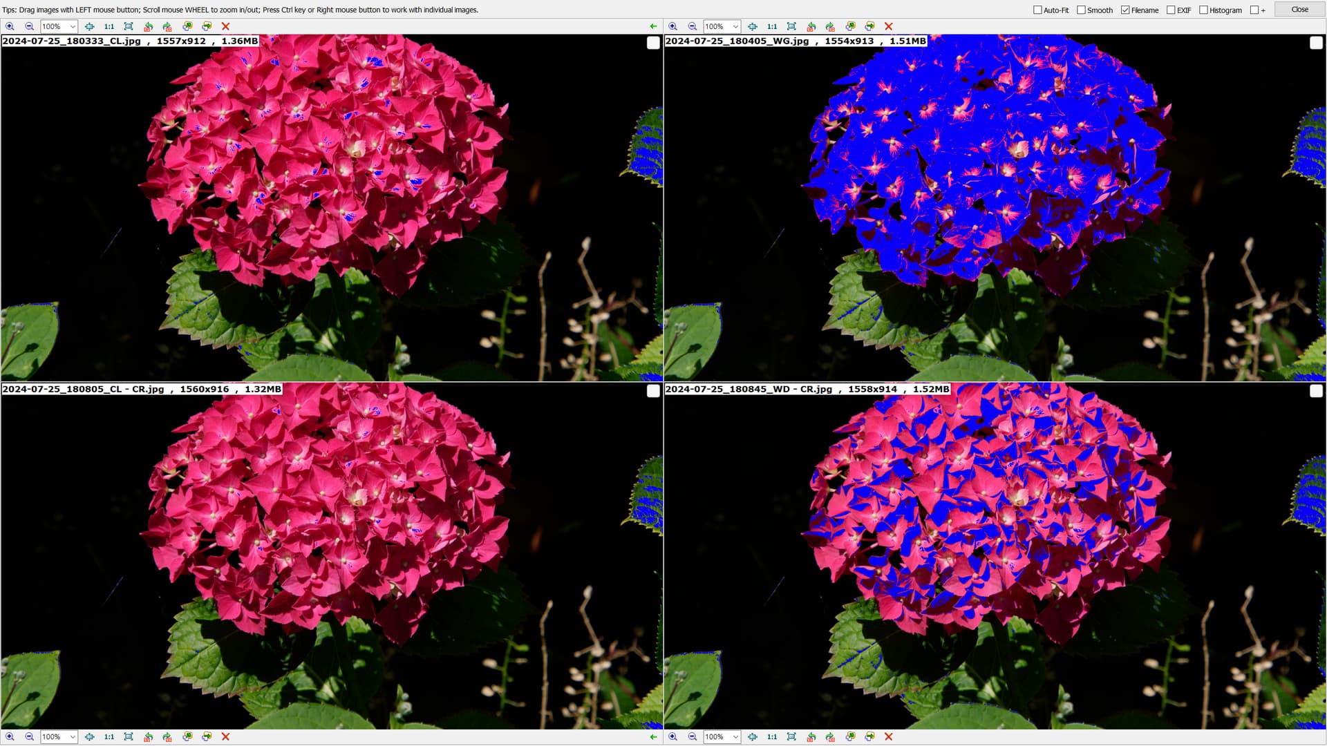
@platypus Thank you for your examples. I did a similar test with images taken at Great Dixter some weeks ago.
I applied just Vignetting, Crop and Distortion to an image and then created 3 VCs as you had done, so that we have
- WCS = Legacy
- WCS = Wide Gamut
- WCS = Legacy +
- WCS = Wide Gamut +
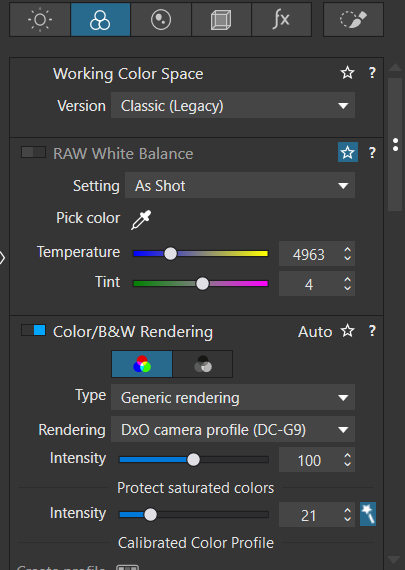
but I later noticed that the automatic settings for ‘Color Rendering’ are actually different but were what DxPL automatically applied when I set them and I verified that by toggling between the DCS settings!
Needless to say the variations are different for different flower colours but go something like this to a greater or lesser extent where
no suffix = CL,
_1 = WG,
_2 = CL + CR,
_3 = WG + CR
To be even more “boring” I made a video from exported images viewed via FastStone Image Viewer because it actually shows the differences, if any, much better!
It is a bit of a horror movie and I understand @Bhard’s concern.
OK, I am starting to see what you mean.
Here I have:
1: Optical corrections only + WCS Wide Gamut
2. Optical corrections only + WCS Classic
3. Standard + WCS Wide Gamut
It is, of course, setting 1 that was my problem, this is totally wrong.
What is the advantage of using 3 instead of 2 (here I would usually make additional manual adjustments, contrast and the like)? I like to keep it as “unadjusted” as possible, and add my own corrections. It would seem to be the idea with RAW.
Maybe it’s just a monitor gamut problem (like Adobe vs sRGB)?
Personally I use Classic gamut to display true pixel values for 8-bit RGB TIFFs, used for some experiments.
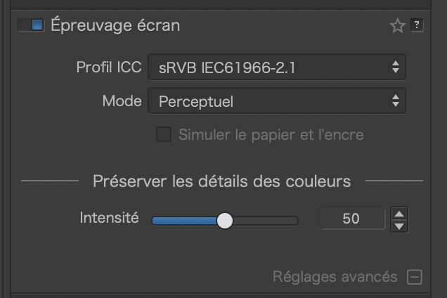
I took my standard Lobster test image and used the soft proofing tool to show what and where the differences are for an sRGB screen profile.
Classic (OOG warnings on)…
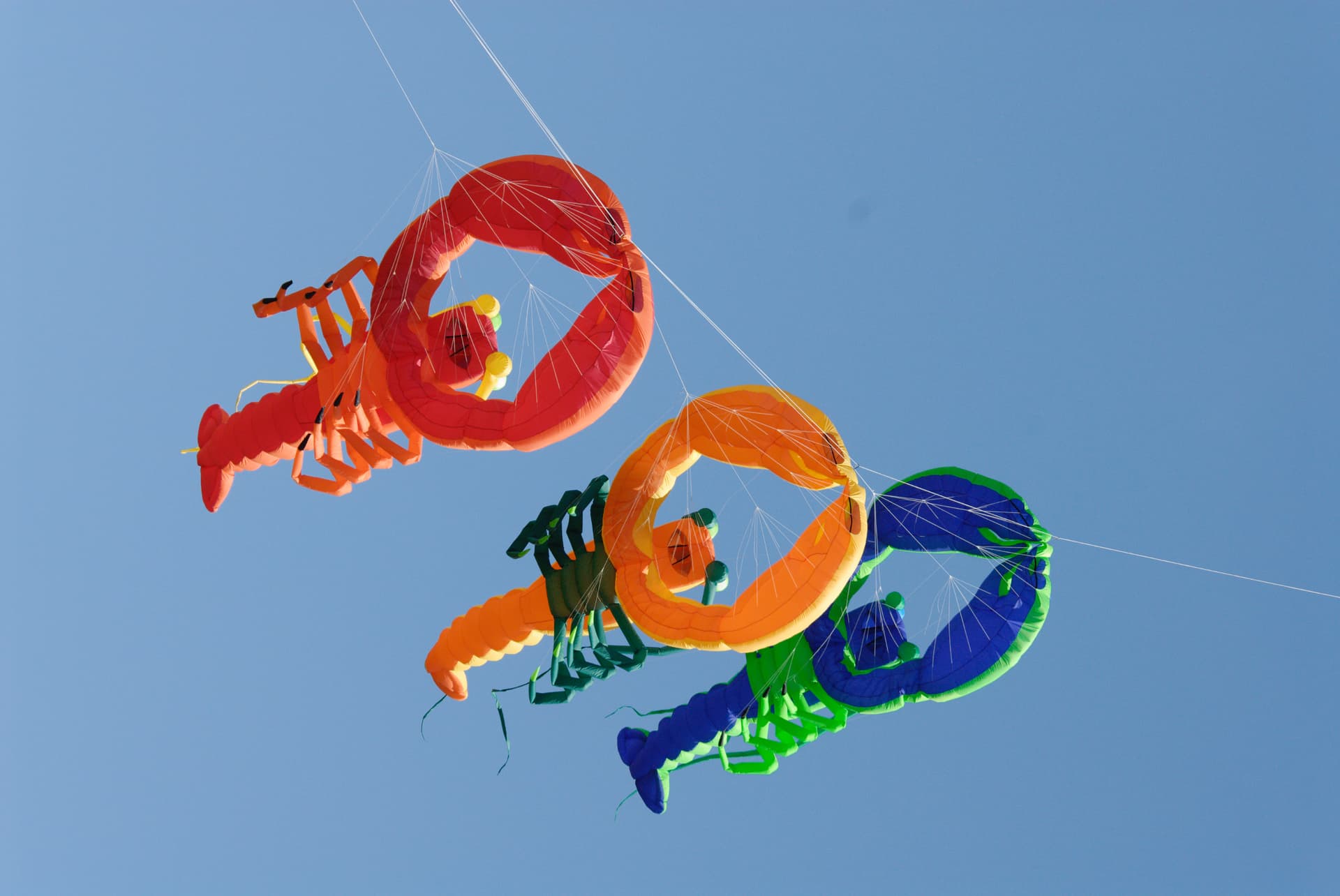
Wide Gamut (OOG warnings off)
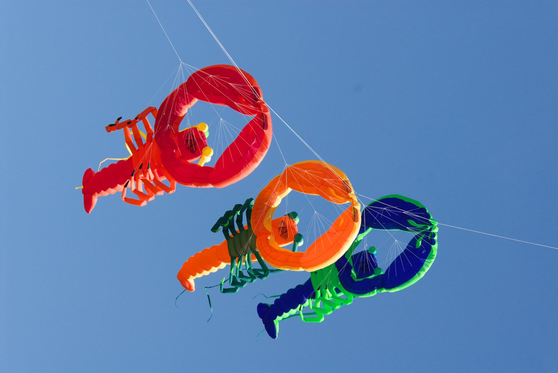
Wide Gamut (OOG warnings on)

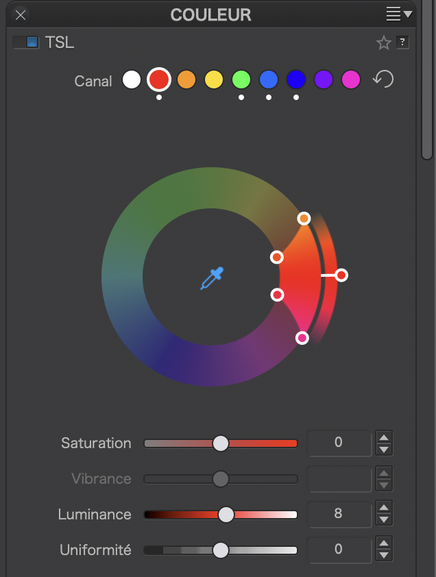
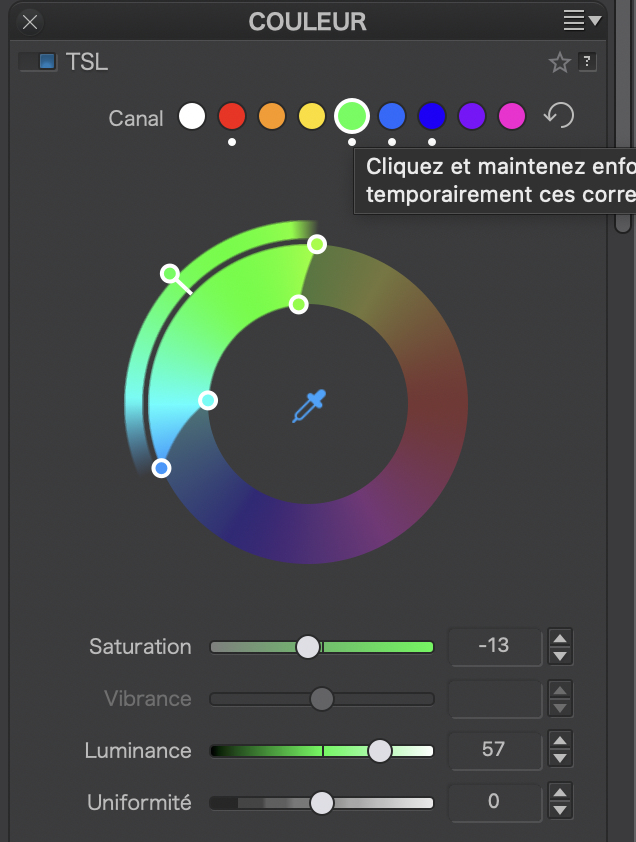
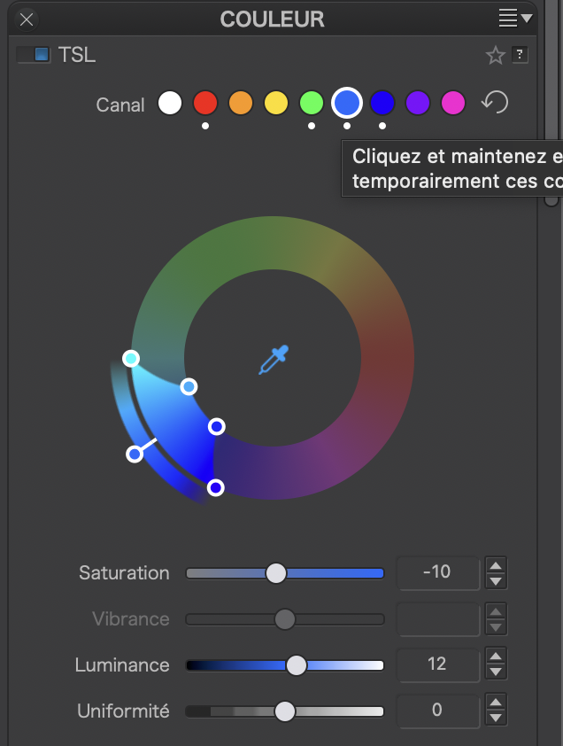
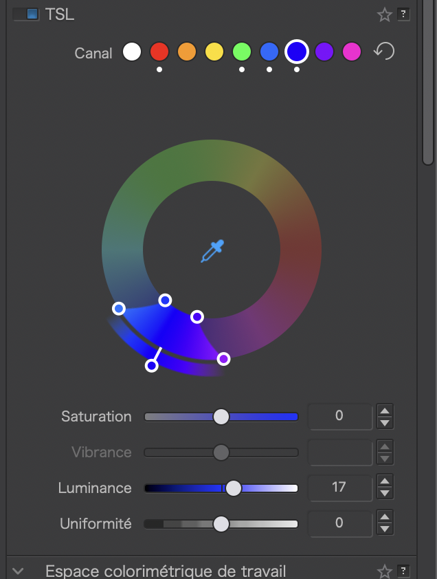
Color Wheel adjustments to clear warnings…
@Bhard “Standard” sets Vignetting, Crop and Distortion as I have used in my tests PLUS
- Smart Lighting = Slight,
- WCS = Wide Gamut as I have used in VC[1] and VC[3},
- WB= As Shot,
- Color Rendering as I have in VC[2] & VC[3],
- NR = HQ, *
- LS = default (some suggest the default is too sharp and I tend to use -0.5 but not in my tests here), *
- CA = Default *
- The distortion setting does not include ‘Keep aspect ratio’ but mine does
The items marked with an * do not show in the preview until that is 75% or above.
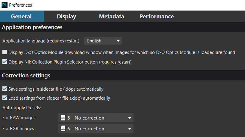
I believe that @Standard’ is not a good plan in your case ans that you could create your own minimal preset and then make that the default when opening new images in the ‘Preferences’.
@Wlodek My camera is set to sRGB, my screens are sRGB so I should not be able to see a wider Gamut than that surely.
So Classic Legacy and Wide Gamut should both be largely identical except there will be “holes” in the Wide Gamut image presentation because my monitor cannot show such colours !?
@Joanna I don’t believe I am seeing Out Of Gamut warnings I am simply seeing different colours, as is @Bhard ,why?
This is only valid as long you shoot in jpg.
But it does NOT disable your cam to capture colors beyond sRGB (if there are) as RAW file.
And then it depends on what monitor you use, what monitor profile, if you calibrated your monitor etc. …
As a general note – for web use (and some printing services) always export in sRGB color space and make use of PL’s Softproof.
1 Like
You need to activate the warnings for screen calibration…
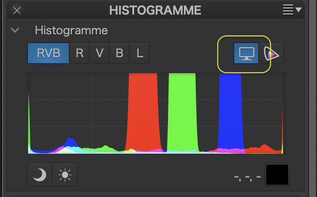
And switch on the Screen Proofing palette…
@Wolfgang I was hoping that that comment would prompt you into action! I realised the inaccuracy as I made it but left it as it was to see who might correct me, the issue has come up before.
I have taken to using soft-proofing but left it out in my original post to “simplify” the number of steps. However, I have now repeated the test with the first image and added soft proofing and , as I suspected, the images created are identical to those without explicit soft proofing so why are the image colours varying between CL and WG?
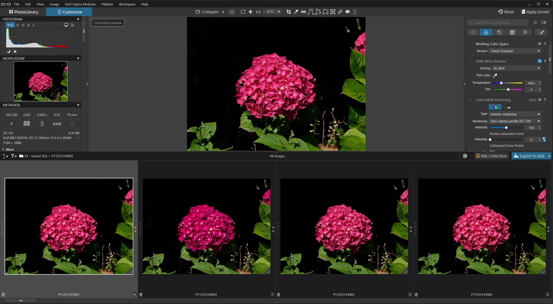
P1125514.RW2 (22.9 MB)
P1125514.RW2.dop (43.8 KB)
@Joanna I admit to forgetting the ‘Monitor gamut warning’, available at all times and the ‘Destination gamut warning’, available when ‘Soft Proofing’ is “active”.
The good news is that I had already started re-testing with ‘Soft Proofing’ added to my image testing so all I needed to do was use the warning button and got this
That indicates a problem but does it explain why the ‘Wide Gamut’ image is actually a different colour, i.e. is the loss of the ability to display all the colours the reason for the second (the WG) image appearing so much darker than the first (the CL) image?
Please note that CL - CR in the title means CL + CR etc.
If I remember correctly, the default rendering of classic is always the standard camera rendering, even if you deselect the rendering option and select the ,no corrections‘ preset. Whereas for wide gamut, the default rendering is a ‚neutral‘ profile, meaning the colors will always be different. In order to compare them, both should select the same camera profile.